Responsive Type and Zoom
Responsive Type and Zoom 관련


Typography that responds to viewport width (‘fluid’ or ‘responsive’ typography) can be useful when you want to ensure text does not get clipped or spill out of some design elements. Carousels, widget controls, or my Venn diagram are some examples.
I say viewport width because I rarely see responsive type consider the viewport height or the printed page. Not considering height can bw problematic for users holding their phone in landscape mode while trying to navigate pages with cookie consents and email form sign-ups. Not considering print can make for reams of wasted paper.
Responsive vs. Static
The alternative approach is to just use static text sizing, ignoring the size of the viewport.
To demonstrate the difference I forked a five-year-old Codepen that had just been updated last week, Precision responsive typography (aardrian) and started zooming the page, capturing screen shots along the way.
Then I duplicated the pen (aardrian), removing all the responsive sizing styles, ensuring the text started at the same size in an un-zoomed window. Then I zoomed and screen-shat it.
Screens
All screen shots were captured in Windows 10 / Firefox 72.0b1, but the effect is the same across browsers.
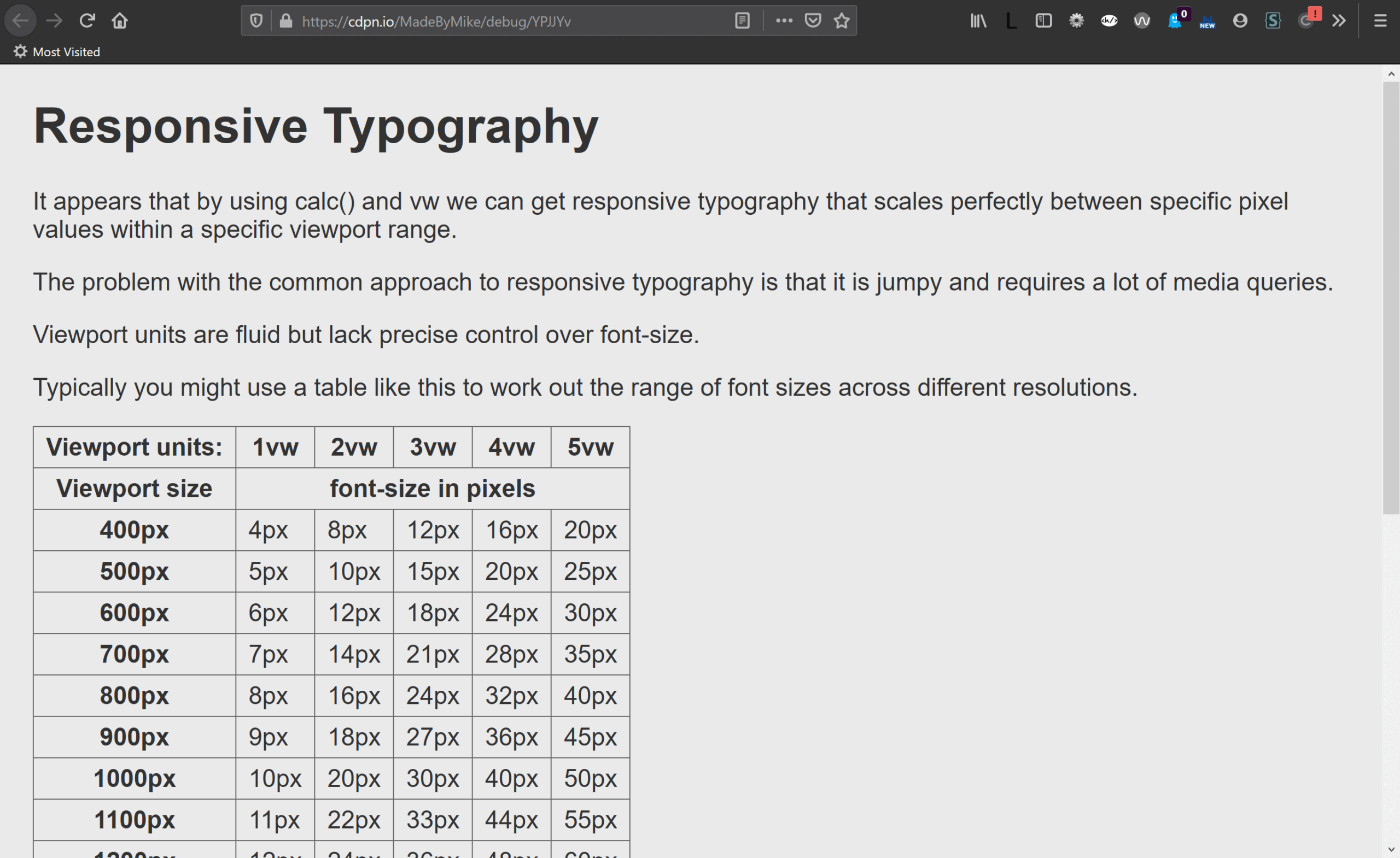
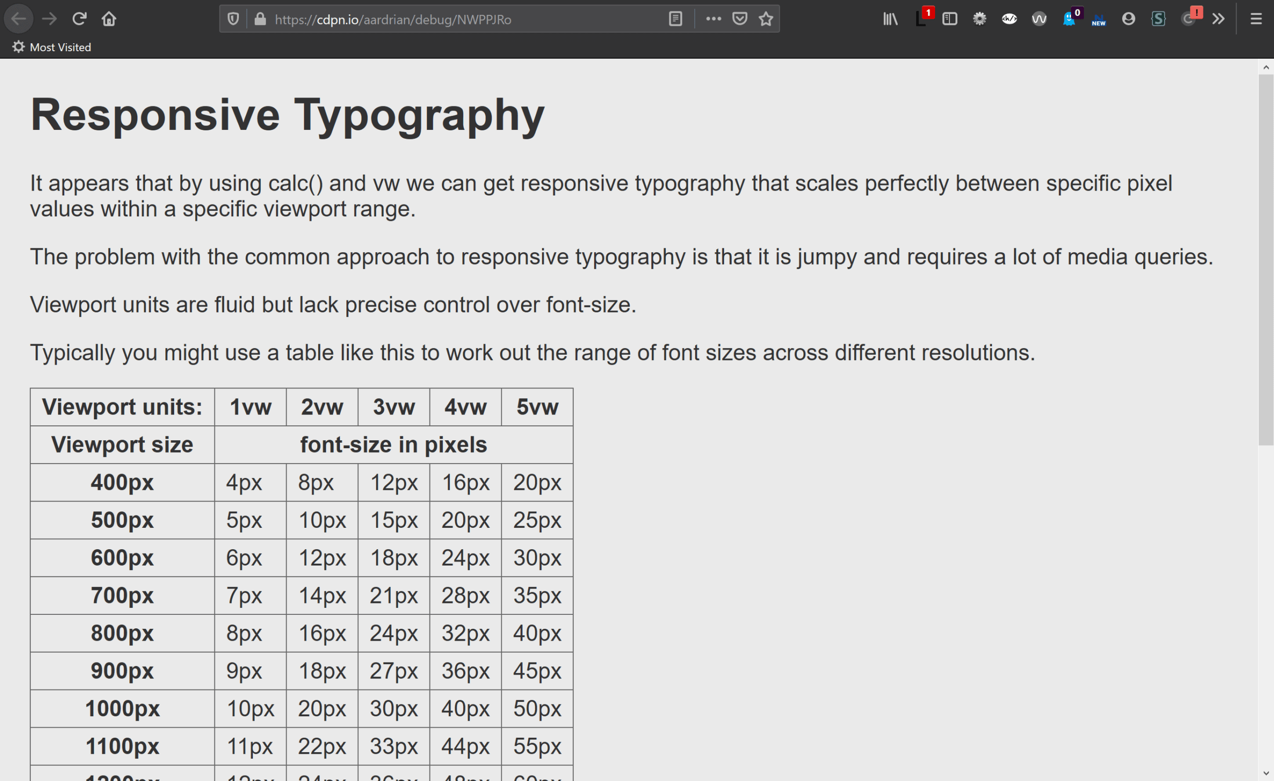
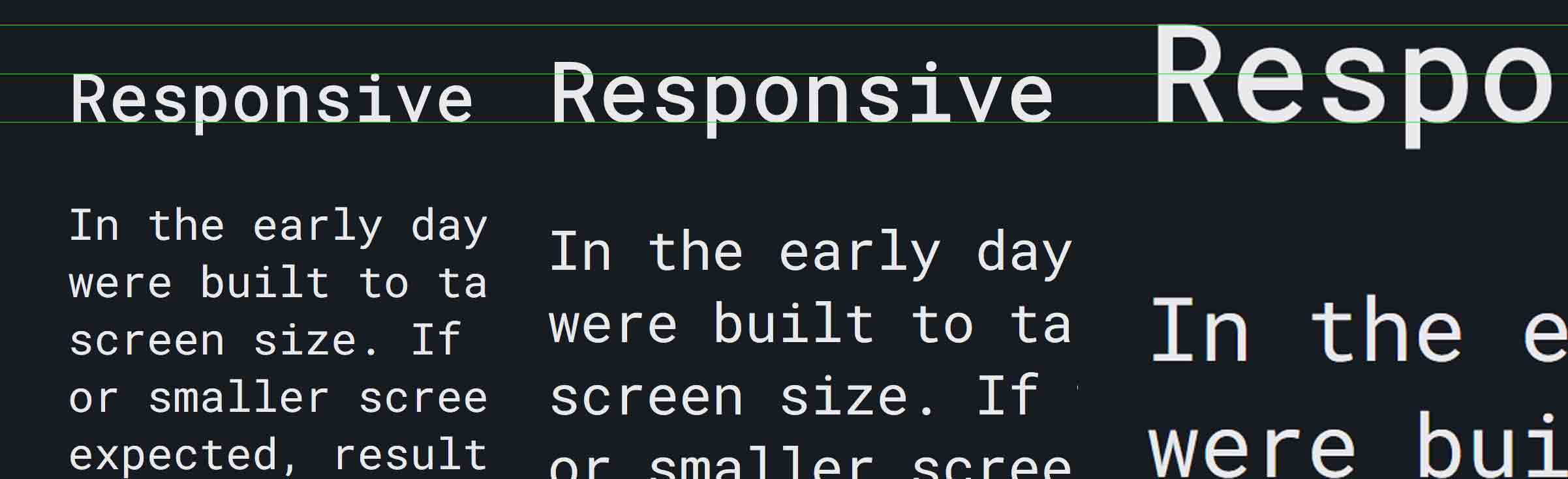
The first/left image is the responsive type example with no zoom. The second image is the same HTML, but no responsive type, with no zoom. The text is the same size in both.
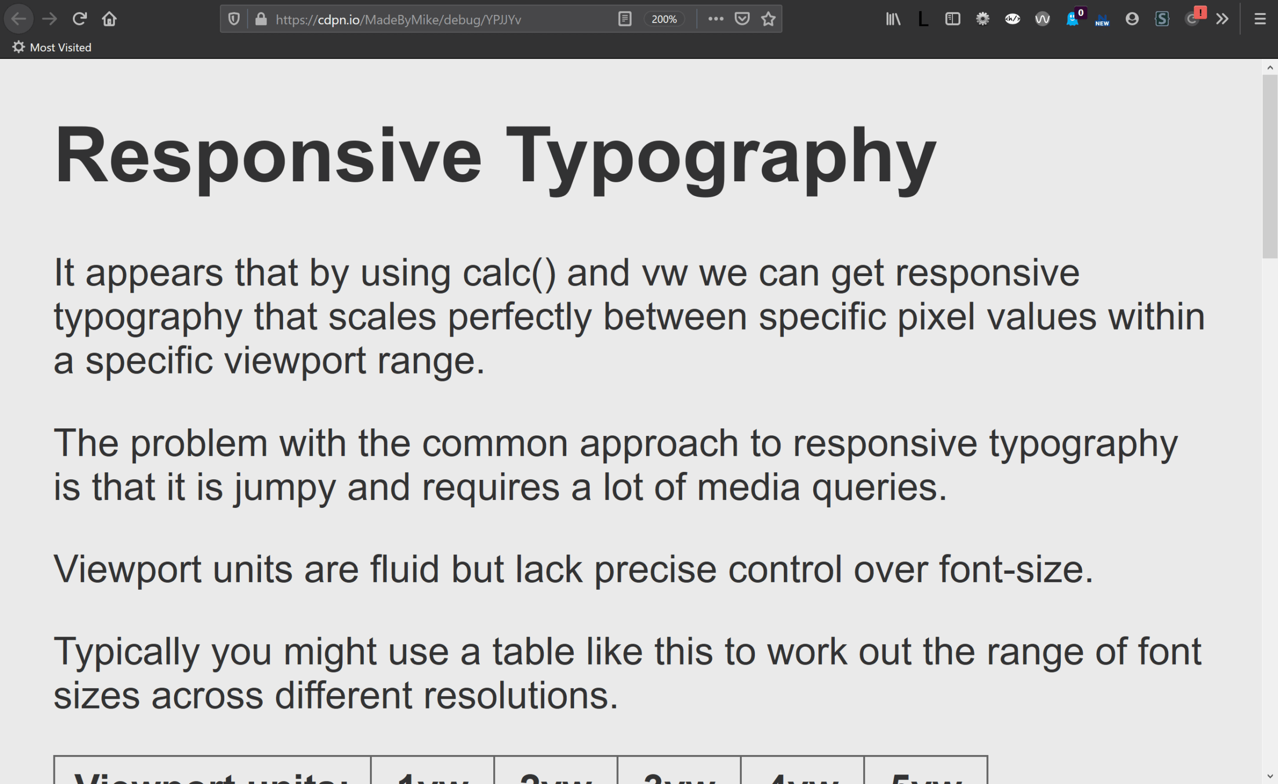
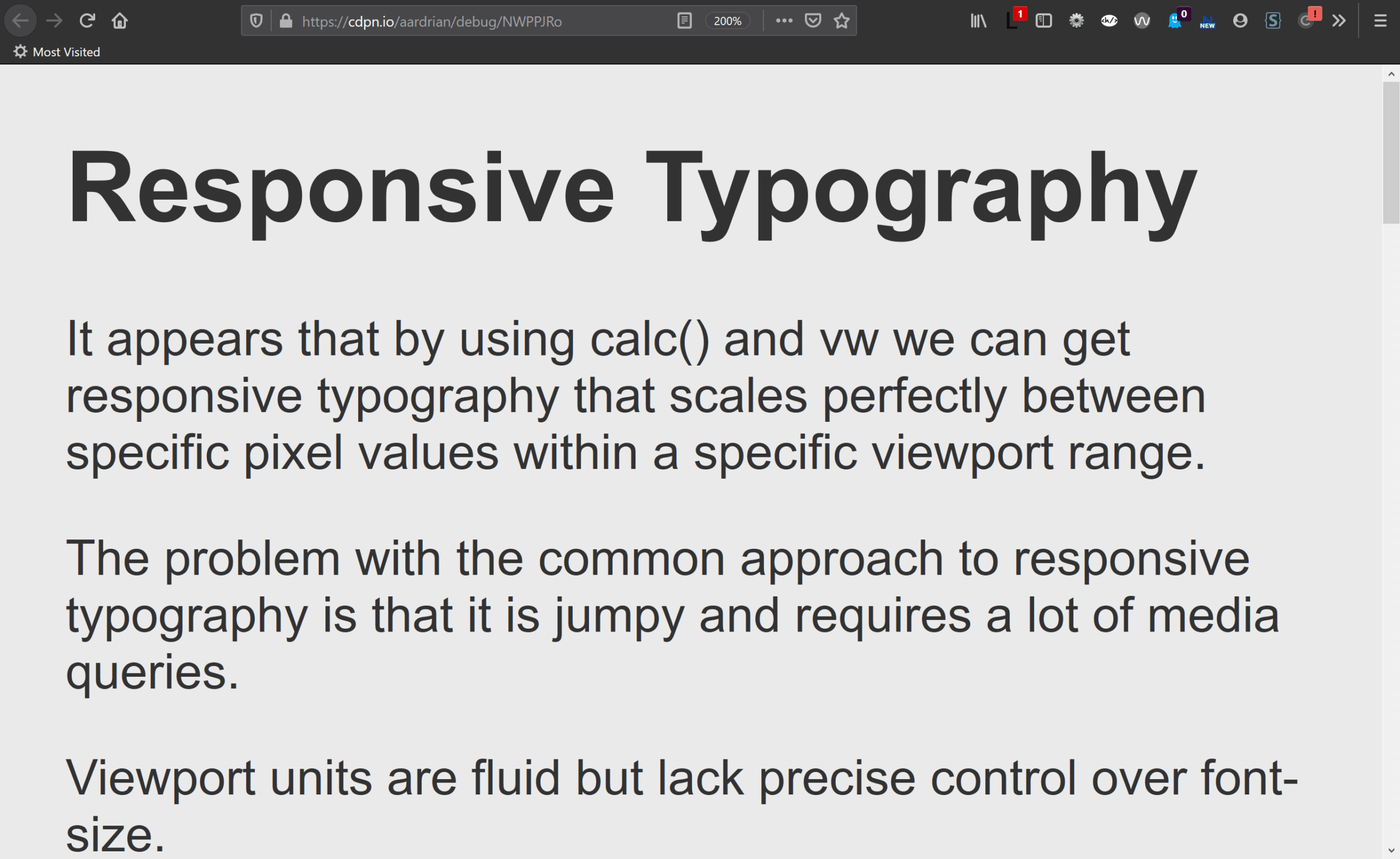
The first/left image is the responsive type example at 200% zoom. The second image is the same HTML, but no responsive type, at 200% zoom. The size difference is apparent, but not overwhelming.
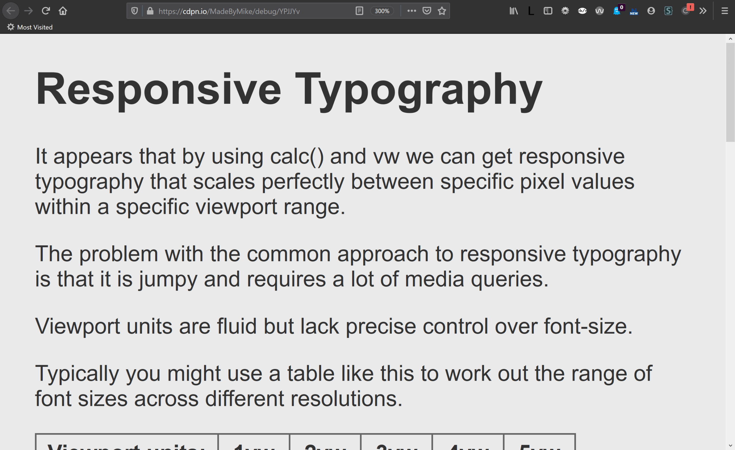
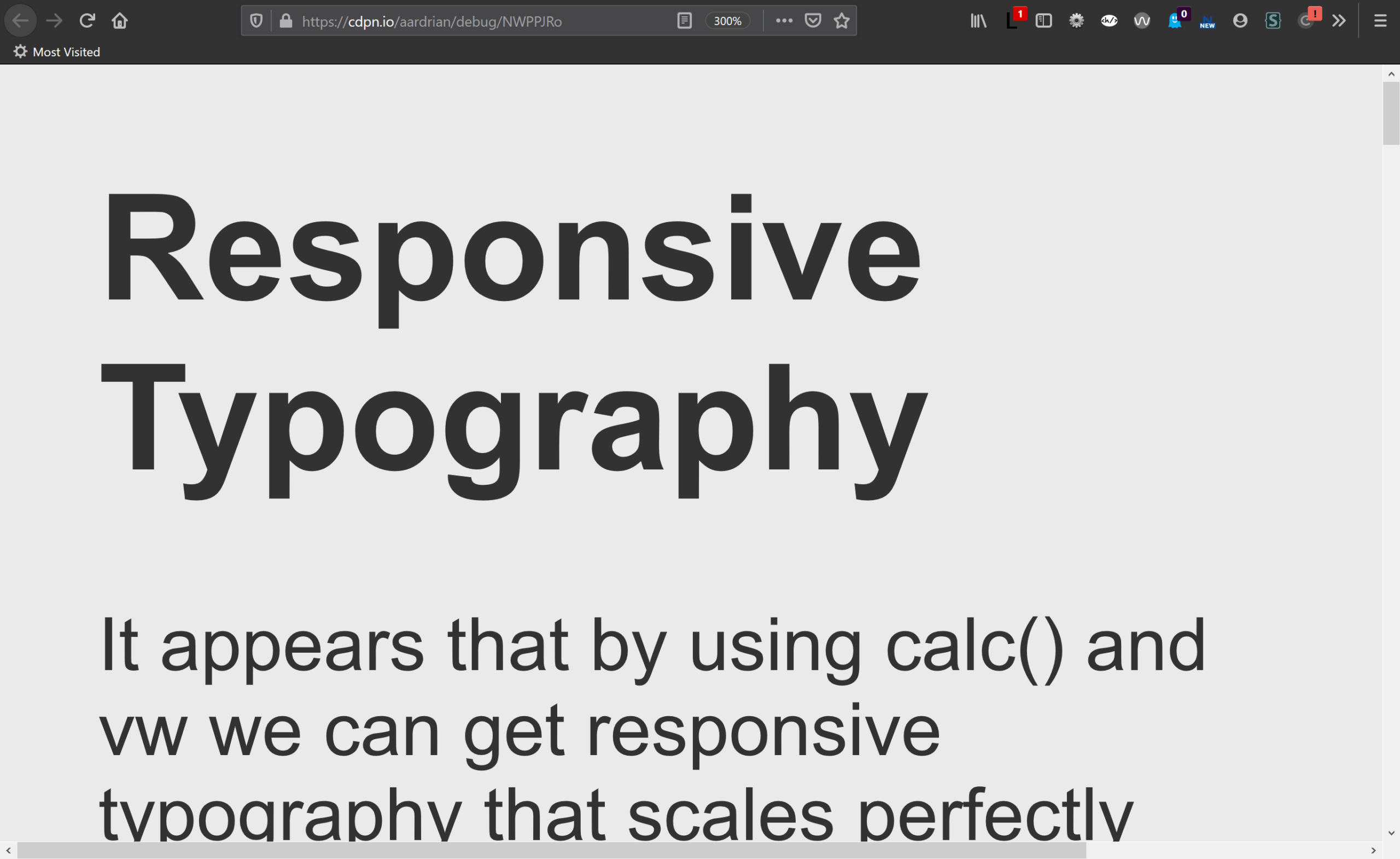
The first/left image is the responsive type example at 300% zoom. The second image is the same HTML, but no responsive type, at 300% zoom. Firefox users cannot zoom any more, which means the text cannot get any larger for them. The text cannot get to truly 200% its original size.
While Firefox limits zoom to 300%, Chrome goes higher and at 400% zoom the user of the responsive type page can finally get the text to almost 200% of its original size.
Code
For comparison, I have embedded the two different CSS blocks within this poorly-styled details/summary thinger…
The original SCSS (comments stripped):
$min_width: 400;
$max_width: 800;
$min_font: 12;
$max_font: 24;

:root { font-size: #{$min_font}px; }

@media (min-width: #{$min_width}px) and (max-width: #{$max_width}px){
  :root {
    font-size: calc( #{$min_font}px + (#{$max_font} - #{$min_font}) * ( (100vw - #{$min_width}px) / ( #{$max_width} - #{$min_width}) ));
  }
}
@media (min-width: #{$max_width}px){
   :root {
     font-size: #{$max_font}px;
   }
}
The entirety of the text sizing CSS in my pen:
:root {
  font-size: 150%;
}
Why It Matters
I have worked with users who scale text to this large. Some of them do it because they surf on their TV from their couch. Some do it when reading a recipe off their phone in the kitchen. Some do it when they need to present on a wall to a room full of a people. Some of them just have poor vision.
When people zoom a page, it is typically because they want the text to be bigger. When we anchor the text to the viewport size, even with a (fractional) multiplier, we can take away their ability to do that. It can be as much a barrier as disabling zoom. If a user cannot get the text to 200% of the original size, you may also be looking at a WCAG 1.4.4 Resize text (AA) problem — check out Failure of Success Criterion 1.4.4 due to incorrect use of viewport units to resize text.
I want to be clear — I am not picking on the specific example above. That example is only demonstrating what developers can do, not what they should do. There may be completely valid reasons to use these techniques and the example I borrowed shows one method to do that.
What to Do
Identify why you want responsive type. Is it based on user request? Surveys? Research? Or is it just that you or your team think it looks better? Or you want to try out this technique? The answers may tell you if you should even move ahead with responsive type.
Consider not setting a base font size. Maybe use the following rule (or similar or nothing) to inherit the font size from the browser, which may have been explicitly chosen by the user:
:root {
   font-size: 100%;
}
Then only set subsequent text size values using %, em, or rem units, avoiding values below 100%, 1em, or 1rem (unless scaling down in something already scaled up).
Be careful when using vw or vh units. Then be careful if using calc(). Be even more careful when using min(), max(), or clamp() (see CSS Values and Units Module Level 4 for the Working Draft spec language).
If you are going to use responsive typography techniques anyway, you must test it by zooming. Zoom across devices, across browsers, across viewport sizes (not everyone surfs full-screen), and across viewport orientations.
Also, don’t forget print styles. Consider print units in pt, and print to PDF to confirm it works without wasting paper.
Update: 7 January 2020
New York Times has an experimental interactive piece that demonstrates some of what I discuss above. Zooming out from a page should not make the text larger than zooming in.
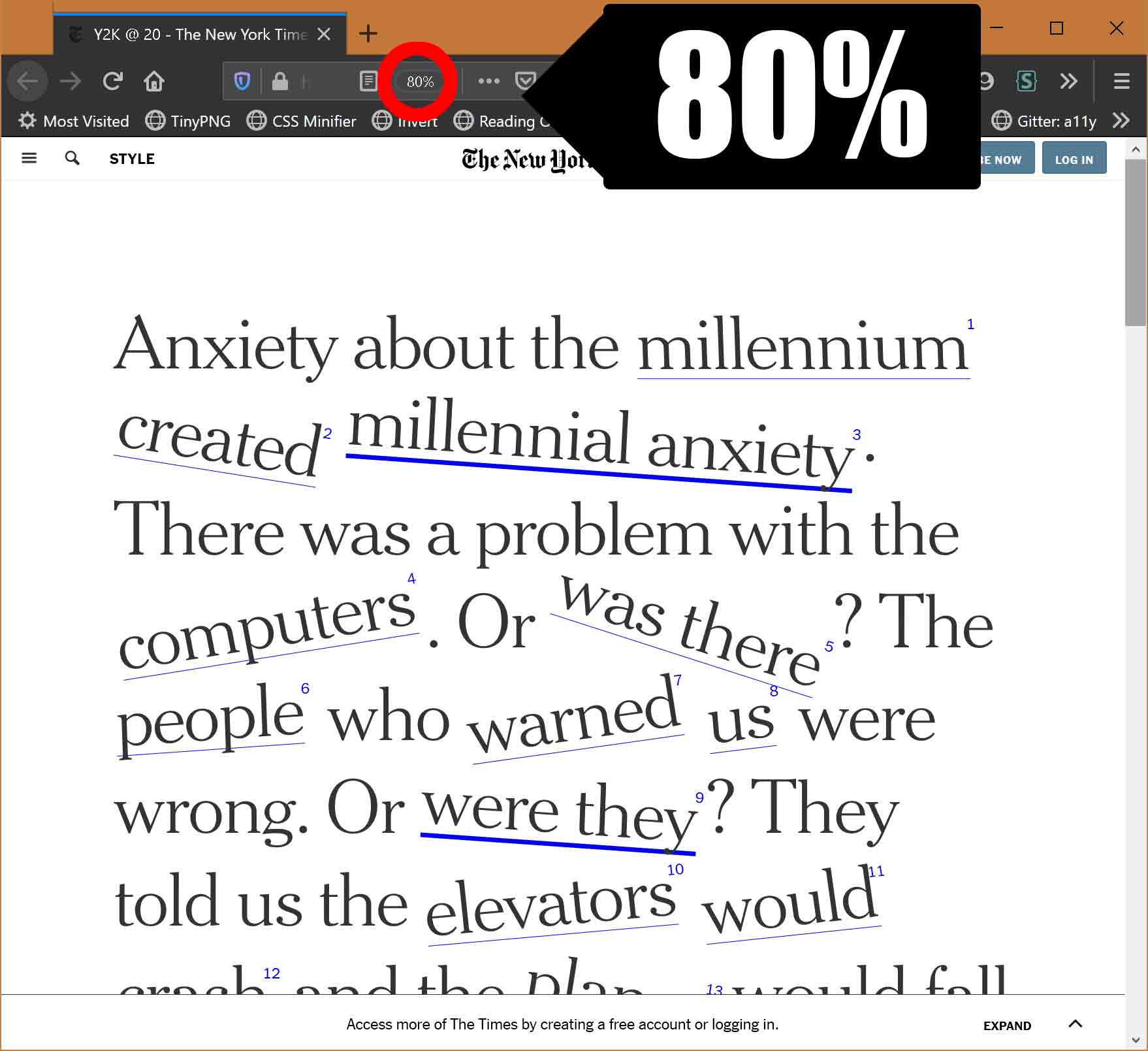
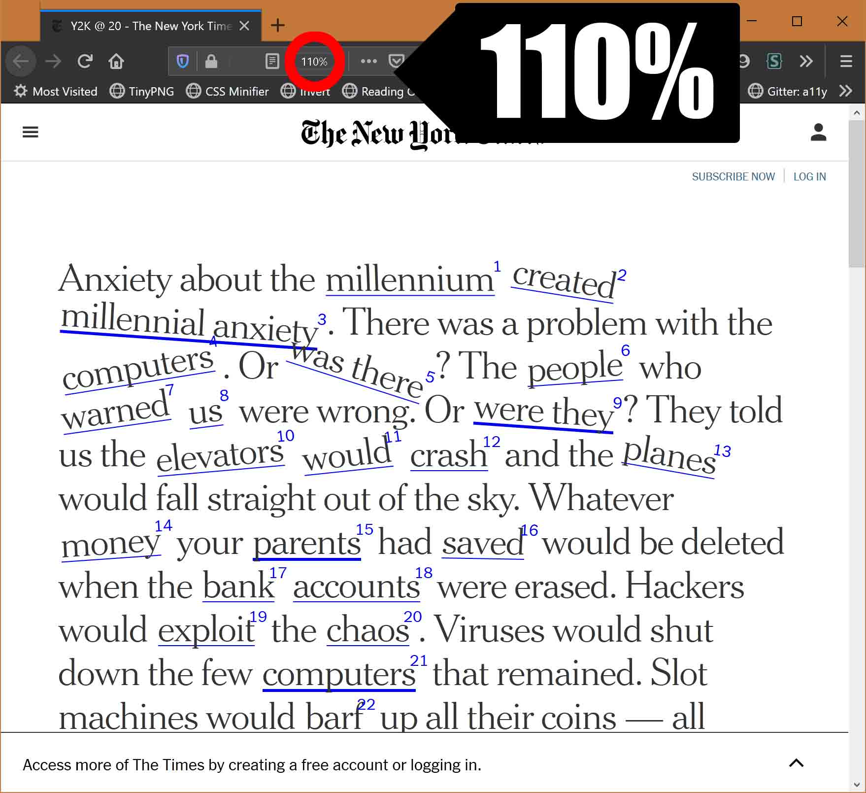

The text is largest when at 80% zoom (first image), then much smaller at 110% zoom (middle image), then a bit larger at 133% zoom (last image).
Update: 20 May 2020
Scaling text by using the browser preferences to change the default text size will not affect any text on a page that is set in px units.
To say it a different way, if you set your text in px, then it will not scale when a user explicitly chooses a larger or smaller default size. You px-based text will stay the same size, laughing at your user.
Obviously full-page zoom overrides it, but many users still opt for a larger default size to avoid having to scale every site. So don’t set your text in px.
Update: 26 September 2020
Apparently I need to keep saying this. The following is becoming my default comment on articles that keep appearing without cautions.
Please be careful with maximum text size, particularly on sites/pages that face the general public or employees. If you prevent the text from scaling up 200%, then that is a WCAG SC 1.4.4 failure at Level AA. Viewport units have their own call-out as a major risk in WCAG.
No matter what technique you use, be sure that the page text can be zoomed at least 200%. And yes, I have written about responsive type and zoom, and have cautioned against min(), max(), and clamp().
Update: 29 September 2020
This in response to a specific request on the post Linearly Scale font-size with CSS clamp() Based on the Viewport. I referenced a simpler example (pprg1996) from the post in my comment, but figured I would use the final example here to be sure I caught all the affordances in the code.
I made a video showing that as I zoom to 200%, the text stops scaling at about the 150% point.
Here I compare the original text, the page scaled to 200%, and then how the text should look if it was actually made it to 200%.
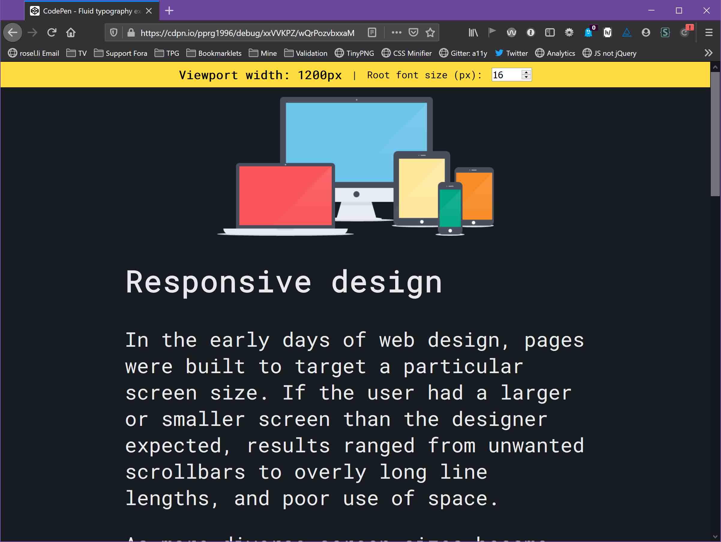
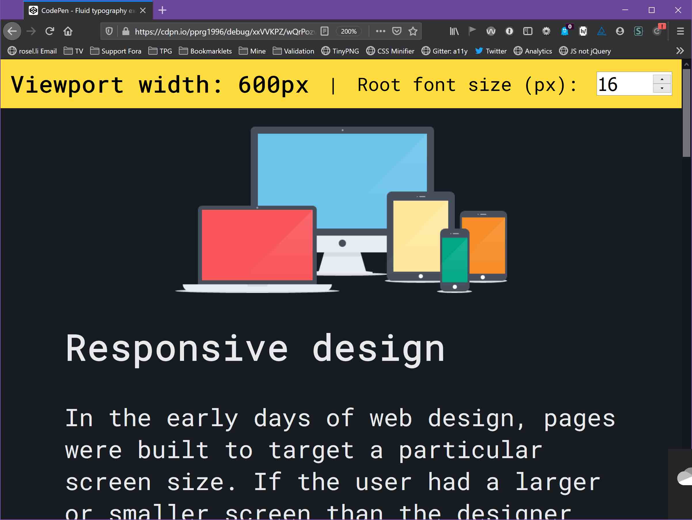
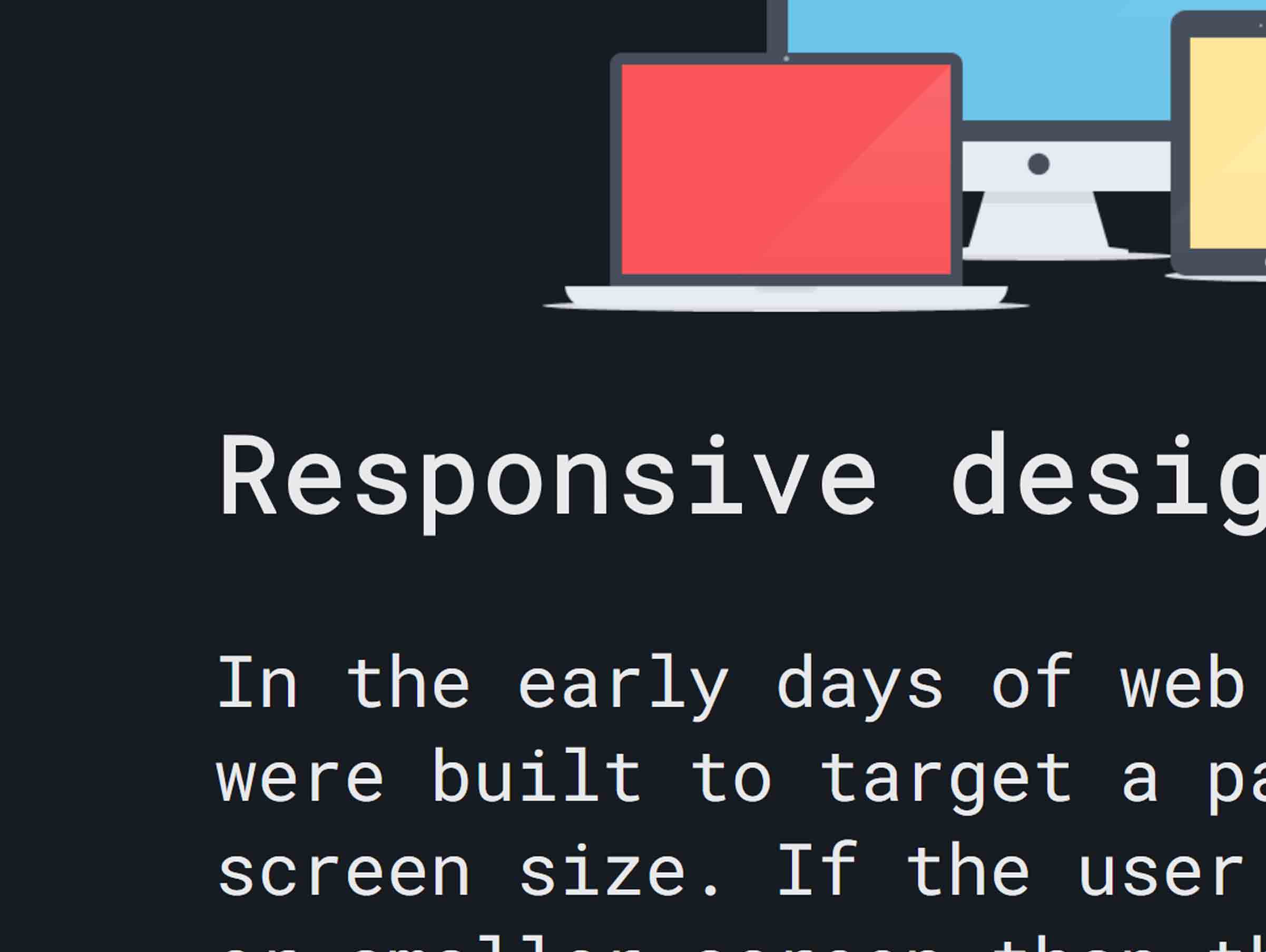
Here I show the <h1> at its initial size, when the page is zoomed to 200%, and when the text is actually 200% the size of the initial text. I aligned them on the baseline to make the difference between them more obvious.
Similarly, even a simple demo (pprg1996) taken out of context can be a problem. Your text should never get smaller when the user zooms, and it certainly should not be smaller at 300% zoom.
Update: 17 October 2020
Over at dev.to, Google’s developer support blog, Una Kravets posted min(), max(), and clamp(): three logical CSS functions to use today where she walks through how each of those CSS functions works and shows some examples.
There is a fluid typography example she borrowed from elsewhere that shows how text can scale and adjust to the viewport, using only the style declaration font-size: clamp(1.5rem, 5vw, 3rem). A video shows it in action.
If you have read this far, you may have spotted something that can cause a problem here. It’s not the use of clamp(), since the upper limit, 3rem, is twice the size of the starting 1.5rem. It’s the use of vw units. For some users, the text can never get large enough to bump up against the 3rem.
I made a video to demonstrate it in action, but you can visit the original demo (una) to try it yourself. Remember that Firefox can only zoom to 300%.
This is a 1,024 pixel window in width, though I kept the height short and it has no impact on the demo. The text starts at 64px tall, at 200% zoom has only increased to 68px in height (a 6.25% increase), and at 300% zoom has only increased to 96px in height (a 150% increase).
If you use this code as-is, you have guaranteed a WCAG failure.
I filed a pull request (GoogleChrome/web.dev) (which they merged on 21-Oct) with a brief explanation:
When you use
vwunits or limit how large text can get withclamp(), there is a chance a user may be unable to scale the text to 200% of its original size. If that happens, it is WCAG failure under 1.4.4 Resize text (AA) so be certain to test the results with zoom.
…before merging another PR (GoogleChrome/web.dev) that removed the links. So, shrug emoji?
Update: 27 September 2022
I completely failed to link to W3C issues that may or may not have some impacts here:
- #1671 Can large headings be exempt from Success Criterion 1.4.4 Resize text? (
w3c/wcag#1671), filed against WCAG by Šime Vidas on 8 March 2021; - #6869 Browser zoom unit for accessibility [css-values-and-units] (
w3c/csswg-drafts#6869), filed against CSS by Scott Kellum on 8 December 2021. Not a lot of movement recently, but it is instructional to see the challenges and goals outlined by all parties.
Update: 17 November 2023
I kinda like this:
"Addressing Accessibility Concerns With Using Fluid Type" From Smashing Magazine (smashingmagazine.com)
Mudford cites Adrian Roselli, who appears to be the core source of the other warnings:
Addressing Accessibility Concerns With Using Fluid Type by Maxwell Barvian at Smashing Magazine
That may very well be true. I did not find others citing the very real (and easy to prove) WCAG failures developers were suddenly pushing into their projects. That was a little depressing, frankly (considering how easy it is to prove). I spent a lot of time grumping about this online, too. So yay me.
Anyway, Maxwell does the thing I did not — he tried to plot the curves and do the math to give developers guidance on how to write their CSS functions to create WCAG-conformant fluid type. I have not tested the assertions, but I definitely appreciate the effort.
It only took four years!
Update: 3 April 2025
This video may look familiar:
A string of text in a browser window reads “This text fits to the available space.” It does not wrap to a second line. The user zooms the page and surrounding text gets larger, but not this text. It never changes size, becoming smaller and smaller relative to surrounding text.
I have videos in this post showing the same behavior with other responsive type techniques. But this technique is new. It’s meant to ensure a piece of text always fits the width of its parent. Wrapping does not seem to be an option.
Patrick Lauke posted this video as a comment on [css-fonts-4] Feature for making text always fit the width of its parent #2528 (w3c/csswg-drafts#2528). He demonstrated that encoding this behavior into the CSS specification will create an almost guaranteed WCAG failure every time it is used. Unfortunately, the first response by a W3C CSS Working Group member was to say that WCAG should revise this SC which, unfortunately, seems to ignore the W3C Priority of Constituencies at the very minimum.
Update: 20 October 2025
Miriam Suzanne has been running at responsive type for a few months now, with a series of five posts (and a sixth about units in general) ending with Visualizing Responsive Typography. None of them gives a definitive, absolute, copy-pasta-ready set of styles for responsive type that’s guaranteed not to trigger a 1.4.4 violation. Because this stuff is hard, as that series demonstrates.
Meanwhile, last week Matthias Ott posted Compressed Fluid Typography, which is another effort at trying to solve this and not fail WCAG. He acknowledges that in the post. What we are seeing is that there are many ways to detonate a cat but so far none leave the cat alive.