How CSS works: Parsing & painting CSS in the critical rendering path
How CSS works: Parsing & painting CSS in the critical rendering path 관련


CSS often feels like this mysterious, whimsical force governing everything that we see on the web. It can be inherently simple at times, yet writing scalable, performant CSS seems to be the exception rather than the norm.
Whether you think of CSS as a “necessary evil” or think of it as capable-yet-misunderstood, CSS is a must-have for anyone working on web applications. A deep knowledge of CSS can be the difference between a beautiful, polished web application and one that just feels kinda “meh”.
This post is going to be the first in a series where we take a deep dive into CSS as well as its attached ecosystem. The vision is that by popping open the hood on CSS we can gain deeper understanding and appreciation for the de-facto styling language of the web, enabling us to write faster, cleaner, beautiful CSS that scales as our applications grow in size and complexity.
For the first post of this series, we’re gonna jump into how CSS gets rendered to the screen on initial page load.
The reason we care about the path that CSS has to take to turn into beautiful pixels boils down to two words.
Load time.
If your site takes forever to load, chances are your users aren’t gonna wait for it to finish, even if there’s valuable content to be found there. Some studies have shown that up to 50% of mobile users leave a page after 3 seconds of waiting.
With users expecting those types of load times, it’s our responsibility as web developers to not bloat the amount of stuff we’re sending to the user. Sadly, CSS is often the culprit of increased load times, so having a nuanced understanding of how the CSS you send is transformed into beautiful pixels will help you optimize that crucial seconds where users are most likely to bounce.
What is the Critical Rendering Path, anyway?
When we say that users want quick load times, we have to draw the distinction between critical and non-critical resources. Perhaps you’re lazy-loading some of your images or you’ve set up a bit of fancy route-splitting (thank you webpack!) to not send all of your JavaScript at once. These resources that are loaded after the initial page render are considered to be non-critical — that is, they don’t delay the initial render of the page. Resources that delay the first render of the page are considered to be critical.
The critical rendering path is the minimum steps that the browser has to take from the moment it receives the first byte of HTML to the moment that it renders pixels on the screen for the first time. Essentially, it’s what the browser has to do to process our critical resources into something our users can enjoy. It looks something like this.
- Build the DOM (Document Object Model) from the received HTML
- If we encounter a CSS style sheet (embedded or linked), start building the CSSOM (CSS Object Model — we’ll get into what this is in a bit).
- If we encounter a JS block (not designated as
async) while building the DOM, wait for CSSOM construction, stop DOM construction and parse/execute the code. The reason for this is because JS execution can modify the DOM and access/modify the CSSOM.
For the purposes of this article, we’ll be diving into that second step — how CSS factors into the critical rendering path. It’s easy to take utmost care to tree-shake, route-split, and lazy-load our JavaScript, but sometimes CSS can be forgotten. However, an unoptimized CSS bundle can easily wreak havoc on your load times.
HTML and the critical rendering path
Since this is primarily an article on CSS, we won’t spend a ton of time on DOM construction. However, CSS is fundamentally a language for styling markup, so we need to be aware of how it interacts with the DOM.
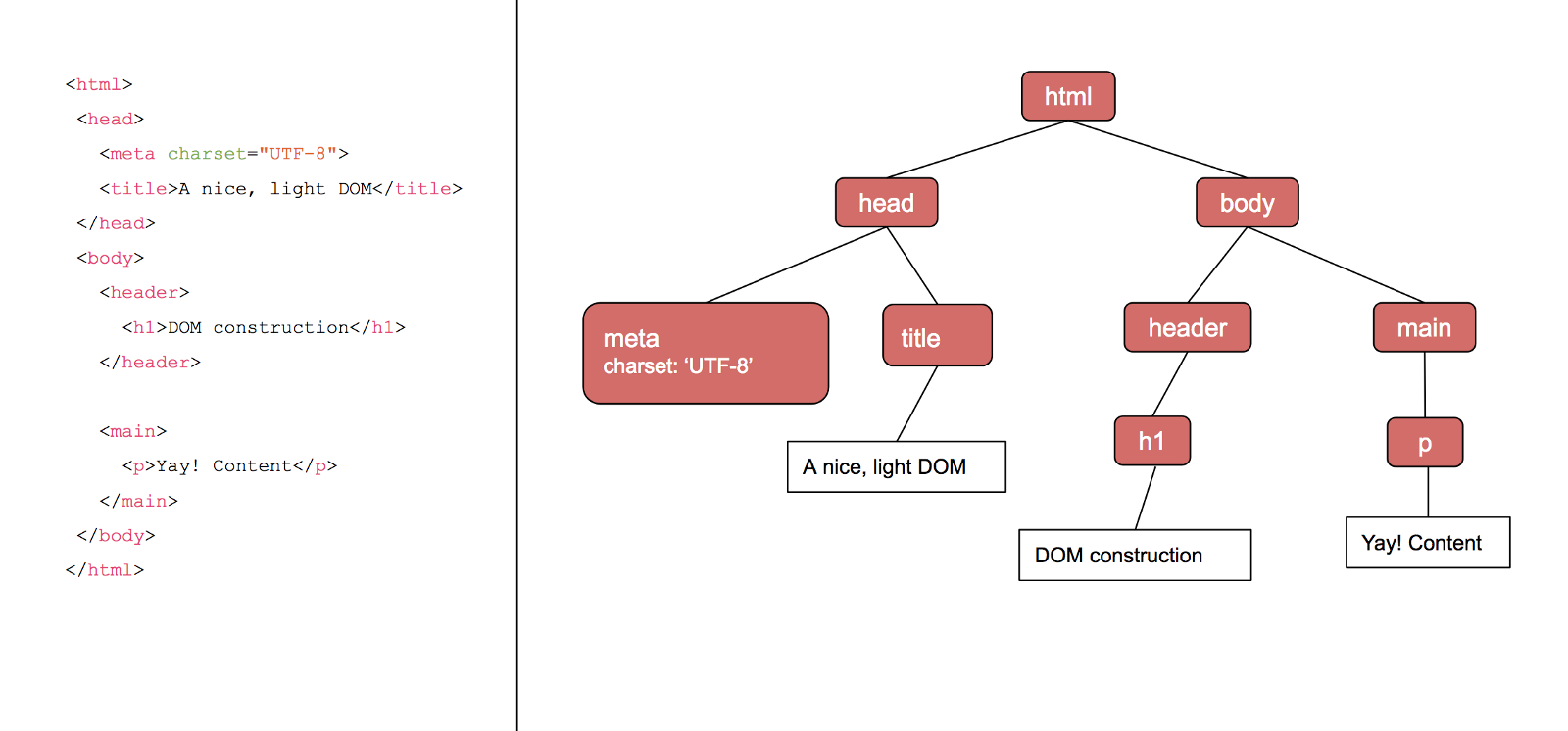
The DOM is a tree-like data structure containing all of the HTML nodes on the page. Each node contains the data about that HTML element (such as attributes, ids, and classes) If the node has any HTML elements as children, it will also point to those child nodes. For example, given the following HTML, we would construct the following DOM. Notice how the HTML’s indentation and the DOM’s structure are very similar.

As far as the critical rendering path goes, we consider HTML to be one of our render-blocking, critical resources — we can’t render any content if we haven’t parsed it yet!
Building the CSS ObjectModel
When the browser encounters a CSS stylesheet (either embedded or external), it needs to parse the text into something it can use for style layouts and paints. The data structure that the browser turns CSS into is creatively named the CSSOM, — the CSS Object Model.
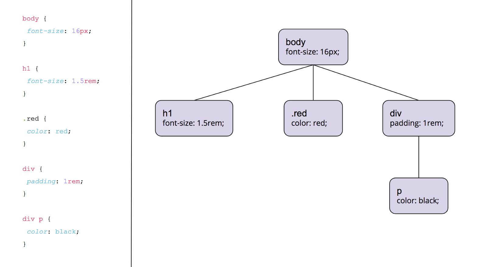
What does the CSSOM look like? Given the following CSS, the browser would construct a CSSOM that looks like this.

Essentially, we parse through any CSS selectors we have and assign them their place in the tree. If there’s a single selector, it will be attached to the root node of the tree. Nested selectors will be attached to the node which they are nested underneath. The CSS parser has to read nested selectors from right-to-left in order to guarantee that they end up underneath the correct nodes.
Turning CSS into the CSSOM is considered to be a “render-blocking” stage just like building the DOM out of our HTML. If it just went ahead and rendered to pixels without waiting for the CSSOM we’d see a flash of unstyled content (ugly!) for a moment while the CSSOM was parsing. After that, everything would shift around when finally applying the CSS. Not exactly a great UX by a long shot.
The rendertree
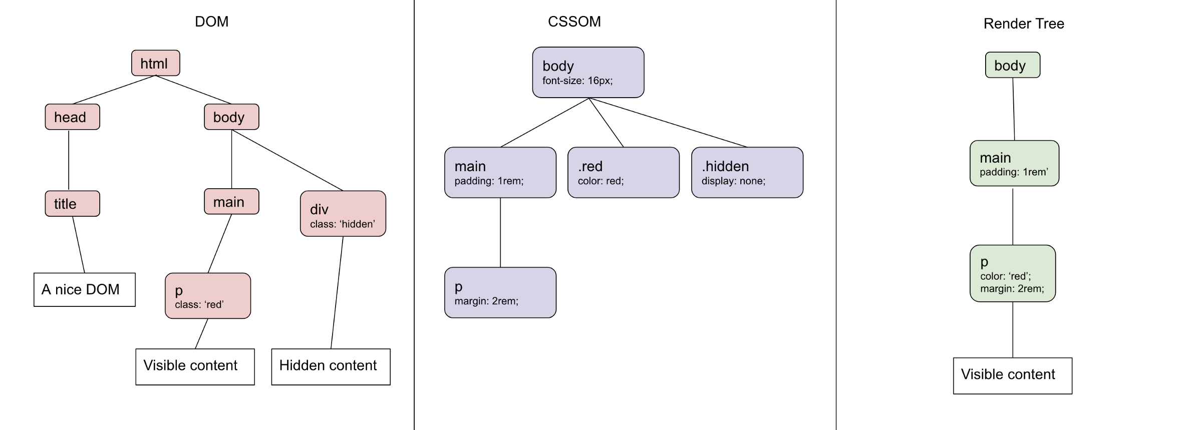
The browser uses the constructed CSSOM and DOM to create a “render tree”. In short, the render tree contains all of the information needed for the browser to create pixels on the page. The browser basically takes the DOM and CSSOM and smooshes them together, removing anything that won’t have an effect on the rendered output.
First, the browser removes all non-visible elements. This includes elements such as <head>, <script>, and <meta>, as well as HTML elements that have the hidden attribute. These elements, although used by other parts of the app, won’t be rendered to the page, so the browser can safely proceed with rendering knowing that all elements in the render tree are in fact visible HTML elements.
Next, we go through the CSSOM and find out which elements in our current render tree match the CSS selectors. The CSS rules for any selector that does match will be applied to that node of the render tree.
There’s one CSS rule that’s an exception, though. Applying display: none; in a CSS rule will remove an element from the render tree entirely. This goes back to only including visible elements in the render tree. Other methods of hiding an element, such as opacity: 0; will not remove an element from the render tree but rather render it without showing it.

And with that we have a render tree, all ready to go! After we’ve combined our CSSOM and DOM into a render tree, the browser can use this and safely assume that the render tree contains exactly the information needed to paint those first pixels — nothing more, nothing less.
Racing down the home stretch: Layout andpaint
Armed with a complete render tree, the browser is ready to start putting actual pixels on the page. The last phase of the critical rendering pipeline contains two main steps: Layout and Paint.
Layout is where the browser figures out where elements go and how much space they take up. The browser takes rules affecting margin, padding, width, and positioning into account here. When calculating layout, the browser has to start at the top of the render tree and move downward, since each element’s positioning, width, and height is calculated based off of the positioning of its parent nodes.
If you’re familiar with the CSS box model, the browser is essentially drawing a bunch of CSS boxes across the page (if you want to a little more information about the box model, there’s some excellent reading here).
However, it’s important to remember that at this point nothing is shown on the page. Think of it as drawing stencil lines across the viewport, getting ready to fill them in.
Paint happens directly after the Layout phase, and we finally get to see some stuff rendered to the page! If you’re measuring the end of the race as time to first pixel, this is the finish line. The browser goes through and fills in all the other CSS boxes with the non-layout rules. If you’re using multiple compositor layers, the browser will make sure things get into their dedicated layer.
It’s important to remember that some CSS properties can have a larger impact on the page weight than others (for example, a radial-gradient is much more complex to paint than a simple color). If you are experiencing some “jank” during the Paint step, decreasing the amount of “expensive” CSS rules can dramatically improve the perceived performance of your app.
Why should I care about CSS in the critical rendering path?
You can spend as much time as you want optimizing the frames per second performance of your app, making it look pretty, or A-B testing for higher conversion rates, but it doesn’t matter if your users bounce before the page even loads.
Knowing which steps the browser takes to get to that ever-so-important first pixel is critical (no pun intended 😂) if you’re trying to improve your load time. Since the browser blocks rendering until it has parsed all CSS you can greatly improve your load time by removing any CSS that doesn’t apply to the first paint from your initial HTML document. Doing so greatly decreases the amount of time the browser needs to construct the CSSOM and render tree.
Any CSS that is not necessary for the first load can be considered “non-critical” and can be lazy-loaded after users have gotten that first paint (this is especially important if you have a single page app, it’s a big performance hit to send CSS for pages that aren’t even visible yet!)
Another benefit of knowing how the CSSOM is constructed is a deeper knowledge of selector performance. Since nested selectors must check parent nodes of the CSSOM, they tend to be slightly less performant than a flat CSSOM that avoids nested selectors. However, I would venture that in most apps that this isn’t your performance bottleneck, and likely other things can be optimized before you need to rewrite CSS selectors.
As with anything related to web performance, you’re probably better off profiling your load time before you start doing an overhaul on your CSS. If you’re using Chrome, pop open DevTools and head over to the Performance tab. You can quickly see how much time you’re spending on CSSOM construction, Layout and Paint by looking for the Recalculate Styles, Layout, and Paint events. Then you can start honing in on your bottlenecks and start optimizing accordingly.