Web animations with HTML, CSS, and JavaScript
Web animations with HTML, CSS, and JavaScript 관련

Introduction
Many years ago, websites were more focused on displaying information to users without consideration for how to create visual experiences to make the site more user-friendly. In the past few years, many things have changed: website owners are now creating visual experiences to keep users on their site.
Developers discovered human beings tend to pay more attention to moving objects because of our natural reflex to notice movement.
By extension, adding animations to your website or application is a very important method of drawing users’ attention to important areas of your website and revealing more information about a product.
Note
Effective animations are capable of building a strong connection between users and the content on the screen.
What is web animation?
Web animation is basically just making things move on the web.
Web animation is necessary for creating eye-catching websites that enable better conversions and attract users to click, view, and buy things on your website.
When done well, animations can add valuable interaction, enhance the emotional experience for users, and add personality to your interface.
Presently, there are hundreds of libraries, tools, and plugins that can be used for creating animations ranging from simple to complex. With CSS Animation, it becomes unnecessary to make use of plugins that slow down your website speed for animations that can be done easily with CSS.
In this article, I will be showing you some animations that can be achieved with HTML, CSS, and JavaScript.
What CSS properties can I animate?
It’s one thing to know how to animate, and it is another thing to know what to animate.
Some CSS properties are animatable, meaning that they can be used in animations and transitions.
These are properties that can change gradually from one value to another, such as size, color, numbers, shape, percentage, e.t.c.
We can animate properties like background, background-color, border color, filter, flex, and font.
You can get a comprehensive list of all of the properties you can animate here.
Different kinds of animations
There are so many different kinds of animations that are very well-used in websites and play a very important role in user experience.
These include:
Tooltips
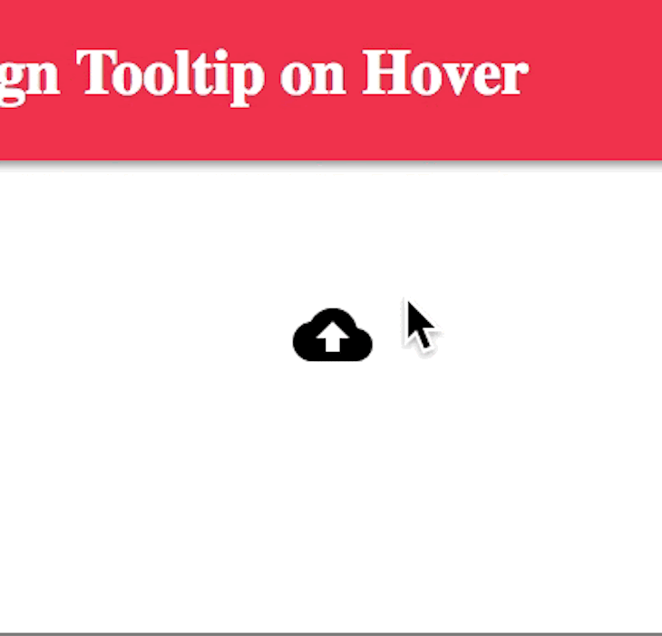
Tooltips are text labels that appear when the user hovers over, focuses on, or touches an element.
In other words, it is a brief, informative message that appears when a user interacts with an element in a graphical user interface (GUI).
Tooltips may contain brief helper text about their functions:

Hover
The hover pseudo-class is used to add a special effect to an element when you guide your mouse over it. This way, it has the ability to catch users’ attention as soon as they hover over an item.
It is a useful way to show which elements are clickable.

Loading
Loadings are very essential because they helps to keep the user entertained during load time. They also inform users of the level of progress, or how much time is left until a load is complete.

Inputs
Input animations are great and often combined with tooltips and validations. With inputs, the user is able to quickly fix errors and fill missing fields to complete forms.

Menus
Animations on menus play a great role in UI/UX. Menus are types of animations that amaze the user and keep them interactive allowing them to see all the content throughout the page.
Note
There are many other animations like page transition, parallax, etc.

CSS animation
So far, we have seen so many different kinds of animations that can be achieved with CSS, but I haven’t explained how it’s done.
CSS allows us to animate HTML elements without making use of JavaScript.
To use CSS animation, you must first specify some keyframes for the animation. Keyframes hold the styles that the element will have at certain times.
For proper understanding, I will be explaining the basic properties we will be using.
The CSS animations are made up of two basic building blocks:
@keyframes
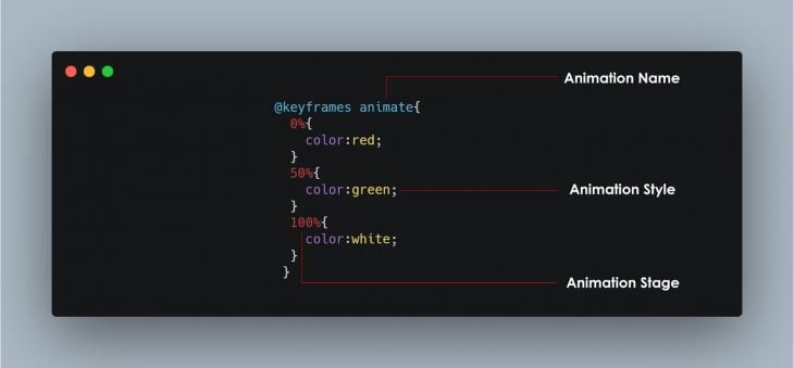
keyframes are used to indicate the start and end of the animation (as well as any intermediate steps between the start and end).

It’s composed of 3 basic things:
- Animation name: This is simply the name given to the animation, as illustrated in the picture above.
- Animation stages: This indicates the stages of the animation. It’s mostly represented as a percentage, as shown in the picture above.
- Animation style or CSS properties: These are the properties expected to change during the the animation.
Animation properties
Once the @keyframes are defined, the animation properties must be added in order for your animation to function.
This is primarily used to define how the animation should happen.
The animation properties are added to the CSS selectors (or elements) that you want to animate.
Two properties are very essential to notice how the animation takes effect. They are the animation-name and the animation-duration.
There are other properties like:
animation-timing-function: Defines the speed curve or pace of the animation. You can specify the timing with the following predefined timing options:ease,linear,ease-in,ease-out,ease-in-out,initial,inherit.animation-delay: This property defines when the animation will start. The value is defined in seconds (s) or milliseconds (ms).animation-iteration-count: This property specifies the number of times an animation should be played.animation-direction: This CSS property sets whether an animation should play forward, backward, or alternate back and forth between playing the sequence forward and backward.animation-fill-mode: This property specifies a style for the element when the animation is not playing (before it starts, after it ends, or both).animation-play-state: This property specifies whether the animation is running or paused.
The next big question on your mind will be: Do I have to specify all these properties anytime I want to animate an element?
Actually, no.
We have the animation shorthand property. Each animation property can be defined individually, but for cleaner and faster code, it’s recommended that you use the animation shorthand.
All the animation properties are added to the same animation: property in the following order:
animation: [animation-name] [animation-duration] [animation-timing-function] [animation-delay] [animation-iteration-count] [animation-direction] [animation-fill-mode] [animation-play-state];
Note
For the animation to function correctly, you need to follow the proper shorthand order and specify at least the first two values.
Here is a very simple landing page for a shirt store.
I decided to add a very little animation to the shirt so it can grab users attention as soon as they visit this link.
All I did was apply the transform property and translate it vertically (up and down). You can take your time to check through the code.
Why JavaScript?
As you read through, you might start asking yourself why JavaScript was included in the topic. You will see why now!
So, why JavaScript?
We make use of JavaScript to control CSS animations and make it even better with a little code.
In the above code, I created a form to collect user details, but I want the form fields to shake if there is no input.
With the help of CSS, I can make them shake:
@keyframes inputMove {
  0% {
    transform: translateX(5px);
  }

  25% {
    transform: translateX(-5px);
  }

  50% {
    transform: translateX(5px);
  }

  75% {
    transform: translateX(-5px);
  }

  100% {
    transform: translateX(0px);
  }
}
In the above code, the input field will move to and fro (left to right) with 5px and then finally return to its initial position at 100% (we use the CSS transform property to achieve that as seen in the code above).
Then, we add the animation properties to the CSS selector error:
.form-control.error input {
  border: 2px solid red;
  animation-name: inputMove;
  animation-duration: .5s;
}
The next thing is: How will I know if these fields are empty and the user clicks the submit button?
This is where JavaScript comes in. We use JavaScript to control our animation.
- Check if the form submit button has been clicked.
- Select all form fields.
- Check if the input fields are empty.
- Add the CSS selector using JavaScript
classListproperty. You can read more about theclassListproperty here (olawanle_joel).
Note
I properly added comments to the JavaScript and CSS code in the embedded codepen so you can easily understand the code.
Once the form is submitted with all the appropriate information, some bubbles will begin to slide up. This was achieved with CSS animation.
Conclusion
These are just a few things you need to know about web animation. Remember, this is a very broad topic but I know you saw the importance of animation and why you should think of making use of CSS animation for your projects.