
Better Anchor Positioning with position-area
Better Anchor Positioning with position-area 관련

position-area might be my favorite part of the CSS Anchor Positioning spec, with a ton of features packed in to make things just… work. But there’s no magic here, just a few key parts that work well.
Info
Check out our Winging It conversations about design, frontend, and backend development.
- Winging It episode 8: CSS Anchor Positioning in Practice
- Winging It episode 16: Debugging CSS Anchor Positioning
Initially, position-area seems like nothing more than a shorthand. Just replace top: anchor(bottom); left: anchor(right) with position-area: bottom right and it works.
Or go even further, and replace that with position-area: end.
Note
The examples in this article are best viewed in a Chromium browser, version 131 or later.
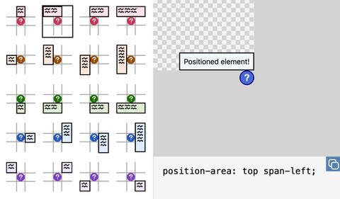
The idea behind position-area is that in most cases, you want your positioned element to be touching a specific corner or edge of the anchor. position-area creates a grid around the anchor, and lets you place your positioned element within that grid.
Anchor-tool.com is a fantastic tool for exploring the different values for positioning an element within that grid.
But position-area is more than a shorthand for anchor(), introducing some behaviors that may be surprising.
A new containing block
One of the key differences between using anchor() and position-area is that position-area creates a new containing block for the positioned element.
If you are using anchor(), the positioned element’s containing block works like normal. For a fixed position element, it will usually be the viewport. For an absolute positioned element, it will usually be the closest ancestor that has a position besides static. The anchor() function then resolves to a length that positions the element as specified, within that containing block.
position-area creates a containing block that does not map to an element. Instead, it is defined by the relationship between the anchor and the anchor’s containing block.
This containing block is generated by the grid area that you select using position-area. For instance, with position-area: top left, the new containing block starts at the top left corner of the anchor’s containing block and extends to the top left corner of the anchor itself.
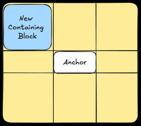
Note that the element we’re positioning doesn’t have to fill this entire area, but we’re choosing the container that we want to position our element inside of.
Positioning within the containing block
Using position-area also handles some defaults so that the positioned element is placed near to the anchor, within its new containing block.
First, any inset properties like top or inline-start that don’t have values set on the positioned element resolve to 0. This makes the containing block fill the entirety of its grid area.
Then, align-self and justify-self are used to position the element close to the anchor, by setting the alignment away from the specified grid area and towards the non-specified grid area. If the grid area is center or span-all, then the value is anchor-center.
Together, that means that position-area: top right is equivalent to the following declaration using anchor().
.positioned-element {
  bottom: anchor(top);
  left: anchor(right);
  top: 0;
  right: 0;
  justify-self: start;
  align-self: end;
}
Shifts to prevent overflow
As a side effect of being an absolutely positioned element with justify-self or align-self set, your positioned element will have the behavior of smartly shifting to stay within its original content block.
If, after applying padding and margins, your positioned element would overflow the newly created containing block but would fit inside its original container block, it will get shifted to prevent overflow.
In this example, the targets are all positioned with position-area: center. The top and bottom targets are shifted toward the center because they would otherwise overflow their original containing block, which is the div with the dashed border. They are shifted just enough to be flush with their containing block.
Note that in this example, the targets are position: absolute. If instead the targets are position: fixed, the targets do not overflow their original containing block (the viewport) and so no shifting happens.
You can opt in to this behavior with anchor() by setting a value for all of top, right, bottom, and left, and setting a value for justify-self and align-self. But position-area is much more terse.
Percentages
One of the ways we observe a containing block is that percentages are resolved in relation to the containing block. This means that padding: 5% on an element positioned using position-area will have a padding of 5% of the size of the containing block – the section of the grid that was selected.
In this case, the padding on the element positioned with anchor() is much larger, since its containing block is the viewport, not the grid area created by position-area.
Try it out
position-area is available in Chromium browsers. It was initially called inset-area, but was renamed in the Chromium 129 release.
The Anchor Positioning Polyfill does not yet support position-area. This article was written as part of our exploration into the spec, and if you would like to sponsor further development, please get in touch!
Info
Interested in learning more about anchor positioning? Sign up for our free weekly CSS anchor positioning email course.
Sponsor us
If you found this article helpful, please sponsor our work! Deep dives like this take time and energy, and we want to keep them coming!
You can also hire us to develop the Anchor Positioning polyfill or another OSS language/tool you rely on. Our client work also helps fund our educational work like this article, so get in touch with us if you have any web development needs.
