Container Queries: a Quick Start Guide
Container Queries: a Quick Start Guide 관련


The @container query, that elusive feature developers have been requesting and proposing for years, has finally made its debut in a browser. Well, sort of. Here we’ll explain what container queries are, how they work, and what other features they might come with once fully supported in browsers.
Update March 21, 2025:
🥳 Container queries have been available to use in all major browsers since February 2023. We’ve updated the guide with changes and developments that have happened since we first published.
- New containment types have been added and other implied or planned containment behavior has been adjusted or removed.
- Some features that were being considered have landed in browsers, while some are only partially implemented.
In the latest version of Chrome Canary, the most recent @container query proposal is available for use behind an experimental flag. Developed by OddBird’s own Miriam Suzanne, the draft (w3c/csswg-drafts) builds upon the ideas previously proposed by other web standards experts like David Baron, who wrote the original draft (dbaron/container-queries-implementability).
Background
@Media queries sparked a responsive design revolution by allowing authors to change the style of elements based on the size of the entire viewport. Up until now, what could not be done was changing the style of an element based on the size of one of its nearest containers.
Syntax and an example
The proposed @container query syntax feels a lot like writing a @media query, but a main difference is that a @container query has to be implemented in two parts.
In this demo (which only works in the latest version of Chrome Canary), a blockquote is styled differently depending on the size of its container.
https://codepen.io/dvdherron/pen/YzpywrZ container query demo with blockquotes
Define a containment context
To achieve this, first define a containment context. This lets the browser know which container to query against later and how exactly to query that specific container.
article,
section {
  container-type: inline-size;
}
The container-type[1] property turns on containment for the selected elements, allowing for the testing of aspects such as style, size, and state.
The inline-size value specifies that, in this case, queries will be made against the containing element’s inline axis. Layout and size[2] containment are applied automatically as well.
(Block-size is also being considered as a containment type in the new proposal. Inline-size seemed to satisfy more use-cases, so is being developed first.)
Update March 21, 2025
Inline-sizecontainment has been well-supported since container queries were supported in stable versions of browsers.Layoutcontainment was previously applied automatically whencontainer-typeandcontainer-nameproperties were used. It has since been removed from the container queries specification, but is still applied in some browsers that have not updated their implementation of container queries.- Single-axis
block-sizecontainment proved to be impossible and has since been abandoned. - The
sizecontainment type, which queries in both the inline and block axes, has been available as a containment type in all browsers since February 2023. Settingcontainer-type: sizeallows for querying the container’s orientation and aspect-ratio in addition to its size.
Containers can also be named:
article,
section {
  container-name: demo;
  container-type: inline-size;
}
And the container-type and container-name properties can be combined by using the container shorthand property:[3]
article,
section {
  container: demo / inline-size;
}

 @container demo (min-width: 30em) {
   .element {
      /* styles to apply */
   }
 }
Apply @-rules at desired breakpoints
Now that a containment context has been defined, the @container rule is used to tell the browser when and how styles should change inside each container.
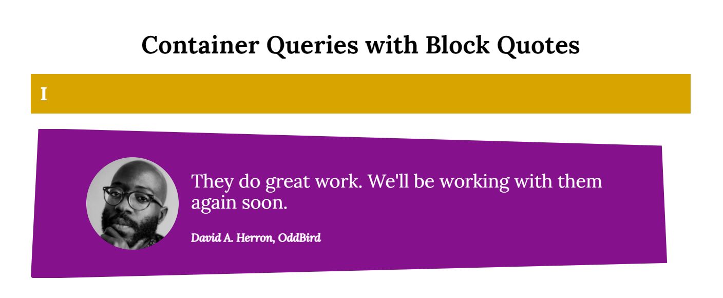
With a narrow parent container, the blockquote features the image stacked on top of the text.

At the first breakpoint, the layout for the blockquote changes so that the profile image moves from being above the quote to sitting next to it, and the text describing the speaker gets a heavier weight applied.
/* change styles according to container size */
@container (min-width: 35em) {
  .quote {
    grid-gap: 1rem;
    grid-template: "media quote" auto/ max-content 1fr;
  }

  .media {
    align-items: center;
  }

  .source {
    font-weight: bold;
  }
}
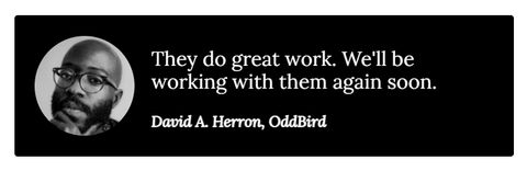
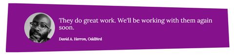
At the second breakpoint, the size of the text for the quote and the attribution grows, the background changes color, and the overall shape of the blockquote changes by way of a clip-path.
@container (min-width: 60em) {

  .quote {
    --quote-size: 1.5rem;
    --quote-background: darkmagenta;
    clip-path: polygon(
      -0.04% 100.6%,
      1.12% -0.52%,
      95.65% 11.18%,
      96.46% 90.05%
    );
    padding: 1.25em 3em;
    max-width: unset;
  }

  .source {
    font-size: 1.1rem;
  }
}
Any styles inside of one of these @container blocks will be applied when the container fulfills the condition of the query.
Just as with @media queries, authors can write as many @container queries as needed.
All together now
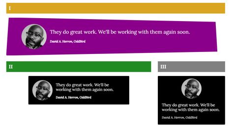
With each blockquote sitting in a different sized container, they all look slightly different, at the same viewport size.
What’s next?
It’s still very early in the proposal process, so a lot regarding how container queries work could change.
- There might be a way to contain only the block axis.
- Queries could also be made against properties like
aspect-ratio,orientation,or even custom properties and layout states (w3c/csswg-drafts). - We already have viewport-relative units like
vhandvw. Container-relative units (w3c/csswg-drafts) could be on the horizon as well.
Update March 21, 2025
- Container-relative units have been available to use in all major browsers since February 2023.
- Most Chromium based browsers added support for
scroll-statecontainment in February of 2025. As of this update, it’s available in a browser preview version of Opera. - Style queries – the ability to query a computed value of a containing element – have been partially implemented by most browsers (no support in Firefox yet). The current implementation allows for the querying of custom property values:
    @container style(--theme: light) {
      /* styles to apply here */
    }
Browsers are still working on adding support for using style queries to evaluate booleans (@container style(gap) {...}) and property-value pairs (@container style(display: flex) {...}).
- Size queries have made it possible to now query a containing element’s
aspect-ratioand orientation.
Bookmark Miriam’s scratch site for updates: Miriam’s CSS Sandbox.
To participate in discussions and implementation questions related to container queries, visit this project board: Open Issues & Work on the Contain 3 Spec (orgs/w3c).
Experiment and share
Follow these steps to get started experimenting and making your own demos:
- Download Chrome Canary or update to the latest version.
- Navigate to
chrome://flags. - Search for “CSS container queries” and select
Enabled. - Restart the browser.
The OddBird team would love to see what you come up with. Tag us on Twitter (OddBird) with a link to whatever you create. In the meantime, check out our collection of demos on CodePen for inspiration.
Syntax for establishing a containment context was updated July 14, 2021 to use the new
container-typeandcontainer-nameproperties instead ofcontain. ↩︎A previous version of this article listed
styleandlayoutas required values for thecontainproperty when establishing a containment context. These values are now automatically applied when using the newcontainer-typeandcontainer-nameproperties. Updated July 14, 2021. ↩︎The two values of the shorthand were originally reversed, with
container-typeand thencontainer-name. Updated August 18, 2022. ↩︎