
Zoom, zoom, and zoom
Zoom, zoom, and zoom 관련

I’m working on an article about fluid typography, and relative units. But instead, I fell down this rabbit hole – or a cleverly-disguised trap? – trying to understand ‘zoom’ in the browser (not Zoom™️ the software). Since I couldn’t find any up-to-date articles on the subject, I thought I should write one.
In brief: there is wide support for three different types of ‘zoom’ – available both to site visitors and (to some extent) CSS authors:
- Page zoom is the default with a handy keyboard shortcut, and roughly matches behavior of the CSS
zoomproperty. - Scale factor (or ‘pinch zoom’) was introduced by early versions of mobile Safari, and may only be available through trackpad or touch interfaces – roughly matching the behavior of the CSS
scaletransform. - Text-only zoom is also provided by Firefox and Safari. While not directly available in CSS, the behavior is similar to changing default font size on a site that uses entirely relative text sizing with
remunits.
What’s a (CSS) pixel?
To understand these different zoom behaviors, it’s helpful to understand that a pixel is not a completely fixed unit – at least not the CSS pixels we access through the px unit.
Device Pixels are specific to an output device, and are physically determined by the hardware. To quote the CSS Values & Units Specification:
"CSS Values & Units Specification" From CSS Working Group Editor Drafts (drafts.csswg.org)
A device pixel is the smallest unit of area on the device output capable of displaying its full range of colors. For typical color screens, it’s a square or somewhat rectangular region containing a red, green, and blue subpixel.
These can range in size dramatically. Printers can generally fit more dots in a tighter space (more pixels per inch) than a screen can, and modern screens have smaller pixels than ever before. If we relied on those physical device pixels for design, all our interfaces would become too small to read or interact with on higher-resolution devices!
Operating systems often provide one layer of device-pixel abstraction – allowing us to set a screen ‘resolution’ that is different from the physical potential of the hardware. I have a 4k monitor here with 3840x2160 physical pixels, but to make the interface more legible it renders at a 1920x1080 resolution by default.
That means we have twice the pixel density – we can now fit multiple physical pixels inside a single visual ‘pixel’! That ratio of rendered pixels to physical pixels is called the device pixel ratio. For my screen, at the default settings, I have a device pixel ratio (what CSS calls a ‘resolution’) of 2x or 2dppx (dots per px unit).
To phrase it differently, the entire operating system is zoomed in 200% by default on this monitor.
CSS adds another layer of pixel abstraction. While the CSS px unit is generally equivalent to a single OS-provided ‘pixel’ by default, there are several ways they can diverge – including the zoom/scale options that we’ll discuss below.
But also, rather than having fixed real-world dimensions, the CSS pixel (1px) and CSS inch (1in) have a fixed relationship to each other. There are always 96 CSS pixels for every CSS inch. But depending on the output media (screen vs print), their actual sizes might vary:
- On screens, the
pxacts as an ‘anchor unit’, and physical units (likein,cm,mm) are determined relative to that. It might not match a real-word inch, but you can count on the relationship:1in == 96px. - In print, where physical measurements are more reliable, the ‘physical’ units act as our anchor – and the CSS pixel unit becomes relative instead (
1px == 1/96in).
On screens, the actual size of a CSS inch depends on the screen resolution – and may not be anywhere close to a physical inch. But once you hit ‘print’, the inch becomes reliable, and pixels will resize to fit.
No matter the medium, that 1:96 inch-to-px relationship (determined by the arm-length of Håkon Wium Lie) is always the same. We only change which unit is anchored to the media, and which one is adjusting to maintain the ratio.
Elika Etemad (aka Fantasai) covered this in her recent talk at CSS Day: Standardization Stories.
Why are there two viewports?
You might have heard about the browser viewport, or even used viewport units (vw/vi/etc). But browsers actually provide two viewports:
- The layout viewport is the box that we put our web pages in. You can think of it like the parent element of the
<html>tag. It might overflow (and have scrollbars), but it still has a fixed size based on your browser window. When we make that layout viewport larger, we can fit more things on the page without overflowing. - The visual viewport is the window we look through to see the page. When we make the visual viewport smaller, we can see less of the layout on screen.
Those might sound the same, because they usually are! Both are based on the size of your browser window by default, or the size of page we print on.
Even when we have enough content to overflow the layout viewport, it stays attached to the visual viewport. The box isn’t growing, it’s overflowing. Viewport units (based on the layout viewport) don’t change their value when we create longer pages.
So there’s a difference between overflowing the box (when our content grows) and only seeing part of the box (when we scale one viewport in relation to the other).
Imagine a photo-editing tool. The image itself has a ‘canvas size’. We can enlarge elements of the image so that they overflow the canvas (and usually get cropped). That’s like the relationship between content and the layout viewport. But we can also zoom the entire canvas in or out. That doesn’t change the relationship between content and canvas, but it can change how much of the canvas we see in our editing interface. That interface window is like the visual viewport.
Sometimes we can’t see all the content inside the canvas, and sometimes we can’t see the entire canvas in our browser window.
Since I’m old, I’m drawn to microfiche as a visual analogy:

In most situations, the two viewports are the same size – the size of your browser window (or what’s left of it after drawing the tabs and toolbars). But as we’ll see, there are some zoomed-in situations where the visual viewport can end up smaller (but never larger) than the layout viewport.
It gets confusing (to me at least) because both viewports can overflow in different ways. When we add more content, we can overflow the layout viewport. In order to overflow the visual viewport, we need to make the layout viewport larger! And we can only do that with help from the browser.
In researching this article, I also came across an old two-part QuirksMode post by PPK – A tale of two viewports – which covers this in depth.
Getting the zoomies
To zoom or scale a page, we have to manipulate either the size of a CSS pixel in relation to the layout viewport, or the relationships between the two viewports. Each approach gives a different result.
This behavior is defined in the CSS View Module specification.
Page zoom: CSS pixels vs. the layout viewport
Browsers all provide a page zoom feature for us as we surf the web. I use it all the time. By default, pages load at 100% page zoom, but we can zoom in or out from there. Generally, browsers will remember our zoom settings for each domain we visit. (I used to have Wikipedia load at 150%, but now they provide built-in tools for scaling the font size. Thanks, Wikipedia!)
This is the most common form of zoom available to us web surfers. I use the Ctrl+/- (Cmd+/- on Mac) keyboard shortcuts quite often, but these controls are also available in a browser menu.
Page zoom is similar to the resolution setting in your operating system. Adjusting the page zoom will change the ratio of CSS pixels vs device pixels. In fact, browsers combine the operating system and page zoom to provide an overall device pixel ratio – the relationship between a (physical) pixel and a rendered (CSS) pixel.
Pixels on my 4k monitor are already zoomed 2x/200% by the operating system, before the browser gets involved. If I also zoom a web page by 2x/200% in the browser, the result is a 4x/400% overall zoom – and a device pixel ratio of 4:1.
This zoom is applied to the size of a CSS pixel, before the page is rendered. By zooming in, we make each ‘pixel’ larger. But our layout viewport isn’t growing at all, so our layout now contains fewer px in each dimension. In effect, we’ve made the layout viewport smaller in relation to our pixels.
Page Zoom is adjusting the size of a CSS pixel in relation to the layout viewport. Since that happens before rendering, it impacts the layout of the page. It’s then reflected by media queries, which query a ‘smaller’ viewport when we zoom in – or a larger viewport zoomed out.
As far as the browser is concerned, there’s very little difference between making the window smaller or making the pixels bigger. The result is the same: fewer pixels fit in the viewport.
Scale factor: viewport vs. viewport
The scale factor is also available in all browsers, but you’re most likely to notice it on touch-screen devices. As far as I can tell, this was implemented originally for mobile Safari – then later added to the spec, and adopted by desktop browsers. In fact, the published spec uses an old name for it – pinch zoom – and the Editor’s Draft provides an explanation for the change:
"CSSOM View Module, Editor’s Draft" From CSS Working Group Editor Drafts (drafts.csswg.org)
The “scale factor” is often referred to as “pinch-zoom”; however, it can be affected through means other than pinch-zooming. e.g. The user agent may zooms [sic] in on a focused input element to make it legible.
I know I’ve experienced that. On Safari for iOS you can double-tap elements in the page to ‘zoom in’ so the tapped element fills the viewport. Testing here in macOS Vivaldi (Chromium) on a MacBook with a trackpad, both the pinch and double-tap interactions work for me.
If you play with this, you’ll notice that it’s quite different from the behavior of page zoom above. First: we can only zoom in, not out. There is no way to scale the page so that it is smaller than 100% of the visual viewport. And when we do ‘scale’ the page up, the layout doesn’t change, but we can see less of it.
Everything on the web page stays exactly where it was relative to everything else – even the media-queries remain untouched – we’re just looking at a smaller area of the overall page.
Scale factor is adjusting the size of one viewport in relation to the other. Specifically, the layout viewport can be scaled up larger (but not smaller) than the visual viewport. Since that happens after rendering, it has no impact on our page layout, or the available pixels, or any media queries.
You might also notice a lack of scrollbars. We’re not overflowing the box, we’re zoomed in to view one smaller part of the box – and browsers handle that differently.
CSS zoom and scale properties
There’s an old CSS browser hack using zoom: 1 to trigger hasLayout on Internet Explorer – an internal IE concept that’s roughly equivalent to a modern Block Formatting Context. You can see it used in Jay Hoffmann’s excellent evolution of the clearfix. Other than that, I don’t think I’ve ever paid much attention to the zoom property in 20-some years of writing CSS.
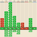
It turns out there’s a good reason for that. CSS zoom was initially IE-only. I believe it pre-dates IE6, released in 2001 (MDN and CanIUse don’t have data farther back), but it wasn’t available in Firefox until May 2024. Zoom (the CSS property) just became available in all browsers this year!
The zoom property is similar to page zoom. Zoom changes the relative size of a CSS pixel in relation to its layout box, before rendering. Now we can apply that behavior to individual elements inside the page.
We also have the much more commonly-used scale() transform, available (with a prefix) since ~2010. Over the last couple years, a number of transforms (including scale) have become stand-alone properties. But the function and the property work the same – both of them behaving like the page scale factor. The entire element is scaled (up or down!) as a cohesive rendered unit, in relation to the things around.
Or, as CanIUse explains the difference:
"CSS Zoom" From Can I Use (caniuse.com)
If e.g.
transform: scale(0.6)is used on thehtmlorbodyelement then it resizes the entire page, showing a minified page with huge white margins around it, whereaszoom: 0.6scales the elements on the page, but not the page itself on which the elements are drawn.
Note that only the browser can zoom or scale in a way that impacts our two viewports. But when we zoom or scale in CSS, we’re applying the same concepts to elements on the page:
Text-only zoom
Firefox and Safari provide an additional option to zoom text only. This is generally available as an alternative of page zoom. I’m still working on that article – all about font-sizing – so I’ll save the details for later.
In brief: it does exactly what it says. Text gets bigger, and nothing else changes. If you’ve ever wanted to zoom the text without zooming or scaling anything else on the page, there it is!
Note
Header image of a zooming dog by Eric Sontroem, some rights reserved