New capabilities for attr()
New capabilities for attr() 관련


The ability to use attr() references in CSS is getting more powerful. Shipping in Chrome 133 (stable rollout beginning next week!), this highly-requested feature gives you ability to supercharge attributes and use them in CSS beyond simple strings! You can reference colors, numbers, percentages, named values as custom identifiers, and more.
Semantic use of attributes in
attr()is a feature I’ve wanted for a very long time and I’m stoked it’s finally landing[1]
Basic usage
Attributes, including but not limited to data attributes, can be referenced in css using the attr() function. For example, attr(data-color) references a data attribute data-color. The catch is, attr(data-color) is always parsed as a string, and could only ever be referenced as a string value and used in the content property of a pseudo element until now.
To rewind, currently in CSS with very wide browser support, you can access the data-name and use it in the content property of a pseudo element, like so:
.something::after {
  content: attr(data-name);
}
With this new functionality, you can add another argument to give this data attribute a type. attr(data-color type(<color>)); can now be used as a color value.
Given <div data-color="red"></div>, you can create a red background on this element with:
div {
  background-color: attr(data-color type(<color>));
}
You can take that a step further and add a fallback value, like so:
/* gray fallback value */
div {
  color: attr(data-color type(<color>), gray);
}
Note
In addition to a string, you can use the following types:
<angle>: angle (i.e.degorturn)<color>: color (i.e. named color,rgb,hsl,oklch, etc.)<custom-ident>: custom identifier, used for naming things like view transition names<integer>: discrete, whole step number<length>: number + unit (see more)<length-percentage>: a value that can either be a length or percentage<number>: extends integer with .‘s for fractional values<percentage>: percentage (%), often relative to a parent object<resolution>: used in media queries (i.e.dpi)<time>: used in animation (i.e.sorms)<transform-function>: function to change appearance of an element (i.e.rotate())
Note
can’t use advanced attr() for images and with the url syntax type. All of the following are invalid at computed-value time, as per the spec:
background-image: src(attr(foo));- can’t use it directly.background-image: image(attr(foo))- can’t use it in other url-taking functions.background-image: src(string("http://ex.com/?token=" attr(foo)))- can’t “launder” it thru another function.--foo: attr(foo); background-image(src(var(--foo)))- can’t launder the value thru another property.
So you can’t use this technique, unfortunately, for images or icons.
attr() IRL: product card demo
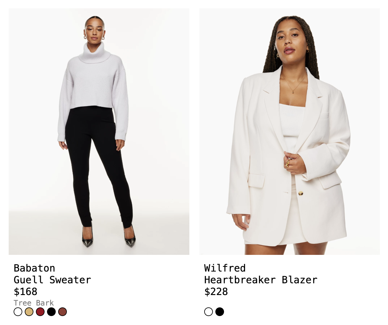
Expanded capabilities with attr() are extremely powerful and work so much better with the way we’re already building front-end systems, i.e. with properties that you pass down as you construct components.
Say you have a product card that shows a variety of colors for that one product. You might have a list of colors that you’re looping through, which you’re pulling from some database. You might have a list item to represent each available color:
return (
  <ul className="color-list">
    {colors.map((colorVal, colorName) => (
      <li color={props.colorVal} color-name={props.colorName}>...</li>
    ))}
  </ul>
);
This becomes:
<ul class="color-list">
  <li color="rgb(255, 255, 255)" color-name="Snow">white</li>
  <li color="rgb(145, 60, 50)" color-name="Tree Bark">brown</li>
  ...
</ul>
Previously, to use this color attribute as a background, you would have to either write inline styles like <li style={{backgroundColor={props.colorVal}}} ...</li> or write some JavaScript to apply the styles like I do in this example (una).
const colors = [...document.querySelectorAll('.color-list li')]

colors.forEach((color) => {
  const colorValue = color.getAttribute('color');
  color.style.backgroundColor = colorValue;
})
This is fine, but it’s not ideal. Inline styles affect specificity and reduce flexibility, and I don’t love using JavaScript for purely style-related matters. I prefer to keep a better separation of concerns.
But now, with this new capability, you can directly access attributes and cast them to a type:
background-color: attr(color type(<color>));
Note
Again, since you can't use it for images, you wouldn't be able to use this for pattern backgrounds
To data-* or not to data-*
The attr() function works for both regular, custom attributes and data-* attributes. But using data attributes does have a few distinct benefits, and is a more intentional way to use this feature. Benefits of data-* include:
- No risk of namespace collision with existing attributes.
data-*gives you access to the data list in JavaScript, meaning you can update it withelement.dataset
Google AI overview says: “data attributes are for storing additional information that can be accessed by JavaScript, while normal attributes are for defining the element’s inherent properties”. So I suppose for CSS, it’s up to you and your needs.
What about custom properties?
Sure, you can use custom properties to access values from your elements, but again that would require you to write inline styles. If you are using data attributes, you can shorten the work.
Instead of:
<div style="--color: red"></div>
or
element.style.setProperty("--color", "red")
You write:
<div data-color="red"></div>
or
element.dataset.color = "red"
Star rating demo
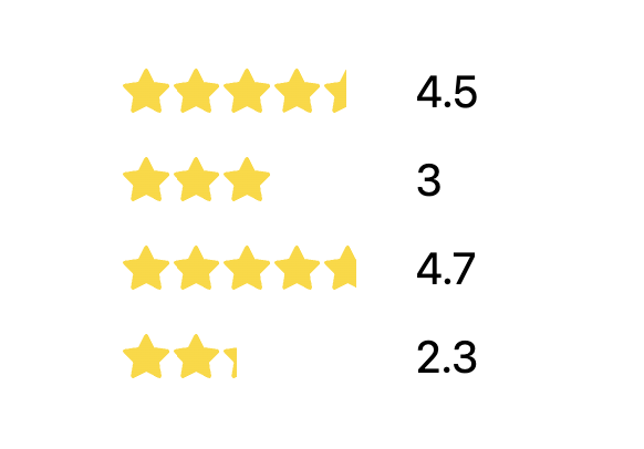
Another neat thing about using attributes here is that they can be repurposed for multiple needs. Say you have a star-rating component:
<div class="star-rating" data-rating="4.5"> ...
We know the rating (4.5 above), so in a view with 5 stars, this 4.5 would need to be multiplied by 2 to 9.0/10. That translates to 90%, which aligns with how we want to visually represent the “fill” behind the stars. The final step would be to convert the 9/10 to a percentage out of 100%, so we multiply it by 10% to convert this properly. To shorten the value * 2 * 10%, we can multiply by 20%:
--percent-fill: calc(attr(data-rating type(<number>)) * 20%);
We then use a linear-gradient as a background to cover the space by 90%, with hard starts and stops at this percentage:
background: linear-gradient(to right, gold var(--percent-fill), transparent var(--percent-fill));
Grid placement demo
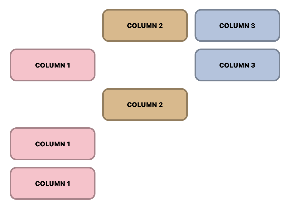
Another example of how to use advanced attr() is placing items in a grid. You can leverage values from the data attributes to do this as well:
<div class="item" place-col="2">column 2</div>
.item {
  display: grid;
  grid-column: attr(place-col type(<number>));
}
Anchored popovers
Finally, you can skip a step for anchored popovers and directly use the popover name with advanced attr().
Take this example with multiple popover menus that are attached to different buttons.
Previously, you would need to write styles for each menu button to anchor the menu items popover. It makes the most sense currently to do this inline, like so:
<div class="menu">
  <button popovertarget="menu-items-01" style="anchor-name: --menu-01">
    ...
  </button>
  <ul id="menu-items-01" popover style="position-anchor: --menu-01" role="menu">
    ...
  </ul>
</div>
Now, you can forgo these repetitive individual styles, put a data attribute on the parent one time, like so:
<div class="menu" data-anchor="--menu-01">
  <button popovertarget="menu-items-01">
    ...
  </button>
  <ul id="menu-items-01" popover role="menu">
    ...
  </ul>
</div>
And write CSS once that will enable every button and popover menu to leverage their unique data-anchor to set the anchor-name and position-anchor.
.menu {
  --anchor-id: attr(data-anchor type(<custom-ident>));

  button {
    anchor-name: var(--anchor-id);
  }

  [popover] {
    position-anchor: var(--anchor-id);
  }
}
Note
You do still need a unique identifier for the popovertarget to connect to the id of the menu for the popover behavior to work. If popover relationships were enabled via CSS, you would be able to reuse the parent attribute here and not require this.
Conclusion and further resources
There are so many more great usecases and examples, including the view transitions demo (web-dot-dev) in this article by Bramus Van Damme. I am so happy to see this feature land in Chrome and hope to see other browsers follow suit!
Learn more:


with some limitations for security purposes ↩︎