A Responsive Accessible Table
A Responsive Accessible Table 관련


Painfully slow demonstration of the example table resizing and different media queries kicking in.
After writing (again) that it is ok to use tables, and after providing quick examples of responsive tables, I received questions about why I used some of the code I did. I am going to attempt to break it down to give you enough information to make your own responsive, accessible table because my example will likely not fit your case precisely (or closely?).
This approach is different from others you may have seen in that it uses a valid <table> (and child elements) and acknowledges that screen readers no longer consider <table>s to be tables when you start messing with their display properties. There was a nice talk about accessibility APIs and tables a couple years ago by Edd Sowden at State of the Browser 5. Update (2 October 2020): All the SotB 5 videos are gone and Wayback did not save the video, but the slides are still online.
If you are new to trying to make responsive tables, I have tried to detail each step. If you are experienced and even use other methods for responsive tables, I have tried to provide clear justification for each decision.
I made an index so you can see what’s in here and jump to a specific section if you want:
The Example
This is the table I will be using for this post (embedded below or available on CodePen (aardrian)). It’s a simple table — no spanning cells and no row headers. Hopefully by the end of this post you will have enough information to go tackle those on your own (with accessibility notes from my post claiming it’s still ok to use tables).
General Layout Styles
These are some baseline styles I use that I find help with readability. These are generic, do not apply to all cases, and are informed by a combination of experience, user testing, and opinion.
Zebra Stripes
I sometimes use some zebra striping on a table, particularly if it is wide. By using transparency for the background colors, you can avoid the hassle of replacing colors as your site themes change. Same thing with the column headers. Be sure to keep your color contrast ratios in mind (so the text meets WCAG values against both backgrounds).
tr:nth-child(even) {
  background-color: rgba(255, 255, 255, 0.25);
}
tr:nth-child(odd) {
  background-color: rgba(255, 255, 255, 0.5);
}
th {
  background-color: rgba(0, 0, 0, 0.5);
}
If you’ve read Richard Rutter’s book, Web Typography, you may understand why in a vacuum this is not always a good idea. You can read an excerpt on A List Apart in the post Designing Tables to be Read, Not Looked At. Based on experience, user testing, and accessibility practices, I generally include zebra stripes to help group rows that change into blocks as users rotate screens or otherwise change context.
Vertical Alignment
Depending on the nature of your content, get some vertical alignment into place. I prefer my column headings to align to the bottom, while my table data aligns to the top.
td {
  vertical-align: text-top;
}
th {
  vertical-align: bottom;
}
See Designing Tables to be Read, Not Looked At for more justification for this approach.
Horizontal Alignment
I generally left-align all my text (not justified, because justified text adversely affects dyslexic readers) and right align my numbers (because browsers refuse to support decimal alignment). Then I find my exceptions and adjust accordingly for both the column header and the cell.
th,
td {
  text-align: left;
}
th:nth-of-type(3),
td:nth-of-type(3) {
  text-align: right;
}
Seriously, Designing Tables to be Read, Not Looked At came out after I wrote all this stuff. Really. Anyway, he goes into more detail than is relevant here.
Hanging Indents
For cases where I know I will have longer chunks of text in cells, I also like to use a hanging indent to help break up the left edge, particularly in compact tables. I make up for the negative indent in the padding styles, being sure to keep all my sizing relative to the type in the cells using ems.
th,
td {
  padding: 0.25em 0.5em 0.25em 1em;
  text-indent: -0.5em;
}
Going Responsive
At this point, let’s assume your table is valid HTML (use a validator), meets WCAG 2.0 AA requirements (see my last post on why it is ok to use tables), and is styled the way you like for large viewports.
And yes, I am intentionally taking a desktop-first approach, though you can invert that after you head read through my logic.
Scrolling
As I mentioned in my last post, the simplest way to make a table responsive is to put it in a container that will scroll. This way it does not break your design by pushing the layout and content past the viewport edges.
The catch is that in order to scroll an area you need a mouse or other pointing device. Those restricted to keyboards cannot put focus on the container to make use of its scrolling.
For horizontal scrolling (narrow viewports), this also puts the scrollbar at the bottom of the table and can require a good deal of page scrolling to see (there are many cases where you don’t want to restrict the height of a table, just the width).
Keyboard-Friendly Scroll
Making it keyboard-navigable is as simple as adding tabindex="0". With that single attribute you have now allowed a user to tab into the box and use the arrow keys (no matter where the scrollbar sits).
This impacts screen reader users, however, who mostly navigate using solely the keyboard (I say “mostly” because not all screen reader users are blind). A screen reader will announce it as a tab stop, but it does not help a user understand why this non-structural non-interactive thing is a tab stop.
To address that potential confusion, we give the container a role, but specifically a generic role so it does not pretend to be something else. In this case, role="region" will do the trick.
Now the user knows there is a region, but has no idea what it is. That is why we give it a name. We can use aria-label, but that means we have to re-type the name and remember to change it as we copy/paste code (yes, you can use server-side or client-side script to duplicate it, but that is overkill).
Instead, let’s lean on the <caption> for the <table> (because you have one) by giving the <caption> an id attribute and referencing it from aria-labelledby on the scrolly container.
At this point our code might look like this:
<div role="region" aria-labelledby="Cap1" tabindex="0">
  <table id="Books">
    <caption id="Cap1">Books I May or May Not Have Read</caption>
By the way, this code is taken from Steve Faulkner’s post on making scrolling regions accessible, which I also adapted to other uses.
With all these other techniques I am about to cover, I recommend you still apply the scrolling approach. Consider it a fallback for when your content’s minimum width is still wider than you expect.
Adjusting to Viewport Size
This is the part of responsive design with which most developers are familiar. Though media queries and responsive design encapsulate so much more, for this part we are talking about the viewport, and further limiting it by referencing the width only.
We are skipping height for a few reasons, but primarily because most problems I see with tables are that they are too wide. For particularly long tables, fixed headers are appropriate but outside the scope of what I am covering here.
Viewport Width
I have chosen to invert my media queries. Instead of building mobile first, I am assuming the grid view of a table is the default state, and I will adjust it for smaller sizes. This means fewer styles to undo at the start and then re-do once the viewport gets wide enough.
I identify the width of my table (from its content) before the scrollbars of my container kick in, and I use that as my media query. One media query for all tables or per table is up to you and your content. Your code may look like this:
@media all and (max-width: 37em) {
  …
}
Now we have a place to stuff all our narrow viewport styles.
Blockify
First, let’s tear up the table display styles and reduce everything to blocks. This will give us a neatly stacked pile of content. This is also when screen readers tap out on referring to it as a table.
table,
tr,
td {
  display: block;
}
Zebra Stripes
The zebra striped rows will still be valuable to users to help denote where each chunk of related content starts and ends, so we will also give them a little extra space.
tr {
  padding: 0.7em 2vw;
}
Alignment
Our vertical alignment is moot since nothing is a table cell and it all stacks anyway. Our horizontal alignment might warrant a revisit. Depending how wide your collapsed table is allowed to get, right-aligned numbers might look weird. You may want to override that style now.
td:nth-of-type(3) {
  text-align: left;
}
But then you may still want to right align some of the number anyway. For this example, I am pretending the ISBN numbers need right alignment, am setting the generated content (keep reading) to left while, and figuring the width for the whole construct to keep the widest number visually lined up on the left edge.
td:nth-of-type(4), td:nth-of-type(5) {
  text-align: right;
  width: 12em;
}
td:nth-of-type(4)::before, td:nth-of-type(5)::before {
  text-align: left;
}
Column Headers
At this point you should have noticed that the column headers are just stacked up at the top of the table, offering nothing useful to any user. You may also be hesitant to remove them because you still want screen readers to be able to make sense of the table.
Here’s a fun fact: as soon as I changed the table styles to display: block, screen readers no longer consider this to be a table. The header cells (<th>) are meaningless. Adding role="table" does not turn it back into a table. So with no connection to underlying data, and given the styling hassle of trying to integrate them in a valuable way, let’s just remove them and the entire row holding them.
th,
tr:first-of-type {
  display: none;
}
The Caption
Without the column headers, the table caption becomes even more important. Not only does it and the corresponding role="region" wrapper give a screen reader user important context, but it can be used to visually replace the design element signaling the top of the table that the column headers (<th>s) provided.
caption {
  font-style: normal;
  background-color: rgba(0, 0, 0, 0.35);
  color: #fff;
  font-weight: bold;
}
The background color transparency value of .35 black approximates the <th> background color transparency value of .5 black sitting within a <tr> with a background color transparency value of .5 white.
Some Sort of Cell Label
Now we have a lovely stack of data with no clue what each individual chunk of data is. Since screen readers no longer treat this as a table, we might as well just use plain text right before each discrete data point. We can use CSS generated content for that since screen readers have supported it for some time. That code would look like this, if you manually add it:
td:nth-child(1)::before {
    content: "Author: ";
}
td:nth-child(2)::before {
    content: "Title: ";
}
td:nth-child(3)::before {
    content: "Year: ";
}
td:nth-child(4)::before {
    content: "ISBN-13: ";
}
td:nth-child(5)::before {
    content: "ISBN-10: ";
}
We’ll come back to automating that part.
Styles for the Cell Label
We know we are going to automate the generated content (because I just said it), so let’s get the styles together to make them look the way we want. I want them to stand out visually, so I make them bold, and I want them to override other text styles that I set, such as italics.
td::before {
  display: inline;
  font-weight: bold;
}
td:nth-of-type(2)::before {
  font-style: normal;
}
Controlling When the Cell Label Appears
Because we are going to automate that CSS generated content, I don’t want to have to write script to recognize the screen size or what media query has been triggered. That is unnecessary overhead. I also don’t want to have to, as a developer, re-write my viewport sizes in two places as I tweak my media queries. So let’s just hide them in standard, default desktop styles.
td::before {
  display: none;
}
Because we gave them a display: inline; style in our max-width media query, they will just pop into existence when that media query triggers.
CSS Grid Tweak
So far we have done nothing more than turn everything into stacking blocks. Not even any floats. You also may have noted that the cell label text runs right into the content. It’s not awful, but visually it could be better. Here is where we can throw a little CSS grid into the mix.
You don’t need to use an @supports feature query because what we are doing is so simple. Also, because Internet Explorer 11 will (somewhat inaccurately) report that it supports grid, it would still pass that query regardless, even though it does not honor the grid declaration. Since we already set all <td>s to display: block above, we don’t have to worry about IE11 ignoring the grid styles.
td {
  display: grid;
  grid-template-columns: 4em auto;
  grid-gap: 1em 0.5em;
}
You will need to customize the first value of grid-template-columns to the column header text for your table (make sure to use a relative unit like em).
Firefox, IE11, and Edge still honor the text-indent style, so when the text wraps it has a nice hanging indent. When combined with the grid columns you just created, the table is far more legible.
Screen Reader Support
Screen readers, and other assistive technology that uses the browser’s accessibility APIs, rely on the browser conveying the table structure correctly. Changing display properties on rows, cells, or the table triggers bugs in most browsers that cause them to no longer treat them as tables. I cover this in more detail in my post Tables, CSS Display Properties, and ARIA.
In the example at the start of this post, I added a JavaScript function to insert ARIA into the table to retain the semantics the browsers otherwise remove. You can read more about that function in my post Functions to Add ARIA to Tables and Lists.
Windows High Contrast Mode
This one is pretty easy. You likely will have to do nothing on a simple table. If, however, you are using background colors or otherwise relying on colors to convey any information, then you will need to account for their absence. To be truly accessible, you cannot rely on color alone, so icons or other cues should be there for cases where you are otherwise conveying information with a background color or image. The zebra stripes will go away completely.
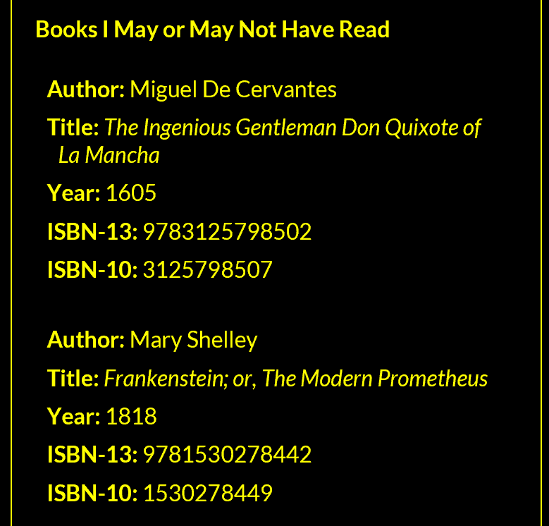
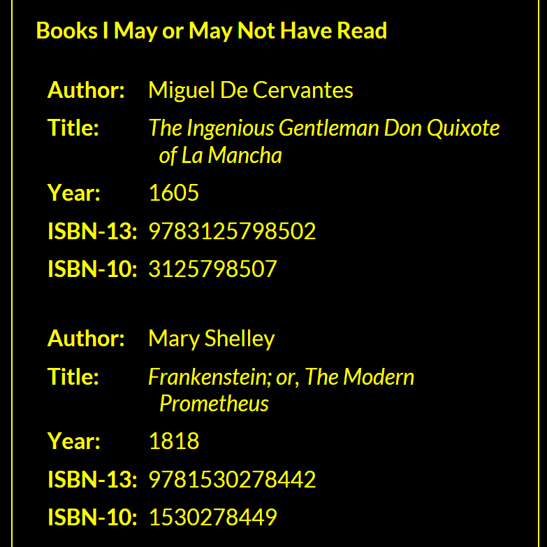
The table in Windows High Contrast Mode in a narrow viewport. The first image is IE11 and shows how the layout looks without CSS grid support. The second image is Edge and shows the layout with CSS grid support. They each show how important spacing around the <tr> is.
Print Styles
Print styles are an integral and necessary part of your responsive design considerations. You need to account for it. For the most part, this is pretty easy. I even have a print styles tutorial at Net Magazine to get you started.
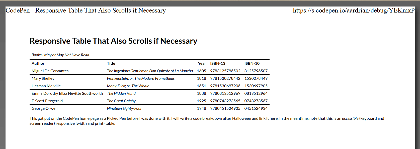
The table as seen in the print preview in Firefox.
General Page Styles
If you haven’t already, clear all the margins from your <body> and other containers as appropriate to make the most use of the paper. Set the page (and container) background to white, the text to black, and choose an appropriate point size for the text. Consider whether you want your tables to span pages when printed as well, bearing in mind a stacked table should probably span pages, but its rows maybe not.
@media print {
  body {
    font-size: 6pt;
    color: #000;
    background-color: #fff;
    background-image: none;
    margin: 0;
    padding: 0;
  }
  table {
    page-break-inside: avoid;
  }
}
@media print and (max-width: 5in) {
  table {
    page-break-inside: auto;
  }
  tr {
    page-break-inside: avoid;
  }
}
Remove the Scroll
There is a chance that scrolling region will come back to bite you, especially if somewhere in your print styles its width ever gets set to any value. Minimize that risk by adjusting it to allow the table content to expand past the size of the container.
div {
  overflow: visible;
}
Beware the Stacking
Make sure your width media query does not generate the stacked version of the table unless it really needs to, as this is most likely a waste of paper. This means you may want to set your initial media query with one value for screen and one for print. You will need to do some testing to identify what best fits your content and target browsers.
@media screen and (max-width: 37em), print and (max-width: 5in) {
  …
}
Borders and Fills
You will want to make your own decisions about how to handle these styles. I tend to prefer my column headers to be black with bold white text, but on verbose tables this can waste a lot of ink. Note that while users can override background styles when printing, not many know how to. How you choose to apply grid lines should also be appropriate for the nature and amount of data, though you want to keep an eye to re-usability for those cases where the narrow styles print.
@media print {
…
  th {
    color: #000;
    background-color: #fff;
    border-bottom: 1pt solid #000;
  }
  tr {
    border-top: 1pt solid #000;
  }
}
@media print and (max-width: 5in) {
  caption {
    color: #000;
    background-color: #fff;
    border-bottom: 1pt solid #000;
  }
}
Maintainability
Probably the biggest variable, and therefore the hardest part to maintain, from the example above is the CSS generated content. You don’t want to have to create td:nth-child(…)::before {content: "…: "; } for every cell in every table on your site. I know I don’t want to.
We can use JavaScript to automate that process to some extent. All you will need to do is put an id on every table and call a function for each table (though you could automate that too). Frankly, all your tables should have ids to allow easier in-page links because I know you aren’t the kind of developer who drank the Kool-Aid and believes using ids in your code is bad.
Alternatively, if you want to avoid JavaScript altogether, you can ignore this section completely and you will still have an accessible, responsive table. This code is not necessary, but it could make your maintenance easier.
Create the Function
You are creating a function that accepts one parameter — the id of the table to affect. I like to wrap it all in a try/catch that writes the function name and any errors to the console for easier debugging.
function ResponsiveCellHeaders(elmID) {
  try {
    …
  } catch (e) {
    console.log("ResponsiveCellHeaders(): " + e);
  }
}
ResponsiveCellHeaders("Books");
Create an Array of Column Headers
The first step is to walk through all the <th>s in the <table> and stuff their text values into an array.
var THarray = [];
var table = document.getElementById(elmID);
var ths = table.getElementsByTagName("th");
for (var i = 0; i < ths.length; i++) {
  var headingText = ths[i].innerHTML;
  THarray.push(headingText);
}
Create a Style Block
We will need a place to contain all those fancy styles that hold the generated content.
var styleElm = document.createElement("style"),
  styleSheet;
document.head.appendChild(styleElm);
styleSheet = styleElm.sheet;
Loop Through the Array
Now it's a matter of looping through the array of <th> text and creating a style rule for each one. Passing in the id of the table limits it to just the one I want, and the position in the array ensures it drops the text from the array into the right selector. Note that I add 1 to array position. This is because the array is zero-indexed, but CSS child selectors start at 1.
for (var i = 0; i < THarray.length; i++) {
  styleSheet.insertRule(
    "#" +
      elmID +
      " td:nth-child(" +
      (i + 1) +
      ')::before {content:"' +
      THarray[i] +
      ': ";}',
    styleSheet.cssRules.length
  );
}
Forgive the mixed quotes, whenever I tidy the code in CodePen it re-inserts them.
Wrap-up
That's it. Not a lot of code, minimal effort. Just a lot of reading to get this far.
Your To-Do List
I ran through quite a lot above. For the most part you can copy and paste the CSS and JavaScript and use it as-is. However, you will need to customize just a few things for each table on your site. I've made a quick list of what to do from all the bits above:
- Give your
<table>anidattribute. - Put the value of that
idinto thearia-labelledbyon the wrapper. - Identify the ideal width for the table in your print and screen media queries.
- Reset any cell text alignment for the smaller size.
- Choose an appropriate width for the cell label text in the
grid-template-columnsvalue.
The Takeaway
This collection of HTML, CSS, and JavaScript will not work for all cases. More complex tables, bigger tables, tables with different kinds of content, and so on, will all test the limits.
Hopefully there is enough information and context here from which you can build your own solution that fits your or your project’s needs.
Update: February 19, 2018
There was some hullabaloo this weekend over a post that used strictly CSS to allow table sorting. Many folks rightly noted its inacessibility and failure to honor the separation of concerns. It also demonstrated that plenty of people do not know that throwing display: flex onto a <table> makes it no longer a table in the eyes of a screen reader (pun?). I made videos to demonstrate.
The table from the example with CSS disabled as heard in NVDA. I am using table navigation controls. NVDA announces the number of rows & columns, all the headings when hopping cells, and tells you when you hit the edge of the table.
The same table with CSS flex added, as heard in NVDA. It is longer presented as a table. The tab order when tabbing through the links is confusing, headers are not announced, sorting controls do not work.
In short, using CSS flex on an HTML table will override its native semantics and render it essentially useless to a screen reader. Do not do it.
Update: February 20, 2018
I expanded on how tables are affected in my post Tables, CSS Display Properties, and ARIA.
Update: November 18, 2020
In the three years since I wrote this, I still see folks over-engineering responsive tables. I encourage you to start with my Under-Engineered Responsive Tables first, before trying other techniques. To distill the essence of that post:
<div role="region" aria-labelledby="Caption01" tabindex="0">
  <table>[…]</table>
</div>
[role="region"][aria-labelledby][tabindex] {
  overflow: auto;
}

[role="region"][aria-labelledby][tabindex]:focus {
  outline: .1em solid rgba(0,0,0,.1);
}
Update: August 24, 2023
If you came here from the Kevin Powell responsive table tutorial on YouTube, I have some additional links about accessible tables. If you have no idea what I am talking about, here is the video (links follow it):
Other posts on my site that go into accessibility bits related to tables:
Update: 7 October 2023
Copied from It’s Mid-2022 and Browsers (Mostly Safari) Still Break Accessibility via Display Properties.
Very good progress in Safari 17. Tables and description lists are no longer broken when display properties are applied. Buttons with display: contents, however, are still inoperable by keyboard users and problematic for VO users (and I confirmed is also the case in Safari TP 180).
Meanwhile, the heading issue I reported for Safari 17 on iPadOS (261978 - AX: Headings with display: contents cannot be navigated) has been marked as a VoiceOver issue with no insight when it will be fixed. But marking it a VoiceOver issue means Safari can claim to have no bug so yay?
Apple seems reasonably confident it has finally fixed its historically years-lagging support (despite prior claims), and so has been doing the rounds suddenly arguing all the other browsers and specs need to fix display: contents issues while using its own claims of (abruptly and questionably) better support to bolster them:
- CSS Working Group Comment on
#3040(w3c/csswg-drafts#3040)[css-a11y][css-display]display: contents; strips semantic role from elements from 2018. - Web Platform Tests #568
display: contents(web-platform-tests/interop)
I also filed a PR with Can I Use (Fyrd/caniuse) to amend the one filed by Apple three weeks ago (Fyrd/caniuse) (I was unable to review owing to travel and this is not my job slash no one is paying me).
With Safari almost there on basic support and Apple now pushing for the specs and browsers to agree, after sitting it out for a few years, I am excited that the end is in sight. Which I expect before WCAG 3.
Other Posts
More recent post: Feature Request for Firefox Grid Inspector: Source Order