
A deep dive into CSS Module
A deep dive into CSS Module 관련


Introduction
According to the official CSS Module GitHub repository (css-modules/css-modules), a CSS Module is a CSS file in which all class names and animation names are scoped locally by default. By contrast, in a typical CSS file, all CSS selectors live in the global scope.
In this tutorial, we’ll look into some common issues that frequently arise when writing CSS and learn how CSS Module can help us avoid them. Then, we’ll integrate CSS Module into a React application.
Let’s get started!
Prerequisites
- Knowledge of HTML and CSS
- Working knowledge of React
Familiarity with CSS Module is an added bonus!
Understanding common CSS issues
All selectors in CSS are global variables. As an application scales, working with global variables and managing dependencies becomes increasingly difficult. When several developers are working on the app, things become even trickier.
Here’s why:
Name collision
Let’s say that while styling a blog, we add the class name post to indicate posts on the homepage. Another developer creates the sidebar and also adds the class name post for posts on the sidebar. Mistakes like this lead to name collision, seen here:
.main .post {
  color: #000000;
  font-size: 2rem;
}

.sidebar .post {
  color: #FFFFFF;
  font-size: 1rem;
}
As an application scales, you’re more likely to encounter name collision (potentially harming performance).
Difficulty in clearing dead codes
When an element or a React component is deleted from our code, we also need to delete its styles. However, in large applications, it can be very hard to determine whether a class is in use. CSS does not provide a solution out of the box.
Dependency management
Dependencies are not explicitly defined when working with global variables, making it difficult to determine which styles would be inherited or applied through composition (css-modules/css-modules).
There are other implicit dependencies in CSS that are not easily identified by merely scanning the code. For example, an element with position: absolute is relative to its parent element with position: relative.
Dependencies are a huge cause of concern, and the ease of maintaining our CSS code depends greatly on how well our dependencies are structured.
Evaluating solutions
BEM — Block Element Modifier is a popular naming convention for classes in HTML and CSS that aims to help developers understand the relationship between both languages. BEM solves the problems described above by providing strict naming rules.
In BEM, a Block is a standalone element that can make sense on its own; it is often a parent element like .btn{}. An Element refers to the child element of a Block; it has no standalone meaning and is denoted by two underscores following the name of the Block (e.g., .btn__text).
The modifier is a flag on the Block or Element used to style it. It is denoted by two hyphens to the name of the Block or Element (e.g., .btn--primary {}).
/* Block Element */
.btn {}

/* Element that depends on the Block often a child element */
.btn__text {
  // rules
}

/* Modifiers that changes the styles of the block */
.btn--primary {}
.btn--small {}
The benefit of the BEM naming methodology is that all selectors are scoped by the modifiers despite being global. However, adding BEM naming manually is repetitive, fairly tedious, and prone to human error.
You may end up spending a significant amount of time figuring out whether something is a Block or Element. In my opinion, Jeremy Thomas (jgthms), the creator of Bulma CSS, perfectly summarizes the issue:
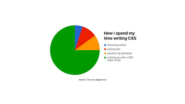
Development involves automating difficult problems, so we should be able to easily automate naming with the right tool.
Note
Although CSS Module enables us to scope our styles, we can still declare global classes by prefixing the class name with :global:
:global .title {
  font-size: 2rem;
}
Advantages of CSS Module
Most modern JavaScript and CSS workflows have trended towards component-based architecture, but progress on CSS has been purely conventional and not actually supported by the language.
BEM, as previously discussed, is a perfect example. A familiar saying known as the fundamental theorem of software engineering declares that “every problem in computer science can be solved by one extra layer of abstraction”.
CSS Module is a thin layer of abstraction that encapsulates new concepts introduced to the language. Consequently, CSS Module is written just like plain CSS, as seen in the following code snippet:
.title {
  font-size: 2rem;
  font-weight: bold;
  color: red;
}
.text {
  font-size: 1.2rem;
  font-weight: 500;
  color: blue;
}
One difference is that in CSS Module, all our markup is written in a JavaScript file like index.js:
import styles from "./styles.css";

document.getElementById("app").innerHTML = `
  <h1 class=${styles.title}>Hello Vanilla!</h1>
  <div class=${styles.text}>
    We use the same configuration as Parcel to bundle this sandbox, you can find more
    info about Parcel
  </div>
`;
When we import our CSS Module from our index.js file, CSS Module exports an object with mappings from local names to global names:
{
  title: "_src_styles__title",
  text: "_src_styles__text"
}
We can see that CSS Module dynamically generates unique class names, automating naming for our whole team.
How CSS Module works
Modern tooling like webpack, Browsify, and JSPM enables us to explicitly define cross-language dependencies. Consequently, we can explicitly describe each file’s dependencies, regardless of the type of source file.
In the code snippet below, whenever MyComponent is loaded or bundled, the corresponding CSS is loaded just like any other dependency:
import './my-component-name.css';

const MyComponent = () => {
  // component codes
}
export default MyComponent;
CSS Module includes this new technique, which is the key capability of modern loaders. However, at the fundamental level, there is a need for a new specification to describe how these symbols are shared.
Understanding ICSS
Although CSS Module is written like plain CSS, it actually compiles to a low-level interchangeable format called ICSS (Interoperable CSS (css-modules/icss) that is designed for loader implementers, not end-users. It is a superset of standard CSS and a low-level file format that enhances CSS.
You can incorporate CSS Module into a wide range of applications (css-modules/css-modules), however, we’ll style a React app.
Styling a React application with CSS Module
Create React App v2 (facebook/create-react-app) (and higher) support CSS Module out of the box. All we have to do is use the following naming convention:
[name].module.css
Let’s see it in action by building a simple React app! First, let’s bootstrap and run our application:
npx create-react-app button-stack
cd botton-stack
npm start
Next, we’ll add CSS module support for our app by simply renaming the App.css file to App.module.css. Update the import statement in the App.js file to avoid error:
.shadow {
  box-shadow: rgba(50, 50, 50, 0.2) 0 5px 5px 0;
}
.app {
  display: flex;
  justify-content: space-around;
}
.title {
  margin-top: 25%;
  text-align: center;
}
Update the Index.css file to Index.module.css, as well as the import statement in the Index.js file. Next, in our App.js file, add the following code:
import { title, app } from './App.module.css';
import Button from './components/Button';

function App() {
  return (
    <div>
      <h1 className={title}>CSS Module Buttons</h1>
      <article className={app}>
        <Button />
      </article>
    </div>
  );
}

export default App;
Though most of this code should be familiar, there are a few things we need to look out for. First, we are destructuring title and app. The styles we need are from the styles object, which is exported by CSS Module.
Now, we’ll need to create the Button component. In the src directory, create a components folder. Inside the folder, create a Button.js and a Button.module.css file; add the following code in the Button.module.css file:
.normal-button {
  display: inline-flex;
  line-height: 2;
  text-align: center;
  padding: 1px 60px;
  font-family: "IBM Plex Sans";
  font-size: 1rem;
  font-weight: 500;
  border-radius: 4px;
  cursor: pointer;
  composes: shadow from "../App.module.css"
}

.danger {
  composes: normal-button;
  background-color: rgb(255, 8, 8);
  border: 2px solid rgb(255, 8, 8);
  color: white;
}

.secondary {
  composes: normal-button;
  background-color: rgb(128, 118, 118);
  border: 2px solid rgb(128, 118, 118);
  color: white;
}

.info {
  composes: normal-button;
  background-color: rgb(6, 218, 255);
  border: 2px solid rgb(6, 218, 255);
  color: white;
}

.warning {
  composes: normal-button;
  background-color: rgb(248, 202, 49);
  border: 2px solid rgb(248, 202, 49);
  color: #ffffff;
}

.success {
  composes: normal-button;
  background-color: rgba(30, 156, 41, 0.966);
  border: 2px solid rgba(30, 156, 41, 0.966);
  color: white;
}

.primary {
  composes: normal-button;
  background-color: rgba(33, 124, 243, 0.849);
  border: 2px solid rgba(33, 124, 243, 0.849);
  color: #FFFFFF;
}
In this file, we have a normal button class .normal-button that composes the shadow class from the App.module.css.
Composition is a feature in CSS Module that enables us to compose selectors. Consequently, we can compose a class by inheriting styles from another class, but these composes rules must come before other rules.
For example, the .danger, .info, .primary, .warning, and .success classes all inherit styles from .normal-botton via composition.
Our App.js file should now look like the code below:
import { title, app } from './App.module.css';
import Button from './components/Button';
function App() {
  return (
    <div>
      <h1 className={title}>CSS Module Buttons</h1>
      <article className={app}>
        <Button />
      </article>
    </div>
  );
}
export default App;
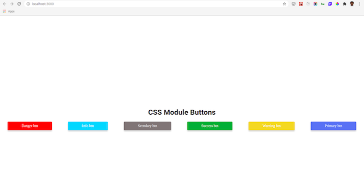
Our app display should look like the image here:
You can view the full code lawrenceagles/css-module-demo for the tutorial.
Conclusion
Without a doubt, CSS Module provides one of the most significant improvements to the CSS language in years! One of the best things about CSS Module is that we get to write good old CSS that can be incorporated into a variety of applications. It simply adds more power to CSS!
If your React app does not use Create React App, or it uses a version lower than version 2, you can still add support for CSS module by using the gajus/babel-plugin-react-css-modules.