How to preview your layout at different Dynamic Type sizes
How to preview your layout at different Dynamic Type sizes 관련
Updated for Xcode 15
When building apps it’s critical to make sure your layouts work great with all ranges of Dynamic Type. This is partly because SwiftUI natively supports it, partly because many people use smaller font sizes because they want a higher information density, but mostly because many people with accessibility needs rely on it.
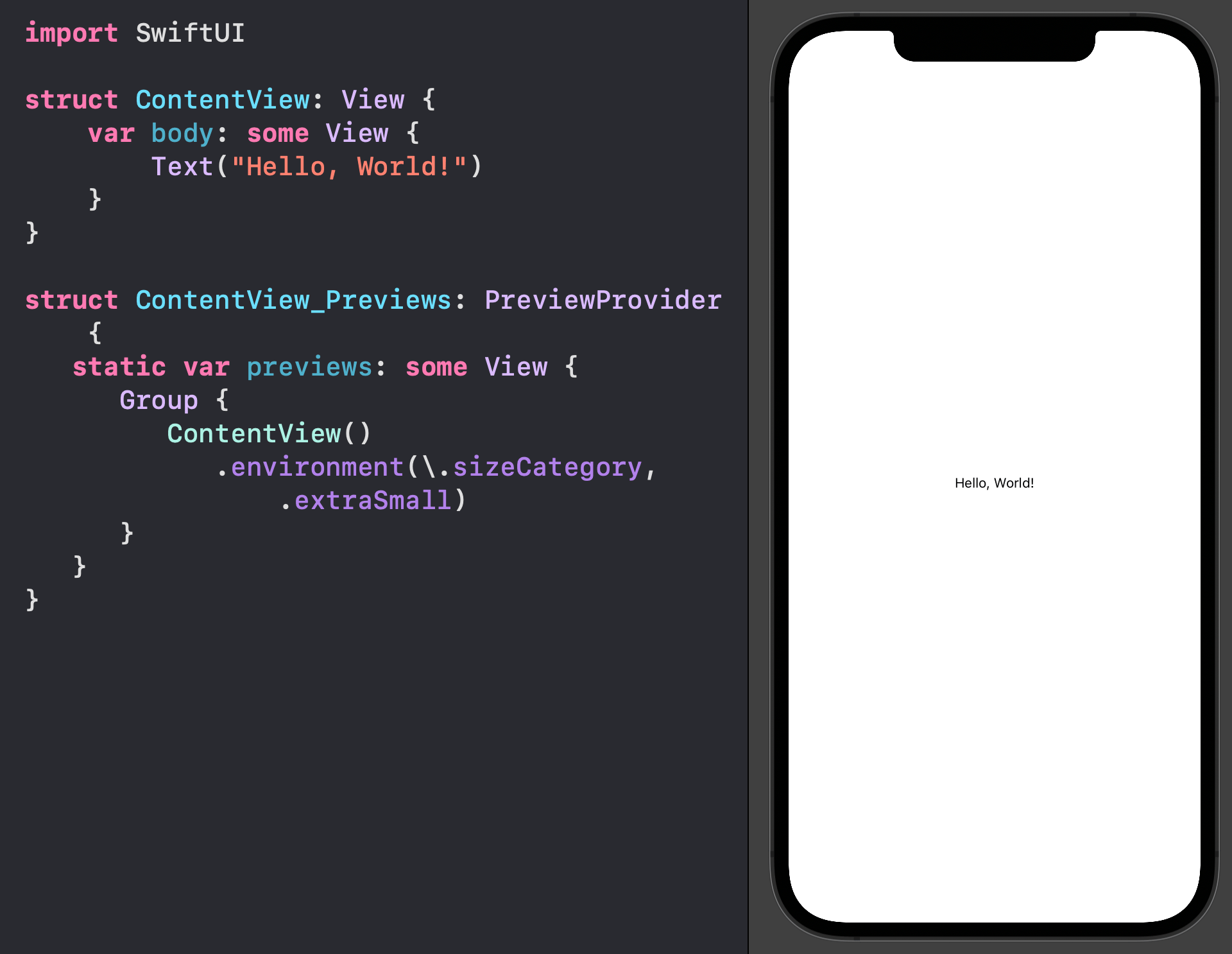
Fortunately, all of SwiftUI’s components natively adapt to Dynamic Type sizes, and it’s even easy to preview your designs at various sizes by using the \.sizeCategory environment value in your preview
For example, if you wanted to see how a view looks with extra small text, you would add .environment(\.sizeCategory, .extraSmall) to your content view preview, like this:
struct ContentView_Previews: PreviewProvider {
   static var previews: some View {
      Group {
         ContentView()
            .environment(\.sizeCategory, .extraSmall)
      }
   }
}

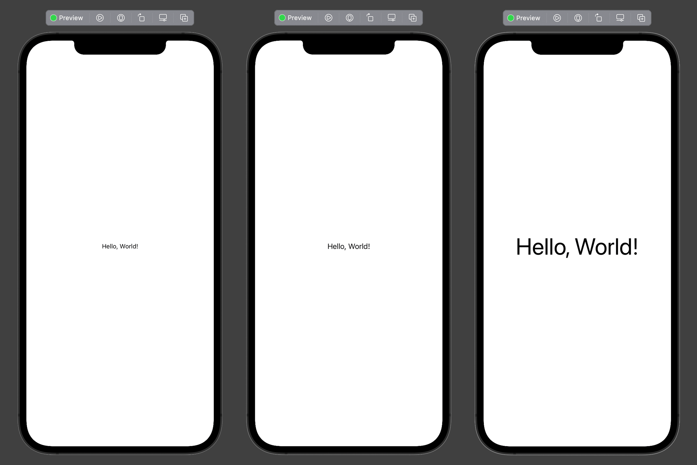
You can also send back a group of previews, all using different size categories. This allows you to see the same design at various font sizes side by side.
So, this code shows the design at extra small size, regular size, and the largest possible size:
struct ContentView_Previews: PreviewProvider {
    static var previews: some View {
        ContentView()
            .environment(\.sizeCategory, .extraSmall)

        ContentView()

        ContentView()
            .environment(\.sizeCategory, .accessibilityExtraExtraExtraLarge)
    }
}

If your design works great across all three of those, you’re good to go.
Tips
If your preview is zoomed right in, you should either scroll around or zoom out to the other previews.