Responsive and Fluid Typography with Baseline CSS Features
Responsive and Fluid Typography with Baseline CSS Features 관련


This post is part of a series on revisiting fluid typography:
I spent much of 2025 on this blog digging into font-sizing and responsive/fluid typography, and it has changed the way I approach sizing text on the web. Feel free to read (and watch the videos) back through my process if you’re interested in the details – but this article on the web.dev blog provides a quick summary of my current approach.
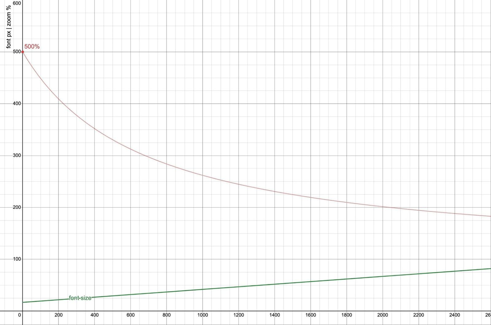
I found that graphing various relationships helped me understand better how all the parts interact. I may do a follow-up post here exploring and explaining this chart in more detail:
The default settings show calc(16px + 2.5vw). You can adjust the values and add clamp() ranges to the graph on Desmos.
This is really two graphs overlaid, using the same horizontal axis (viewport width in pixels) but a different vertical axis. Near the bottom, in px units, the base and zoomed font-size at different viewport widths, and a line showing that 2× font-size grows at a much steeper pace than 200% zoom. Above, in % units, we can see the effectiveness of various zoom values, and the zoom required to achieve a 2× font-size.
Hopefully I got the math right, but let me know if I’ve missed something.
Article Contents
- Negotiate a base font-size based on user preferences (I prefer the
clamp()approach) - Add responsiveness
- Warning: Viewport changes don’t always mean the same thing!
- Typographic scales with
pow() - Respond to the size of in-page containers