
5 accessibility checks to run on every component
5 accessibility checks to run on every component 관련

Accessibility has become part of most web teams’ workflows – as we realize that it’s the right way to build and that it increases the number of people who can use (or buy!) our products. There are also legal obligations, such as the European Accessibility Act, which took effect on 28 June 2025.
Luckily, your design system can help! Components don’t just improve your design and development workflows; they can actually have a massive impact on product accessibility. Let’s examine five key aspects we can test and document during development.
Note
Accessibility exists in context, so if you’re testing WCAG conformance, do it on* full pages and processes.
1. Keyboard accessibility
People use all sorts of input devices to interact with your UIs, whether that’s a touch screen, a mouse, or a keyboard. To make sure your components work well with just a keyboard, as WCAG 2.1.1 requires, check that any element that a user can click on – such as links, buttons, and form controls – can also be activated using a keyboard.
If there are many controls within one component (for example, a selection widget, toolbar, or calculator), you usually don’t want them all to go into the Tab order. For complex controls, the expected behavior is that the user can tab to the control and then navigate within the control itself using arrow keys. For instance, in a calendar picker, the user would access the picker with the Tab key and then navigate between days with their arrow keys.
Some things to test for keyboard accessibility:
- Can you reach all controls with Tab or arrow keys, and use them with Enter and Space? (Check out Adrian Roselli’s post on Enter and Space.)
- Can you see where you are at all times?
- Are you accidentally focusing on elements that aren’t interactive? Those probably shouldn’t be focusable.
- Can you press all keys on the keyboard without triggering some kind of action? (Single key shortcuts don’t meet WCAG.)
2. Accessible tokens
Design tokens are a great way to document your design decisions in one place. They are also an opportunity for accessibility. The default values for your tokens can set the right example.
The three types of tokens most important for accessibility are:
Color
If there are pairs commonly used together, like foreground and background colors, you’ll want to ensure they meet WCAG’s minimum contrast requirements and that they are combinations that work with all types of color blindness.
Spacing
For anything that can be used with a “pointer”, such as a mouse or finger, you’ll want to ensure the defaults are big enough, so that they work better with large fingers, on small screens, and for people with impairments like hand tremors.
Breakpoints
Accessible interfaces need to be completely responsive, so that users don’t need to scroll in two directions. With good default breakpoints, your design system can facilitate this effort.
If your design system allows for documentation, cough zeroheight cough, take that opportunity to remind colleagues about accessible defaults while they’re in the right frame of mind.
Some things to test for design tokens:
- Do the defaults meet accessibility requirements, such as contrast and spacing?
- Does your documentation explain which values would not meet accessibility requirements?
3. Named controls
People who use screen readers can navigate by specific types of content. They can pull up a list of all the headings, form controls, or links. These lists lack context, however, so it’s super important for the items to be self-explanatory.
Imagine a list of links that goes like this:
- Click here
- Click here
- Click here
Without context, it would be impossible to make out where each of them goes. Users are left with no other option but to try them all. If, instead, we make sure the link text clearly conveys what it links to – for example, “About us”, “Products”, or “Contact us” – everyone saves time.
A similar principle applies when using controls, like buttons and form fields, on a website: You’ll want them all to have a name that clearly describes what will happen.
Some things to test for control names:
- Does the control have an accessible name?
- Is the name unique?
- Is the name descriptive and obvious without extra context?
- Is the name short and to the point? Avoid “Click here to submit application” or “Submit application button”; use “Submit application” instead.
4. Zoom and user preferences
Lots of users zoom in when they use your application. For UI design, that means your available space will vary. Especially when zoomed in, less space means you’ll need to get creative.
People may also be using platform-specific preferences: from color preferences (like dark mode on macOS/iOS and forced colors on Windows) to reduced motion.
Some things to test for zoom and user preferences:
- Zoom in to 400% and confirm all elements remain visible and usable.
- For any sticky elements, check that they don’t cover non-sticky content.
- Try out the component with different user settings turned on.
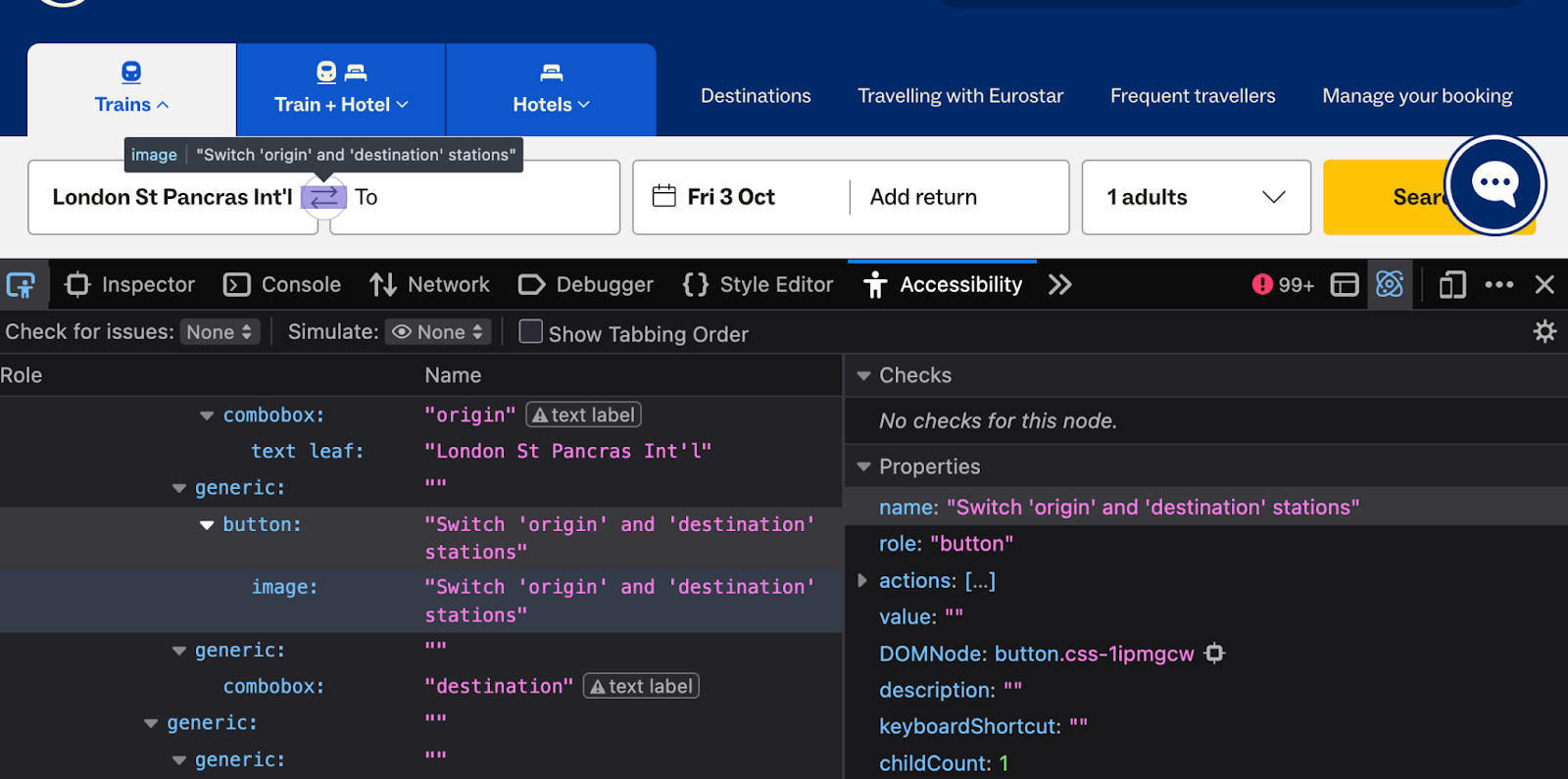
5. Screen reader compatibility
To get your components to work well with screen readers, they need to expose the so-called “accessibility meta information” for each element they contain. Broadly, it comes down to information about:
Roles
What kind of element is this? For example, a link, button, heading, or plain text.
States
What’s happening with the element? For instance, is it expanded or pressed? Ensure your ARIA works correctly.
Properties
What else do we need to know about the element? Sometimes they change, for example, sometimes they don’t (like aria-multiline).
We only need to add and check for these, if they are elements that are identified in ARIA.
Note that some elements already include implicit metadata. For instance, a button element has a button role built in, so it’s not necessary to add one.
It’s also perfectly fine for elements to not have any roles, states, or properties. If it’s just text, for example, it’s just text.
This is what to test for screenreader compatibility (use the browser’s accessibility tree):
- Do any of the roles have the expected children, parents, states, and properties?
- Do elements use roles that you would expect? Check if they have the expected role (for instance, a div that looks and behaves like a button, but has no such role), and that they don’t have the wrong role (for example, a link that has a button role).
In addition to these checks in the browser, also test in real screen readers, such as VoiceOver on the Mac and NVDA or JAWS on Windows. Or, even better, test with users who rely on them, so that you can get the most realistic feedback on whether your UI works well.
Summing up: Accessibility checks for components
In this post, we’ve looked at five things you can test against all of your design system components. They give you a fast, practical way to catch accessibility issues at the component level.
Conducting these tests doesn’t replace a full WCAG evaluation. They need the context of whole websites and apps. However, these tests give you a head start: Mistakes are a lot cheaper to fix in a component than after an application goes live.