
How to annotate design system components for accessibility
How to annotate design system components for accessibility 관련

Picture this: Your design system team is building a pagination component. You’re using the design system foundations, which have been carefully crafted to provide strong color contrast, responsive typography, and generous spacing. Accessible by default, right?
Nearly.
What's missing are the accessibility requirements.
Like: How do users navigate between pages using just a keyboard? How do screen readers announce the current page? What happens when a user zooms to 400%? These requirements are essential, yet they're often missing from designs.
Accessibility annotations bridge this gap.
This article outlines a systematic process for documenting accessibility requirements when you build design system components. We'll cover what to annotate, how to create reusable specifications, and why machine-readable formats unlock greater value than sticky notes and design tool callouts.
Why annotate?
Annotations shift accessibility ‘left’ in your process, catching issues early when decisions are cheap and straightforward to make. They get the team aligned before any code is written. You might know exactly what's needed, but if it's not documented, accessibility requirements can easily get overlooked by your team during the build.
Most importantly, annotations can help prevent accessibility debt at scale. Design systems amplify both good and bad decisions. When you specify accessibility properly at the component level, those thoughtful decisions scale across your entire product.
A systematic approach to accessibility documentation
Accessibility annotations are most effective when they're integrated into your regular workflow. Here's a practical approach to follow that will set you up for success.
- Research accessibility patterns. Study proven implementations from established sources like the ARIA Authoring Practices Guide, GOV.UK Design System, and USWDS. Also, test existing components with screen readers, keyboard navigation, and at 400% zoom to understand best practices before you build.
- Get together. Make accessibility annotations a standard part of speccing out a component. When it's built into the process, your team won't view it as extra work or something to tackle at the end. You may already have an established call you can use to bring the team together to refine tickets.
- Start with a visual reference. Use your existing design or reference a component from another design system as a foundation. Even rough sketches work for initial discussions. What matters is having something visual to annotate.
- Document systematically. Break down each interactive element, state, and behavior. Step through different user requirements at every touchpoint. Be methodical about it. Your future self (and every developer who uses this component) will appreciate you.
Let's walk through what to capture in your annotations, using a basic Pagination component as our example. Pagination is often used on news or ecommerce sites to help users quickly navigate through a set of results.
Pagination appears visually as a series of links. Most users click the arrow icons to advance or the page numbers to quickly skip ahead. But keyboard users and those using assistive tools, such as screen readers, need pagination to be structured and labeled thoughtfully to navigate it efficiently.
This example assumes that your design system already covers foundational requirements, such as color contrast, minimum touch target sizes, and legible, responsive typography. We'll focus on the accessibility requirements of components that you need to annotate. Let's go!
What should you annotate?
1. Semantics, relationships, and structure
Semantics sound technical, but they're just the meaning that HTML and ARIA assign to elements. Think of it like labeling boxes in your house: Label a storage box ‘Winter Clothes’, and anyone knows what's inside without opening it. Web semantics work the same way. They tell assistive technologies that “this is a button”, “this is a navigation menu”, and “this text is a heading”, so users can navigate and interact with the page with confidence.
- Why it matters: Screen readers and assistive tech rely on semantics to understand a component's purpose and how it fits within the page hierarchy. Without proper semantics, users can't distinguish between clickable elements, understand relationships, or navigate efficiently.
- What to annotate: HTML elements and ARIA roles, landmark regions, heading hierarchy, grouping relationships, and structural patterns that create meaning for assistive technologies. See WebAIM and MDN docs for good explainers.
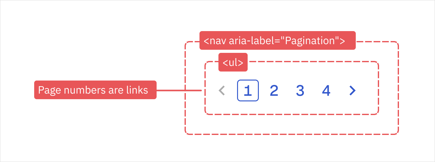
Pagination example
- Wrap pagination in a
<nav aria-label="Pagination">element to define a navigation region. The component will announce to screen readers as ‘pagination, navigation’ and appears in the landmarks menu for quick access. - Each page number should be a link:
<a href="">. - Group links inside an unordered list:
<ul>.
2. Keyboard interactions
Keyboard interactions define how users navigate and operate your interface without a pointing device.
- Why it matters: Not everyone uses a mouse. Some users rely exclusively on keyboards, while others prefer keyboard shortcuts for increased efficiency.
- What to annotate: Tab order sequence, which keys trigger which actions, focus management between states, and any keyboard shortcuts or alternative navigation patterns.
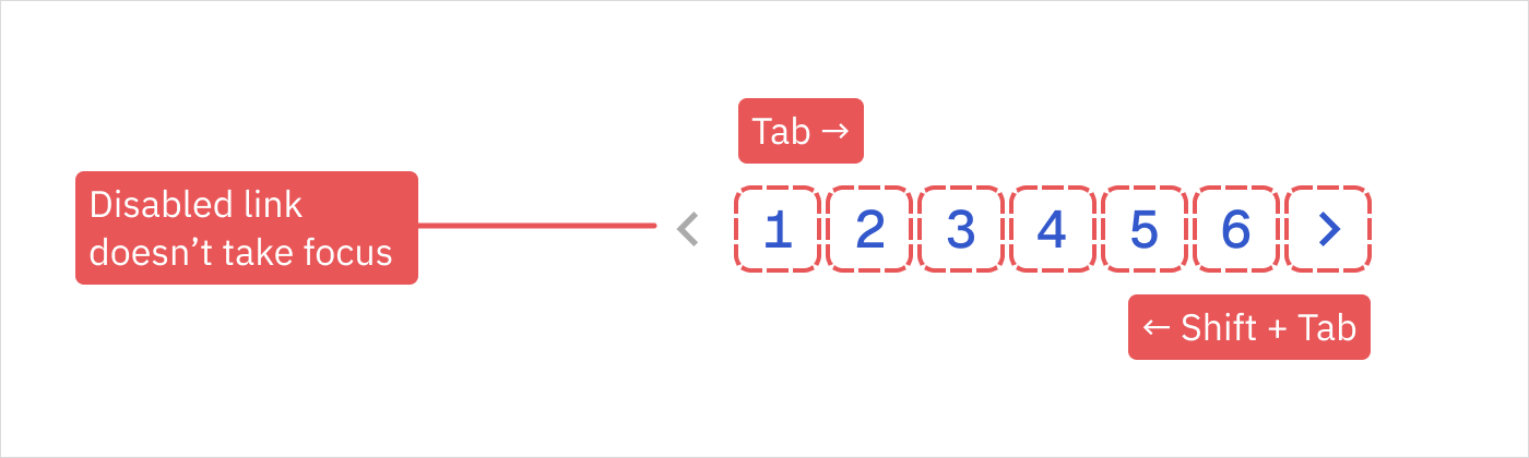
Pagination example
- Tab and Shift+Tab move sequentially through controls in a logical order.
- Enter or Space activates the focused link or button.
- Disabled controls are skipped in the tab order.
- Provide a distinct visual hover style and a focus indicator that achieves a contrast ratio of at least 3:1.
3. Zoom and responsive behavior
Users interact across a variety of screen sizes, and components need to adapt thoughtfully.
- Why it matters: People with low vision may zoom in or increase type size at the browser or device level. Components must remain functional without horizontal scrolling or loss of information.
- What to annotate: Reflow behavior at different zoom levels, responsive breakpoint behavior, and how text overflows or truncates.
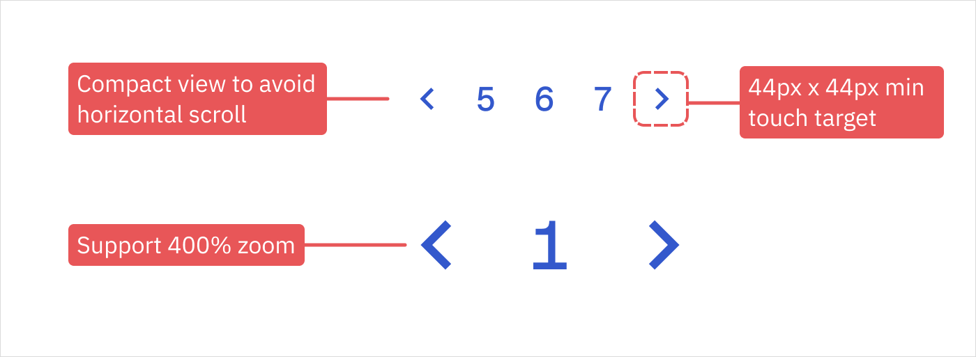
Pagination example
- Support up to 400% zoom without losing information.
- Consider a compact view to avoid horizontal scrolling on small viewports or when zoomed.
- Keep touch targets at least 44 × 44 px.
4. States and feedback
Users need clear feedback about their current location, available actions, and system responses.
- Why it matters: If states are not communicated clearly, users can become disoriented or miss critical system changes.
- What to annotate: Visual and programmatic states for default, hover, focus, active, disabled, and loading states where applicable. Include how state changes are announced to screen readers and whether announcements are immediate or polite.
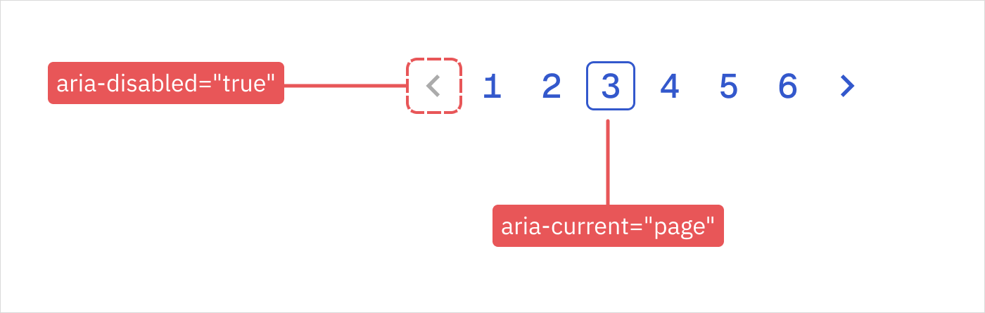
Pagination example
- Add
aria-current="page"to the active page, so screen readers can announce it. - Add
aria-disabled="true"to disabled links.
5. Labels and instructions
Every interactive element needs a text-based name that explains its purpose.
- Why it matters: Clear, meaningful labels help users understand what each element does and how to interact with it.
- What to annotate: Accessible names for all interactive elements, descriptive text for complex controls, alt text for icons and images, error messages, and instructional content that may not be visually apparent. Include whether labels should be visible text or programmatic.
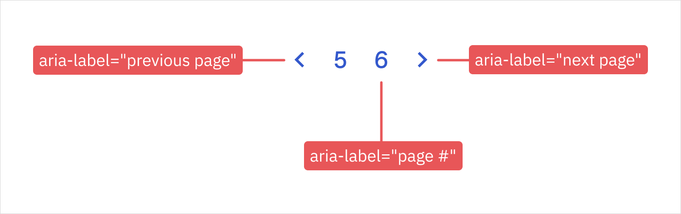
Pagination example
- Add descriptive labels for arrow controls, such as
aria-label="Previous page"andaria-label="Next page", which do not have a visible text label. - Use
aria-label="Page {number}"to make it explicit that the numbers are links to page numbers. The screen reader will announce “Page 5” rather than just announcing the number.
6. Motion, animation, and timing
This covers anything that moves, animates, transitions, auto-plays, or changes over time.
- Why it matters: Some users struggle with motion or find it disorientating, and some just prefer static screens. Motion can trigger vestibular disorders, while timed content can be missed by users who need more time to process information.
- What to annotate: Reduced motion alternatives, animation duration limits, auto-play controls, timeout behaviors, and focus management during transitions. Document any content that flashes or moves automatically.
Pagination example
- If page changes animate, respect the “prefers-reduced-motion” user setting.
How to record annotations
Design annotation kits
Our design tools don't have space for essential accessibility information. Much of it is non-visual, so it’s easy to overlook during implementation. Design annotation kits offer a solution to this.
There are some excellent open-source examples shared in community files that you can tailor to your organization's needs. Check out the CVS Health kit on Figma and Stéphanie Walter's kit on PenPot, for example. And if you're looking for inspiration on how to use annotation kits, watch Jan Maarten and Daniel Henderson-Ede's talk on how different design teams annotate for accessibility at 2025’s Inclusive Design 24.
Design annotations can be helpful discussion starters. But the trouble with sticky-note annotations is that they can get left behind once development begins. They're also not reusable. Every new component means starting from scratch, re-documenting the same accessibility patterns you've already specified.
Recording annotations in a reusable way can provide more value.
Create reusable documentation
Moving beyond static annotations in design files opens up powerful possibilities for scaling accessibility knowledge across your design system.
- Text-first specification: In mature design systems with tokenized values, text-based component specs often prove faster than visual annotations and enable quicker implementation cycles.
- Structured accessibility data: If you record accessibility annotations in machine-readable formats, such as JSON or markdown tables, they become reusable. This transforms annotations from sticky notes into queryable, testable records.
- AI-powered documentation: Machine-readable formats unlock AI integration. Tools like zeroheight's MCP Server could surface accessibility requirements when consumers ask about components.
- Automated testing hooks: You could even structure annotations to generate automated acceptance criteria, reducing the gap between specification and validation.
- Cross-platform portability: Specifications can be shared across teams working on different platforms to help maintain consistent accessibility patterns, whether you're building for web, iOS, or Android.
Here's an example of how structured annotations might look for our pagination component:
{
  "pagination": {
    "semantics": {
      "element": "nav",
      "role": "navigation",
      "ariaLabel": "Pagination",
      "structure": "ul > li > a[href]",
    },
    "keyboard": {
      "navigation": ["tab", "shift+tab"],
      "activation": ["enter", "space"],
      "skip": ["disabled controls"]
    },
    "zoom": {
      "reflowAt400Percent": true,
      "avoidHorizontalScroll": true,
      "touchTargetMin": "44x44px"
    },
    "states": {
      "active": "aria-current=page",
      "disabled": "aria-disabled=true"
    },
    "labels": {
      "previous": "aria-label=Previous page",
      "next": "aria-label=Next page",
      "pageLinks": "aria-label=Page {number}"
    },
    "motion": {
      "prefersReducedMotion": true
    }
  }
}
When annotations repeat across components, you could even define them as accessibility tokens – reusable, portable values defined just like color or spacing tokens.
Let's wrap up
Make accessibility annotations part of your component specification process. Annotations create cross-team alignment on accessibility requirements before any code is written.
Choose a format that suits how your team likes to work. Sticky notes and callouts can be a great conversation starter between design and engineering, while machine-readable documentation could unlock automation, AI integration, and cross-platform consistency.
A single design system component can't be 'accessible' in isolation, but thinking about your user needs and technical implementation from the outset will set your consuming teams up for success. The invisible requirements you document today become the inclusive experiences your users depend on tomorrow.
Resources


For advice on annotating a pagination component for accessibility, I took inspiration from these excellent examples:

Info
Big thanks to Maryia Radchuk (mariya-radchuk), Senior Web UI Engineer at Just Eat Takeaway.com, for feedback on this article.