Resize Observer API
Resize Observer API 관련

🏝 What is Resize Observer API
The Resize Observer API can help us listen to the change in element size and perform some actions when the size changes. For example, we can use Resize Observer API to dynamically adjust UI layout, load or unload images, etc.
🎨 How to use the Resize Observer API
Using the Resize Observer API is very simple. I’ll walk you through 3 usage examples to familiarize you with the Resize Observer API.
1. Listening for changes in element size
In development projects, we usually need to listen for changes in element size and perform some actions when the size changes. For example, we may need to dynamically adjust the UI layout to fit a different size screen or device. The following is an example of listening for element size changes:
// Create a ResizeObserver instance
const observer = new ResizeObserver((entries) => {
  for (let entry of entries) {
    console.log(entry.target, entry.contentRect)
    // dynamically adjust the UI layout
    const { width, height } = entry.contentRect
    // ...
  }
})
// Listening for an element
const element = document.getElementById("my-element")
observer.observe(element)
In this example, we use the Resize Observer API to listen for changes in the size of the element with ID “my-element”. In the callback function, we can get information about the size of the element and use this information to dynamically adjust the UI layout.
2. Listening for size changes inside elements
In addition to listening for changes in the size of the element itself, we can also listen for changes in the size of the inside of the element. For example, when the text or image inside an element changes, we may need to recalculate the size of the element and adjust the UI layout accordingly. The following is an example of listening for changes in the size of the element’s internals:
// Create a ResizeObserver instance
const observer = new ResizeObserver((entries) => {
  for (let entry of entries) {
    console.log(entry.target, entry.contentRect)
    // dynamically adjust the UI layout
    const { width, height } = entry.contentRect
    // ...
  }
})
// listen to the internal size change of an element
const element = document.getElementById("my-element")
observer.observe(element, { box: "content-box" })
In this example, we use the Resize Observer API to listen for size changes inside the element with ID “my-element”. We pass an optional object with the box property set to content-box, indicating that we want to listen for size changes inside the element.
3. Using the Resize Observer API in React
Of course, we can also use it in React or Vue, and we can also use third-party libraries to simplify the use of the Resize Observer API. For example, in React, you can use the react-resize-observer library to listen for changes in the size of elements. Here is an example of using the react-resize-observer library:
import React, { useState } from "react"
import { ResizeObserver } from "@juggle/resize-observer"
import { useResizeObserver } from "react-resize-observer"
function MyComponent() {
  const [width, setWidth] = useState(0)
  const [height, setHeight] = useState(0);
  const onResize = (entry) => {
    const { width, height } = entry.contentRect;
    setWidth(width);
    setHeight(height);
  };
  const { ref } = useResizeObserver({ onResize, polyfill: ResizeObserver });
  return <div ref={ref}>My content goes here</div>;
}
In this example, we use react-resize-observer and @juggle/resize-observer libraries to listen for changes in the size of elements. We use the useResizeObserver() hook to create a ResizeObserver instance and update the state of the component in the callback function.
👍 Where to use the Resize Observer API
The Resize Observer API can be used in many work scenarios. For example:
1. Responsive Layout
Responsive layout** can be easily implemented using the Resize Observer API. For example, when the screen size changes, we can listen to the size change of the root element and adjust the UI layout accordingly. The following is a sample code implemented using the Resize Observer API:
<!-- Responsive layout sample code -->
<div class="container" id="responsive-container">
  <div class="row">
    <div class="col-sm-4">
      <p>First column content</p>
    </div>
    <div class="col-sm-4">
      <p>Second column content</p>
    </div>
    <div class="col-sm-4">
      <p>Third column content</p>
    </div>
  </div>
</div>
<script>
  const container = document.getElementById("responsive-container");
  const resizeObserver = new ResizeObserver((entries) => {
    for (let entry of entries) {
      const { width } = entry.contentRect;
      if (width >= 768) {
        container.classList.add("large-device");
      } else {
        container.classList.remove("large-device");
      }
    }
  });
  resizeObserver.observe(container);
</script>
<style>
  .large-device .col-sm-4 {
    width: 33.33%;
  }
</style>
2. Image lazy loading
Using Resize Observer API you can implement image lazy loading. For example, when an image element enters the visible area, we can listen to its size change and display the image after the element is fully loaded. The following is a sample code for lazy loading of images using the Resize Observer API:
<!-- HTML -->
<img data-src="https://example.com/image.jpg" alt="My image" />
<script>
  // JavaScript
  const observer = new ResizeObserver((entries) => {
    for (let entry of entries) {
      if (entry.isIntersecting) {
        const img = entry.target;
        const src = img.getAttribute("data-src");
        if (src) {
          img.setAttribute("src", src);
          img.removeAttribute("data-src");
        }
      }
    }
  });
  const images = document.querySelectorAll("img[data-src]");
  images.forEach((img) => {
    observer.observe(img);
  });
</script>
In the above code, we use the Resize Observer API to listen for changes in the size of the image element. When the image element enters the viewable area, we assign the URL in its data-src property to its src property to achieve the effect of lazy loading of the image. Also, we use the Intersection Observer API to listen to whether the image element enters the visible area.
Note that in this sample code, we also need to set a data-src attribute for the image element, which contains the URL of the image to be loaded, so as to avoid loading all the images immediately on page load and thus improve page performance.
3. Adaptive UI components
Adaptive UI components can be easily implemented using the Resize Observer API. For example, when the number or size of elements inside a UI component changes, we can listen for the size change and adjust the UI layout accordingly.
🧭 Resize Observer API Compatibility
The Resize Observer API is a relatively new Web API and is currently only supported in modern browsers. Here is the compatibility of the Resize Observer API:
- Chrome 64+ ✅
- Firefox 69+ ✅
- Safari 14.1+ ✅
- Edge 79+ ✅
- Opera 51+ ✅
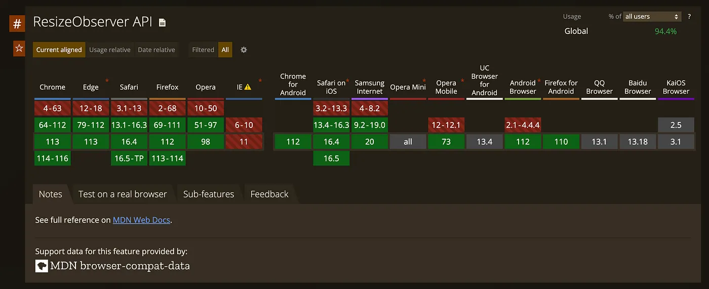
Details of compatibility can be viewed at Can I Use.
📋 Resize Observer API Pros and Cons
The following are the advantages and disadvantages of the Resize Observer API:
1. Advantages
- Can be used to detect changes in element size without polling or using other detection techniques.
- It can listen to multiple elements for size changes and only trigger the callback function when the element size changes.
- Size changes can be detected for any element, not limited to visible elements.
- Compared to other detection techniques (such as the
window.resizeevent), the Resize Observer API is more stable, as it avoids performance problems due to the frequent triggering of events.
2. Disadvantages
- Not supported by all browsers, especially older browsers.
- Because the Resize Observer API’s callback function is executed asynchronously, it is not guaranteed to execute immediately after an element size change.
- The Resize Observer API does not provide the exact size value of the element, only the size change information. If you need to get the specific size value of an element, developers need to calculate it themselves.
🎯 Summary
In this article, we introduced the basic usage of Resize Observer API and provided some sample code to help you better understand and use the API. hope this article can help you better understand and use Resize Observer API. If you want to know more information, please refer to the following references: