Circular dashed border
11/25/21About 1 minCSSArticle(s)blogcss-tip.comcss
Circular dashed border 관련

CSS > Article(s)
Article(s)
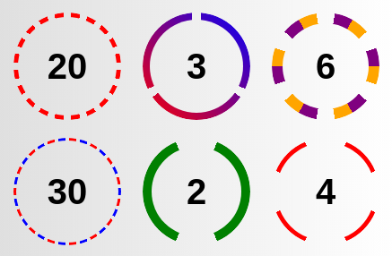
Create a circular dashed border with full control over the dashes. Only one element and a few lines of code are required. Simply update the CSS variables to control the design of the border.
.box {
  --n: 20;   /* control the number of dashes */
  --d: 8deg; /* control the distance between dashes */
  --t: 5px;  /* control the thickness of border*/
  --c: red;  /* control the coloration (can be a gradient) */

  width: 120px;
  aspect-ratio: 1;
  position: relative;
}
.box::after {
  content: "";
  position: absolute;
  inset: 0;
  border-radius: 50%;
  padding: var(--t);
  background: var(--c);
  mask:
      linear-gradient(#0000 0 0) content-box,
      repeating-conic-gradient(
         from calc(var(--d)/2),
         #000  0 calc(360deg/var(--n) - var(--d)),
         #0000 0 calc(360deg/var(--n))
       );
  mask-composite: intersect;
}
See Dashed border by t_afif on CodePen.
More CSS Tips
- max-width + centering with one instruction Use max() to center your element and set a max-width. December 10, 2021
- Hamburger menu icon Use CSS gradients to create a menu icon. December 07, 2021
- Progress bar with dynamic coloration Create a scrolling shadow effect using only CSS gradients. November 15, 2021
- One column to control the height of another Make one column control the height of another one with a simple property. November 05, 2021

Circular dashed border
Use mask and gradient to create a fancy dashed border