Circular progress using scroll-driven animations
7/4/24About 1 minCSSArticle(s)blogcss-tip.comcss
Circular progress using scroll-driven animations 관련

CSS > Article(s)
Article(s)

Circular progress using scroll-driven animations
Transforming the native progress element into a circular one using scroll-driven animations
Transforming the native progress element into a circular one.
- No extra elements (only the
<progress>tag) - No Magic Numbers
- Everything is controlled by the "max" and "value" attributes
- Powered by Scroll-Driven animations &
@property
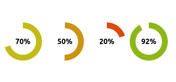
It's a Chrome-only experimentation:
And a version with animation
More CSS Tips
- Get the screen width & height without JavaScript A few lines of CSS to get the screen width/height as integer values. July 16, 2024
- Border gradient with border-radius The modern way to add gradient to borders while having rounder corners. July 10, 2024
- Fancy hover effect with anchor positioning Create a navigation menu with a cool hover effect. June 21, 2024
- Cut-out shapes using clip-path Invert any kind of polygon shapes following simple steps. June 19, 2024
Circular progress using scroll-driven animations
Transforming the native progress element into a circular one using scroll-driven animations