A Modern way to create hexagon shapes
1/11/24About 2 minCSSArticle(s)blogcss-tip.comcss
A Modern way to create hexagon shapes 관련

CSS > Article(s)
Article(s)
An easy and modern way to create Hexagon Shapes
- Only 2 CSS declarations
- No magic numbers
- A simple 4-point polygon for the clip-path
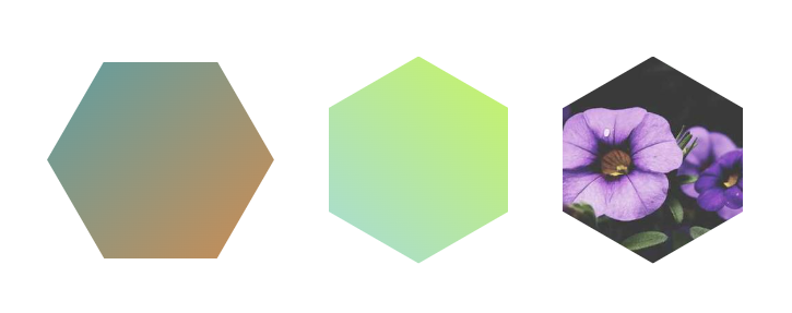
.hex {
  aspect-ratio: 1/cos(30deg);
  clip-path: polygon(50% -50%,100% 50%,50% 150%,0 50%);
}

.hex-alt {
  aspect-ratio: cos(30deg);
  clip-path: polygon(-50% 50%,50% 100%,150% 50%,50% 0);
  /* Notice how I simply switched the x/y
     of the previous polygon, easy! */
}
More CSS Shapes

More CSS Tips
- A fancy frame with wavy borders (wavy box) Place your image inside a wavy box using modern CSS. January 23, 2024
- Triangle shape with rounded corners A few lines of code to create a triangle with rounded corner using only CSS. January 19, 2024
- Fancy corner decoration for your images A few lines of code for a cool corner decoration. January 05, 2024
- Border with inner radius for your images Two lines of code to add an inner radius to your images. January 03, 2024

A Modern way to create hexagon shapes
Two lines of CSS code an no magic number for an hexagon shape