
The future of hexagon shapes
6/12/25About 1 minCSSArticle(s)blogcss-tip.comcss
The future of hexagon shapes 관련

CSS > Article(s)
Article(s)
A new and easy way to create hexagon shapes using corner-shape. As a bonus, you can add a border to it.
It's the only method that works with borders!
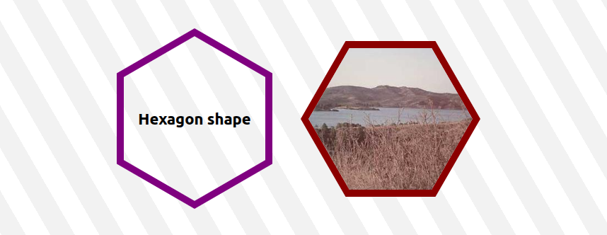
.hexagon {
  border-radius: 50% / 25%;
  corner-shape: bevel;
  aspect-ratio: cos(30deg);
  border: 8px solid purple; /* the border will follow the shape! */
}
/* OR  */
.hexagon {
  border-radius: 25% / 50%;
  corner-shape: bevel;
  aspect-ratio: 1/cos(30deg);
  border: 8px solid purple; /* the border will follow the shape! */
}
⚠️ Very limited support (Chrome-only with experimental flag enabled)
See Hexagon shapes (with border!) by t_afif on CodePen.
Until better support use this: A Modern way to create hexagon shapes
More CSS Tips
- Get the index of an element within its parent A native CSS function to get the index of an element among its siblings within a parent element. July 10, 2025
- Invert CSS Shapes using shape() A simple trick to get the cut-out version of any shape created using shape(). July 01, 2025
- How to correctly use if() in CSS Learn how to easily fix an issue you will face when using if(). June 02, 2025
- How to style a broken image Give a nice visual touch to images that fail to load. May 22, 2025

The future of hexagon shapes
A new way to easily create hexagon shapes using corner-shape