Hexagon shapes with rounded corners
4/16/25About 1 minCSSArticle(s)blogcss-tip.comcss
Hexagon shapes with rounded corners 관련

CSS > Article(s)
Article(s)

Hexagon shapes with rounded corners
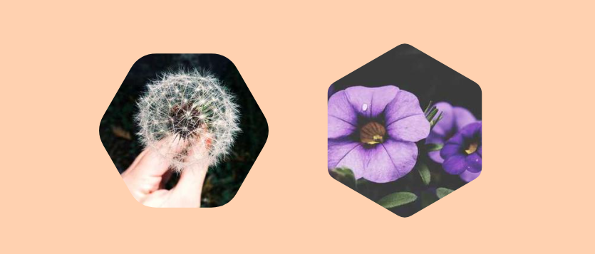
Use the new shape() function to create a hexagon shape with rounded corners
We can create a hexagon shape using clip-path: polygon() but what about the rounded corners variation? It's now possible with the new clip-path: shape(). The code is more complex but you can easily control it using CSS variables.
.hexagon {
  --r: 0.15; /* control the radius [0 1] */
  --a: 30deg; /* control the rotation */

  width: 280px;
  aspect-ratio: 1;
  clip-path: shape(/* a complex code but all you have to do is to update the above variables */);
}
As a bonus we can animate the radius and also rotate the shape. Here is a demo with a cool hover effect.
⚠️ Chrome-only for now ⚠️
More CSS Tips
- A heart shape with modern CSS Use the new shape() function to create a heart shape with minimal code. April 23, 2025
- Arrow-like Box with rounded corners Create a rectangle with a rounded triangle shape on one side. April 22, 2025
- Custom progress element using attr() Create a custom progress element with a dynamic coloration based on the value. March 25, 2025
- Zig-Zag edges using CSS mask One line of code to add Zig-Zag edges to any element using the mask property. March 20, 2025
Hexagon shapes with rounded corners
Use the new shape() function to create a hexagon shape with rounded corners