
Collapsing Toolbar in Compose— PART 2
Collapsing Toolbar in Compose— PART 2 관련


Introduction
Creating smooth, responsive user experiences in modern UI development often involves complex scrolling interactions. One common requirement is nested scrolling, where a scrollable component is embedded within another. Jetpack Compose, with its declarative approach, provides an elegant way to handle such interactions.
InPART 1of this article, we covered scroll states and the basics of nested scrolling. Now, inPART 2, we will build a dynamic UI with a collapsing toolbar and learn how to handle nested scrolling effectively.

Overview
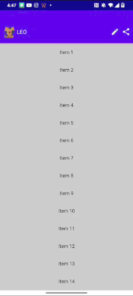
We aim to create an interface with a lazy list where scrolling causes the top card to transform into a toolbar, with a smooth, curved path transition effect.
What You’ll Learn
- Creating custom layouts
- Resizing layouts based on states (collapsed or expanded)
- Combining lazy list scrolling with screen content
- Working with nested scrolling and
NestedScrollConnection
Step 1: Building the Header
The header has two states:expandedandcollapsed. We use dynamic elements with changing heights and widths to achieve a smooth transition between these states.


Tips
To calculate the height for these containers we will use Custom layout in compose. If you already not know custom layout checkout this.

Defining the Heights
private val expandedBoxHeight = 200.dp
private val collapsedBoxHeight = 96.dp
private val ExpandedLeoHeight = 80.dp
private val CollapsedLeoHeight = 32.dp
private val leoTextHeight = 16.sp
private val ButtonSize = 24.dp
We interpolate between these values as the header transitions between states.
To get the linear sizes ar each state we use lerp function.
val leoHeight = with(LocalDensity.current) {
    lerp(CollapsedLeoHeight.toPx(), ExpandedLeoHeight.toPx(), progress).toDp()
}
where progress is changing from 1f to 0f lineraly.
Create box to set background image
@Composable
fun CollapsingToolbar(
    @DrawableRes backgroundImageResId: Int,
    progress: Float,
    onPrivacyTipButtonClicked: () -> Unit,
    onSettingsButtonClicked: () -> Unit,
    modifier: Modifier = Modifier
) {
    val leoHeight = with(LocalDensity.current) {
        lerp(CollapsedLeoHeight.toPx(), ExpandedLeoHeight.toPx(), progress).toDp()
    }
    val logoPadding = with(LocalDensity.current) {
        lerp(CollapsedPadding.toPx(), ExpandedPadding.toPx(), progress).toDp()
    }

    Surface(
        color = MaterialTheme.colors.primary,
        elevation = Elevation,
        modifier = modifier
    ) {
        Box(
            modifier = Modifier
                .fillMaxWidth()
                .height(if (progress == 1f) 200.dp else leoHeight \* 3)
        ) {
        // #Background Image
                Image(
                    painter = painterResource(id = backgroundImageResId),
                    contentDescription = null,
                    contentScale = ContentScale.FillWidth,
                    modifier = Modifier
                        .fillMaxSize()
                        .graphicsLayer {
                            alpha = progress \* Alpha
                        },
                    alignment = BiasAlignment(0f, 1f - ((1f - progress) \* 0.75f))
                )

        // .......
        // inside content
        }
    }
}
Here background image alignment is changing with progress.
(0f , 1f — ((1f — progress) * 0.75f) = (0f , 1f — ((1f — 1f) * 0.75f)
(0f, 1f — 0f * 0.75f) = (0f, 1f)
which mean it will start from horizontal 0 to vertical 1.
(0f , 1f — ((1f — progress) * 0.75f) = (0f , 1f — ((1f — 0f) * 0.75f)
(0f, 1f — 1f * 0.75f) = (0f, 1f-0.75f) = (0f, 0.25f)
which mean it will start from horizontal 0 to vertical 0.25f alignment of whole box size .
and alpga is changing with progress which means on 1f it will be completely visible to get invisible on 0f progress value.

Now let’s add all these element without any sense of direction for now.
//Inside card elements
Image(
    painter = painterResource(id = R.drawable.ic\_leo),
    contentDescription = null,
    modifier = Modifier
        .padding(logoPadding)
        .height(leoHeight)
        .width(leoHeight)
)
Text(
    text = "LEO",
    color = Color.White,
    fontSize = 16.sp,
    modifier = Modifier
        .padding(logoPadding)
        .wrapContentWidth(),
)
Row(
    modifier = Modifier.wrapContentSize(),
    horizontalArrangement = Arrangement.spacedBy(ContentPadding)
) {
    IconButton(
        onClick = onPrivacyTipButtonClicked,
        modifier = Modifier
            .size(ButtonSize)
            .background(
                color = LocalContentColor.current.copy(alpha = 0.0f),
                shape = CircleShape
            )
    ) {
        Icon(
            modifier = Modifier.fillMaxSize(),
            imageVector = Icons.Rounded.Edit,
            contentDescription = null,
        )
    }
    IconButton(
        onClick = onSettingsButtonClicked,
        modifier = Modifier
            .size(ButtonSize)
            .background(
                color = LocalContentColor.current.copy(alpha = 0.0f),
                shape = CircleShape
            )
    ) {
        Icon(
            modifier = Modifier.fillMaxSize(),
            imageVector = Icons.Rounded.Share,
            contentDescription = null,
        )
    }
}
Arrange them dynamically using custom layout
@Composable
fun CollapsingToolbar(
    @DrawableRes backgroundImageResId: Int,
    progress: Float,
    onPrivacyTipButtonClicked: () -> Unit,
    onSettingsButtonClicked: () -> Unit,
    modifier: Modifier = Modifier
) {
    val leoHeight = with(LocalDensity.current) {
        lerp(CollapsedLeoHeight.toPx(), ExpandedLeoHeight.toPx(), progress).toDp()
    }
    val logoPadding = with(LocalDensity.current) {
        lerp(CollapsedPadding.toPx(), ExpandedPadding.toPx(), progress).toDp()
    }
    Surface(
        color = MaterialTheme.colors.primary,
        elevation = Elevation,
        modifier = modifier
    ) {
        Box(
            modifier = Modifier
                .fillMaxWidth()
                .height(if (progress == 1f) 200.dp else leoHeight \* 3)
        ) {
            // #Background Image
            Image(
                painter = painterResource(id = backgroundImageResId),
                contentDescription = null,
                contentScale = ContentScale.FillWidth,
                modifier = Modifier
                    .fillMaxSize()
                    .graphicsLayer {
                        alpha = progress \* Alpha
                    },
                alignment = BiasAlignment(0f, 1f - ((1f - progress) \* 0.75f))
            )
            CollapsingToolbarLayout(progress, Modifier) {
                // Inside card elements
                // ..............................
            }
        }
    }
}
@Composable
private fun CollapsingToolbarLayout(
    progress: Float,
    modifier: Modifier = Modifier,
    content: @Composable () -> Unit
) {
 Layout(
        modifier = modifier,
        content = content
    ) { measurables, constraints ->

        // Repositioning of the elements
        // ...
    }
}
now check element count is 3(1. cat image, 2. Text, 3. row of buttons) and get placables from that.
check(measurables.size == 3)
val placeables = measurables.map {
    it.measure(constraints)
}
layout(
    width = constraints.maxWidth,
    height = constraints.maxHeight
) {
    val expandedHorizontalGuideline = (constraints.maxHeight * 0.4f).roundToInt()
    val collapsedHorizontalGuideline = (constraints.maxHeight * 0.5f).roundToInt()

    val leoImage = placeables[0]
    val petName = placeables[1]
    val buttons = placeables[2]

We will check the positioning of each item in
Collapsed state
because content padding was already added. x cooridnate can start from 0 in this case. and y can be middle of collapsed card.
x = 0
y = collapsedHorizontalGuideline/2
x coordinate will start after cat image. and padding was already added.
x = leoImage.width
y = (collapsedHorizontalGuideline — petName.height/2)`
x = constraints.maxWidth - buttons.width
y = (constraints.maxHeight - buttons.height) / 2
Same way place expanded content. whole code will look something like this.
@Composable
private fun CollapsingToolbarLayout(
    progress: Float,
    modifier: Modifier = Modifier,
    content: @Composable () -> Unit
) {
    Layout(
        modifier = modifier,
        content = content
    ) { measurables, constraints ->
        check(measurables.size == 3)
        val placeables = measurables.map {
            it.measure(constraints)
        }
        layout(
            width = constraints.maxWidth,
            height = constraints.maxHeight
        ) {
            val expandedHorizontalGuideline = (constraints.maxHeight * 0.4f).roundToInt()
            val collapsedHorizontalGuideline = (constraints.maxHeight * 0.5f).roundToInt()

            val leoImage = placeables[0]
            val petName = placeables[1]
            val buttons = placeables[2]

            leoImage.placeRelative(
                x = lerp(
                    start = 0,
                    stop = constraints.maxWidth / 2 - leoImage.width / 2,
                    fraction = progress
                ),
                y = lerp(
                    start = collapsedHorizontalGuideline / 2,
                    stop = expandedHorizontalGuideline / 2,
                    fraction = progress
                )
            )
            petName.placeRelative(
                x = lerp(
                    start = leoImage.width ,
                    stop = constraints.maxWidth / 2 - petName.width / 2,
                    fraction = progress
                ),
                y = lerp(
                    start = (collapsedHorizontalGuideline - petName.height/2),
                    stop = constraints.maxHeight / 2 + leoImage.width / 3,
                    fraction = progress
                )
            )
            buttons.placeRelative(
                x = constraints.maxWidth - buttons.width,
                y = lerp(
                    start = (constraints.maxHeight - buttons.height) / 2,
                    stop = 0,
                    fraction = progress
                )
            )
        }
    }
}
Here placeRelative function takes x, y, z coordinates. and to set x, y we will again use lerp function we defines linear path for these cooridinates, where start being collapsed state and stop being expanded state.
I hope it was pretty clean till now.