Multi-State Buttons
Multi-State Buttons 관련

There are traditional ways for a user to pick one-option-from-many. The classics beeing a <select> or a group of <input type="radio"> elements.
But it’s nice to have more options. Sometimes when a user must choose one option from many, it’s nice to have a single element that switches between available option on a quick click. A practical example of such a singular UI is a tag control that transitions through various states on each click. Any given tag in an interface like this could be be in three different states:
- Disregarded in search results (default state)
- Search results must include tag
- Search results must exclude tag
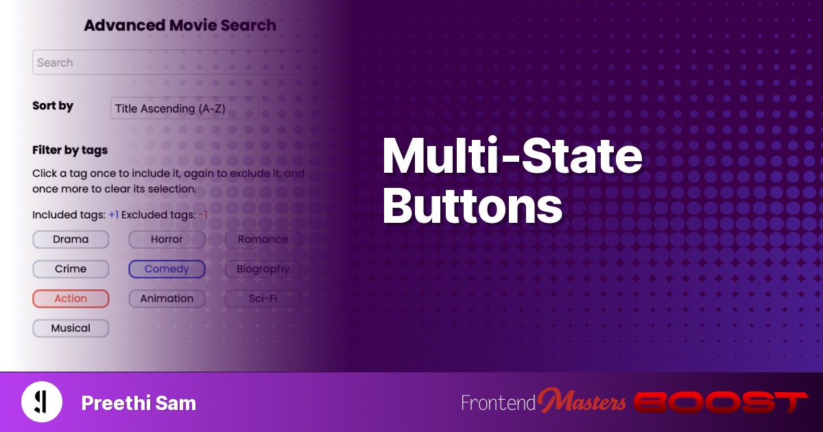
Here’s an image example of such a UI:

The Plan
We’ll be coding such a control using a set of stacked HTML radio buttons.
The UI’s functionality — jumping through different states on each click — is implemented by a bit of CSS-only trickery. We’ll be changing the value of the CSS propertypointer-eventsin the radio buttons when one is selected.
Thepointer-eventsproperty when applied to HTML elements determines whether a pointer event, such as a click or hover — through mouse pointer, touch event, stylus usage, etc — occurs on an element or not. By default, the events do occur in the elements, which is equivalent to setting pointer-events: auto;.
Ifpointer-events: none; is set, that element won’t receive any pointer events. This is useful for stacked or nested elements, where we might want a top element to ignore pointer events so that elements below it become the target.
The same will be used to create a multi-state control in this article.
Basic Demo
Below is a basic control we’ll be coding towards to demonstrate the technique. I’ll also include a Pen for the movie tags demo, shown before, at the end.
<div class="control">
  <label class="three">
    <input type="radio" name="radio" />
    Third state
  </label>

  <label class="two">
    <input type="radio" name="radio" />
    Second state
  </label>

  <label class="one">
    <input type="radio" name="radio" checked />
    First state
  </label>
</div>
.control {
    width: 100px;
    line-height: 100px;
    label {
        width: inherit;
        position: absolute;
        text-align: center;
        border: 2px solid;
        border-radius: 10px;
        cursor: pointer;
        input {
            appearance: none;
            margin: 0;
        }
    }
    .one {
        pointer-events: none;
        background: rgb(247 248 251);
        border-color: rgb(199 203 211);
    }
    .two {
        background: rgb(228 236 248);
        border-color: rgb(40 68 212);
    }
    .three {
        background: rgb(250 230 229);
        border-color: rgb(231 83 61);
    }
}
In HTML shown above, there are three<input>radio buttons (for three states), which are nested within their respective<label>elements.
The label elements are stacked over each other within the parent<div>element (.control), sharing the same dimensions and style. The default appearance of the radio buttons is removed. Naturally, the label elements will trigger the check/uncheck of the radio buttons within them.
Each label is colored differently in CSS. By default, the topmost label (.one) is checked on page load for having thecheckedHTML attribute. In CSS, itspointer-eventsproperty is set tonone.
Which means when we click the control, the topmost label isn’t the target anymore. Instead, it clicks the label below it and checks its radio button. Since only one radio button in a group with the same name attribute can be checked at a time, when the bottom label is checked, its radio button unchecks the topmost label’s. Consequently, the control transitions from its first to second state.
That’s the basis of how we’re coding a multi-state control. Here’s how it’s programmed in the CSS for all the labels and, consequently, their radio buttons:
label:has(:checked) {
    ~ label {
        opacity: 0;
    }
    &:is(:not(:first-child)) {
        pointer-events: none;
        ~ label { pointer-events: none; }
    }
    &:is(:first-child) {
        ~ label { pointer-events: auto; }
    }
}
When a label’s radio button is checked, the following labels in the source code are hidden withopacity: 0so that it alone is visible to the user.
If a checked radio button’s label isn’t the first one in the source code (bottom-most on screen), it and the labels after it getpointer-events: none. This means the label underneath it on the screen becomes the target of any following pointer events.
If the checked radio button’s label is the first one in the source code (bottom-most on screen), all the labels after it get thepointer-eventsvalueauto, allowing them to receive future pointer events. This resets the control.
In a nutshell, when a user selects a state, the following state becomes selectable next by giving the current and all previously selected statespointer-events: none.
Usage Warning
Although this method is applicable to any number of states, I would recommend limiting it to three for typical user controls like tags, unless it’s a fun game where the user repeatedly clicks the same box and sees something different each time. Additionally, it’s apt to consider whether keyboard navigation is to be supported or not. If it is, it would be more practical to adopt a user experience where users can see all reachable options using the tab and navigation keys, rather than showing a single UI.
Advanced Demo
Below is a prototype for a tag cluster composed of three-state tags designed to filter movie search results based on genres. For instance, if a user wants to filter for comedy movies that are not action films, they can simply click on comedy once to include it and on action twice to exclude it. If you’re curious about how the counts of included and excluded tags are calculated in the demo below, refer to the list under the Further Reading section.
Further Reading