Add Interactivity to Your Dash Apps Using Callbacks
Add Interactivity to Your Dash Apps Using Callbacks 관련

Add Interactivity to Your Dash Apps Using Callbacks
In this section, you’ll learn how to add interactive elements to your dashboard.
Dash’s interactivity is based on a reactive programming paradigm. This means that you can link components with elements of your app that you want to update. If a user interacts with an input component like a dropdown or a range slider, then the output, such as a graph, will react automatically to the changes in the input.
Now you’re going to make your dashboard interactive. This new version of your dashboard will allow the user to interact with the following filters:
- Region
- Type of avocado
- Date range
The collapsible boxes below contain the full source code that you’ll be exploring in this section. Start by replacing your local app.py with the new version in the collapsible section below:
import pandas as pd
from dash import Dash, Input, Output, dcc, html

data = (
    pd.read_csv("avocado.csv")
    .assign(Date=lambda data: pd.to_datetime(data["Date"], format="%Y-%m-%d"))
    .sort_values(by="Date")
)
regions = data["region"].sort_values().unique()
avocado_types = data["type"].sort_values().unique()

external_stylesheets = [
    {
        "href": (
            "https://fonts.googleapis.com/css2?"
            "family=Lato:wght@400;700&display=swap"
        ),
        "rel": "stylesheet",
    },
]
app = Dash(__name__, external_stylesheets=external_stylesheets)
app.title = "Avocado Analytics: Understand Your Avocados!"

app.layout = html.Div(
    children=[
        html.Div(
            children=[
                html.P(children="🥑", className="header-emoji"),
                html.H1(
                    children="Avocado Analytics", className="header-title"
                ),
                html.P(
                    children=(
                        "Analyze the behavior of avocado prices and the number"
                        " of avocados sold in the US between 2015 and 2018"
                    ),
                    className="header-description",
                ),
            ],
            className="header",
        ),
        html.Div(
            children=[
                html.Div(
                    children=[
                        html.Div(children="Region", className="menu-title"),
                        dcc.Dropdown(
                            id="region-filter",
                            options=[
                                {"label": region, "value": region}
                                for region in regions
                            ],
                            value="Albany",
                            clearable=False,
                            className="dropdown",
                        ),
                    ]
                ),
                html.Div(
                    children=[
                        html.Div(children="Type", className="menu-title"),
                        dcc.Dropdown(
                            id="type-filter",
                            options=[
                                {
                                    "label": avocado_type.title(),
                                    "value": avocado_type,
                                }
                                for avocado_type in avocado_types
                            ],
                            value="organic",
                            clearable=False,
                            searchable=False,
                            className="dropdown",
                        ),
                    ],
                ),
                html.Div(
                    children=[
                        html.Div(
                            children="Date Range", className="menu-title"
                        ),
                        dcc.DatePickerRange(
                            id="date-range",
                            min_date_allowed=data["Date"].min().date(),
                            max_date_allowed=data["Date"].max().date(),
                            start_date=data["Date"].min().date(),
                            end_date=data["Date"].max().date(),
                        ),
                    ]
                ),
            ],
            className="menu",
        ),
        html.Div(
            children=[
                html.Div(
                    children=dcc.Graph(
                        id="price-chart",
                        config={"displayModeBar": False},
                    ),
                    className="card",
                ),
                html.Div(
                    children=dcc.Graph(
                        id="volume-chart",
                        config={"displayModeBar": False},
                    ),
                    className="card",
                ),
            ],
            className="wrapper",
        ),
    ]
)

@app.callback(
    Output("price-chart", "figure"),
    Output("volume-chart", "figure"),
    Input("region-filter", "value"),
    Input("type-filter", "value"),
    Input("date-range", "start_date"),
    Input("date-range", "end_date"),
)
def update_charts(region, avocado_type, start_date, end_date):
    filtered_data = data.query(
        "region == @region and type == @avocado_type"
        " and Date >= @start_date and Date <= @end_date"
    )
    price_chart_figure = {
        "data": [
            {
                "x": filtered_data["Date"],
                "y": filtered_data["AveragePrice"],
                "type": "lines",
                "hovertemplate": "$%{y:.2f}<extra></extra>",
            },
        ],
        "layout": {
            "title": {
                "text": "Average Price of Avocados",
                "x": 0.05,
                "xanchor": "left",
            },
            "xaxis": {"fixedrange": True},
            "yaxis": {"tickprefix": "$", "fixedrange": True},
            "colorway": ["#17B897"],
        },
    }

    volume_chart_figure = {
        "data": [
            {
                "x": filtered_data["Date"],
                "y": filtered_data["Total Volume"],
                "type": "lines",
            },
        ],
        "layout": {
            "title": {"text": "Avocados Sold", "x": 0.05, "xanchor": "left"},
            "xaxis": {"fixedrange": True},
            "yaxis": {"fixedrange": True},
            "colorway": ["#E12D39"],
        },
    }
    return price_chart_figure, volume_chart_figure

if __name__ == "__main__":
    app.run_server(debug=True)
Next, replace style.css with the code in the collapsible section below:
body {
  font-family: "Lato", sans-serif;
  margin: 0;
  background-color: #f7f7f7;
}

.header {
  background-color: #222222;
  height: 288px;
  padding: 16px 0 0 0;
}

.header-emoji {
  font-size: 48px;
  margin: 0 auto;
  text-align: center;
}

.header-title {
  color: #ffffff;
  font-size: 48px;
  font-weight: bold;
  text-align: center;
  margin: 0 auto;
}

.header-description {
  color: #cfcfcf;
  margin: 4px auto;
  text-align: center;
  max-width: 384px;
}

.wrapper {
  margin-right: auto;
  margin-left: auto;
  max-width: 1024px;
  padding-right: 10px;
  padding-left: 10px;
  margin-top: 32px;
}

.card {
  margin-bottom: 24px;
  box-shadow: 0 4px 6px 0 rgba(0, 0, 0, 0.18);
}

.menu {
  height: 112px;
  width: 912px;
  display: flex;
  justify-content: space-evenly;
  padding-top: 24px;
  margin: -80px auto 0 auto;
  background-color: #ffffff;
  box-shadow: 0 4px 6px 0 rgba(0, 0, 0, 0.18);
}

.Select-control {
  width: 256px;
  height: 48px;
}

.Select--single > .Select-control .Select-value,
.Select-placeholder {
  line-height: 48px;
}

.Select--multi .Select-value-label {
  line-height: 32px;
}

.menu-title {
  margin-bottom: 6px;
  font-weight: bold;
  color: #079a82;
}
Now you’re ready to explore the interactive components that you’ve added to your application!
How to Create Interactive Components
First, you’ll learn how to create components that users can interact with. For that, you’ll include a new <div> element above your charts. It’ll include two dropdowns and a date range selector that the user can use to filter the data and update the graphs.
You start by changing how you process your data. You no longer filter the data when you read them. Instead you find the regions and avocado types that are present in your data:
# ...

data = (
    pd.read_csv("avocado.csv")
    # Remove .query(...)
    .assign(Date=lambda data: pd.to_datetime(data["Date"], format="%Y-%m-%d"))
    .sort_values(by="Date")
)
regions = data["region"].sort_values().unique()
avocado_types = data["type"].sort_values().unique()
# ...
Next, you’ll use regions and avocado_types to populate a few dropdowns. Here’s how that looks in app.py:
# ...

app.layout = html.Div(
    children=[

        # ...

        html.Div(
            children=[
                html.Div(
                    children=[
                        html.Div(children="Region", className="menu-title"),
                        dcc.Dropdown(
                            id="region-filter",
                            options=[
                                {"label": region, "value": region}
                                for region in regions
                            ],
                            value="Albany",
                            clearable=False,
                            className="dropdown",
                        ),
                    ]
                ),
                html.Div(
                    children=[
                        html.Div(children="Type", className="menu-title"),
                        dcc.Dropdown(
                            id="type-filter",
                            options=[
                                {
                                    "label": avocado_type.title(),
                                    "value": avocado_type,
                                }
                                for avocado_type in avocado_types
                            ],
                            value="organic",
                            clearable=False,
                            searchable=False,
                            className="dropdown",
                        ),
                    ],
                ),
                html.Div(
                    children=[
                        html.Div(
                            children="Date Range", className="menu-title"
                        ),
                        dcc.DatePickerRange(
                            id="date-range",
                            min_date_allowed=data["Date"].min().date(),
                            max_date_allowed=data["Date"].max().date(),
                            start_date=data["Date"].min().date(),
                            end_date=data["Date"].max().date(),
                        ),
                    ]
                ),
            ],
            className="menu",
        ),

        # ...
On lines 10 to 62, you define a <div> element above your graphs, consisting of two dropdowns and a date range selector. It’ll serve as a menu that the user will use to interact with the data:
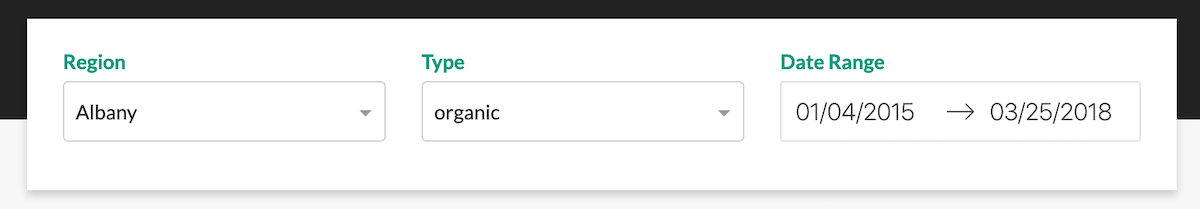
The first component in the menu is the Region dropdown. Focus on the code for that component:
html.Div(
    children=[
        html.Div(children="Region", className="menu-title"),
        dcc.Dropdown(
            id="region-filter",
            options=[
                {"label": region, "value": region}
                for region in regions
            ],
            value="Albany",
            clearable=False,
            className="dropdown",
        ),
    ]
),
Here, you define the dropdown that users will use to filter the data by region. In addition to the title, it has a dcc.Dropdown component. Here’s what each of the parameters means:
idis the identifier of this element.optionsindicates the options shown when the dropdown is selected. It expects a dictionary with labels and values.valueis the default value when the page loads.clearableallows the user to leave this field empty if set toTrue.classNameis a CSS class selector used for applying styles.
The Type and Date Range selectors follow the same structure as the Region dropdown. Feel free to review them on your own.
Next, take a look at the dcc.Graphs components:
# ...

app.layout = html.Div(
    children=[

        # ...

        html.Div(
            children=[
                html.Div(
                    children=dcc.Graph(
                        id="price-chart",
                        config={"displayModeBar": False},
                    ),
                    className="card",
                ),
                html.Div(
                    children=dcc.Graph(
                        id="volume-chart",
                        config={"displayModeBar": False},
                    ),
                    className="card",
                ),
            ],
            className="wrapper",
        ),
    ]
)

# ...
In this part of the code, you define the dcc.Graph components. You may have noticed that, compared to the previous version of the dashboard, the components are missing the figure argument. That’s because a callback function will now generate the figure argument using the inputs that the user sets using the Region, Type, and Date Range selectors.
How to Define Callbacks
You’ve defined how the user will interact with your application. Now you need to make your application react to user interactions. For that, you’ll use callback functions.
Dash’s callback functions are regular Python functions with an app.callback decorator. In Dash, when an input changes, a callback function is triggered. The function performs some predetermined operations, like filtering a dataset, and returns an output to the application. In essence, callbacks link inputs and outputs in your app.
Here’s the callback function that’s used for updating the graphs:
# ..

@app.callback(
    Output("price-chart", "figure"),
    Output("volume-chart", "figure"),
    Input("region-filter", "value"),
    Input("type-filter", "value"),
    Input("date-range", "start_date"),
    Input("date-range", "end_date"),
)
def update_charts(region, avocado_type, start_date, end_date):
    filtered_data = data.query(
        "region == @region and type == @avocado_type"
        " and Date >= @start_date and Date <= @end_date"
    )
    price_chart_figure = {
        "data": [
            {
                "x": filtered_data["Date"],
                "y": filtered_data["AveragePrice"],
                "type": "lines",
                "hovertemplate": "$%{y:.2f}<extra></extra>",
            },
        ],
        "layout": {
            "title": {
                "text": "Average Price of Avocados",
                "x": 0.05,
                "xanchor": "left",
            },
            "xaxis": {"fixedrange": True},
            "yaxis": {"tickprefix": "$", "fixedrange": True},
            "colorway": ["#17B897"],
        },
    }

    volume_chart_figure = {
        "data": [
            {
                "x": filtered_data["Date"],
                "y": filtered_data["Total Volume"],
                "type": "lines",
            },
        ],
        "layout": {
            "title": {"text": "Avocados Sold", "x": 0.05, "xanchor": "left"},
            "xaxis": {"fixedrange": True},
            "yaxis": {"fixedrange": True},
            "colorway": ["#E12D39"],
        },
    }
    return price_chart_figure, volume_chart_figure

# ...
On lines 6 to 11, you define the inputs and outputs inside the app.callback decorator.
First, you define the outputs using Output objects. They take two arguments:
- The identifier of the element that they’ll modify when the function executes
- The property of the element to be modified
For example, Output("price-chart", "figure") will update the figure property of the "price-chart" element.
Then you define the inputs using Input objects. They also take two arguments:
- The identifier of the element that they’ll be watching for changes
- The property of the watched element that they’ll be watching for changes
So, Input("region-filter", "value") will watch the "region-filter" element and its value property for changes. The argument passed on to the callback function will be the new value of region-filter.value.
Note
The Input object that you’re using here is imported directly from dash. Be careful not to confuse it with the Input component coming from dcc. These objects aren’t interchangeable, and they have different purposes.
On line 13, you define the function that’ll be applied when an input changes. It’s worth noticing that the arguments of the function will correspond with the order of the Input objects supplied to the callback. There’s no explicit relationship between the names of the arguments in the function and the values specified in the Input objects.
Finally, on lines 14 to 54, you define the body of the function. In this case, the function takes the inputs (region, type of avocado, and date range), filters the data, and generates the figure objects for the price and volume charts.
That’s all! If you’ve followed along to this point, then your dashboard should look like this:
Way to go! That’s the final version of your dashboard. In addition to making it look beautiful, you also made it interactive. The only missing step is making it public so you can share it with others.