Style Your Dash Application
Style Your Dash Application 관련

Dash provides you with a lot of flexibility to customize the look of your application. You can use your own CSS or JavaScript files, set a favicon—the small icon shown on tabs in the web browser—and embed images, among other advanced options.
Note
In this tutorial, you’ll see how to show off your own style with CSS. There are several packages on PyPI that provide styled Dash components. For example, dash-bootstrap-components are Bootstrap themed.
In this section, you’ll learn how to apply custom styles to components, and then you’ll style the dashboard that you built in the previous section.
How to Apply a Custom Style to Your Components
You can style components in two ways:
- Using the
styleargument of individual components - Providing an external CSS file
Using the style argument to customize your dashboard is straightforward. This argument takes a Python dictionary with key-value pairs consisting of the names of CSS properties and the values that you want to set.
Note
When specifying CSS properties in the style argument, you should use mixedCase syntax instead of hyphen-separated words. For example, to change the background color of an element, you should use backgroundColor and not background-color.
If you wanted to change the size and color of the H1 element in app.py, then you could set the element’s style argument as follows:
html.H1(
    children="Avocado Analytics",
    style={"fontSize": "48px", "color": "red"},
),
Here, you provide to style a dictionary with the properties and the corresponding values that you want to set. In this case, the specified style is to have a red heading with a font size of 48 pixels.
The downside of using the style argument is that it doesn’t scale well as your codebase grows. If your dashboard has multiple components that you want to look the same, then you’ll end up repeating a lot of your code. Instead, you can use a custom CSS file.
If you want to include your own local CSS or JavaScript files, then you need to create a folder called assets/ in the root directory of your project and save the files that you want to add there. By default, Dash automatically serves any file included in assets/. This will also work for adding a favicon or embedding images, as you’ll see in a bit.
Then you can use the className or id arguments of the components to adjust their styles using CSS. These arguments correspond with the class and id attributes when they’re transformed into HTML tags.
If you wanted to adjust the font size and text color of the H1 element in app.py, then you could use the className argument as follows:
html.H1(
    children="Avocado Analytics",
    className="header-title",
),
Setting the className argument will define the class attribute for the <h1> element. You could then use a CSS file in the assets folder to specify how you want it to look:
.header-title {
  font-size: 48px;
  color: red;
}
You use a class selector to format the heading in your CSS file. This selector will adjust the heading format. You could also use it with another element that needs to share the format by setting className="header-title".
Next, you’ll style your dashboard.
How to Improve the Looks of Your Dashboard
You just covered the basics of styling in Dash. Now, you’ll learn how to customize your dashboard’s looks. You’ll make these improvements:
- Add a favicon and title to the page.
- Change the font family of your dashboard.
- Use an external CSS file to style Dash components.
You’ll start by learning how to use external assets in your application. That’ll allow you to add a favicon, a custom font family, and a CSS style sheet. Then you’ll learn how to use the className argument to apply custom styles to your Dash components.
Adding External Assets to Your Application
Create a folder called assets/ in your project’s root directory. Download a favicon from the Twemoji open-source project (twitter/twemoji) and save it as favicon.ico in assets/. Finally, create a CSS file in assets/ called style.css and add the code in the collapsible section below:
body {
  font-family: "Lato", sans-serif;
  margin: 0;
  background-color: #f7f7f7;
}

.header {
  background-color: #222222;
  height: 256px;
  display: flex;
  flex-direction: column;
  justify-content: center;
}

.header-emoji {
  font-size: 48px;
  margin: 0 auto;
  text-align: center;
}

.header-title {
  color: #ffffff;
  font-size: 48px;
  font-weight: bold;
  text-align: center;
  margin: 0 auto;
}

.header-description {
  color: #cfcfcf;
  margin: 4px auto;
  text-align: center;
  max-width: 384px;
}

.wrapper {
  margin-right: auto;
  margin-left: auto;
  max-width: 1024px;
  padding-right: 10px;
  padding-left: 10px;
  margin-top: 32px;
}

.card {
  margin-bottom: 24px;
  box-shadow: 0 4px 6px 0 rgba(0, 0, 0, 0.18);
}
The assets/style.css file contains the styles that you’ll apply to components in your application’s layout. By now, your project structure should look like this:
avocado_analytics/
│
├── assets/
│   ├── favicon.ico
│   └── style.css
│
├── venv/
│
├── app.py
└── avocado.csv
Once you start the server, Dash will automatically serve the files located in assets/. You include two files, favicon.ico and style.css, in assets/. To set a default favicon, you don’t have to take any additional steps. To use the styles that you defined in style.css, you’ll need to use the className argument in Dash components.
You need to make a few changes in app.py. You’ll include an external style sheet, add a title to your dashboard, and style the components using the style.css file. Review the changes below. Then, in the last part of this section, you’ll find the full code for your updated version of app.py.
Here’s how you include an external style sheet and add a title to your dashboard:
# ...

external_stylesheets = [
    {
        "href": (
            "https://fonts.googleapis.com/css2?"
            "family=Lato:wght@400;700&display=swap"
        ),
        "rel": "stylesheet",
    },
]
app = dash.Dash(__name__, external_stylesheets=external_stylesheets)
app.title = "Avocado Analytics: Understand Your Avocados!"

# ...
In these code lines, you specify an external CSS file containing a font family, which you want to load in your application. You add external files to the head tag of your application, so they load before the body of your application loads. You use the external_stylesheets argument for adding external CSS files or external_scripts for external JavaScript files like Google Analytics.
You also set the title of your application. This is the text that appears in the title bar of your web browser, in Google’s search results, and in social media cards when you share your site.
Customizing the Styles of Components
To use the styles in style.css, you’ll need to use the className argument in Dash components. The code below adds a className with a corresponding class selector to each of the components in the header of your dashboard:
# ...

app.layout = html.Div(
    children=[
        html.Div(
            children=[
                html.P(children="🥑", className="header-emoji"),
                html.H1(
                    children="Avocado Analytics", className="header-title"
                ),
                html.P(
                    children=(
                        "Analyze the behavior of avocado prices and the number"
                        " of avocados sold in the US between 2015 and 2018"
                    ),
                    className="header-description",
                ),
            ],
            className="header",
        # ...
In the highlighted lines, you can see that you’ve made three changes to the initial version of the dashboard:
- There’s a new
<div>element that wraps all the header components. - There’s a new paragraph element with an avocado emoji, 🥑, that’ll serve as a logo on the page.
- There’s a
classNameargument in each component. These class names match a class selector instyle.css, which defines the looks of each component.
For example, the header-description class assigned to the paragraph component starting with "Analyze the behavior of avocado prices" has a corresponding selector in style.css. In that file, you’ll see the following:
.header-description {
  color: #CFCFCF;
  margin: 4px auto;
  text-align: center;
  max-width: 384px;
}
These lines define the format for the header-description class selector. They’ll change the color, margin, alignment, and maximum width of any component with className="header-description". All the components have corresponding class selectors in the CSS file.
The other significant change is in the graphs. Here’s the new code for the price chart:
# ...

app.layout = html.Div(
    children=[
        # ...

        html.Div(
            children=[
                html.Div(
                    children=dcc.Graph(
                        id="price-chart",
                        config={"displayModeBar": False},
                        figure={
                            "data": [
                                {
                                    "x": data["Date"],
                                    "y": data["AveragePrice"],
                                    "type": "lines",
                                    "hovertemplate": (
                                        "$%{y:.2f}<extra></extra>"
                                    ),
                                },
                            ],
                            "layout": {
                                "title": {
                                    "text": "Average Price of Avocados",
                                    "x": 0.05,
                                    "xanchor": "left",
                                },
                                "xaxis": {"fixedrange": True},
                                "yaxis": {
                                    "tickprefix": "$",
                                    "fixedrange": True,
                                },
                                "colorway": ["#17b897"],
                            },
                        },
                    ),
                    className="card",
                ),

                # ...

            ],
            className="wrapper",
        ),
    ]
)

# ...
In this code, you define a className and a few customizations for the config and figure parameters of your chart. Here are the changes:
- Line 14: You remove the floating toolbar that Plotly shows by default.
- Lines 21 to 23: You set the hover template so that when users hover over a data point, it shows the price in dollars. Instead of
2.5, it’ll show as$2.5. - Lines 26 to 38: You adjust the axes, the color of the figure, and the title format in the layout section of the graph.
- Lines 11 and 41: You wrap the graph in a
<div>element with a"card"class. This will give the graph a white background and add a small shadow below it. - Lines 9 and 47: You add a
<div>element that wraps the graph components with awrapperclass.
There are similar adjustments to the sales and volume charts. You can see those in the full code for the updated app.py in the collapsible section below:
import pandas as pd
from dash import Dash, dcc, html

data = (
    pd.read_csv("avocado.csv")
    .query("type == 'conventional' and region == 'Albany'")
    .assign(Date=lambda data: pd.to_datetime(data["Date"], format="%Y-%m-%d"))
    .sort_values(by="Date")
)

external_stylesheets = [
    {
        "href": (
            "https://fonts.googleapis.com/css2?"
            "family=Lato:wght@400;700&display=swap"
        ),
        "rel": "stylesheet",
    },
]
app = Dash(__name__, external_stylesheets=external_stylesheets)
app.title = "Avocado Analytics: Understand Your Avocados!"

app.layout = html.Div(
    children=[
        html.Div(
            children=[
                html.P(children="🥑", className="header-emoji"),
                html.H1(
                    children="Avocado Analytics", className="header-title"
                ),
                html.P(
                    children=(
                        "Analyze the behavior of avocado prices and the number"
                        " of avocados sold in the US between 2015 and 2018"
                    ),
                    className="header-description",
                ),
            ],
            className="header",
        ),
        html.Div(
            children=[
                html.Div(
                    children=dcc.Graph(
                        id="price-chart",
                        config={"displayModeBar": False},
                        figure={
                            "data": [
                                {
                                    "x": data["Date"],
                                    "y": data["AveragePrice"],
                                    "type": "lines",
                                    "hovertemplate": (
                                        "$%{y:.2f}<extra></extra>"
                                    ),
                                },
                            ],
                            "layout": {
                                "title": {
                                    "text": "Average Price of Avocados",
                                    "x": 0.05,
                                    "xanchor": "left",
                                },
                                "xaxis": {"fixedrange": True},
                                "yaxis": {
                                    "tickprefix": "$",
                                    "fixedrange": True,
                                },
                                "colorway": ["#17b897"],
                            },
                        },
                    ),
                    className="card",
                ),
                html.Div(
                    children=dcc.Graph(
                        id="volume-chart",
                        config={"displayModeBar": False},
                        figure={
                            "data": [
                                {
                                    "x": data["Date"],
                                    "y": data["Total Volume"],
                                    "type": "lines",
                                },
                            ],
                            "layout": {
                                "title": {
                                    "text": "Avocados Sold",
                                    "x": 0.05,
                                    "xanchor": "left",
                                },
                                "xaxis": {"fixedrange": True},
                                "yaxis": {"fixedrange": True},
                                "colorway": ["#E12D39"],
                            },
                        },
                    ),
                    className="card",
                ),
            ],
            className="wrapper",
        ),
    ]
)

if __name__ == "__main__":
    app.run_server(debug=True)
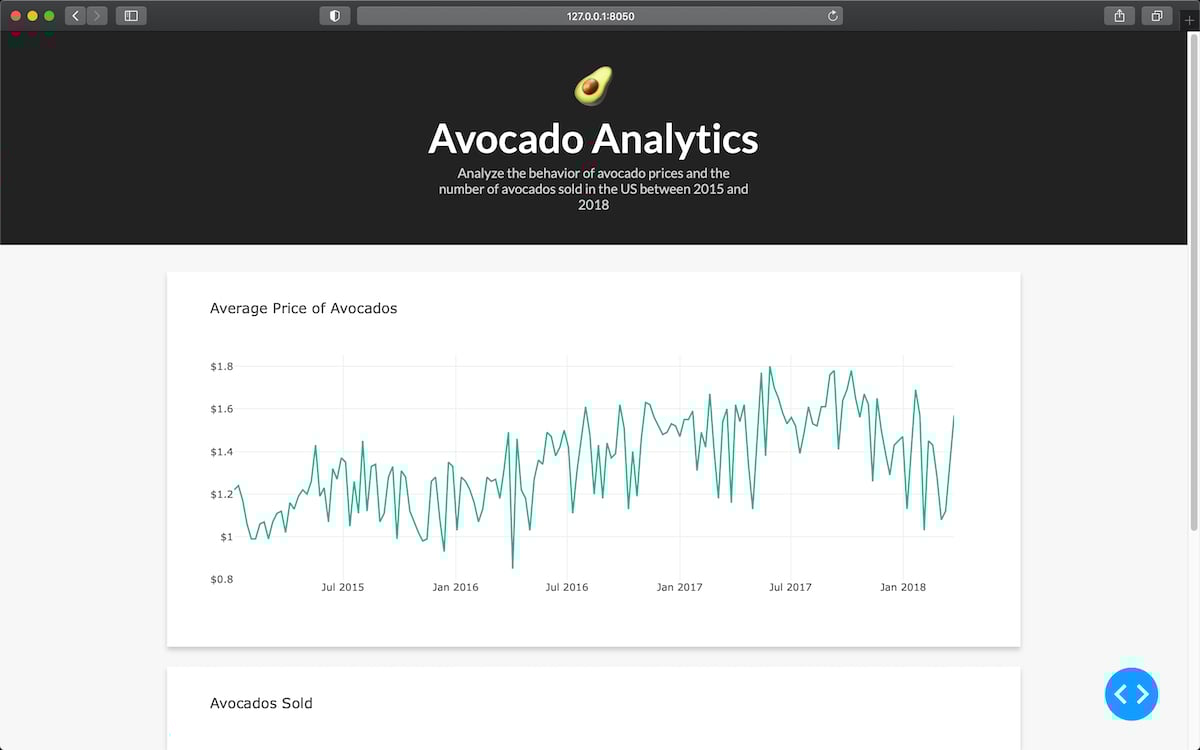
This is the updated version of app.py. It has the required changes in the code to add a favicon and a page title, update the font family, and use an external CSS file. After these changes, your dashboard should look like this:
In the next section, you’ll learn how to add interactive components to your dashboard.