How to indent the content or scroll indicators in a ScrollView
How to indent the content or scroll indicators in a ScrollView 관련
Updated for Xcode 15
New in iOS 17
By default, SwiftUI's ScrollView allows its content to fill all the available space, and the scroll indicators sit neatly on the trailing edge of the screen. However, with the contentMargins() modifier we can adjust either of these, insetting the content or the scroll indicators by any amount and on any edges.
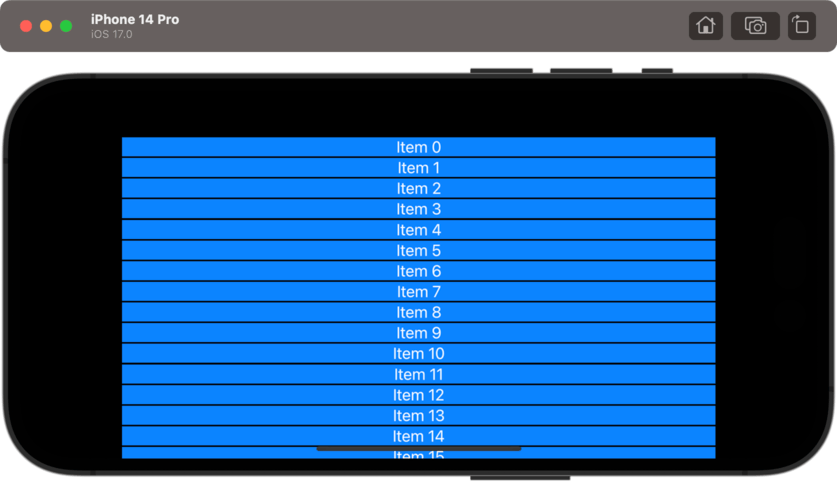
For example, this indents a scroll view's contents by 50 points on each edge, without adjusting the scroll indicators:
ScrollView {
    ForEach(0..<50) { i in
        Text("Item \(i)")
            .frame(maxWidth: .infinity)
            .foregroundStyle(.white)
            .background(.blue)
    }
}
.contentMargins(50, for: .scrollContent)

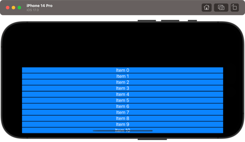
If you want only some edges, you can specify either a single value or an option set of your choosing. For example, this indents the content by 150 points on the top edge only:
ScrollView {
    ForEach(0..<50) { i in
        Text("Item \(i)")
            .frame(maxWidth: .infinity)
            .background(.blue)
            .foregroundStyle(.white)
    }
}
.contentMargins(.top, 150, for: .scrollContent)

In a similar way you can adjust the inset amount for the scroll view's indicators, either by itself or alongside adjusting the content insets.
As before you can adjust all edges at once or chose only the ones you care about, so for example this adds 100 points of margin to the top of the scroll indicator, but leaves the rest untouched:
ScrollView {
    ForEach(0..<50) { i in
        Text("Item \(i)")
            .frame(maxWidth: .infinity)
            .background(.blue)
            .foregroundStyle(.white)
    }
}
.contentMargins(.top, 100, for: .scrollIndicators)
Using content margins rather than simple padding allows your content to scroll edge to edge as the user interacts with it, while also adding a little extra space for scrolling - it's a much better optional than simple padding.