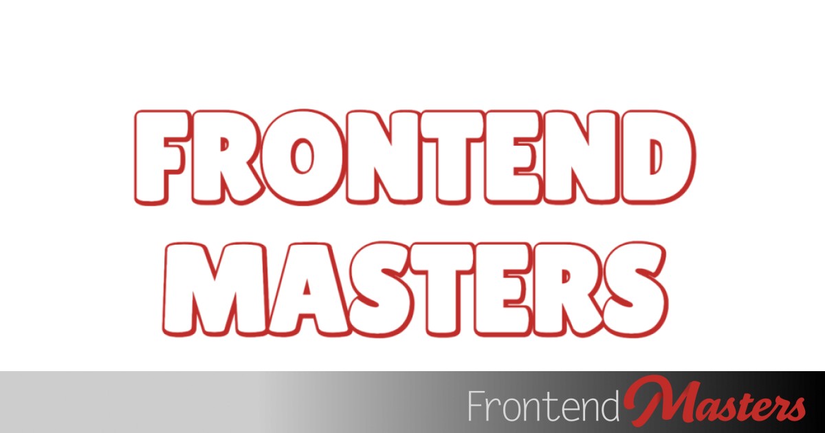
Layered Text Headers
Layered Text Headers 관련

There is a way to apply a stroke to web text across all browsers:
.stroke-text {
  -webkit-text-stroke: 5px red;
}
Despite the vendor prefix there, it works across all browsers.
But I’ve never liked it… until recently.
I’m not sure if I’ve ever spelled out exactly why, so first let me do that. Here’s a nice R from Roslindale.

Which is made up of vector points like all fonts:

In an application like Adobe Illustrator which gives me control over how a vector shape applies a stroke, if I stroke the outside it ends up looking OK as the integrity of the letterform is preserved.

It’s a bit harder to do with Roslindale “R” with the narrow passages at the top and middle of the letterform here, but we can apply stroke to the inside as well and the overall shape of the letter stays the same.

But if we apply a stroke to the “middle”, that is, straddled across the edge of the shape such that the stroke is equal on both sides, now we’ve ruined the shape of the letter and it looks like 💩.

This is even more pronounced as we deal with more text.

Middle: Inside stroke
Bottom: Center stroke 💩
Point is: center aligned stroke sucks. And guess what the only option is for -webkit-text-stroke? Center-aligned. And, equally sadly, all strokes in SVG, a bonkers omission for a vector painting specific language.
Alas there is a half decent and kinda fun workaround. The trick is essentially using paint-order (which works in CSS and SVG) to make sure that the “fill” of the element is drawn on top of the “stroke”, which effectively makes the stroke appear as if it’s outside-aligned even if it’s not actually doing that.
.stroke-text {
  paint-order: stroke fill; /* fill is on top */
  -webkit-text-stroke: 5px red;
}
With this combo we can make stroked text tolerable:
Just putting that fill on top can fix some different awkward situations. Here’s Adam Argyle showing how a text-shadow can really interfere, and then fixing it by forcing that fill layer back on top again.
Wes Bos showed this off, layering on some text-shadow stuff as well, which resulted in a great look:
I had a play as well, and I really like the combination of being able to use a text stroke safely and being able to use a text shadow for an additional effect. Here the shadow comes up on top of the text giving it an actual embossed look:
You could have a play with this one, adding more text shadows or adjusting colors or whatever to get a nice look.
Perhaps goes without saying but I’ll say it anyway: thicker typefaces are going to generally work better with this.