Reanimating the CSS Day Buttons
Reanimating the CSS Day Buttons 관련

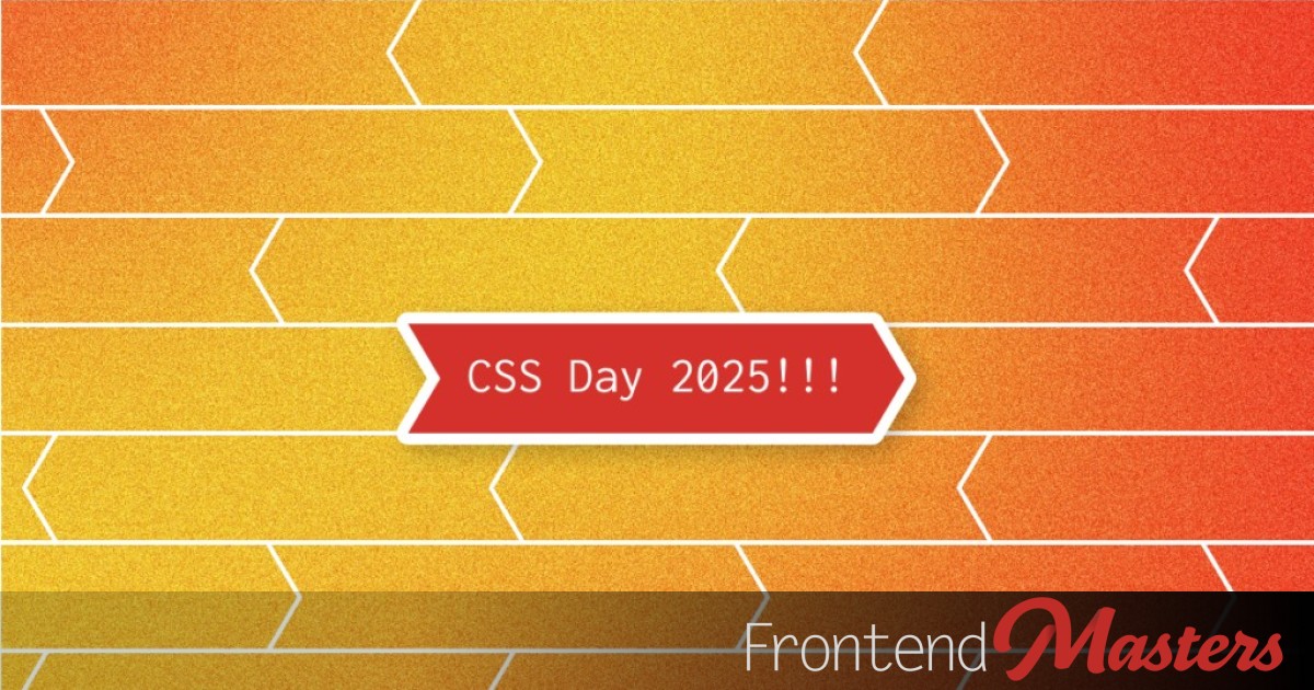
Are you as excited aboutCSS Dayas I am? While browsing the conference website, I couldn’t help but notice their big firebrick-red buttons. A website isn’t just about displaying content, it’s about creating excitement. Every interaction should feel polished and engaging, especially buttons, which are the primary way users navigate the site.
A well-animated button can capture attention, reinforce branding, and make the experience more enjoyable. In this article, we’ll take a closer look at the existing buttons and explore ways to enhance them with modern CSS techniques.
First, here is a version of the button that is currently on the website. Hover over the button to see its shape change.
Theaelement is wrapped with adivthat has a solid background color, and thehovereffect sets thediv‘s background totransparent, revealing thea‘s arrow shape, created using aclip-path. The transition between the states (the ‘fade’ of the background) creates weird looking triangles.
I think that we can improve on that by using some movement and dynamics.
Approach 1: Background Image Animations
One simple-yet-effective way to add flair to buttons is by animating abackground-image. Well, we’re not really animating the image, but we can achieve a smooth transition effect that feels dynamic by animating thebackground-positionproperty.
Here is a button that uses a linear transition on thebackground-position:
button {
  border: 2px solid firebrick;
  background: linear-gradient(120deg, white 50%, firebrick 0) 0 0/ 250% 100%;
  color: firebrick;
  padding: 0.6em 1em 0.7em;
  cursor: pointer;
  transition: all 0.5s;
  &:hover {
    background-position-x: 100%;
    color: white;
  }
}
In this example the background stretches the gradient horizontally to 2.5 times the width of the button, and the background’s position changes from0%to100%. to better understand this effect, you can use the ‘Visualize background’ checkbox.
So how do you usebackground-positionto create the arrow-shaped hover effect? We’ll actually need to layer two backgrounds and control both positions. Here’s how:
The pointed shape is created using two simpleconic-gradients, and again, the background stretches each gradient to 2.5 times the width of the button, so we can set thebackground-positionto bring the center of these conics in and out of view.
This method can actually be quite powerful and is great for many applications. And while I love using (and animating) background gradients, maybe for this specific use case it’s not the best option. So let’s try something else…
Approach 2: Clip-Path Transition
Another way to animate shapes in CSS is by using clipping, allowing us to create unique shapes and transitions. In our case, the buttons already have aclip-pathproperty, so let’s use it. We’ll set it to thehoverstate, and ‘reset’ thepolygonon idle.
button {
  display: block;
  border: none;
  background: var(--yearColour);
  color: white;
  padding: 0.6em 1em 0.7em;
  clip-path: polygon(0% 0%, 100% 0%, 100% 50%, 100% 100%, 0% 100%, 0% 50%);
  cursor: pointer;
  transition: clip-path 0.5s;
  &:hover {
    clip-path: polygon(0% 0%, 95% 0%, 100% 50%, 95% 100%, 0% 100%, 5% 50%);
  }
}
Note
Note that in order to transition the movement, the number of nodes in thepolygonshapes must be the same.
This approach already looks nice, but I think we can do better.
When working withclip-path(and clipping in general) you need to remember that the clipping is inwards, removing parts of your elements, and you can’t overflow anything outside the clipped area. If we do want to expand outward from our element, we need to first expend the element itself, and then adjust the clipping.
.button-v2 {
  display: block;
  border: none;
  background: var(--yearColour);
  color: white;
  padding: 0.6em 1.3em 0.7em;
  clip-path: polygon(2.5% 0%, 97.5% 0%, 97.5% 50%, 97.5% 100%, 2.5% 100%, 2.5% 50%);
  cursor: pointer;
  transition: clip-path 0.5s;

  &:hover {
    clip-path: polygon(0% 0%, 95% 0%, 100% 50%, 95% 100%, 0% 100%, 5% 50%);
  }
}
In the above example I’ve increased the inlinepadding, making the element wider, then adjusted the idle state of thepolygonto remove the added width. Now the clipping is not just inward, but also expands out, which not only creates a more dynamic effect but also reduces the risk of cutting into the button’s content.
Here is a live demo of the two versions, In my opinion, this second shape looks slightly better overall. Which one do you like?
Solving the Challenge of the Dotted Button
While the previous techniques work well for solid buttons, the CSS Day website also has a dotted-style button. These require a different approach, sincebackground-imageandclip-pathalone don’t handle dotted outlines effectively.
Approach 3: Pseudo-Elements and Transforms
Somehow, whenever there’s an animation or interaction that feels tricky to implement, it often turns out that pseudo-elements (e.g. ::before and ::after) are the solution. They’re like the hidden superpower of every element, allowing us to do some really cool things.
In this case, we can achieve a clean and elegant solution using pseudo-elements. The idea is pretty straightforward: ensure each pseudo-element spans the full width of the button and half the height. We place one element at the top of the button and the second at the bottom. Then, on hover, we apply a skew transformation to the elements. Simple enough? Here’s a live demo:
Let’s break down what we added:
- We applied
position: relative;to the button as we’re going to position the pseudo-elements usingposition: absolute. - For the pseudo-elements, we started with shared styling: positioning, size, color,
z-index, and of course, atransitionso everything moves smoothly. - The
::beforepseudo-element is placed attop: 0;to serve as the background for the top half of the button, and the::afterpseudo-element is positioned atbottom: 0;to cover the bottom half. - We added a
transformwith a simpleskewfunction along the X-axis, and usedcalcto adjust the direction of the skew in the::afterelement so the skew effects are applied in two different directions. - The last thing we added is a
hoverstate that defines the desired skew angle, transforming the button into an arrow shape.
So how do pseudo-elements help us solve the dotted button challenge? It’s simple: all we need to do is change the text color of the button and the background color of the pseudo-elements, then apply a dotted border. The key is to ensure that the::beforehas a border on the sides and top, while the::aftergets a border on the sides and bottom.
.button.dotted {
  color: firebrick;

  &::before, &::after {
    background-color: white;
    border: dotted firebrick;
  }
  &::before {
    border-width: 2px 2px 0;
  }
  &::after {
    border-width: 0 2px 2px;
  }
}
That’s it. I’ve also added a version that changes the button color after the shape shifts on hover. Here are live examples of both versions:
Wrapping Up
We’ve reanimated the CSS Day 2025 buttons by experimenting with different CSS techniques:
- Background-image animationsfor smooth gradient transitions.
- Clip-path effectsfor unique button shapes.
- Pseudo-elementsto create a dynamic dotted button effect.
Each approach offers distinct advantages (and some drawbacks), and it’s important to familiarize ourselves with various animation options so that we can choose the most suitable one for each case based on the design needs, the desired effect, and the button’s context
Want to take this further? Try incorporating CSS Variables for more flexibility or mixing in@keyframesfor even more animation control. Happy coding!