Numbers That Fall (Scroll-Driven Animations & Sibling Index)
Numbers That Fall (Scroll-Driven Animations & Sibling Index) 관련

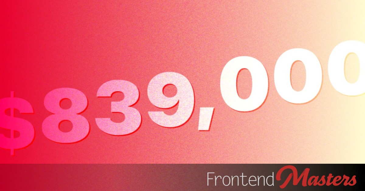
Maybe you noticed the big number at the bottom of the current design of this site? As I write, that number is $839,000 and it’s just a reminder of how Frontend Masters gives back to the open source community. I did that design so I figured I’d write down how it works here.
Figuring out the Scroll-Driven Animation
It’s helpful to just stop and think about how you want the animation to behave in regard to scrolling. In this case, I’d like the numbers do be done animating shortly after they arrive on the page from the bottom. This means they will be visible/readable most of the time, which feels appropriate for text especially.
With this in mind, I recommend heading to Bramus Van Damme’s tool View Progress Timeline: Ranges and Animation Progress Visualizer. This tool is extremely useful to play around with to understand the different possibilities with different sizes of content. After various playing, I found a good match of animation-range-start and animation-range-end values for what I had in mind.
In the video above, we’re seeing a “fly in” animation. But that animation doesn’t matter. It’s just showing us the time range that will be relevant to whatever animation we choose to apply. Our numbers are going to “fall in”, and we’ll get to that soon.
Split the Numbers Up
We’ll put each number in a <span> so we can animate them individually. But we’ll make the accessible text for that component read properly with an aria-label attribute:
<div class="dollar-amount" aria-label="$839,000">
  <span class="dollar-sign">$</span>
  <span>8</span>
  <span>3</span>
  <span>9</span>
  <span>,</span>
  <span>0</span>
  <span>0</span>
  <span>0</span>
</div>
Animate Each Span
Each one of the numbers will have the same animation:
.dollar-amount {
  ...

  > span {
    display: inline-block;
    animation: scroll-in linear both;
    animation-timeline: view();
    animation-range: cover 0% entry-crossing 120%;
  }
}
The animation we’ve named there scroll-in might look like this:
@keyframes scroll-in {
  from {
    scale: 1.33;
    opacity: 0;
    translate: 0 -50px
  }
}
That will make each letter “fall” from 50px above down to it’s natural position, while also fading in and starting bigger and ending up it’s intrinsic size.
But, they will all do that the exact same way. We want staggering!
Staggering in a Scroll-Driven World
Usually animation staggering uses transition-delay or animation-delay on individual “nth” elements. Something like:
.dollar-amount {
  span:nth-child(1) { animation-delay: 0.1s; }
  span:nth-child(2) { animation-delay: 0.2s; }
  span:nth-child(3) { animation-delay: 0.3s; }
  ...
}
But that’s not going to work for us here. Delay in a scroll-driven animation doesn’t mean anything. I don’t think anyway?! I tried the above and it didn’t do anything.
Fortunately, the effect I was going for was a bit different anyway. I wanted the numbers to have a staggered fall in effect (see video above) where subsequent numbers almost look like they are falling from a different height and yet all arrive at the same time. So I could handle that like…
.dollar-amount {
  span:nth-child(1) { translate: 0 -20px; }
  span:nth-child(2) { translate: 0 -40px; }
  span:nth-child(3) { translate: 0 -60px; }
  ...
}
But, if we’re being really future-looking, we can handle it 1) within the @keyframes 2) in one line.
@keyframes scroll-in {
  from {
    scale: 1.33;
    opacity: 0;
    translate:
      /* x */ calc(sibling-index() * 4px)
      /* y */ calc(sibling-index() * -20px);
  }
}
The sibling-index() function is perfect for staggering of any kind. It’ll return 1 for what would be :nth-child(1), 2 for what would be :nth-child(2), etc. Then we can use that integer in a calculation or delay.
Demo
That should do it!
(Note this will only work in Chrome’n’friends due to the sibling-index() usage. I’ll leave it as an exercise for the reader to write a fallback that supports a deeper set of browsers.)
The part that feels the weirdest to me are the “magic number”y values as part of the animation-range. But I guess they are about as magic as font-size or the like. They are values that describe the animation that works best for you, even if they are a little hard to immediately visualize.