Scroll-Driven Letter Grid
Scroll-Driven Letter Grid 관련

I was thinking about variable fonts the other day, and how many of them that deal with a variable axis for their weight go from 100 to 900. It varies — so you can always check wakamaifondue.com if you have the font file. Jost on Google Fonts is a classic example. Load that sucker up and you can use whatever weight you want.
I was also thinking about the “simple” kind of scroll-driven animations where all it does is move a @keyframe animation from 0% to 100% while a scrolling element goes from 0% to 100% “scrolled”. Fair warning that browser support isn’t great, but it’s just a fun thing that can easily just not happen.
It’s deliciously simple to use:
We can smash these things together. We should be able to map 0%-100% to 100-900 pretty easily, right?
Right.
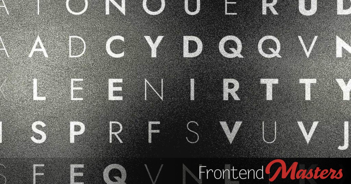
Let’s made a grid of 100 letters inside a <div id="grid">. We could use any kind of HTML generating technology. Let’s just vanilla JavaScript here.
function generateGrid() {
  const grid = document.getElementById("grid");
  grid.innerHTML = "";

  for (let i = 0; i < 100; i++) {
    const div = document.createElement("div");
    div.textContent = getRandomLetter();
    grid.appendChild(div);
  }
}

generateGrid();
The lay it out as a 10✕10:
#grid {
  display: grid;
  grid-template-columns: repeat(10, 1fr);
}
We can chew through that grid in Sass applying random weights:
@for $i from 1 through 100 {
  #grid :nth-child(#{$i}) {
    font-weight: 100 + math.ceil(random() * 800);
  }
}
Looks like this.
But scroll up and down that preview!
I attached a scroll timeline to the document like:
html {
  scroll-timeline: --page-scroll block;
}
Then use that timeline to call an animation like:
#grid {
  > div {
    animation: to-thin auto linear;
    animation-timeline: --page-scroll;
  }
}
That animation is named to-thin, but actually I made three different animations: to-thick, to-thin, and to-mid, then applied them in rotation to all the letters, so any given letter does something a bit different.
@keyframes to-thick {
  50% {
    font-weight: 900;
  }
}
@keyframes to-thin {
  50% {
    font-weight: 100;
  }
}
@keyframes to-mid {
  50% {
    font-weight: 450;
  }
}
See how I used 50% keyframes there which is a nice trick to animate to that value half way through the animation, then back.
It then occurred to me I could make a secret message. So I make a @mixin that would override certain letters in CSS to make the message. It still randomized the weight, but all the letters animate to thin while the secret message animates to thick, revealing it as you scroll down.
Anyway this is sometimes how I spend my free time and it’s completely normal.