Modern CSS Round-Out Tabs
Modern CSS Round-Out Tabs 관련

Quite a while back I made a set of “round out” tabs, where the literal tab part of the UI would connect to the content below with a rounded edge that flared out as it connected. A bit tricky of a situation, even now!
That old school solution used four additional elements per tab. Two to place a square on the bottom edges of the tab, and then larger circles to hide everything but the flared part.

Here’s that (again: old!) demo:
Let’s Use shape() Instead
I’m so hyped on shape(). It’s an amazing addition to CSS, giving us a primitive that can draw, well, anything you could draw with a pen tool.
In our case we’re going to use the shape() primitive with clip-path to carve a tab shape out of a rectangle. No extra elements!
.tab {
  clip-path: shape(
    /* do commands to cut out a tab shape */
  );
}
The shape() function takes all these commands to do the drawing. Depending on how complex a thing you are trying to do, the syntax is fairly human-readable.
Let’s slowly walk through hand-building this tab shape. It’ll be extra cool because:
- It’s not completely fixed shape. Parts of it can be fixed coordinates, and other parts can be flexible. You’ll see, it’s awesome.
- We can variablize it, meaning we can adjust the look on the fly.
1. Starting Out!
Elements start out as rectangles. Ours are going to be horizontally longer rectangles just by virtue of them having text in them pushing them that direction. Then a bit of padding pushing those inline edges more than the block side edges.
.tab {
  display: inline-block; /* So <a> will take padding */
  padding: 0.5rem 2rem;
  white-space: nowrap; /* a wrapped tab will look silly */

  clip-path: shape(
    from bottom left,
  );
}
We wanna start carving away at this tab with clip-path from the bottom left corner, so here we go.

2. The First Curve!
Right away we need to curve into the tab shape. This is beautiful right away, as this is the “round out” part that is hard to pull off. Ain’t no border-shape can really help us here, we’re fancy people.

.tab {
  ...
  clip-path: shape(
    from bottom left,
    curve to 10px calc(100% - 10px) with 10px 100%,
  );
}
3. Straight up!
We could use syntax (line) here saying “draw a straight line to these new coordinates”, but I think it’s more satisfying here to use syntax (vline) saying “whatever horizontal coordinate you’re at doesn’t matter, just draw to this new vertical coordinate”.

.tab {
  ...
  clip-path: shape(
    from bottom left,
    curve to 10px calc(100% - 10px) with 10px 100%,
    vline to 10px
  );
}
4. Curve to the Top!
We’ll use the same curve command here as the first curve, where we specify where we’re going and a point the curve should use to sorta pull toward.
Honestly I tried using arc commands here first (like arc to 20px 10px of 20%) but by default the arc curved “the wrong way” making a bite shape and I didn’t really get what 20% meant. I’m absolutely sure it’s possible and maybe a smidge easier, I just thought curve made more sense to me.

.tab {
  ...
  clip-path: shape(
    from bottom left,
    curve to 10px calc(100% - 10px) with 10px 100%,
    vline to 10px,
    curve to 20px 0 with 10px 0,
  );
}
5. Moving to the Other Side!
This is my favorite point on the whole shape.
Again instead of specifying an exact coordinate, we’re just saying draw horizontally from wherever you are to 20px away from the right edge.

We don’t know how far away the last point and this new point are away from each other. They could be 200px away, 117.23px away, 0px away, the line could even draw to the left because the element is so narrow. That’s good. We’re drawing a shape here with points that are a combination of fixed positions (e.g. 10px from the top!) and flexible positions (20px away from whatever the right edge is!).
.tab {
  ...
  clip-path: shape(
    from bottom left,
    curve to 10px calc(100% - 10px) with 10px 100%,
    vline to 10px,
    curve to 20px 0 with 10px 0,
    hline to calc(100% - 20px),
  );
}
6. Draw the Rest of the Owl
From here, I think you get the point. We’re going to:
- Curve back downward.
- Draw the vertical line.
- Curve to complete the round-out.
We don’t need to draw a line back to the start of the shape. That’s just implied magically.

.tab {
  ...
  clip-path: shape(
    from bottom left,
    curve to 10px calc(100% - 10px) with 10px 100%,
    vline to 10px,
    curve to 20px 0 with 10px 0,
    hline to calc(100% - 20px),
    curve to calc(100% - 10px) 10px with calc(100% - 10px) 0,
    vline to calc(100% - 10px),
    curve to 100% 100% with calc(100% - 10px) 100%
  );
}
That complete’s our shape! The white areas here are what is “cut away” leaving the yellow area (just for visualization):

The padding we’ve set in the inline direction (2rem) is plenty to survive from being clipped away, as we’re only clipping ~10px away.
Variablizing Things
Hmmmmmmm.
Notice we used 10px and awful lot in our shape(). We used a couple of 20px values too, and the intention was clearly “twice as much as that other value”. So we could get away with setting a custom property to 10px and using that repetitively.
.tab {
  --tabGirth: 12px;

  clip-path: shape(
    from bottom left,
    curve to var(--tabGirth) calc(100% - var(--tabGirth)) with
      var(--tabGirth) 100%,
    vline to var(--tabGirth),
    curve to calc(var(--tabGirth) * 2) 0 with var(--tabGirth) 0,
    hline to calc(100% - calc(var(--tabGirth) * 2)),
    curve to calc(100% - var(--tabGirth)) var(--tabGirth) with
      calc(100% - var(--tabGirth)) 0,
    vline to calc(100% - var(--tabGirth)),
    curve to 100% 100% with calc(100% - var(--tabGirth)) 100%
  );
}
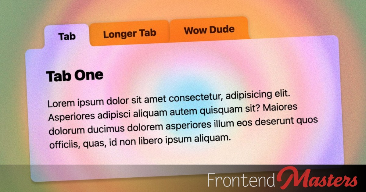
The Modern Demo
I added a few doo-dads to the final demo. The hover and active states push the tabs down a little with translate, for instance. That’s nothing to write home about, but then I wanted to rudimentary overflow: auto behavior so the non-wrapping tabs didn’t blow out horizontally, and it led to this:

The horizontal scrollbar is what I wanted, but the vertical scrollbar is like: no.
So I enjoyed the fact that can now (sorta) do single-directional overflow control:
/*
  Allow horizontal scrollbars, but
  hide vertical overflow
*/
overflow-inline: auto;
overflow-block: clip;
I also used yairEO/knobs to give a UI control to the CSS variable --tabGirth so you can see how the tabs look with different values. The more girth almost the smaller the tabs look, because we need to “cut away” more of the tab.
There is a smidge of other trickery in there like getting shadows via filter on a parent element, that even work with the clip-path.
Fallbacks
Not every browser supports shape() at the time of this writing (there is even sub-support issues of syntax features).
But that doesn’t mean we have to deliver them entirely rectangular tabs. A @supports test allows us to deliver a fallback just fine. We just need to pass in a valid shape syntax (you can’t just do shape()).
.tab {
  ...

  @supports not (clip-path: shape(from top left, hline to 0)) {
    /* less padding needed inline */
    padding-inline: 1rem;

    /* top rounding */
    border-start-start-radius: var(--tabGirth);
    border-start-end-radius: var(--tabGirth);
  }
}
Accessibility of Tabs
The tabs are built from anchor links that jump-link to the related content. When JavaScript is active, they get what I think are the correct roles and aria-* attributes. The aria-attributes are updated when I think is the appropriate time to the appropriate values.
But I’m sure this isn’t fully correct. Just having anchor links here means the arrow keys to change tabs don’t work, which I think is a general requirement of tabs. So anyway this is mostly about the design of the tabs and you’d be better off consulting elsewhere for perfectly accessible implementations of the behavior.
Other Examples
I looked around at a number of older examples and a lot of them involve pseudo or extra elements and have aged like milk. Despite the modern browser support requirements here, I expect the above will age much better, as will these more modern takes below: