Drawing CSS Shapes using corner-shape
Drawing CSS Shapes using corner-shape 관련

We recently got the newshape()function forclip-pathwhich is a game changer for creating CSS shape. Another cool feature is on the way and will soon be available: corner-shape.
I will not call it “new” because it’s something that has been around for quite a while and you can find countless GitHub discussions around it. There is evenan 11-year old Github Repo made by Lea Verou (LeaVerou/corner-shape)with an interactive demo showing a few examples! After all that time, It finally hasits own specificationand is ready to be implemented and shipped.
Note
At the time of writing, corner-shape is available in Chrome v139 or 136+ with the experimental web features flag turned on, but no other browsers yet.
What is corner-shape?
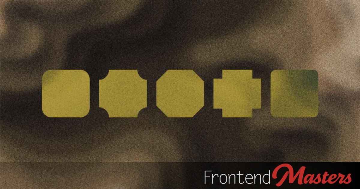
When you define aborder-radiusyou will get rounded corners.corner-shapeallows you to change those rounded corners to something else. It’s in the name; it changes the “shape” of the “corner”.

The value roundis the default (the classic rounded corners). As you can see above, we have many cool variations. All of this with a simple syntax:
.corner {
  border-radius: 30px;
  corner-shape: round | scoop | bevel | notch | squircle;
}
We can also use thesuperellipse(K)value that can define all the different variations and more by adjusting theKvariable. I will not detail that part as it’s not important for the article but it’s good to know so I invite you to checkthe (draft) specificationfor more detail.

Let’s Draw Shapes
Changing the corner shape is good — but how can we draw shapes? The answer is to play withborder-radius. Follow along to see all the magic we can do withcorner-shape!
Rhombus & Octagon
If you look closely at the example using thebevelvalue, you will see that we have 8 sides since the corners are diagonal straight lines so we almost have an octagon shape. We simply need to find the exact value forborder-radiusthat gives us 8 equal sides.

I will skip the boring math and give you the final value which is:
border-radius: calc(100%/(2 + sqrt(2)));
Even without being precise, you can approximate the value using trial & error. You will get an octagon when you are close to29%. The usage of percentage is important because it means the shape is responsive and let’s not forgetaspect-ratio: 1as well.
.octagon {
  border-radius: calc(100%/(2 + sqrt(2)));
  corner-shape: bevel;
  aspect-ratio: 1;
}
Now what if we keep increasing the radius? We get a Rhombus shape at50%.

.rhombus {
  border-radius: 50%;
  corner-shape: bevel;
  aspect-ratio: 1;
}
Some of you might ask if this method is better than what we already have. Inmy shape collection, you can easily find the code of the above shapes made usingclip-pathso why another method?
First of all, the syntax is a bit easier than theclip-pathone so this can improve the readability of the code as we have fewer values to deal with. But the most important advantage is that we can add a border to the shape! Adding borders to custom shapes is always a nightmare butcorner-shapemade it easy.
This is logical since, by default, when we addborder-radius, the border and other decorations such asbox-shadowwill follow the rounded corners. It’s still the case even if we change the shape of the corner.

Here are the rhombus and octagon shapes with borders:
Note how we can have a border-only version if we keep the background transparent and we can also apply the shape to an image as well. Cool, right?
Hexagon
Do you see how can we achieve a hexagon shape? Try to think about it before reading my explanation.
The trick is to rely on the fact thatborder-radiusaccepts vertical and horizontal values, something we always forget about. Let’s take the rhombus shape and decrease the vertical or the horizontal radius.

Do you see that? We have an “almost” hexagon shape. All that is missing is the correct aspect-ratio.
.hexagon {
  border-radius: 50% / 25%; /* OR 25% / 50% */
  corner-shape: bevel;
  aspect-ratio: cos(30deg); /* OR 1/cos(30deg) */
}
We can definitely say that we have the easiest and simplest way to create hexagon shapes!
Triangles
Following the same logic we can create most of the common shapes and triangles aren’t an exception. Again, we can use the Rhombus as a starting point and adjust either the horizontal or the vertical radius like below.

This one can be a bit tricky at first glance because we don’t have the 4 diagonal lines for each corner like the previous shapes but don’t forget that we can use0withborder-radiuswhich will disable the corresponding corner.
.triangle {
  border-radius: 50% / 100% 100% 0 0;
  corner-shape: bevel;
}
From there, we can easily get any kind of triangle by trying the different radius combinations and also playing withaspect-ratio.
Below is a demo with many examples. Try to create some of them before checking my code. It’s the perfect exercise to practice with corner-shape.
The only caveat with triangle shapes is that the border is not perfect. It may sound like a bug but it’s not. I won’t detail the logic behind this but if you want to add a border, you may need a different thickness for one or many sides.
Here is an example with one of the triangle shapes where I am increasing the thickness of the top border a little to have a perfect-looking shape.
As you can see in the code, there is a math formula to get the correct thickness but since it will be a different formula for each triangle shape, I won’t bother you with a boring explanation. Plus you can easily (and rapidly) get a good result with some trial & error. No need to be very precise.
Slanted edge
All the shapes we created rely on percentage values butborder-radiusaccepts length as well, which means we can have elements with variable size but the shape remains static.
Example with a slanted edge where the slant keeps the same size whatever the element width:
The code is a simple as:
.slanted {
  border-top-right-radius: 80px 100%;
  corner-shape: bevel;
}
No need for the shorthand property in this case since only the top-right corner matters. As for the value, I think it’s self-explanatory. Simply notice that there is no/to separate the horizontal and vertical radius when using the longhand properties.
Arrow-like box
Using the same logic we can have an arrow-like box:
.arrow {
  border-radius: 80px / 0 50% 50% 0;
  corner-shape: bevel;
}
Trapezoid & Parallelogram
Also trapezoid & parallelogram shapes:
.trapezoid {
  border-radius: 80px / 100% 0 100% 0;
  corner-shape: bevel;
}
.parallelogram {
  border-radius: 80px / 100% 100% 0 0;
  corner-shape: bevel;
}
Conclusion
Using only thebeveloption ofcorner-shapewe were able to create a lot of different shapes easily. All we had to do was to play withborder-radius, a well-known property. Not to mention the fact that we can easily add borders and box shadows which is a real game changer compared to shapes created usingclip-pathormask.
I will end the article with a last demo where I combinebevelandnotchto create an arrow. Yes, you can have a different shape per corner!
What about you? Can you think about a cool shape usingcorner-shape?