Chilled Out Text Underlines
Chilled Out Text Underlines 관련

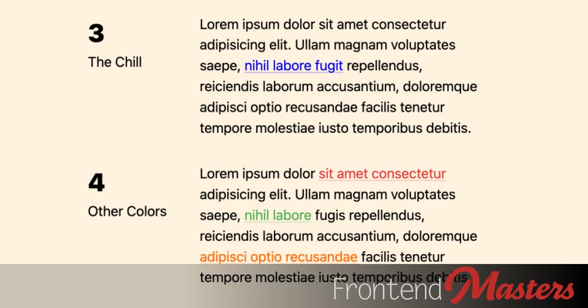
I sometimes struggle with what the perfect look for a link within body text should look like. It needs to be clearly a link, but also not styled so intensely it distracts from reading a paragraph. I generally like the idea that links are blue and underlined, as that’s as close to a default familiar look as we have for links, but I’m flexible. Links that are a “brand” color and distinct from the text color seem fine to me, particularly if also underlined.
Here’s how links look with entirely default styles:

Me, I think that look is a bit intense. I think it can be improved by keeping the spirit of what is going on there but chilling it out a bit.
Nudge the Underline Away
I think the characters are a bit more legible if we move that underline away a little. Let’s make the font system-ui and kick that underline away a smidge:
a {
  text-underline-offset: 2px;
}

I think that’s broadly better, regardless of font-family, line-height, etc.
Add Opacity to the Underline
This is the part that chills the link style out the most, while still reading strongly as a link. We’ve got text-decoration-color to use for this, which we can just apply a chilled out color directly. But we can be a bit smarter!
- Rather than setting a 2nd static color, let’s leverage the
currentColor. That way it’s not yet-another-color we have to manage. - Let’s use this alteration for our
:hoverand:focusstyles, which can be another hard choice!
The relative color syntax would be cool here, but full cross-browser support is a smidge away on that yet, so let’s use the better-supported color-mix() instead.
For a smidge of extra trickery we’ll only apply the opacity underline when the link is “not” hovered or focused, meaning when it is that will be removed:
a:not(:is(:hover, :focus)) {
  text-decoration-color:
    color-mix(in srgb, currentColor, transparent 75%);
}

Color Away!
By using currentColor it means that whatever color the links are, we get this chilled out style that comes along for the ride no matter what.

Possibly a decent candidate for a default stylesheet.
Is all this accessible? My guess is that as long as the color of the link has enough contrast against the background, and the keyboard focus styles are strong, it’s fine. But if I’m wrong feel free to correct me here.