Anchored Menus and a Lesson in Scoping
Anchored Menus and a Lesson in Scoping 관련

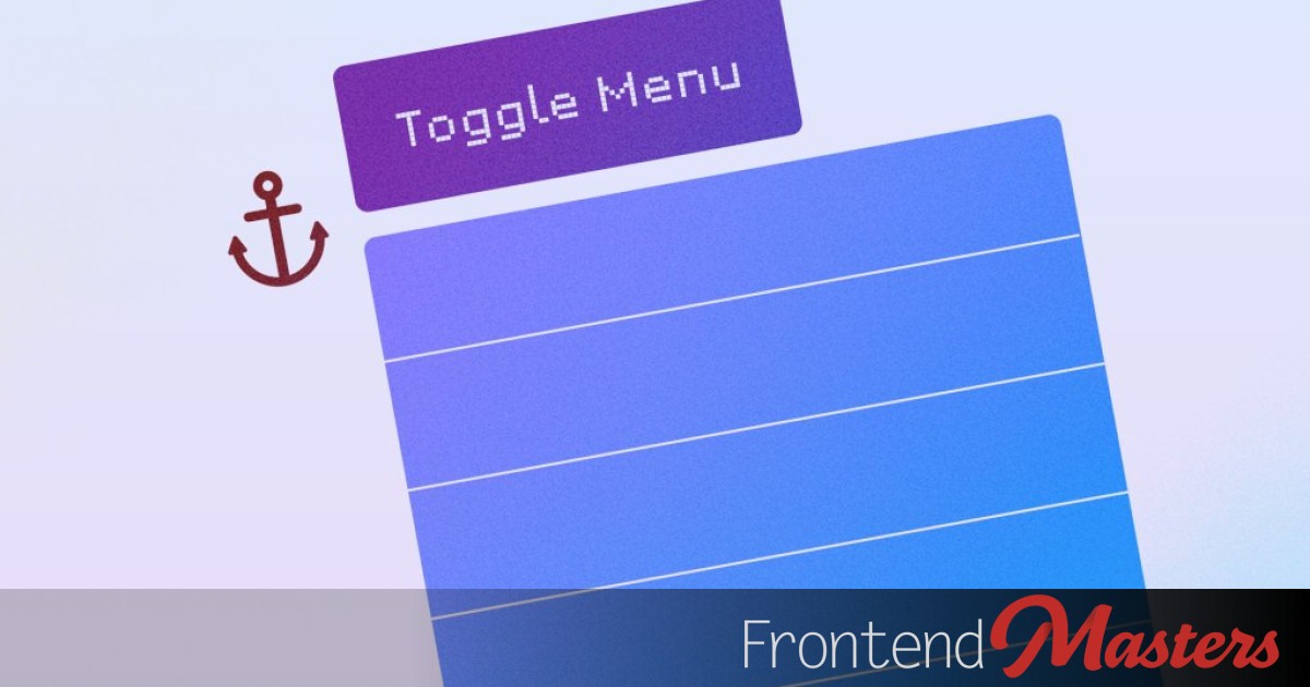
I had this (bad) idea.
It’s related to popovers and anchor-positioned menus. I love this pairing: with only HTML and CSS we can make a button that opens/closes anything we want. A tooltip or a menu is a wonderful use-case.
This isn’t a terribly difficult thing to do, but, you have to remember a bunch of stuff and put certain unique values on certain elements exactly.
- Remember the right
commandattribute value on the button - Put a unique
idon the menu. - Match up the
commandforattribute on the button to that id. - Make sure the button has an unique
anchor-name. - Match up the
position-anchoron the menu to that unique name. - Make sure you’re using good anchor positioning fallbacks.
<button
  commandfor="menu-12345"
  command="toggle-popover"
  style="anchor-name: --menu-button-12345;"
>
  Toggle Menu
</button>

<menu
  id="menu-12345"
  style="position-anchor: --menu-button-12345"
>
  Menu
</menu>
That feels like kind of a lot to remember and get right.
Here’s my (bad) idea: make a quick <web-component> that does those things. On the surface, maybe that makes sense. It did to me. But the ridiculous part is that now it introduces JavaScript into things in a place we didn’t need JavaScript before, which makes it more fragile (and potentially render later) than it would without.
So I’m not advocating for use here, but I did learn some things along the way that I found interesting and worth sharing.
Light DOM Web Component
I called it <a-menu> just to be short and slightly cheeky.
import { LitElement, html, css } from 'lit';
import { customElement, property } from 'lit/decorators.js';

@customElement('a-menu')
export class AMenu extends LitElement {
  @property({ attribute: 'button-name' }) buttonName = 'Menu';

  private menuId = `menu-${Math.random().toString(36).substr(2, 9)}`;

  // Disable the Shadow DOM
  createRenderRoot() {
    return this;
  }

  firstUpdated() {
    const menu = this.querySelector('menu');
    if (menu) {
      menu.setAttribute('popover', 'auto');
      menu.id = this.menuId;
    }
  }

  render() {
    return html` <style>
        a-menu {
          display: inline-block;

          button {
            position-anchor: --menu-button-${menuId};
          }

          menu {
            position-anchor: --menu-button-${menuId};
            position-area: block-end span-inline-start;
            position-try: flip-block, flip-inline, flip-block flip-inline;
            inset: unset;
            margin: 0;
          }
        }
      </style>
      <button
        commandfor="${this.menuId}"
        command="toggle-popover"
      > ${this.buttonName} </button>
    `;
  }
}`
Then usage is as simple as this:
<a-menu button-name="My Menu">
  <menu>
    <li><button>Edit</button></li>
    <li><button>Delete</button></li>
    <li><button>Share</button></li>
  </menu>
</a-menu>
Notice we don’t need to:
- Remember a unique ID on the menu.
- Remember the popover commands.
- Remember to attach an
anchor-nameorposition-anchorto put the menu next to the button.
… but now we have a problem
Even though we’re putting a unique ID on the menu and using unique custom idents on the anchors, the first menu will open in the position of the last button. Why? Because we’re using the Light DOM here, and the last generic a-menu menu {} selector will override the first one, making all buttons/menus use the values of the last one.
Problem Demo
Using @scope
It occured to me that a potential fix here is the newfangled @scope in CSS. If we updated the style block to be this instead:
@scope {
  :scope {
    display: inline-block;

    button {
      anchor-name: --menu-button-${this.menuId};
    }

    menu {
      position-anchor: --menu-button-${this.menuId};
      position-area: block-end span-inline-start;
      position-try: flip-block, flip-inline, flip-block flip-inline;
      inset: unset;
      margin: 0;
      border: 0;
      padding: 0.5rem;
      background: light-dark(white, black);
      border-radius: 4px;
      box-shadow: 0 10px 10px lch(0% 0 0 / 0.2);
    }
  }
}
This fixes the problem because each <style> block only applies directly to the <a-menu> web component it lives inside of.
Kind of a nice little use case for @scope. But…
Using anchor-scope (instead)
It turns out there is an even cleaner fix for this, because anchor positioning actually has its own version of scoping just for it. It’s called anchor-scope.
Rather than scoping everything, as well as requiring a unique custom ident for the anchor, we can tell the root web component to scope that custom ident to itself. Meaning that anything internally that is looking for that custom ident should look in this little neck-of-the-DOM-woods and no further.
a-menu {
  anchor-scope: --menu-button;
  display: inline-block;

  button {
    anchor-name: --menu-button;
  }

  menu {
    position-anchor: --menu-button;
    position-area: block-end span-inline-start;
    position-try: flip-block, flip-inline, flip-block flip-inline;
    inset: unset;
    margin: 0;
    border: 0;
    padding: 0.5rem;
    background: light-dark(white, black);
    border-radius: 4px;
    box-shadow: 0 10px 10px lch(0% 0 0 / 0.2);
  }
}
Now it doesn’t matter if multiple elements are all using the same custom ident for an anchor because they are all scoped to their own parents.
Bonus: Implied Anchors
I learned another thing recently that helps just a smidge here too. That position-anchor we’re putting on the menu? It’s simply not needed. Because our <button> opens our <menu> with those popover commands, which match the id and commandfor, the <menu> has an “implied anchor” of the <button>. That’s amazing to me. You don’t normally see it because popovers have margin: auto; on them in the UA stylesheet which centers them on the screen and kinda overrides the anchor. But as soon as that is removed, like we’re doing with margin: 0;, it “just works”.
I’m totally adding this to my reset stylesheet. (And I like how Manuel is down with the perfect fallbacks for anchors, position-try-fallbacks: flip-block, flip-inline, flip-block flip-inline;, which we also came to here.)
Conclusion
Again, this isn’t a smart web component to actually use because we’ve moved a very nice HTML/CSS only feature into requiring JavaScript. But hey, we learned some stuff along the way.