Simulating Crop Marks
Simulating Crop Marks 관련

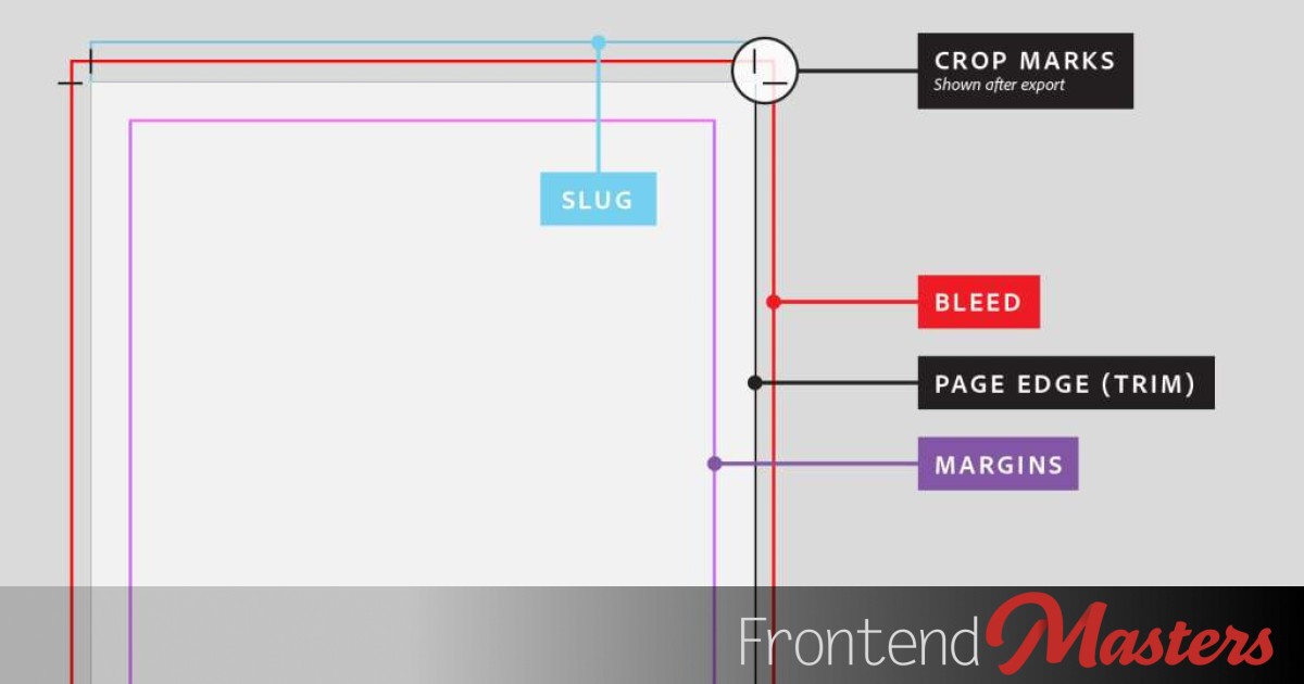
This is weird, but: I had a dream where I was thinking about crop marks. What are crop marks? They were pretty damn important in my print design and digital prepress days. Designers would hang parts of the design off the edge of the document and the expectation is that the ink literally goes to the edge of the paper when printed. Printers can’t actually print to the edge of the paper though (it would be messy!) so instead, the use a little bit bigger paper, crop marks are added, and the design is printed a bit outside the crop marks. Then the final piece is literally cut at those marks, making the design hit the edges as intended.
Design software like InDesign can output files destined for printing this way with these marks.

Then the PDF will be a bit bigger than the designed sheet size and have these marks:

Imagine thousands of printed pages like this all stacked up. The print shop binderies I worked at would have big ol’ cutter machines that would cut the stack of paper right at the crop marks. That’s the point of the crop marks, literally knowing exactly where to cut the paper.

Note
Have you ever heard the term “bleed” in web design?

This comes directly from print design. It’s the area outside the crop marks. When a part of design has bleed it means there are elements of the design that are pulled out into the area that gets cut away. So on the web that means an element of the design touches the edge of the viewport.

In my dream I was thinking about how they looked and how I could add them to a website, just for the aesthetics of it. Could be a worse dream, I guess. It was strong enough of a dream that I woke up and actually felt compelled to do it.
Crop Marks on the Web
To be clear, there is no reason to do this on the web. I’m just thinking it’s a neat print design throwback and aesthetic thing. Like color bars or registration marks.
The trick is that there are eight of these little lines. Certainly, we could add eight <div>s to the page and fix position them and that would do it. But my head always says: this is entirely a visual design thing that has nothing to do with the content of the page. So don’t clutter the HTML!
We can get four elements “for free” on any given page without touching any HTML:
html::before {}
html::after {}
body::before {}
body::after {}
So if we’re able to draw two marks with each of those, we should be able to pull this off. Let’s start by drawing boxes.
We can position a “bar” on each edge like so:
But we don’t have to make these full color background bars, we could make them lines instead.
I tossed slideVars in there to play with the values a little.
But we also don’t want full lines, we want a little line at the top and bottom. We can do this by using linear-gradient() with hard color stops. The big idea is like: draw a little transparent line, then a solid mark, then a long transparent line, then a solid mark, then a little transparent line.
If that was ASCII it would be like:
|---**===**----------------------**===**---|
(lolz)
Translated into CSS it’s like:
/* horizontal line */
html::before {
  content: "";
  left: 0;
  height: 1px;
  width: 100%;
  background: linear-gradient(
    to right,
    transparent
       0
       20px,
    black
       20px
       40px,
    transparent
       40px
       calc(100% - 40px),
    black
       calc(100% - 40px),
       calc(100% - 20px),
    transparent
       calc(100% - 20px)
  );
}
If I abstract that out into custom properties and position the marks like real crop marks, we get:
I put a less-fancy version of these crop marks into this more fleshed out design below, then made the areas outside the crop marks have a white partially transparent fill, showing off how perhaps that’s the part of the design that would be cut away.
WELL THAT WAS FUN.