In-N-Out Animations: Dialogs (Part 1/3)
In-N-Out Animations: Dialogs (Part 1/3) 관련

I’d like to kick off a small series here focused on animating elements in and out of view.
First, we’re going to focus on an element that goes from display: none; to display: block;. This is of particular interest because, well, it used to be quite difficult to do. But more than that: it’s often highly desirable. Movement can help a user understand what’s going when a new element appears or disappears.
Article Series
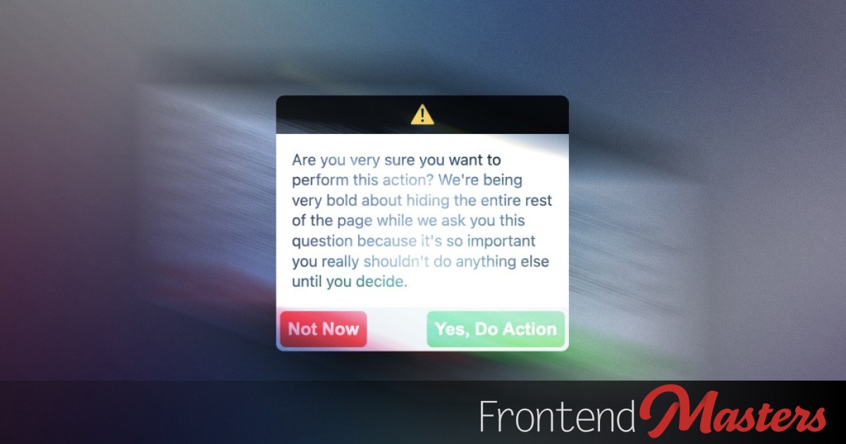
Let’s start with the modern wonder that is the <dialog> element.
Just want the final code snippet?! Jump here.
By default, a <dialog> is display: none; and when you open it, it becomes display: block; naturally. We don’t have to write these styles. If we’re animating something else between these values, that’s fine, you’ll just need to do it yourself:
.thing {
  display: none;

  &.open {
    display: block;
  }
}
If you’re like me, that triggers something in your brain that says well now you can’t animate it, bud. And indeed, if you tried like this:
.thing {
  display: none;
  opacity: 0;
  transition: 1s opacity,

  &.open {
    display: block;
    opacity: 1;
  }
}
That transition would indeed not work. If you toggled that open class, the element would immediately appear (and disappear).
Let’s swap over to <dialog> styles, as that’s what we’ll be animating the rest of the time.
dialog {
  opacity: 0;
  transition: 1s opacity,

  &:open {
    opacity: 1;
  }
}
Note
Note the difference of not hand-writing the display change and using the :open pseudo-class.
Here’s a video of where we are at:
Introducing allow-discrete
The first trick we’re going to need to employ is using a special keyword as the transition-behavior. Here it is:
dialog {
  opacity: 0;
  transition:
    1s opacity,
    1s display allow-discrete;

  &:open {
    /* as it first renders,
       it's already this. */
    opacity: 1;
  }
}
I’m applying the transition-behavior as part of the shorthand value there.
I’m sure that name, allow-discrete, has some fancy reason for being named that, but I don’t know what that is, and I find the name pretty rough (it doesn’t help me understand it). But we need it, so c’est la vie.
The problem we were facing (with the lack of animation) is that the display property changes at an inopportune time during the timeline. We want to change it such that when we’re changing to display: block; we want that to happen right away then let the opacity transition (in our case). Vice versa, when we’re changing to display: none; we want it to wait to change until the transition is over. Here’s a diagram of that:

With that in place, well, here’s a movie of what happens:
That’s still… not great.
Let’s be clear here about our goals and how we’re doing so far:
❌ Dialog instantly appears
❌ Backdrop instantly appears
✅ Dialog fades out
❌ Backdrop instantly hides
So 1 out of 4. We’ve got more work to do. Let’s get that dialog fading in.
Using @starting-style
The way I understand the dialog not fading in, so far, is that when the dialog renders on the page for the very first time, the :open styles immediately apply to it, which are display: block and opacity: 1 already, so there is no need/time to animate anything.
So we need to be very specific with styles for that pre-animation state. One way to do that is applying a @keyframe animation and letting it run to completion, which will happen when the element first renders. But I don’t love that way because it feels more like trickery than an explicit choice to me, and more importantly, the animation isn’t “interuptable” (see explanation in code here) (phaux).
The way to be specific about “before open” styles is a CSS things called @starting-style. It looks like this:
dialog {
  opacity: 0;
  transition:
    1s opacity,
    1s display allow-discrete;

  &:open {
    opacity: 1;
  }

  @starting-style {
    &:open {
      opacity: 0;
    }
  }
}
This is basically saying, hey, when you first render on the page, it’s actually got these styles, and if there happens to be any animation/transition applied, they will happen from these values. Which is exactly what we need.
That gets us here:
A bit better. We’ve checked another one off the list:
✅ Dialog fades in
❌ Backdrop instantly appears
✅ Dialog fades out
❌ Backdrop instantly hides
We just haven’t dealt with that backdrop yet, and you can really feel it.
But before we go there, we need to take some stock into what we’re doing here.
@starting-style is LAST
Notice I’ve put the styles for @starting-style at the end of our block of code styling the dialog element.
dialog {
  opacity: 0;
  transition:
    1s opacity,
    1s display allow-discrete;

  &:open {
    opacity: 1;
  }

  @starting-style {
    &:open {
      opacity: 0;
    }
  }
}
That’s very on purpose.
Those styles need to override the :open styles, but @starting-style doesn’t add any specificity, so they must come later in order to successfully override.
Closed Styles
A bit of a strange thing has emerged here in that the styles that are directly applied to dialog end up being the styles when the dialog isn’t open. Meaning when it comes to animation, the “on the way out” styling, or the styles that the animation moves to as the dialog is being closed.
We can group those styles more clearly, like this:
dialog {
  transition:
    1s opacity,
    1s display allow-discrete;

  &:not(:open) {
    opacity: 0;
  }

  &:open {
    opacity: 1;
  }

  @starting-style {
    &:open {
      opacity: 0;
    }
  }
}
The *Three State* System
Now we have the styles for this dialog isolated into three distinct chunks.
- The “On The Way Out” Styles
- The “Open” Styles
- The “On The Way In” Styles
That’s how they are in the source order. But if we’re going to re-number them as the user would experience them, I’d actually reverse the order.

The process of opening-then-closing the dialog is like this illustration below, hence the “backwards” ordering:

Note
If you remember anything from this post, I think remembering the three-state system is the most important. When dealing with in-and-out styling, you have the opportunity to style all three states, and it’s best to put them in reverse source order.
Three States is Cool!
Styling all three states here is all but a requirement. But instead of having it feel like a repetitive burden, think of it as an opportunity to do some unique design work. Is the “on the way in” style bigger (like scale: 1.1;)?, then maybe the the “on the way out” style could be smaller (like scale: 0.9;). It could even have different anchor points (chriscoyier)!
The Backdrop
In order to accomplish our four goals, we still need to deal with the styling behind the dialog, known as the backdrop, and selected in CSS with ::backdrop.
There is a lot to get right here:
- The
::backdropneeds it’s own transitions - It needs another special keyword
- It needs all three states of styles added
Keeping it simple and only dealing with an opacity fade in/out, it looks like this:
dialog {
  transition:
    1s opacity,
    1s display allow-discrete,
    1s overlay allow-discrete;

  &::backdrop {
    transition: opacity 1s;
  }

  &:not(:open) {
    opacity: 0;
    &::backdrop {
      opacity: 0;
    }
  }

  &:open {
    opacity: 1;
    &::backdrop {
      opacity: 1;
    }
  }

  @starting-style {
    &:open {
      opacity: 0;
      &::backdrop {
        opacity: 0;
      }
    }
  }
}
Notice we’re now applying a transition to the overlay property which*… isn’t actually a property?*
The overlay keyword is another thing that I can’t say I fully get. It has something to do with enabling “top layer” animations, of which dialog and ::backdrop are a part. I’m not a fan, as it feels like something quite random and obscure that doesn’t quite jive with how other things work in CSS. If you don’t include it here, the ::backdrop will not animate out smoothly. But note that we need to apply it to the dialog, not the ::backdrop itself even though it only affects the ::backdrop. 🤷♀️. I did sit in a CSSWG meeting where they were discussing removing it, so we’ll see.
With all this in place: we’re in business:
✅ Dialog fades in
✅ Backdrop fades in
✅ Dialog fades out
✅ Backdrop fades out
Demo
Allow me to add a few more basic styles so it feels a bit more real, and tada:
Reduced Motion
Note that on this demo, we’ve got an @media query to accommodate users who prefer reduced motion:
@media (prefers-reduced-motion: reduce) {
  dialog {
    transition:
    1s opacity,
    1s display allow-discrete,
    1s overlay allow-discrete;

    &, &:open {
      translate: 0;
    }
  }
}
I’ve leaving in the opacity animation, just removing the actual movement, which I think is the proper spirit of this user setting.
Just The Snippet
Looking for a starting point to copy and paste? Here ya go:
dialog {
  transition:
    1s opacity,
    1s display allow-discrete,
    1s overlay allow-discrete;

  &::backdrop {
    transition:
      opacity 1s,
      display 1s allow-discrete,
      overlay 1s allow-discrete;
  }

  &:not(:open) {
    opacity: 0;

    &::backdrop {
      opacity: 0;
    }
  }

  &:open {
    opacity: 1;

    &::backdrop {
      opacity: 1;
    }
  }

  @starting-style {
    &:open {
      opacity: 0;

      &::backdrop {
        opacity: 0;
      }
    }
  }
}

@media (prefers-reduced-motion: reduce) {
  dialog {
    /* If you add animation that isn't just opacity, remember to remove it here. */
    /* transition:
      1s opacity,
      1s display allow-discrete,
      1s overlay allow-discrete; */
  }
}
Conclusion
I feel like you get it. Three states. Style them all. Get all the little details right, including the source order, so it actually works. The reason I wrote this post is that it’s actually kinda easy to get those details wrong and have something not animate that you think should be. And because of the history with these features, it not working can feel like a hard limitation, like maybe it just can’t work. Well, it can. Hopefully these demos and explanations can help.
And one more thing.
Wouldn’t it be kinda cool to be able to abstract this kind of thing away with a CSS @mixin or something? I think that is still being shaken out, so while that’s true, I’ll just make up some fake code I think would be cool. I won’t include how the @mixin would be written, just how I’d want to use it once it has, and how this would expand into our final snippet is an exercise for authors.
@mixin --in-and-out-animation(
  --transition-properties: <array>,
  --in-style: <style-block>,
  --open-style: <style-block>,
  --out-style: <style-block>,
  --timing: <duration>,
  --backdrop: <boolean>
) {
  ... magic ...
}

dialog {
  @apply --in-and-out-animation(
    --transition-properties: opacity, translate, scale,
    --in-style: {
      opacity: 0;
      translate: 100px 0;
      scale: 1.1;
    }
    --open-style {
      opacity: 1;
      translate: 0;
      scale: 1;
    }
    --out-style: {
      opacity: 0;
      translate: -100px 0;
      scale: 0.9;
    }
    --timing: 350ms;
    --backdrop: true;
  );
}
Article Series