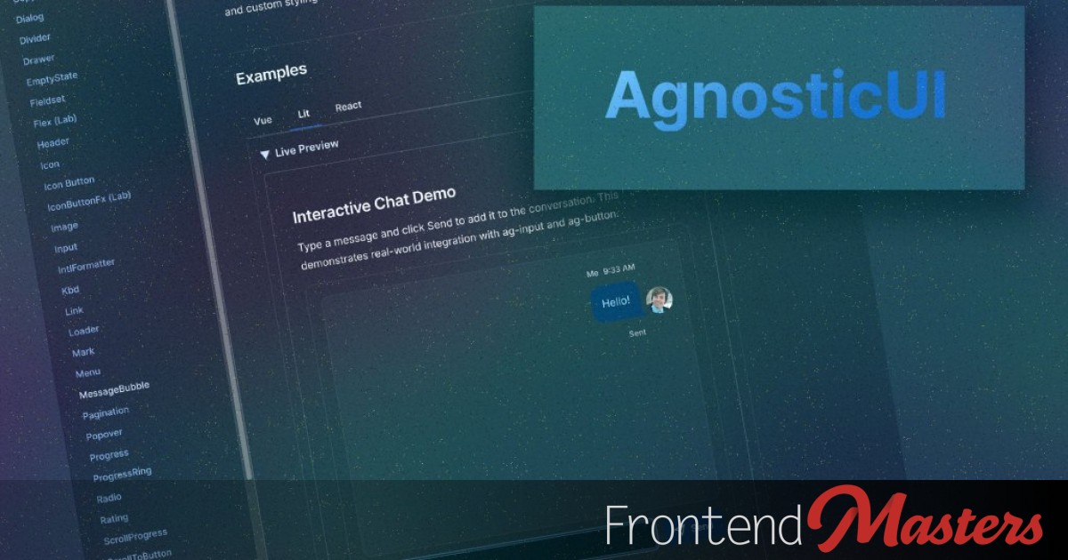
Post Mortem: Rewriting AgnosticUI with Lit Web Components
Post Mortem: Rewriting AgnosticUI with Lit Web Components 관련

It’s Fall 2025. I’m burnt out on my stack. My side projects are going nowhere. I was questioning whether I even liked web development anymore.
So I did what any self-respecting developer does: opened up the console and indexed a lookup table with Math.random():
const options = [
  "Grind LeetCode. Hate life. Land FAANG.",
  "Hard pivot to PM or Design.",
  "Quit. Live off the land.",
];

const nextMove = options[Math.floor(Math.random() * options.length)];
There was just one problem with that.
!options.includes(correctAnswer)
I came up with a better move for myself: actually finish what I’d already started. So I dusted off AgnosticUI, a project I’d started in 2020 and needed a modern update.
The first version of AgnosticUI had solved a real problem: branding consistency across React, Vue, Svelte, and Angular. But keeping JSX, Vue, and Svelte SFC components, and ViewEncapsulation in sync across a single CSS source of truth was an absolute maintenance nightmare. I almost archived the repo, but I had unfinished business.
Some DM exchanges with Cory LaViska (the creator of Shoelace) nudged me toward Web Components as the right primitive for the job.
The Plan: A full rewrite using Lit with the following non-negotiables:
- Close the loop. Double v1 component coverage. Finish what I started.
- Platform over Framework. Leverage Lit and Web Components as the foundation. Embrace the platform.
- Disciplined AI. A solid library has patterns, conventions, and clean interfaces. Use AI for speed, but own the architecture so the codebase doesn’t turn to slop.
- Focused Scope. I’m a single human. Hard choices and narrow scope: no data grids, no complex versioning. Just get it done.
- Zero expectations. Accept that this might reach zero people and make zero dollars.
The work itself had to be the point.
Web Components in 2026
Framework Support is a Non-Issue
One concern that used to follow Web Components was framework compatibility. The website custom-elements-everywhere.com tracks this, and as of 2026, scores are high across the board. While React 19 now gets a perfect score, I feel that @lit/react still improves DX significantly. More on that shortly.
Encapsulation Without a Black Box
As a Lit web components noob, the central question surfaced fast: encapsulation is great, but how do consumers customize anything?
The answer is ::part.
Encapsulation is a feature. The Shadow DOM boundary keeps your components visually consistent regardless of the CSS on the host page, and for a design system, that’s the whole game. But consumers still need styling hooks for the essentials: colors, padding, and border radii.
CSS custom properties get you partway there. You expose --ag-* tokens, and consumers override them. But custom properties only work where you’ve anticipated them. For anything else, the shadow DOM is a wall.
::part punches a deliberate hole in that wall:
<!-- AgInput exposes named parts -->
<input
  part="ag-input"
  ...
/>
<label
  part="ag-input-label"
  ...
/>
A consumer can now target those parts directly from outside the shadow DOM:
ag-input::part(ag-input) {
  border-radius: 999px;
  border-color: hotpink;
}
No leaking internals. No !important wars. Clean styling hooks, nothing more.

::part portal.The “encapsulation wall” of the Shadow DOM vs. the intentional “surgical entry points” provided by ::part.
Here’s a minimal working example showing both the token override and ::part approach together:
<ag-input label="Email" placeholder="you@example.com"></ag-input>

<style> /* Custom properties: broad-stroke theming via exposed --ag-* tokens.
     Overriding these affects the entire system — any component consuming
     --ag-space-2 will reflect the change, not just this one. */
  :root {
    --ag-space-2: 0.5rem;
    --ag-space-3: 0.75rem;
    --ag-border-subtle: #cbd5e1;
    --ag-text-primary: #0f172a;
    --ag-background-primary: #ffffff;
    --ag-font-size-sm: 0.875rem;
  }

  /* ::part: surgical overrides for what tokens can't reach.
     Targets named parts the component explicitly exposes —
     everything else in the shadow DOM remains untouchable. */
  ag-input::part(ag-input) {
    border-radius: 999px;
    border-color: hotpink;
  }

  ag-input::part(ag-input-label) {
    font-weight: 700;
    color: hotpink;
  } </style>
The A11y Trade-Off
Notice the label in that example? It lives inside the shadow root, not in the light DOM where you’d expect it.
In standard HTML, a <label for="some-id"> connects to an <input id="some-id"> across the document. Shadow DOM breaks that contract. The for/id association doesn’t cross the boundary.
The workaround: own the entire form control inside the shadow DOM. Label, input, helper text, error message; all of it lives together, wired up with internally-generated IDs:
<!-- Both label and input share IDs generated at component instantiation -->
<label
  id="${this._ids.labelId}"
  for="${this._ids.inputId}"
  part="ag-input-label"
>
  ${this.label}
</label>

<input
  id="${this._ids.inputId}"
  aria-describedby="${this._getAriaDescribedBy()}"
  ...
/>
Consumers can’t relocate the label, but part="ag-input-label" means they can restyle it.
The Final Frontier: Form Participation
The shadow DOM a11y trade-offs were covered above. But there’s an additional, thornier problem: native form participation.
The line static formAssociated = true sounds like a declaration of intent, but it’s just an opt-in signal to the browser. The actual work requires attachInternals(), and then you’re on the hook for reimplementing behaviors the browser gives native inputs for free: required, disabled, validation state, form reset, value submission.
AgInput doesn’t fully implement this yet. Open ticket: Issue #274 (AgnosticUI/agnosticui#274), captured and ready to tackle. Once resolved, the Experimental badges can finally come down.
The DX Reality Check: React 19 vs. @lit/react
Web components are framework-agnostic by design, but that doesn’t mean “frictionless everywhere.” React is the obvious stress test.
The Raw React 19 Experience
React 19 made genuine progress on web component support, but consuming a web component directly in JSX still surfaces paper cuts that accumulate fast.
Consider using <ag-input> directly in a React 19 app:
// Raw React 19: web component consumed directly
export default function RawExample() {
  const inputRef = useRef(null);

  useEffect(() => {
    // Custom events must be wired manually via ref in React 18 and below.
    // React 19 adds declarative support, but event names must match exactly
    // including case and use the on prefix. Easy to get wrong.
    const el = inputRef.current;
    el?.addEventListener("ag-change", handleChange);
    return () => el?.removeEventListener("ag-change", handleChange);
  }, []);

  return (
    // kebab-case required: JSX won't recognize PascalCase for custom elements
    // Boolean props must be passed as strings or omitted entirely
    // camelCase props like labelPosition may silently fail; React 18 lowercases
    // them to labelposition; React 19 checks for a matching property first
    <ag-input
      ref={inputRef}
      label="Email"
      label-position="top"
      placeholder="you@example.com"
      required
    ></ag-input> // explicit closing tag required; self-closing silently breaks
  );
}
Together, they’re a DX tax that requires knowing which React version you’re on.
The @lit/react Wrapper
The @lit/react createComponent wrapper eliminates the entire surface area of those problems. Here’s the actual wrapper for AgInput:
import * as React from "react";
import { createComponent } from "@lit/react";
import { AgInput, type InputProps } from "../core/Input";

export const ReactInput = createComponent({
  tagName: "ag-input",
  elementClass: AgInput,
  react: React,
  events: {
    // Native events (click, input, change, focus, blur) work automatically.
    // No mapping needed.
  },
});
And consuming it:
// @lit/react wrapper: standard React DX, no web component roughness
export default function WrappedExample() {
  return (
    <ReactInput
      label="Email"
      labelPosition="top"
      placeholder="you@example.com"
      required
      onChange={(e) => console.log(e.target.value)}
    />
  );
}
PascalCase component name. camelCase props. Self-closing syntax. Native event handlers wired up like any other React component. Thin wrapper, big DX win.
React 19 narrowed the gap. @lit/react closes it.
Note
AgnosticUI’s Vue wrappers are hand-rolled .vue SFC files. Story for another day.
CLI & Dogfooding
The CLI Move
Most component libraries ship as npm packages and expect consumers to absorb every update. I wanted to optimize for the consumer instead.
The AgnosticUI CLI takes a different approach: rather than installing a versioned package and praying the next update doesn’t break your overrides, you copy the component source directly into your project. Two commands:
# One-time project setup
npx agnosticui-cli init

# Add the components you actually need
npx agnosticui-cli add button input card
The components land as TypeScript files, readable and modifiable by you or your LLM. Your build tool needs to handle TypeScript compilation (Vite works great). If a future release has something you want, opt in deliberately with another add.
The philosophy is simple: own the source, make the LLM’s job easier.
Reliable Local Dev: Ditch npm link, Use npm pack
npm link is the obvious tool for local package development. It’s also, in my experience, a reliable source of subtle bugs: symlink resolution issues, mismatched peer dependencies, stale module caches.
The npm pack tarball workflow is slightly slower but more trustworthy.
My typical workflow across two terminal tabs:
# Tab 1: in the library root
# Run all checks, then pack a fresh tarball
npm run lint && npm run typecheck && npm run test && npm run build && npm pack
# Produces: agnosticui-core-2.0.0-alpha.[VERSION].tgz
# Tab 2: in the consuming app (docs site, playbook, or test project)
npm run clear:cache && npm run reinstall:lib && npm run docs:dev

# Or install directly by path
npm install ../../lib/agnosticui-core-2.0.0-alpha.13.tgz
I use this for all consumer tests: Storybooks, Kitchen Sink spot testing, CLI testing, and playbooks.
Playbooks
Playbooks are UI that model real scenarios: a Login Form, an Onboarding Wizard, a Discovery Dashboard. Building the Login playbook isn’t about testing AgInput. It’s just about using it. When something feels off, you know immediately.
So, while unit tests may tell you if a component works in isolation, playbooks tell you if it works in practice. That’s the ultimate litmus test and the whole point of dogfooding. Each playbook I shipped sent me back upstream to fix things I otherwise would have missed.
That feedback loop catches things unit tests miss. Each playbook I shipped sent me back upstream to fix something I wouldn’t have caught otherwise. The components powering these aren’t just theoretically correct; they’ve been used and broken in something resembling the real world.

The Login Form playbook. A realistic starting point built entirely with AgnosticUI components.
Want to Remix Them?
The playbooks are designed to be starting points, not finished products. A few ideas:
- Edit the playbook’s corresponding prompt to reposition components, adjust layouts, swap fonts, etc.
- Swap in your own images, logos, and color tokens.
- Try the approach with a different library entirely. DaisyUI, Chakra-UI, and others should work just as well. The key is being prescriptive enough that the LLM isn’t left guessing.
Conclusion
AgnosticUI v2 isn’t finished, and it may always be a WIP labor of love. Some components are still marked Experimental. Form association is an open ticket.
But the loop is closed.
I ramped up on Lit and Web Components. I used AI effectively without taking my hands off the wheel. I shipped something I can point to.
That’s enough.