01A. Enabling CSS Grid
01A. Enabling CSS Grid 관련
Let's enable CSS Grid in a container element and explore the difference between grid and inline-grid.
Turning on Grid
First, let's look at a simple container with 10 colored boxes inside it:

<div id="container">
  <div class="box" style="background-color: #FF5722;">FIRST</div>
  ...
  <div class="box" style="background-color: #3F51B5;">TENTH</div>
</div>
With no grid involved, the container is centered with a black border and each colored box is an individual div. Each div goes all the way across the screen, and the height is dictated by the text inside.
Here's the starting point of the CSS:
#container {
  margin: 0 auto;
  width: 90%;
  height: 1000px;
  border: 4px solid black;
}
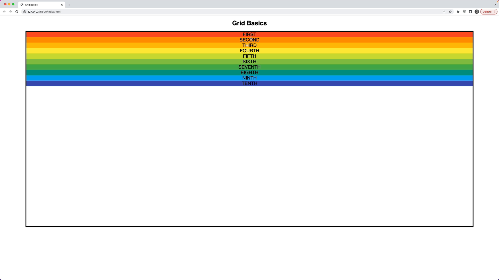
To turn on grid, set the display property of the container element to grid:
#container {
  /* styles from above */
  display: grid;
}
Here's what the result looks like:

The elements go all the way across the container, but they're taller. Each element grows to take up as much available space as possible.
Inline Grid
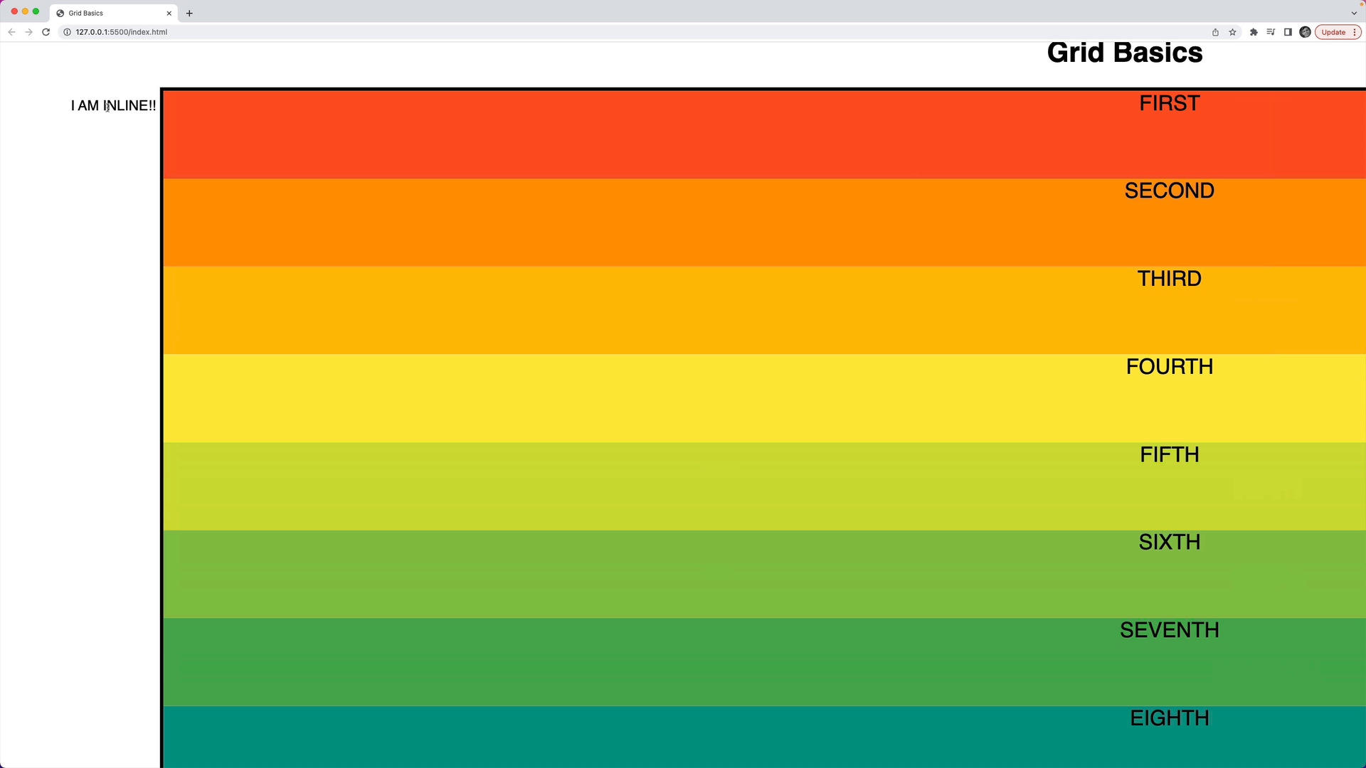
There's a second grid-related option for the display property: inline-grid.
#container {
  /* other styles */
  display: inline-grid;
}
At first, it looks the same as what we saw before.
However, the difference is that the overall container now behaves as an inline element.
For example, a span element and the container will share the same space.
Update the HTML to include a span with "I AM INLINE!!":
<span>I AM INLINE!!</span>
<div id="container">
  <!-- colored boxes -->
</div>
And notice that the container is inline:
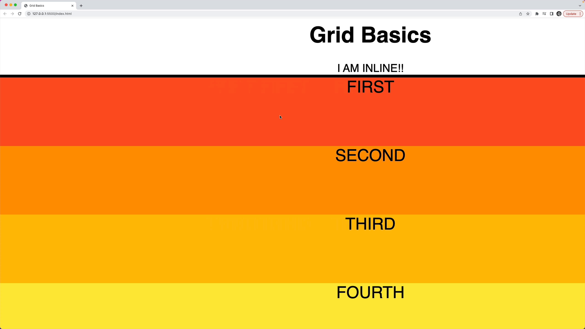
Switching the CSS back to display: grid, the container behaves as a block element and doesn't share space like an inline element:
Recap
You have two choices to turn on the grid system in a container:
display: grid: The container behaves as a block element.display: inline-grid: The container behaves as an inline element.