01F. Adjust Row Heights in an Existing Layout
01F. Adjust Row Heights in an Existing Layout 관련

Problem
In this exercise, your task is to transform the current layout of a web page with a container that has a header, a nav, a main, and a footer.
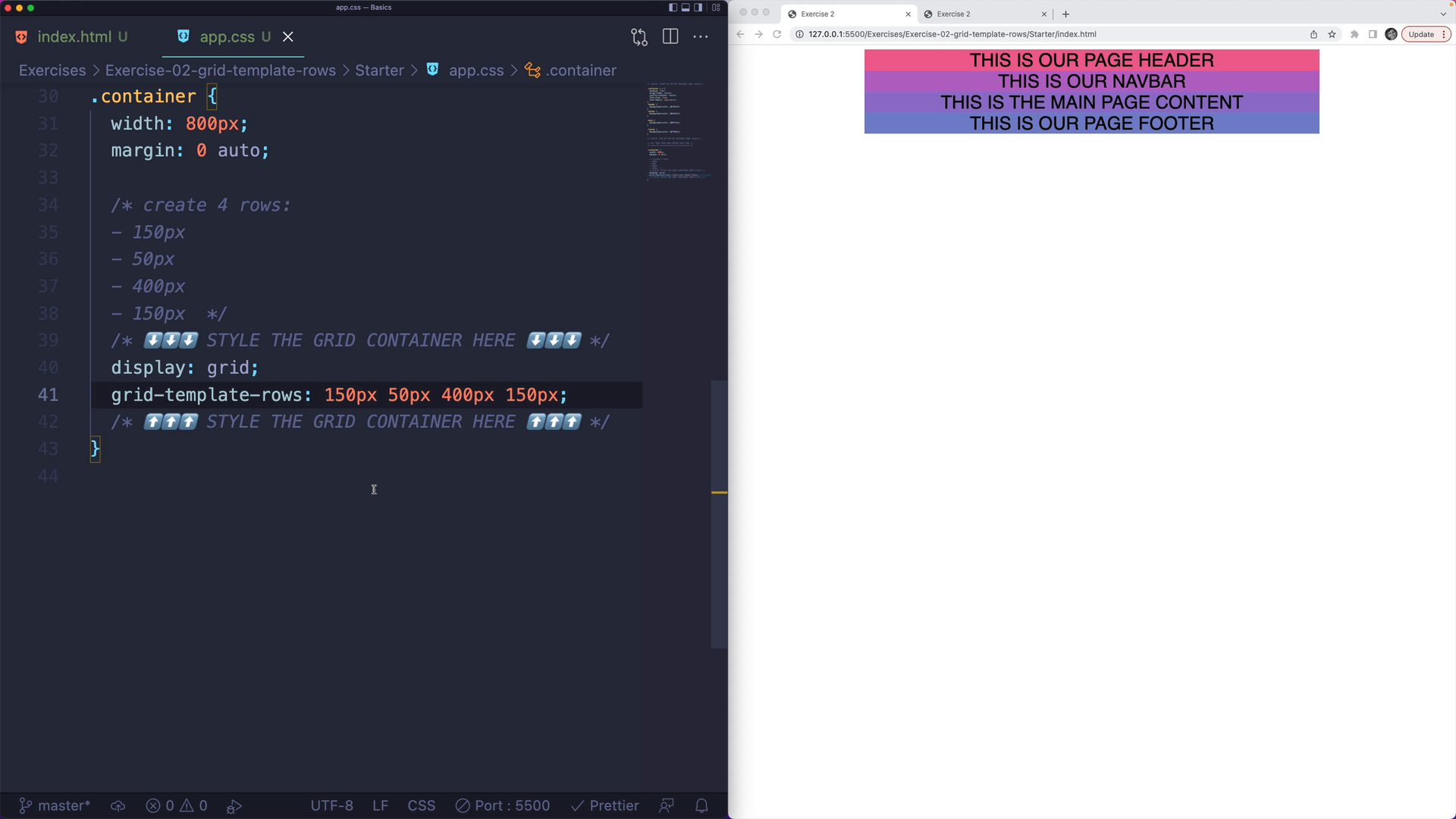
Currently, all elements are the same size and have some text inside of them:
nts are the same size and have some text inside of them:

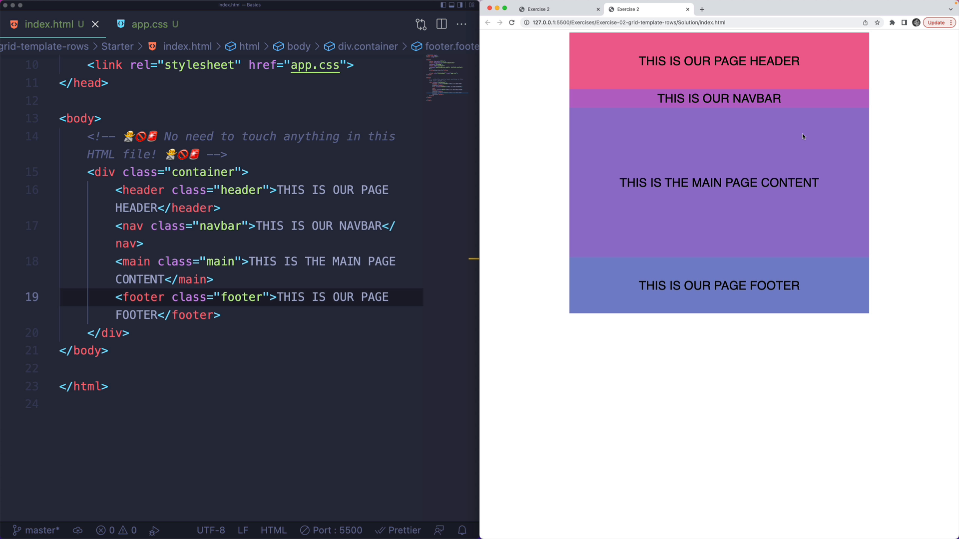
The desired layout is that the main content is largest, followed by the header & footer, then the navbar being smallest:
Challenge
Your challenge is to update the CSS to enable grid and create four rows in the container with the following dimensions:
- 150 pixels
- 50 pixels
- 400 pixels
- 150 pixels
You do not need to touch the HTML file. In the CSS file, do not touch any of the code in the "no touching zone".
Exercise
<!DOCTYPE html>
<html lang="en">

<head>
    <meta charset="UTF-8">
    <meta http-equiv="X-UA-Compatible" content="IE=edge">
    <meta name="viewport" content="width=device-width, initial-scale=1.0">
    <title>Exercise 2</title>

    <link rel="stylesheet" href="app.css">
</head>

<body>
    <!-- 🙅🚫🚨 No need to touch anything in this HTML file! 🙅🚫🚨 -->
    <div class="container">
        <header class="header">THIS IS OUR PAGE HEADER</header>
        <nav class="navbar">THIS IS OUR NAVBAR</nav>
        <main class="main">THIS IS THE MAIN PAGE CONTENT</main>
        <footer class="footer">THIS IS OUR PAGE FOOTER</footer>
    </div>
</body>

</html>
/* ALL YOUR CODE GOES BELOW THIS LINE */
/* ================================== */

.container {
  width: 800px;
  margin: 0 auto;

  /* create 4 rows:
  - 150px
  - 50px
  - 400px
  - 150px  */
  /* ⬇️⬇️⬇️ STYLE THE GRID CONTAINER HERE ⬇️⬇️⬇️ */

  /* ⬆️⬆️⬆️ STYLE THE GRID CONTAINER HERE ⬆️⬆️⬆️ */
}

/* 🚨🚫🙅  START OF THE NO TOUCHING ZONE 🙅🚫🚨 */

.container > * {
  display: flex;
  align-items: center;
  justify-content: center;
  font-size: 2rem;
  font-family: sans-serif;
}
.header {
  background-color: #f06292;
}
.navbar {
  background-color: #ba68c8;
}

.main {
  background-color: #9575cd;
}

.footer {
  background-color: #7986cb;
}

/* 🚨🚫🙅  END OF THE NO TOUCHING ZONE 🙅🚫🚨 */
Solution: Specifying Row Heights
The first step is to turn the container into a grid container, by setting the display property to grid. This is essential, as our second property won't work otherwise:
.container {
  /* other styles above */

  display: grid;
}
Next, we will use the grid-template-rows property, which expects a space-separated list of row values. We want the following row dimensions:
- 150 pixels
- 50 pixels
- 400 pixels
- 150 pixels
.container {
  display: grid;
  grid-template-rows: 150px 50px 400px 150px;
}
And that's it! We now have a grid container with four rows of the exact dimensions specified.