01E. Define CSS Grid Rows with grid-template-rows
01E. Define CSS Grid Rows with grid-template-rows 관련
The grid-template-rows property is used to set up the rows in a grid container.
This property is set on the parent container, not on the individual elements in the grid.
Example
To start, let's work with three boxes and set up the grid-template-rows:
#container {
  margin: 0 auto;
  width: 1000px;
  height: 1000px;
  border: 4px solid black;

  /* GRID STUFF BELOW THIS LINE */
  display: grid;
  grid-template-rows: 200px 200px 200px;
}
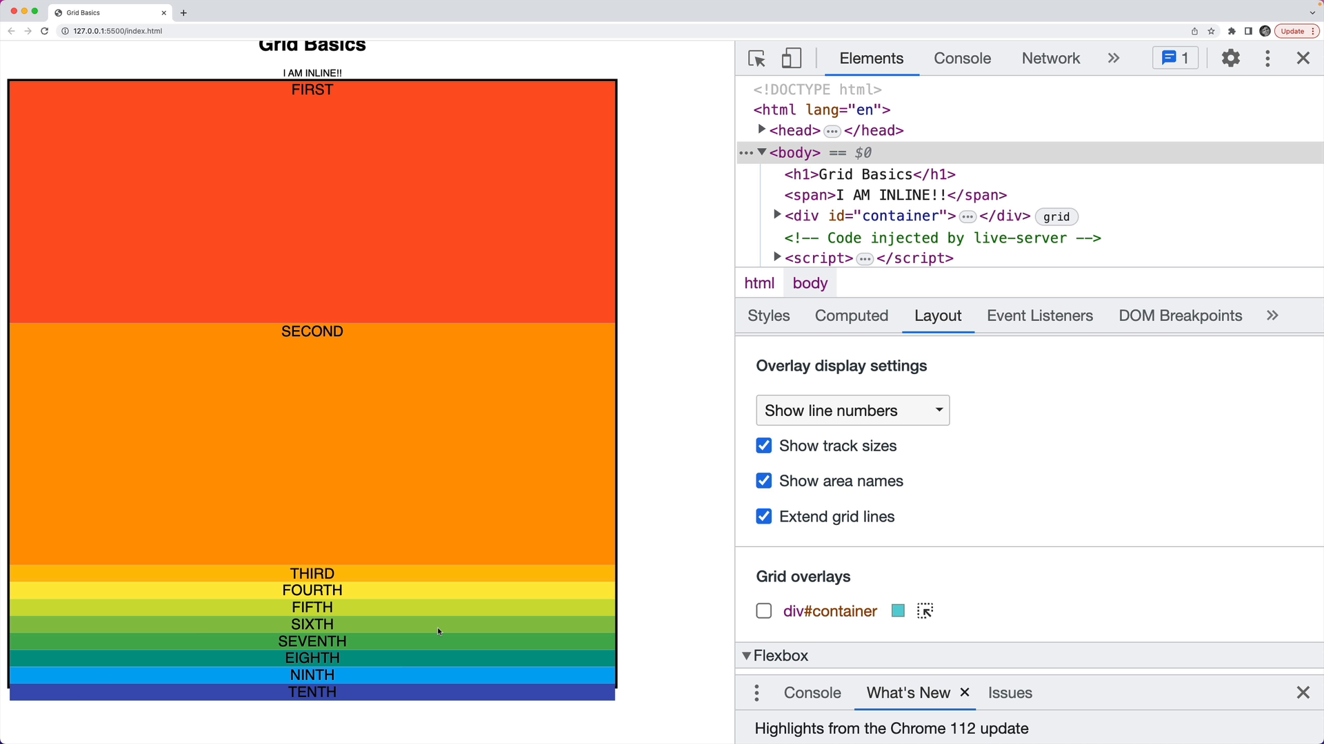
Here, we have set up three rows with a height of 200 pixels each:
Because the container is 1000 pixels tall, there will be some unused space.
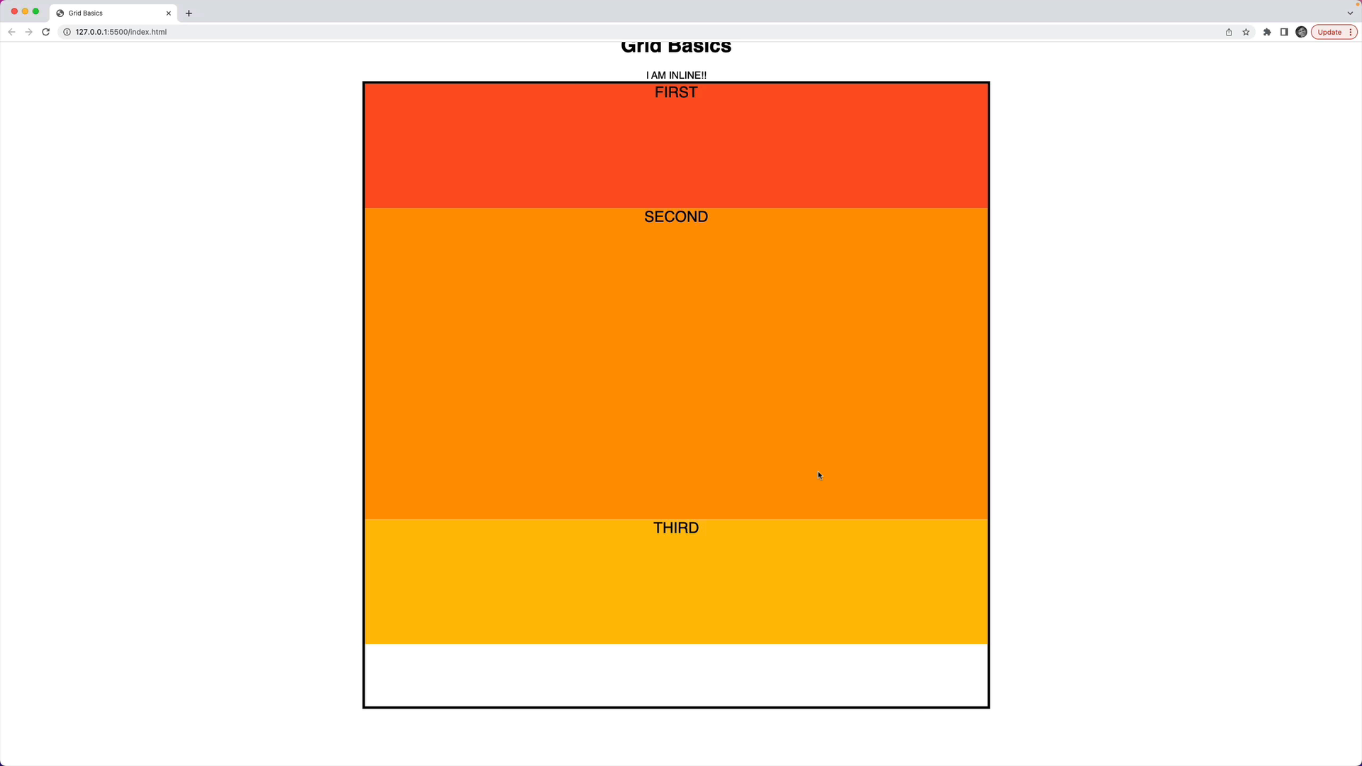
We can adjust the middle row to be 500 pixels tall:
.container {
  display: grid;
  grid-template-rows: 200px 500px 200px;
}
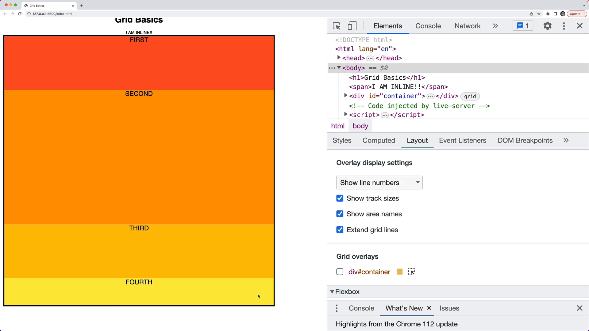
If we add another row with 100 pixels, we will have to add another box in the HTML to fill the added row:
.container {
  display: grid;
  grid-template-rows: 200px 500px 200px 100px;
}
Let's try specifying two rows with a height of 400 pixels, even though we have multiple elements inside the container:
.container {
  display: grid;
  grid-template-rows: 400px 400px;
}
In this case the first two elements will fill the 400-pixel tall rows, and the remaining elements will try to fit into the remaining space. If there's not room, the items might overflow: