01C. Define CSS Grid Columns with grid-template-columns
01C. Define CSS Grid Columns with grid-template-columns 관련
Now that we have grid enabled for our container of 10 boxes, let's set up some rows and columns.
We will start with the grid-template-columns property to define the columns in our grid container.
The grid-template-columns property takes a space-separated list of dimensions.
Let's set grid-template-columns: 200px 100px 200px;:
#container {
  margin: 0 auto;
  width: 90%;
  height: 1000px;
  border: 4px solid black;

  /* GRID STUFF BELOW THIS LINE */
  display: grid;
  grid-template-columns: 200px 100px 200px;
}
This will tell the grid container that we want three columns defined: a 200 pixel wide column, a 100 pixel wide column, and another 200 pixel wide column.
Here's the result:
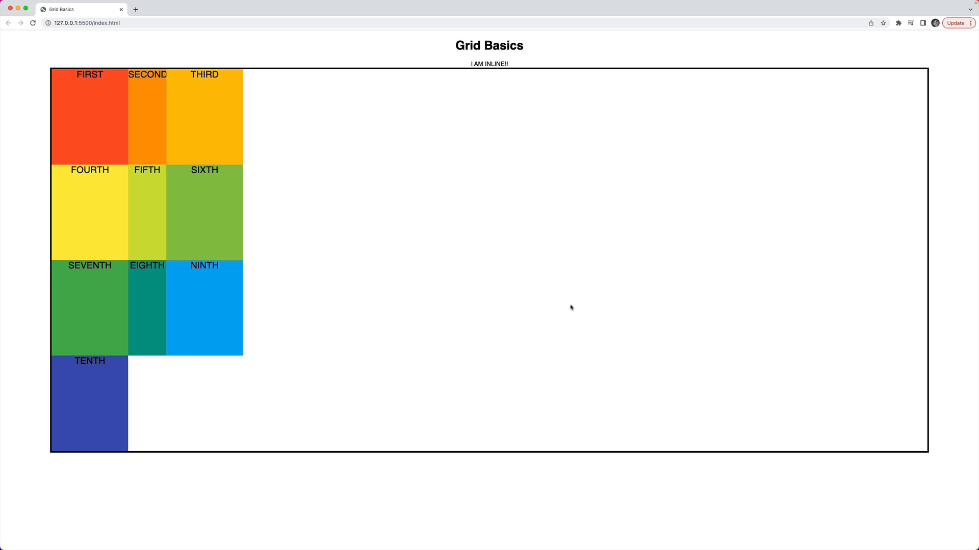
The boxes inside the container will fill these columns from left to right, and then from top to bottom. The widths are 200px, 100px, and 200px as we defined.
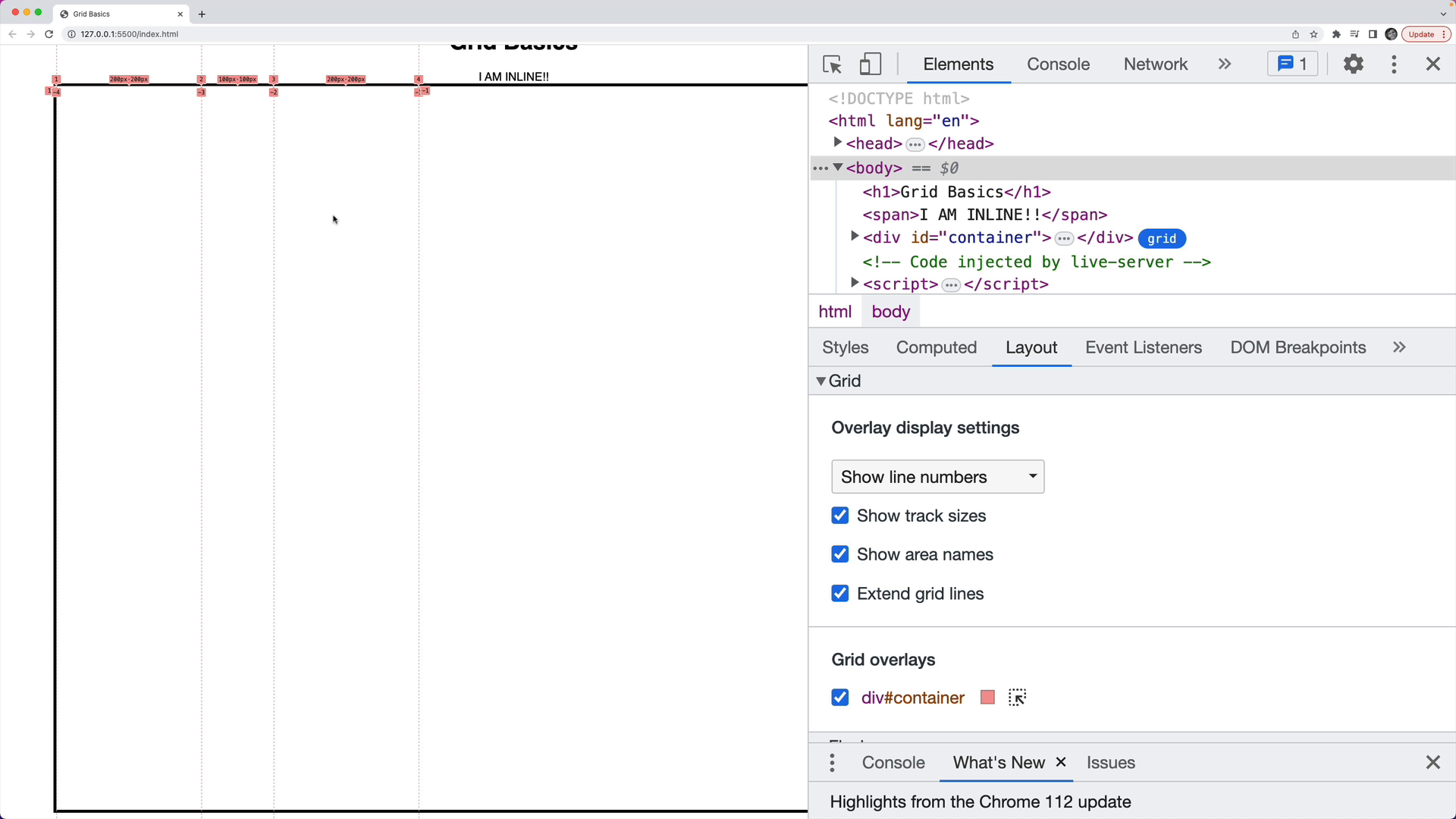
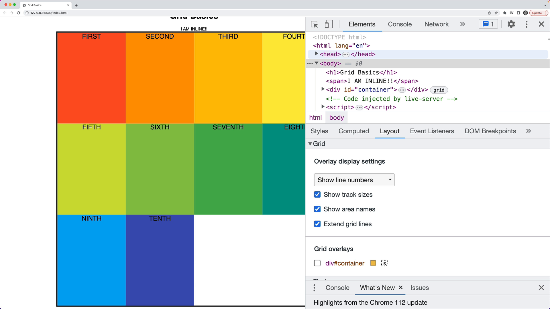
If we comment out the HTML markup and open the grid DevTools, we can see the column widths:
Creating Equal Sized Columns
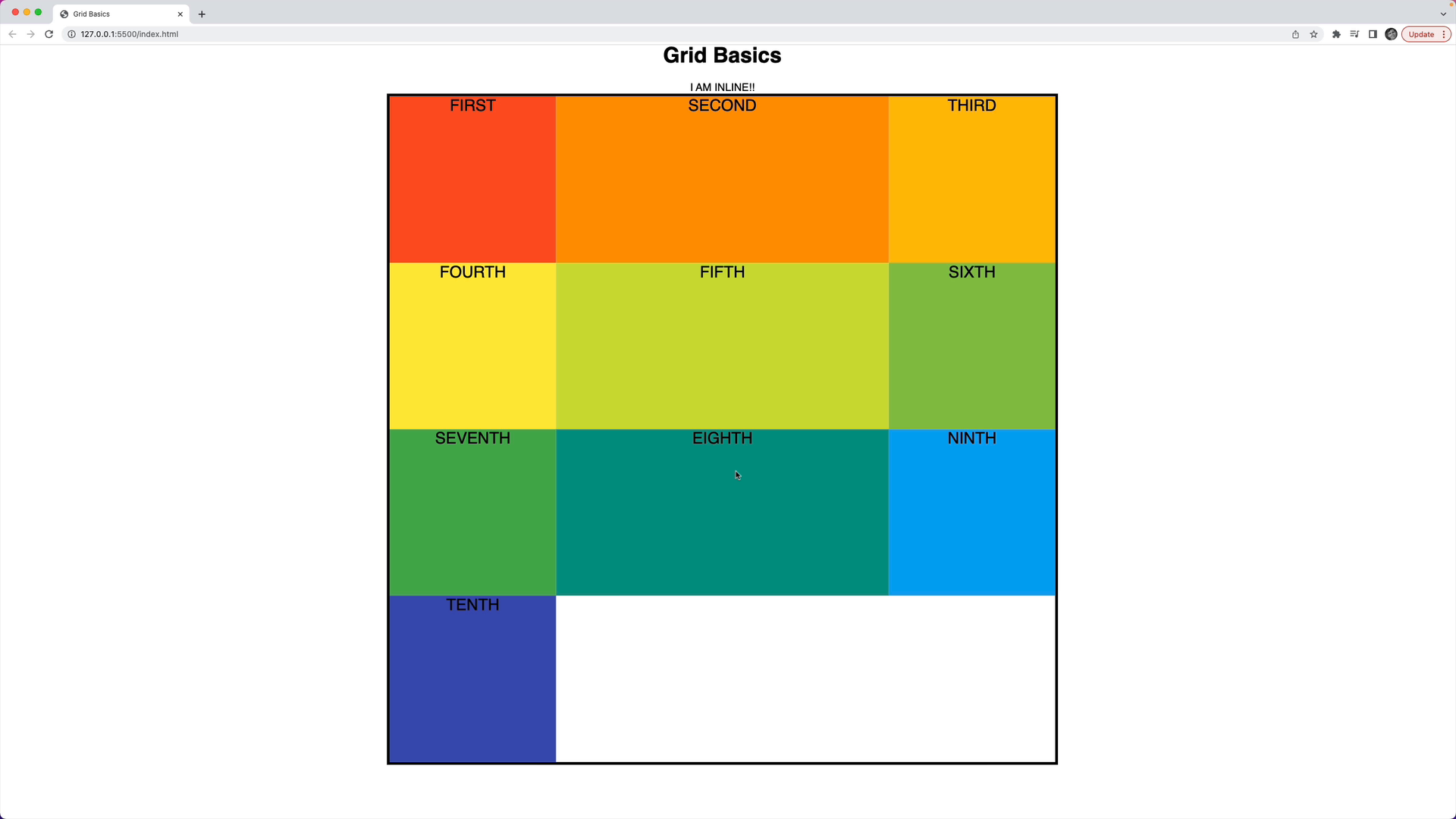
If we change the width property from 90% to 1000px, we could have four evenly sized columns by updating the grid-template-columns property to grid-template-columns: 250px 250px 250px 250px:
#container {
  margin: 0 auto;
  width: 1000px;
  height: 1000px;
  border: 4px solid black;

  /* GRID STUFF BELOW THIS LINE */
  display: grid;
  grid-template-columns: 250px 250px 250px 250px;
}
We'll see a shorthand for this later, but the result is as expected:
Changing Individual Column Sizes
We can also change the size of individual columns.
For example, if we wanted to create small columns on the left and the right, and a wider column in the middle, we could set:
grid-template-columns: 100px 500px 100px;
Which results in:
Recap
Note that in these examples we haven't touched the individual elements yet– they're just filling in the columns that we defined first.
We also haven't controlled the height of the rows yet, only the width of each column.
We have so far only used the grid-template-columns property to define columns in a container with grid enabled.