01D. Converting a Single-Column Layout
01D. Converting a Single-Column Layout 관련

In this exercise, you'll practice creating columns.
Problems
Starting HTML & CSS
You don't need to touch the HTML file, but it's important to understand the structure.
The markup consists of a div with an ID of container, which contains three cards.
<div id="container">
  <!-- Card 1 -->
  <!-- Card 2 -->
  <!-- Card 3 -->
</div>
In the CSS file, there are some predefined styles that create the cards. These are marked as the "NO TOUCHING ZONE".
Challenge
Your task is to write the CSS below the indicated line to create a three-column layout, with each column 300 pixels wide.
Take your time to practice this exercise, and when you're ready, you can check the solution.
Now it's your turn! Try solving this exercise.
Exercise
<!DOCTYPE html>
<html lang="en">
<head>
<meta charset="UTF-8">
<meta http-equiv="X-UA-Compatible" content="IE=edge">
<meta name="viewport" content="width=device-width, initial-scale=1.0">
<title>Exercise 1</title>
<link rel="stylesheet" href="app.css">
</head>
<body>
<!-- 🙅🚫🚨 No need to touch anything in this HTML file! 🙅🚫🚨 -->
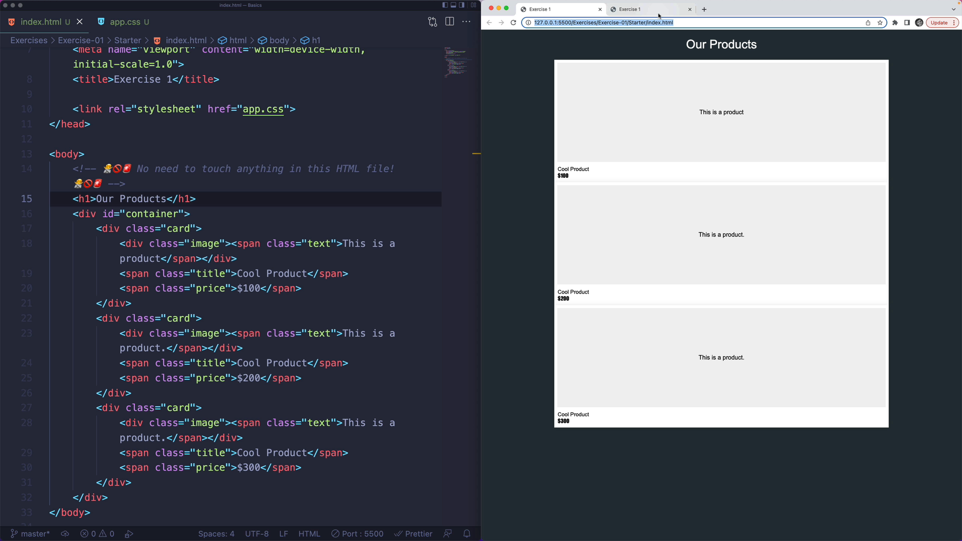
<h1>Our Products</h1>
<div id="container">
<div class="card">
<div class="image"><span class="text">This is a product</span></div>
<span class="title">Cool Product</span>
<span class="price">$100</span>
</div>
<div class="card">
<div class="image"><span class="text">This is a product.</span></div>
<span class="title">Cool Product</span>
<span class="price">$200</span>
</div>
<div class="card">
<div class="image"><span class="text">This is a product.</span></div>
<span class="title">Cool Product</span>
<span class="price">$300</span>
</div>
</div>
</body>
</html>
/* ALL YOUR CODE GOES BELOW THIS LINE */
/* ================================== */

#container {
  margin: 0 auto;
  width: 900px;

  /* ⬇️⬇️⬇️ STYLE THE GRID CONTAINER HERE ⬇️⬇️⬇️ */

  /* ⬆️⬆️⬆️ STYLE THE GRID CONTAINER HERE ⬆️⬆️⬆️ */
}

/* 🚨🚫🙅  START OF THE NO TOUCHING ZONE 🙅🚫🚨 */
body {
  font-family: Arial, Helvetica, sans-serif;
  background-color: #263238;
}
h1 {
  text-align: center;
  color: white;
  font-weight: 100;
}
.card {
  position: relative;
  height: 16.5em;
  box-shadow: 0px 1px 13px rgba(0, 0, 0, 0.1);
  cursor: pointer;
  transition: all 120ms;
  display: flex;
  align-items: center;
  justify-content: center;
  background: #fff;
  padding: 0.5em;
  padding-bottom: 3.4em;
  margin: 0 5px;
}
.card .title {
  font-family: Arial, Helvetica, sans-serif;
  font-size: 0.9em;
  position: absolute;
  left: 0.625em;
  bottom: 1.875em;
  font-weight: 400;
  color: #000;
}
.card .price {
  font-family: Impact, Haettenschweiler, "Arial Narrow Bold", sans-serif;
  font-size: 0.9em;
  position: absolute;
  left: 0.625em;
  bottom: 0.625em;
  color: #000;
}

.image {
  background: rgb(241, 241, 241);
  width: 100%;
  height: 100%;
  display: flex;
  justify-content: center;
  align-items: center;
}
/* 🚨🚫🙅  END OF THE NO TOUCHING ZONE 🙅🚫🚨 */
Solution: Implement a Three-Column Layout
Creating a Three Column Layout with CSS Grid
The first thing to do is turn on grid for the container by setting its display property to grid:
#container {
  display: grid;
}
After doing this, you might notice a small difference in the layout, but it will still appear as a single column.
Next, use the grid-template-columns property to set the size of each column. We want three columns of 300 pixels each:
.container {
  display: grid;
  grid-template-columns: 300px 300px 300px;
}
Now, you should have a three column layout with evenly sized columns. Each column is hard-coded at 300 pixels, as the challenge asked for:
