
How to animate SF Symbols
How to animate SF Symbols 관련

Updated for Xcode 15
New in iOS 17
SwiftUI provides the symbolEffect() modifier to add built-in animation effects for SF Symbols and produce a real touch of delight with almost no effort.
For example, we could animate a dog icon up and down with a gentle bounce whenever a button is pressed:
struct ContentView: View {
    @State private var petCount = 0

    var body: some View {
        Button {
            petCount += 1
        } label: {
            Label("Pet the Dog", systemImage: "dog")
        }
        .symbolEffect(.bounce, value: petCount)
        .font(.largeTitle)
    }
}

You could also try .pulse to animate the opacity, but where things get really clever is when you use SF Symbols that have multiple layers because these can be animated individually or together.
By default, layers are animated individually, so code like this produces a wave-like effect on the “mail.stack” icon:
struct ContentView: View {
    @State private var isFavorite = false

    var body: some View {
        Button {
            isFavorite.toggle()
        } label: {
            Label("Activate Inbox Zero", systemImage: "mail.stack")
        }
        .symbolEffect(.bounce.down, value: isFavorite)
        .font(.largeTitle)
    }
}

Honestly, there are so many variations available, and you can even add extra options to get customize speed and repeat count.
For example, this animates the symbol three times at 3x speed:
struct ContentView: View {
    @State private var isFavorite = false

    var body: some View {
        Button {
            isFavorite.toggle()
        } label: {
            Label("Activate Inbox Zero", systemImage: "mail.stack")
        }
        .symbolEffect(.bounce, options: .speed(3).repeat(3), value: isFavorite)
        .font(.largeTitle)
    }
}

The variable color animation is particularly powerful, because SF Symbols lets you control how the animation displays each layer – .variableColor.iterative colors one layer at a time, .variableColor.cumulative adds each new layer to the previously colored layers, and you can add reversing to either of those to make the animation play forward then backward.
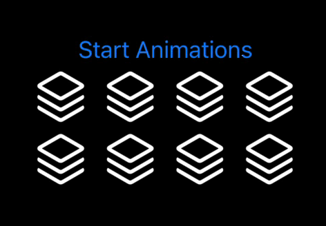
Here's one larger example that shows off a range of possibilities:
struct ContentView: View {
    @State private var animationsRunning = false

    var body: some View {

        Button("Start Animations") {
            withAnimation {
                animationsRunning.toggle()
            }
        }

        VStack {
            HStack {
                Image(systemName: "square.stack.3d.up")
                    .symbolEffect(.variableColor.iterative, value: animationsRunning)

                Image(systemName: "square.stack.3d.up")
                    .symbolEffect(.variableColor.cumulative, value: animationsRunning)

                Image(systemName: "square.stack.3d.up")
                    .symbolEffect(.variableColor.reversing.iterative, value: animationsRunning)

                Image(systemName: "square.stack.3d.up")
                    .symbolEffect(.variableColor.reversing.cumulative, value: animationsRunning)
            }

            HStack {
                Image(systemName: "square.stack.3d.up")
                    .symbolEffect(.variableColor.iterative, options: .repeating, value: animationsRunning)

                Image(systemName: "square.stack.3d.up")
                    .symbolEffect(.variableColor.cumulative, options: .repeat(3), value: animationsRunning)

                Image(systemName: "square.stack.3d.up")
                    .symbolEffect(.variableColor.reversing.iterative, options: .speed(3), value: animationsRunning)

                Image(systemName: "square.stack.3d.up")
                    .symbolEffect(.variableColor.reversing.cumulative, options: .repeat(3).speed(3), value: animationsRunning)
            }
        }
        .font(.largeTitle)
    }
}
And finally, if you're keeping your views the same and are merely changing their content – if you're switching the icon for a fixed label based on user interaction, for example – then you should use the contentTransition() modifier along with one of the options for switching icons.
For example, this uses the .replace transition to make one icon fade out and another arrive:
struct ContentView: View {
    @State private var isFavorite = false

    var body: some View {
        VStack {
            Button {
                withAnimation {
                    isFavorite.toggle()
                }
            } label: {
                Label("Toggle Favorite", systemImage: isFavorite ? "checkmark": "heart")
            }
            .contentTransition(.symbolEffect(.replace))
        }
        .font(.largeTitle)
    }
}

Similar solutions…
