How to Use t-SNE for Visualizing Clusters with Python
How to Use t-SNE for Visualizing Clusters with Python 관련

After applying clustering algorithms like K-Means, Hierarchical Clustering, and DBSCAN, you’ll often want to visualize the resulting clusters to gain a better understanding of the underlying data structure.
While scatter plots work well for datasets with two or three dimensions, real-world datasets often contain high-dimensional features that are difficult to interpret visually.
To address this challenge, you can use dimensionality reduction techniques like t-SNE (t-Distributed Stochastic Neighbor Embedding) to project high-dimensional data into a lower-dimensional space while preserving its structure. This allows you to visualize clusters more effectively and identify hidden patterns that may not be immediately apparent in raw data.
In this section, we will explore the theory behind t-SNE and its implementation in Python.
Understanding t-SNE
t-SNE was introduced by Laurens van der Maaten and Geoffrey Hinton in 2008 as a method to visualize complex data structures. It aims to represent high-dimensional data points in a lower-dimensional space while preserving the local structure and pairwise similarities among the data points.
t-SNE achieves this by modeling the similarity between data points in the high-dimensional space and the low-dimensional space.
The t-SNE Algorithm
The t-SNE algorithm proceeds in the following steps:
- Compute pairwise similarities between data points in the high-dimensional space. This is typically done using a Gaussian kernel to measure the similarity based on the Euclidean distances between data points.
- Initialize the low-dimensional embedding randomly.
- Define a cost function that represents the similarity between data points in the high-dimensional space and the low-dimensional space.
- Optimize the cost function using gradient descent to minimize the divergence between the high-dimensional and low-dimensional similarities.
- Iterate steps 3 and 4 until the cost function converges.
Implementing t-SNE in Python is relatively straightforward with the help of libraries such as scikit-learn. The scikit-learn library provides a user-friendly API for applying t-SNE to your data. By following the scikit-learn documentation and examples, you can easily incorporate t-SNE into your machine learning pipeline.
2D t-SNE Visualisation
import matplotlib.pyplot as plt
from sklearn import datasets
from sklearn.manifold import TSNE

# Load dataset
digits = datasets.load_digits()
X, y = digits.data, digits.target

# Apply t-SNE
tsne = TSNE(n_components=2, random_state=0)
X_tsne = tsne.fit_transform(X)

# Visualize the results on 2D plane
plt.figure(figsize=(10, 6))
scatter = plt.scatter(X_tsne[:, 0], X_tsne[:, 1], c=y, edgecolor='none', alpha=0.7, cmap=plt.cm.get_cmap('jet', 10))
plt.colorbar(scatter)
plt.title("t-SNE of Digits Dataset")
plt.show()

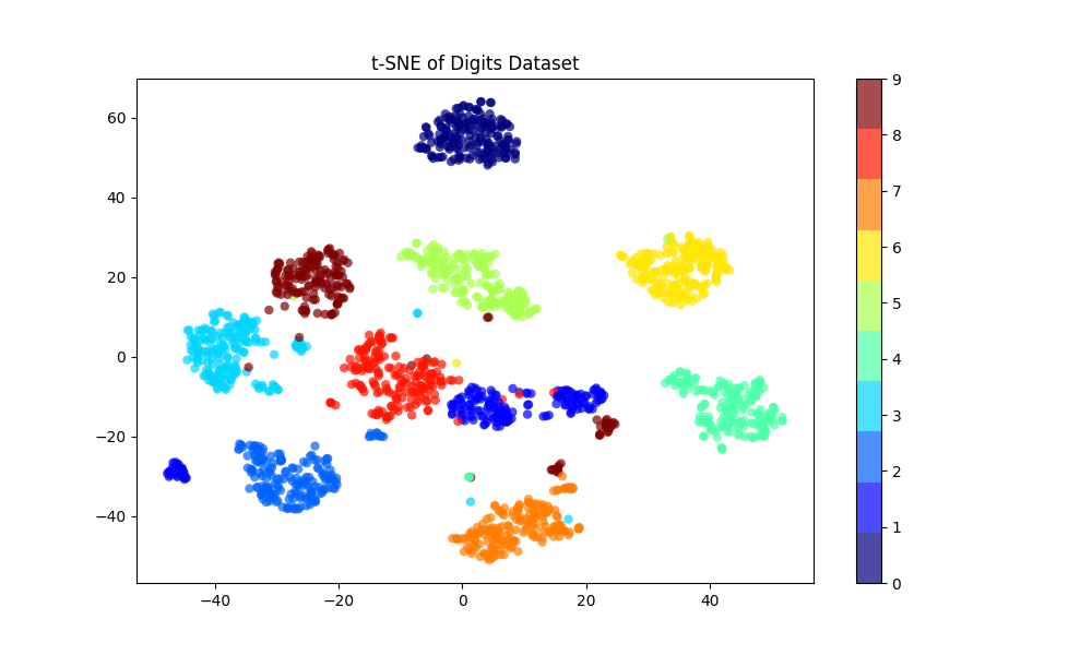
In this example:
- We load the
digitsdataset. - We apply t-SNE to reduce the data from 64 dimensions (since each image is 8x8) to 2 dimensions.
- We then plot the transformed data, coloring each point by its true digit label.
The resulting visualization will show clusters, each corresponding to one of the digits (0 through 9). This helps to understand how well-separated the different digits are in the original high-dimensional space.
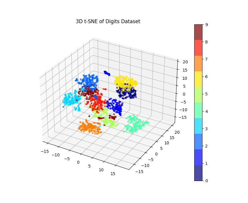
Visualizing High-Dimensional Data
One of the main advantages of t-SNE is its ability to visualize high-dimensional data in a lower-dimensional space. By reducing the dimensionality of the data, t-SNE enables us to identify clusters and patterns that may not be apparent in the original high-dimensional space. The resulting visualization can provide valuable insights into the structure of the data and aid in decision-making processes.
import matplotlib.pyplot as plt
from sklearn import datasets
from sklearn.manifold import TSNE
from mpl_toolkits.mplot3d import Axes3D

# Load dataset
digits = datasets.load_digits()
X, y = digits.data, digits.target

# Apply t-SNE
tsne = TSNE(n_components=3, random_state=0)
X_tsne = tsne.fit_transform(X)

# Visualize the results on 3D plane
fig = plt.figure(figsize=(10, 8))
ax = fig.add_subplot(111, projection='3d')
scatter = ax.scatter(X_tsne[:, 0], X_tsne[:, 1], X_tsne[:, 2], c=y, edgecolor='none', alpha=0.7, cmap=plt.cm.get_cmap('jet', 10))
plt.colorbar(scatter)
plt.title("3D t-SNE of Digits Dataset")
plt.show()

In this revised code:
- We set
n_components=3for t-SNE to get a 3D transformation. - We use
mpl_toolkits.mplot3d.Axes3Dto create a 3D scatter plot.
After executing this code, you’ll see a 3D scatter plot where points are positioned based on their t-SNE coordinates, and they’re colored based on their true digit label.
Rotating the 3D visualization can help us understand the spatial distribution of the data points better.
t-SNE is a powerful tool for dimensionality reduction and visualization of high-dimensional data. By leveraging its capabilities, you can gain a deeper understanding of complex datasets and uncover hidden patterns that may not be immediately obvious. With its Python implementation and ease of use, t-SNE is a valuable asset for any data scientist or machine learning practitioner.