
Hierarchical Clustering
Hierarchical Clustering 관련

Another popular clustering technique is Hierarchical Clustering. This is another unsupervised learning technique that helps us cluster observations into segments. But unlike of K-means, Hierarchical Clustering starts by treating each observation as a separate cluster.
Agglomerative vs. Divisive Clustering
There are two main types of hierarchical clustering: agglomerative and divisive.
Agglomerative clustering starts by assigning each data point to its own cluster. Then, it iteratively merges the most similar clusters based on a chosen distance metric until a single cluster containing all data points is formed.
This bottom-up approach creates a binary tree-like structure, also known as a dendrogram, where the height of each node represents the dissimilarity between the clusters being merged.
On the other hand, divisive clustering begins with a single cluster containing all data points. It then recursively divides the cluster into smaller subclusters until each data point is in its own cluster. This top-down approach generates a dendrogram that provides insights into the hierarchy of clusters.
Distance Metrics for Hierarchical Clustering
To determine the similarity between clusters or data points, there are various distance metrics you can use. Commonly employed distance measures include Euclidean distance, Manhattan distance, and cosine similarity. These metrics quantify the dissimilarity or similarity between pairs of data points and guide the clustering process.
In this technique, initially each data point is considered as an individual cluster. At each iteration, the most similar or the least dissimilar clusters merge into one cluster and this process continues until there is only a single cluster. So, the algorithm repeatedly performs the following steps:
- 1: identify the two clusters that are closest together
- 2: merge the two most similar clusters.
- Then it continues this iterative process until all the clusters are merged together.
The dissimilarity or similarity of two clusters calculation depends on the Linkage type we assume. There are 5 popular linkage options:
- Complete Linkage: max intercluster dissimilarity for which you need to compute all pairwise dissimilarities between the observations in cluster K1 and the observations in cluster K2. Then pick the largest of these similarities.
- Single Linkage: min intercluster dissimilarity for which you need to compute all pairwise dissimilarities between the observations in cluster K1 and the observations in cluster K2. Then pick the smallest of these similarities.
- Average Linkage: mean intercluster dissimilarity for which you need to compute all pairwise dissimilarities between the observations in cluster K1 and the observations in cluster K2. Then calculate the average of these similarities.
- Centroid Linkage: dissimilarity between the centroid of cluster K1 and centroid of cluster K2 (this is usually the less desired choice of linkage since it might result in a lot of overlap).
- Ward’s method: work out which observations to cluster based on reducing the sum of squared distances of each observation from the average observation in a cluster.
Hierarchical Clustering Python Implementation
Hierarchical clustering is a powerful unsupervised learning technique that allows you to group data points into clusters based on their similarity. In this section, we will explore the implementation of hierarchical clustering using Python.
Here is an example of how to implement hierarchical clustering using Python:
import scipy.cluster.hierarchy as HieraarchicalClustering
from sklearn.cluster import AgglomerativeClustering
import numpy as np
import pandas as pd

# creating data for Hierarchical Clustering
df = np.random.randint(0,10,size = [100,2])
X1 = np.random.randint(0,4,size = [300,1])
X2 = np.random.uniform(0,10,size = [300,1])
df = np.append(X1,X2,axis = 1)
hierCl = HieraarchicalClustering.linkage(df, method='ward')

Hcl= AgglomerativeClustering(n_clusters = 7, affinity = 'euclidean', linkage ='ward')
Hcl_fitted = Hcl.fit_predict(df)
df = pd.DataFrame(df)
df["labels"] = Hcl_fitted

This code implements hierarchical clustering using both Scipy’s hierarchical clustering module and Scikit-learn’s Agglomerative Clustering algorithm. The purpose of the script is to generate a synthetic dataset, apply hierarchical clustering, and assign cluster labels to the data points.
The first part of the script imports the necessary libraries. Scipy’s hierarchical clustering module (scipy.cluster.hierarchy) is imported as HieraarchicalClustering, which is used to perform linkage-based clustering. The AgglomerativeClustering class from Scikit-learn is also imported to implement a specific type of hierarchical clustering. Also, NumPy is used for numerical operations and generating random data, while Pandas is used to structure the data into a DataFrame.
Next, the script generates synthetic numerical data. A 100×2 matrix (df) is created with random integers between 0 and 9. Then, two additional datasets, X1 and X2, are created separately. X1 contains 300 random integers between 0 and 3, while X2 contains 300 random floating-point values between 0 and 10. These two datasets are then combined along the second axis using np.append(), forming a dataset with two features that will be used for clustering.
Once the dataset is prepared, hierarchical clustering is applied using the Ward linkage method, which minimizes the variance between merged clusters. The linkage matrix hierCl is created using HieraarchicalClustering.linkage(df, method='ward'), which computes the hierarchical clustering solution.
After generating the hierarchical clustering linkage matrix, Agglomerative Clustering is applied to group the data into seven clusters (n_clusters=7). The affinity='euclidean' parameter specifies that Euclidean distance will be used as the distance metric to measure similarity between points. The linkage='ward' parameter ensures that Ward’s method is used to merge clusters based on minimizing variance. The model is then fitted to the dataset using Hcl.fit_predict(df), which assigns a cluster label to each data point.
Finally, the dataset is converted into a Pandas DataFrame, and a new column "labels" is added to store the assigned cluster labels. The resulting DataFrame now contains both the original data points and their corresponding cluster assignments, allowing for further analysis or visualization.
In summary, this script generates random data, applies hierarchical clustering using both Scipy’s linkage method and Scikit-learn’s Agglomerative Clustering, and assigns cluster labels to each data point. The final dataset can be used to analyze cluster structures, visualize results, or validate clustering effectiveness.
Hierarchical Clustering: Visualization
One of the key advantages of hierarchical clustering is its ability to create a hierarchical structure of clusters, which can provide valuable insights into the relationships between data points.
To visualize hierarchical clustering in Python, we can use various libraries such as Scikit-learn, SciPy, and Matplotlib. These libraries offer easy-to-use functions and tools that facilitate the visualization process.
So, after performing hierarchical clustering, it is often helpful to visualize the clusters. We can use various techniques for visualization, such as dendrograms or heatmaps.
As we discussed above, a dendrogram is a tree-like diagram that shows the hierarchical relationships between clusters. It can be generated using the Scipy library in Python.
Here is an example of how to visualize a dendogram and clustered points in Python:
# Generate a dendrogram to help determine the optimal number of clusters
# The dendrogram visualizes how hierarchical clustering merges points step by step
dendrogram = HieraarchicalClustering.dendrogram(hierCl)
# Set the title of the dendrogram plot
plt.title('Dendrogram')
# Label the x-axis to indicate observations (data points)
plt.xlabel("Observations")
# Label the y-axis to show Euclidean distances between clusters
plt.ylabel('Euclidean distances')
# Display the dendrogram plot
plt.show()
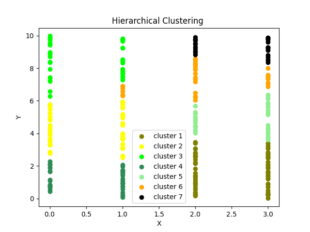
# Visualizing the clustered data using a scatter plot
# Each color represents a different cluster
# Plot all points belonging to cluster 1 in black
plt.scatter(df[df["labels"] == 0][0], df[df["labels"] == 0][1],
c='black', label='cluster 1')
# Plot all points belonging to cluster 2 in green
plt.scatter(df[df["labels"] == 1][0], df[df["labels"] == 1][1],
c='green', label='cluster 2')
# Plot all points belonging to cluster 3 in red
plt.scatter(df[df["labels"] == 2][0], df[df["labels"] == 2][1],
c='red', label='cluster 3')
# Plot all points belonging to cluster 4 in magenta
plt.scatter(df[df["labels"] == 3][0], df[df["labels"] == 3][1],
c='magenta', label='cluster 4')
# Plot all points belonging to cluster 5 in purple
plt.scatter(df[df["labels"] == 4][0], df[df["labels"] == 4][1],
c='purple', label='cluster 5')
# Plot all points belonging to cluster 6 in yellow
plt.scatter(df[df["labels"] == 5][0], df[df["labels"] == 5][1],
c='y', label='cluster 6')
# Plot all points belonging to cluster 7 in black
plt.scatter(df[df["labels"] == 6][0], df[df["labels"] == 6][1],
c='black', label='cluster 7')
# Display the legend to label each cluster in the plot
plt.legend()
# Label the x-axis representing feature 1 (first dimension)
plt.xlabel('X')
# Label the y-axis representing feature 2 (second dimension)
plt.ylabel('Y')
# Set the title of the scatter plot
plt.title('Hierarchical Clustering')
# Display the clustered scatter plot
plt.show()

Here is a step-by-step guide to visualizing hierarchical clustering in Python:
Step 1: Preprocess the data
Before visualizing hierarchical clustering, it is important to preprocess the data by scaling or normalizing it. This ensures that all features have a similar range and prevents any bias towards specific features.
Step 2: Perform hierarchical clustering
Next, we perform hierarchical clustering using the chosen algorithm, such as AgglomerativeClustering from Scikit-learn. This algorithm calculates the similarity between data points and merges them into clusters based on a specific linkage criterion.
Step 3: Create a dendrogram
We can use the dendrogram function from the SciPy library to create this visualization. The dendrogram allows us to visualize the distances and relationships between clusters.
Step 4: Plot the clusters
Finally, we can plot the clusters using a scatter plot or another suitable visualization technique. This helps us visualize the data points within each cluster and gain insights into the characteristics of each cluster.
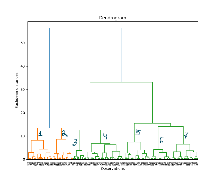
This dendogram can then help us to decide the number of clusters we can better use. As you can see, it seems like, in this case, we should use 7 clusters.
By visualizing hierarchical clustering in Python, we can gain a better understanding of the structure and relationships within our data. This visualization technique is particularly useful when dealing with complex datasets and can assist in decision-making processes and pattern discovery.
Remember to adjust the specific parameters and settings based on your dataset and objective. Experimenting with different visualizations and techniques can lead to even deeper insights into your data.