SwiftUI Tutorial for iOS - Creating Charts
SwiftUI Tutorial for iOS - Creating Charts 관련

Charts are an excellent way to present data to your users. They help users grasp the relationships inherent in large amounts of information. You can use charts to draw attention to trends, clarify causes and assist your users in truly visualizing the information.
In this SwiftUI tutorial, you’ll learn how to create a variety of custom charts to help visualize your app’s data.
While SwiftUI doesn’t provide a native chart library, it includes a rich graphics capability you can use to build custom charts. In this tutorial, you’ll add charts to an app showing historical weather data for several weather stations in and around the Great Smoky Mountains National Park.
Why Use a Chart?
Looking at a few points of data can be enlightening, but staring at a long list of numbers isn’t the best way to gain insight. A list of numbers doesn’t make it easier to get a sense of how warm a certain month was or determine what months are the driest.
Most people have an easier time grasping information when it’s presented graphically. A chart can provide a graphic representation of data designed to inform the viewer.
Charts vs. Graphs
While people often use the terms chart and graph interchangeably, they aren’t the same thing.
A graph shows any relation among values. A simple graph can show the value of y for a given x. The resulting curve can be pretty, but it doesn’t provide insight.
A chart should tell a story. It guides the viewer to a better understanding of the data by making it easier to understand and interpret. In short, all charts are graphs, but not all graphs are charts.
Getting Started
Download the materials by clicking the [Download Materials] button at the top or bottom of this tutorial. Open the begin project in Xcode, then build and run the app.
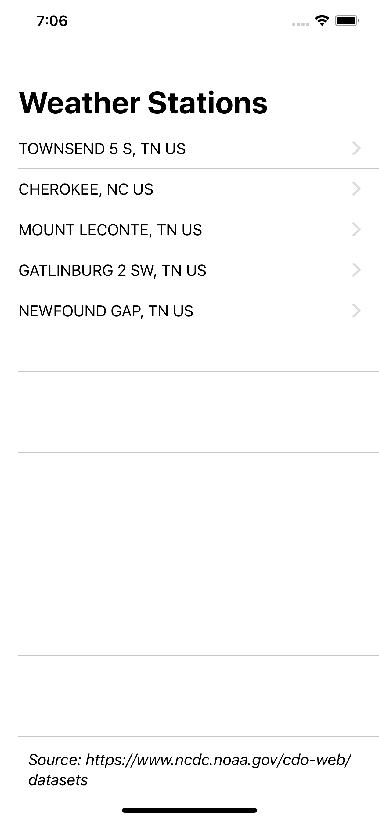
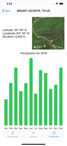
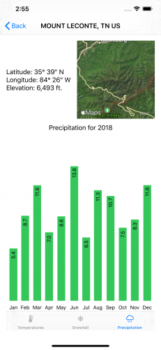
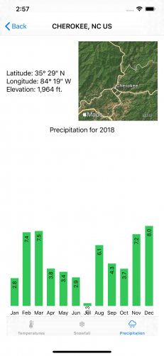
The app shows data for five stations:
- Cherokee, NC and Gatlinburg, TN: The two cities on the main road through the park.
- Newfound Gap: The gap the main road crosses.
- Townsend 5 S: A cover in the southwest part of the park.
- Mount LeConte: One of the highest mountains in the park.
The dataset contains the precipitation, snowfall and temperature range for each day at each location.
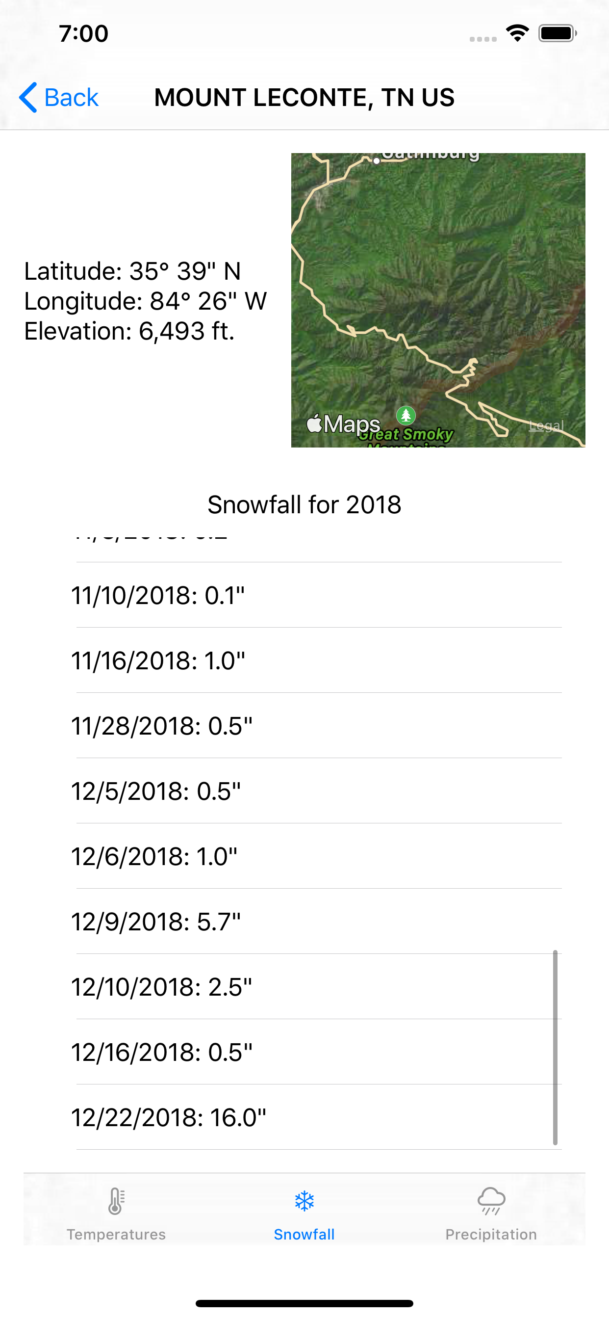
Tapping a location shows information about the location, a map showing the location and three tabs of weather information. The three tabs show the temperature range for each day, the total precipitation for each month and the snowfall for each day with snow.
To begin, you’ll add a bar chart to the app which displays the precipitation data.
Refactoring for Charts
A bar chart provides a bar for each data point. The length of each bar represents a numerical value and can run horizontally or vertically to suit your needs.
Expand the [Tabs] group and open PrecipitationTab.swift. You’ll see a standard SwiftUI List() that loops through the integers zero through 11, representing the months of the year, and displays the total precipitation for each month. The included helper functions change the integer to a month name and sum the amounts for each month.
Right click the empty [Charts] group and select [New File]. Select [SwiftUI View] and click [Next]. Name the new view PrecipitationChart.
Ensure the group is set to Charts and click [Create]. Open the new file. If the Canvas isn’t visible, turn it on by selecting [Editor] ▸ [Canvas] from the menu so you can see your progress.
Add the following code at the top of the PrecipitationChart struct:
var measurements: [DayInfo]
You pass the measurements into the chart using this variable. Now update PrecipitationChart_Previews to pass in measurements for the preview. In this case, you’ll pass in the measurements for Mt. LeConte.
PrecipitationChart(measurements: WeatherInformation()!.stations[2].measurements)
At first, you’re going to replicate the existing functionality in this new view. First, add two helper functions after measurements:
func sumPrecipitation(_ month: Int) -> Double {
  self.measurements.filter {
    Calendar.current.component(.month, from: $0.date) == month + 1
  }.reduce(0, { $0 + $1.precipitation })
}

func monthAbbreviationFromInt(_ month: Int) -> String {
  let ma = Calendar.current.shortMonthSymbols
  return ma[month]
}
sumPrecipitation(_:) uses filter to get only the measurements for the month passed into the function. It adjusts for the integer passed in starting at zero instead of one. reduce sums the precipitation values for those measurements.
monthAbbreviationFromInt(_:) gets a list of the abbreviated month symbols for the current calendar and returns the one that matches the passed integer.
Update body to replicate the existing list:
List(0..<12) { month in
  Text("\(self.monthAbbreviationFromInt(month)): " +
    "\(self.sumPrecipitation(month))\"")
}
Open PrecipitationTab.swift and delete the no longer needed sumPrecipitation(_:) and monthAbbreviationFromInt(_:) methods. Inside body, replace the List and enclosure with a call to the new view:
PrecipitationChart(measurements: station.measurements)
Note
When you run the app make sure you're on the Precipitation tab after selecting a location to see the results.
Raising the SwiftUI Bar
SwiftUI contains several shape views, including a Rectangle shape that works well for building bar charts. Open PrecipitationChart.swift and replace body with:
// 1
HStack {
  // 2
  ForEach(0..<12) { month in
    // 3
    VStack {
      // 4
      Spacer()
      // 5
      Rectangle()
        .fill(Color.green)
        .frame(width: 20, height: CGFloat(self.sumPrecipitation(month)) * 15.0)
      // 6
      Text("\(self.monthAbbreviationFromInt(month))")
        .font(.footnote)
        .frame(height: 20)
    }
  }
}
Here’s a step by step breakdown of what's happening:
A month with one inch of rain results in a rectangle 20 points wide and 15 points long. A month with seven inches of rain shows as a rectangle 20 points wide and 105 points long.
- You've created vertical bars so you use
HStackto arrange the child views horizontally on the device. - You loop through the months using
ForEach. - You use
VStackfor each bar in the chart to stack the elements vertically. - You specify sizes on the other views in the stack and this
Spacerexpands to fill the remaining space. In effect, it tells SwiftUI to put the empty space at the top ofVStack. - You use the
RectangleSwiftUI shape primitive. It creates a rectangle shape that aligns with the view's containing frame and fills it using green. You specify a frame with a constant width and the height as the total precipitation for the month in inches multiplied by 15. - You also provide a label for each bar, in this case, a month of the year. At the bottom of the stack, the
Textview contains the abbreviated name for the corresponding month with the.footnotefont and a static height. Providing a static height ensures the bottoms of the bars line up.
Adding a drop more detail
Adding a drop more detail You've built a good bar chart by taking advantage of the functionality that SwiftUI provides. The outer HStack equally spaces the bars of the chart, which helps readability. The height of the bars shows the proportional amounts of rain over the year.
However, the chart doesn't clearly indicate the exact amounts of precipitation. Add the following code after the Spacer in body to show that data:
Text("\(self.sumPrecipitation(month).stringToOneDecimal)")
  .font(.footnote)
  .rotationEffect(.degrees(-90))
  .offset(y: 35)
  .zIndex(1)
You’ve added a text view to each bar. It displays the total precipitation for that month rounded to one decimal using an extension method on the Double type. You can find it in DoubleExtension.swift.
The text view’s font is set to match the month label and rotates the text counterclockwise by 90 degrees so it flows parallel to the bar. The view is then offset by 35 points downward, placing it inside the bar.
SwiftUI renders views in the order they’re read. This means the rainfall amount would normally be behind the bar since it occupies the same space.
Setting the zIndex property to something other than the default zero value tells SwiftUI to override that default order. Setting it to one tells SwiftUI to draw the Text on top of views with the default zIndex including the bar.
Build and run the app to test this new text view out. Then go to the Cherokee, NC station and select the precipitation tab to see an interesting little bug. Little rain fell in July of 2018 making the bar too short to contain its text.
To fix this bug, you need to add a check to the offset by replacing the offset in the text view with the following:
.offset(y: self.sumPrecipitation(month) < 2.4 ? 0 : 35)
If the amount of precipitation for a month is less than 2.4 inches, which would result in a bar 36 points long, the text remains at the top of the bar.

Beautiful! You've now successfully replaced a list with a bar chart. This chart lets the viewer see all the original list data with a clearer visual guide to the differences in precipitation for each month.
Now that you have a precipitation chart, you're ready to create a horizontal bar chart for snowfall.
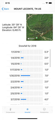
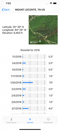
Building a Horizontal Bar Chart
The Smoky Mountains contain some of the highest elevations in the eastern United States. But, outside of those higher elevations, they receive less snow than you might expect.
The scarcity of snow means a chart grouping by month, as the precipitation chart did, would show bumps at the start and end of the year with nothing in the middle. Instead, you'll graph the snow using a horizontal bar chart that only shows the days of the year receiving snowfall.
Right click the [Charts] group in Xcode and select [New File]. Select [SwiftUI View] and click [Next].
Name the new view SnowfallChart and ensure the group is set to Charts. Click [Create] and open the new file.
You need to pass measurements to this view again by adding the following code to the top of the struct:
var measurements: [DayInfo]
You'll use Mount LeConte for the preview because it has the most days with snowfall and the largest amounts of snow. Change the preview to:
SnowfallChart(measurements: WeatherInformation()!.stations[2].measurements)
Next, change body to the following:
// 1
List(measurements.filter { $0.snowfall > 0.0 }) { measurement in
  HStack {
    // 2
    Text("\(measurement.dateString)")
      .frame(width: 100, alignment: .trailing)
    // 3
    Rectangle()
      .fill(Color.blue)
      .frame(width: CGFloat(measurement.snowfall * 10.0), height: 5.0)
    // 4
    Spacer()
    Text("\(measurement.snowfall.stringToOneDecimal)\"")
  }
}
Here’s a step by step breakdown:
You align the text to the .trailing side of the frame next to the start of the bar showing the amount of snowfall.
- You create a
Listwith an entry for each measurement with snowfall. - You start each row with the date the snow fell. By default, a
Textview sizes to fit the text it contains leaving the rows with varying widths. Applying a constant width ensures the bar begins at the same horizontal position for each row. - You use a blue rectangle for the bar. Since this is a horizontal rather than vertical chart, you give the bar a constant height and set the width based on the amount of snow. Since you have less space horizontally on the view, you use fewer points to represent each inch of snow compared to the previous chart.
- After a
Spacer()that fills the empty space after the bar, you show the amount of snow in inches, again rounding to one-tenth of an inch. Back in SnowfallTab.swift replace theListand its closure inside ofbodywith a call to the new view:
SnowfallChart(measurements: station.measurements)
The chart now shows snowfall for the year. Look at December for a particularly impressive snowfall.
Adding Grid Lines
Because of the large variance in snowfall amounts, you can clarify the chart further by adding grid lines. These are lines placed on a chart or graph at a constant value. This makes it easier for the viewer to gauge the length of the bar.
First, change the code for the Rectangle() in SnowfallChart to:
ZStack {
  Rectangle()
    .fill(Color.blue)
    .frame(width: CGFloat(measurement.snowfall * 10.0), height: 5.0)
}
The ZStack lets you overlay multiple child views in the same space. In this case, you’ll overlay the bar and the grid lines. You'll draw grid lines at one-inch intervals out to the greatest measurement of 16 inches.
Add the following code inside the the ZStack after the Rectangle:
ForEach(0..<17) { mark in
  Rectangle()
    .fill(Color.gray)
    .offset(x: CGFloat(mark) * 10.0)
    .frame(width: 1.0)
    .zIndex(1)
}
Here you draw a rectangle filled in gray for each month of data. The offset(x:y:) modifier shifts each line to the right by the appropriate amount, then sets a frame with a width of one, turning the rectangle into a line. You set the zIndex of the Rectangle again so that it shows on top of the bar.
Notice that by not setting a height for the frame, it expands to the height of the view containing it. If you view the current state, you'll notice something a bit off.

The grid lines and bars don't always line up correctly. By default, a ZStack aligns its child views in the center, but you can explicitly specify the alignment of the child views with a little modification. Change the line declaring the ZStack to:
ZStack(alignment: .leading) {
Now the bar and grid line up as expected.
If you're using many grid lines, you can help the viewer by providing a visual cue at regular intervals. Change the call to fill(_:style:) to:
.fill(mark % 5 == 0 ? Color.black : Color.gray)
This uses the Swift ternary operator to color every fifth indicator black using the remainder operator.
Now that you've gained experience creating a couple of basic charts, you can move on to creating a more complex heat map for temperature data.
Creating a Heat Map
Create a new SwiftUI view in the Charts group and name the new view TemperatureChart. Open TemperatureChart.swift and add a variable for the measurement data at the beginning of the struct.
var measurements: [DayInfo]
Change the preview to provide the information:
TemperatureChart(measurements: WeatherInformation()!.stations[1].measurements)
This chart should convey the high and low temperatures for each station across the year. You'll need to use some helper functions to achieve this visualization. Add the following methods to the struct after the measurements variable:
func degreeHeight(_ height: CGFloat, range: Int) -> CGFloat {
  height / CGFloat(range)
}

func dayWidth(_ width: CGFloat, count: Int) -> CGFloat {
  width / CGFloat(count)
}
Instead of using a fixed amount determined by trial and error, this chart adjusts to fit the view. These two functions calculate the points taken by one degree of temperature vertically and the points taken by one day horizontally for the chart. Both functions divide the size of the dimension by the number of elements. The result gives the number of points to use for each element in the view.
With that result, you can determine the point location in the view for a given day and temperature. Add the following two functions after the previous two:
func dayOffset(_ date: Date, dWidth: CGFloat) -> CGFloat {
  CGFloat(Calendar.current.ordinality(of: .day, in: .year, for: date)!) * dWidth
}

func tempOffset(_ temperature: Double, degreeHeight: CGFloat) -> CGFloat {
  CGFloat(temperature + 10) * degreeHeight
}
dayOffset(_:dWidth:) calculates the day of the year from the passed in date and then multiples by the dWidth parameter. This calculates the horizontal position to plot this measurement in the view.
tempOffset(_:degreeHeight:) does a similar calculation to get the point for a given temperature. Since you start the temperature range at -10 degrees, you add ten to the temperature before the multiplication. This shifts the bottom of the range to come out to zero points.
Now change body to the following:
// 1
GeometryReader { reader in
  ForEach(self.measurements) { measurement in
    // 2
    Path { p in
      // 3
      let dWidth = self.dayWidth(reader.size.width, count: 365)
      let dHeight = self.degreeHeight(reader.size.height, range: 110)
      // 4
      let dOffset = self.dayOffset(measurement.date, dWidth: dWidth)
      let lowOffset = self.tempOffset(measurement.low, degreeHeight: dHeight)
      let highOffset = self.tempOffset(measurement.high, degreeHeight: dHeight)
      // 5
      p.move(to: CGPoint(x: dOffset, y: reader.size.height - lowOffset))
      p.addLine(to: CGPoint(x: dOffset, y: reader.size.height - highOffset))
      // 6
    }.stroke()
  }
}
There's a lot here, but the functions simplify much of the needed calculations. Here's how the code works:
In the previous charts, you used constant sizes to produce something that looked correct. Now you calculate the best values for the chart using these values with the earlier functions.
- You create the
GeometryReaderto wrap the chart. AGeometryReaderexpands to fill the view containing it. The closure also provides aGeometryProxyparameter that contains information about the size of the view. Pathprovides a way to create a two dimensional shape. Here you'll create a vertical line connecting the low and high temperatures for each day.Pathalso has a bit of a unique feature in SwiftUI in that you can define variables inside it easing the calculation of points for the path.- Here you use the two functions to calculate the size in points of one degree of temperature and one day for the view using the size from the
GeometryReader. You use a range of 110 because -10 to 100 degrees Fahrenheit covers the range of temperatures found for all locations in the data for this year. - Now you use the functions to determine the vertical point for the date as well as the high and low temperatures.
- These lines move the path to the point for the low temperature and add a line to the high temperature. The vertical view coordinates begin at the top of the view and increase downward. As you want points to start at the bottom and go upward, you subtract the vertical position from
reader.size.heightto get the desired location. stroke()tells SwiftUI to outline the path you've created in the current system color.
Open TemperatureTab.swift and replace body with this to use your new view:
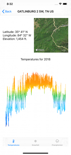
VStack {
  Text("Temperatures for 2018")
  TemperatureChart(measurements: station.measurements)
}.padding()
Build and run the app. Select any location and look at the temperature tab. Notice that the chart adapts to fit the smaller in-app view as well as the larger preview.
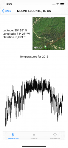
The shape of the chart shows the changes in temperature pretty well but looks a bit bland. Next, you'll make it more interesting by turning the chart into a heat map that uses color to more clearly indicate temperatures.
Adding Heat Map Color
A heat map graphically represents values using colors. Weather maps often represent temperatures using a range of colors starting with purple and blue shades for low temperatures and moving toward yellow, orange and red shades for warmer temperatures. Calculating these colors and changes could involve some complicated math, but not here.
In SwiftUI, you represent the transitions of color using a gradient. A linear gradient creates a smooth color transition between two or more colors along a single axis. Add the following in TemperatureChart.swift after measurements and before the helper functions:
let tempGradient = Gradient(colors: [
  .purple,
  Color(red: 0, green: 0, blue: 139.0/255.0),
  .blue,
  Color(red: 30.0/255.0, green: 144.0/255.0, blue: 1.0),
  Color(red: 0, green: 191/255.0, blue: 1.0),
  Color(red: 135.0/255.0, green: 206.0/255.0, blue: 250.0/255.0),
  .green,
  .yellow,
  .orange,
  Color(red: 1.0, green: 140.0/255.0, blue: 0.0),
  .red,
  Color(red: 139.0/255.0, green: 0.0, blue: 0.0)
])
This defines a gradient consisting of 12 colors to evenly split a temperature range of 110 degrees by ten-degree increments, from purple for -10 to dark red for 100 degrees.
Now change the stroke() at comment six in the body view to:
.stroke(LinearGradient(
  gradient: self.tempGradient,
  startPoint: UnitPoint(x: 0.0, y: 1.0),
  endPoint: UnitPoint(x: 0.0, y: 0.0)))
You replace the solid color with a linear gradient using the previously defined gradient colors. The startPoint and endPoint parameters let you do something almost magical.
Both parameters are UnitPoints that define space in a point independent way where 0.0 and 1.0 mark the edges of the view. The zero points for each direction are at the origin: the top left corner of the view.
You set the start point for the gradient to the bottom left corner of the view and the endpoint to the top left corner of the view. Since it's a linear gradient, the gradient varies only vertically. Each color extends horizontally across the entire view at each point.
Applying it to the path means the gradient shows only for the stroked portion: The range between the low and high temperatures.
Adding Grid Lines and Labels
All that's left now is to make things a little easier on the viewers eyes by adding grid lines, similar to what you did in the bar charts. Add the following helper function after the existing ones in TemperatureChart.swift:
func tempLabelOffset(_ line: Int, height: CGFloat) -> CGFloat {
  height - self.tempOffset(
    Double(line * 10),
    degreeHeight: self.degreeHeight(height, range: 110))
}
This divides the grid into ten-degree blocks and passes in an integer representing the starting temperature divided by ten for that block along with the total height of the view. The function calculates the appropriate vertical offset.
Add the following code to draw the temperature grid lines and labels after the closing bracket of the ForEach loop in body:
// 1
ForEach(-1..<11) { line in
  // 2
  Group {
    Path { path in
      let y = self.tempLabelOffset(line, height: reader.size.height)
      path.move(to: CGPoint(x: 0, y: y))
      path.addLine(to: CGPoint(x: reader.size.width, y: y))
      // 4
    }.stroke(line == 0 ? Color.black : Color.gray)
    // 5
    if line >= 0 {
      Text("\(line * 10)°")
        .offset(x: 10, y: self.tempLabelOffset(line, height: reader.size.height))
    }
  }
}
Here's a breakdown of the new code:
- You loop through the range of -1 to 10 representing the temperatures -10 to 100 degrees Fahrenheit.
- A
Groupview acts as a bit of glue in SwiftUI that combines its child views but doesn't render an element directly. Here it allows you to use both aPathand aText()view inside the loop. - You use the function you just added to calculate the position of the temperature for this line. Then you draw the line horizontally from the left side to the right side of the view at that vertical position.
- You draw most of the grid lines in gray. To help the zero degrees line stand out, you show it in black.
- For all except the first grid line, you add a text label. Since you're no longer inside the
Pathenclosure, you recalculate the position for the temperature the line represents. You again use thetempLabelOffset(_:height:)function to calculate the vertical position.

With the temperatures done, you need indicators and labels for the months to finish. Add the following two helper functions after the existing ones:
func offsetFirstOfMonth(_ month: Int, width: CGFloat) -> CGFloat {
  let dateFormatter = DateFormatter()
  dateFormatter.dateFormat = "M/d/yyyy"
  let foM = dateFormatter.date(from: "\(month)/1/2018")!
  let dayWidth = self.dayWidth(width, count: 365)
  return self.dayOffset(foM, dWidth: dayWidth)
}

func monthAbbreviationFromInt(_ month: Int) -> String {
  let ma = Calendar.current.shortMonthSymbols
  return ma[month - 1]
}
Add the following code to add the month grid lines and labels to the end of body after the closing bracket of the previous ForEach loop:
ForEach(1..<13) { month in
  Group {
    Path { path in
      let dOffset = self.offsetFirstOfMonth(month, width: reader.size.width)

      path.move(to: CGPoint(x: dOffset, y: reader.size.height))
      path.addLine(to: CGPoint(x: dOffset, y: 0))
    }.stroke(Color.gray)
    Text("\(self.monthAbbreviationFromInt(month))")
      .font(.subheadline)
      .offset(
        x: self.offsetFirstOfMonth(month, width: reader.size.width) +
          5 * self.dayWidth(reader.size.width, count: 365),
        y: reader.size.height - 25.0)
  }
}
There's nothing here you haven't used before. A Group, as before, wraps the grid lines and month labels. You then draw a vertical line at the offset that corresponds to the first day of each month.
Then you get the text abbreviation for each month and draw it at the same offset plus a small shift to move the text into the middle of the month. You get the text abbreviation for each month and draw it at the same offset plus a small shift to move the text into the middle of the month.
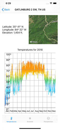
Your chart now gives a good overview of the temperature ranges at each location. The top and bottom of each vertical line combine with the color to clearly show the temperatures at different times of the year. The grid lines and labels help the viewer identify a time of year or temperature range.
Where to Go From Here
You can download the finished project by clicking the [Download Materials] button at the top or bottom of this tutorial.
With all UI things, the Apple Human Interface Guidelines are a good starting point if you’d like to learn more. You'll find a brief section on Charts in the Human Interface Guidelines. You should also read the guidelines on Color when choosing colors for your charts.
Chapter 13: Drawing and Custom Graphics in SwiftUI by Tutorials is a good introduction to creating SwiftUI graphics. But perhaps I'm biased since I wrote it.
If you have any questions or comments, please join the discussion below.
