
Displaying a detail screen with NavigationLink
Displaying a detail screen with NavigationLink 관련

Updated for Xcode 15
When a menu item is tapped, we want to bring in a detail view that shows more information. We already placed ContentView inside a navigation stack, so now we can use a new view type called NavigationLink. We need to give this a destination – what kind of thing it should show – as well as what to show on-screen for the link.
In practice, this looks like all the other containers we've used so far, so let's try it out with a neat shortcut: although we're going to be showing a detail view in just a minute, we can use a regular text view as a placeholder.
So, put this directly around the ItemRow code in ContentView.swift:
NavigationLink {
    Text(item.name)
} label: {
    // existing contents…
}
That means the whole row is a navigation link with a destination of the item's name.
If you run the app now you'll see two important differences:
- All our rows now have a gray disclosure indicator on their right edge, because SwiftUI gives us the correct behavior by default.
- When you tap on any item a new screen will slide in saying the name of whatever item you chose. Being able to present text views like this is a great timesaver while building up user interfaces!
Of course, we want more – we want a nice big picture, some details about the food, and more. So, press Cmd+N to make another new SwiftUI view, this time called ItemDetail.swift.
As with ItemRow, this needs to have a menu item passed in and stored as a property, so add this to ItemDetail now:
let item: MenuItem
We also need to update its preview code to use our example item, so we can see what we're doing:
static var previews: some View {
    ItemDetail(item: MenuItem.example)
}
As with our list rows, we're going to start off simple and iterate until we get something that works well.
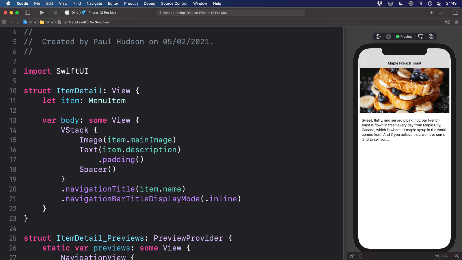
First, a simple version of our ItemDetail view that has an item's image and description, plus a title at the top:
struct ItemDetail : View {
    let item: MenuItem

    var body: some View {
        VStack {
            Image(item.mainImage)
            Text(item.description)
        }
        .navigationTitle(item.name)
    }
}
So that you can start seeing things in action immediately, let's update our NavigationLink in ContentView.swift so that it shows an ItemDetail view with the selected item. There are two ways of doing this, with the simplest one just being to place the ItemDetail code right where we had Text(item.name), like this:
NavigationLink {
    ItemDetail(item: item)
} label: {
That works, but behind the scenes it causes SwiftUI to do more work than you might think – every time it creates a row in our List it will also create the NavigationLink, and as part of that it will also create the ItemDetail for every visible row.
That's far from ideal, so SwiftUI gives us a faster, simpler alternative: we can attach any Hashable object directly to the NavigationLink as its value, then use a navigationDestination() modifier to tell SwiftUI “when you're asked to navigate to a MenuItem, load an ItemDetail view with that value.
This takes two steps. First, we need to change the NavigationLink code to this:
NavigationLink(value: item) {
    ItemRow(item: item)
}
And now we meed to add this modifier to the List – before navigationTitle() is fine, but it doesn't really matter:
.navigationDestination(for: MenuItem.self) { item in
    ItemDetail(item: item)
}
Now you can run the code as we progress, seeing the detail screen in action.
You won't see the title at the top because the preview doesn't know it's in a navigation stack. To fix that, we can just change the preview like so:
struct ItemDetail_Previews: PreviewProvider {
    static var previews: some View {
        NavigationStack {
            ItemDetail(item: MenuItem.example)
        }
    }
}
That doesn't actually change what our code does at runtime – it's just the preview that has changed.
You can see that our detail view has some layout issues, so let's correct them.
First, that navigation bar title shouldn't be big, because Apple recommends using that style only for top-level screens in a user interface. We can fix that by adding another modifier below navigationTitle(), like this:
.navigationBarTitleDisplayMode(.inline)
Second, while having the image very wide looks fine, having the description text go edge to edge is less good. We can fix that by adding a padding() modifier like this:
Text(item.description)
    .padding()
The padding() modifier lets us specify the sides where we want padding and also how much to use, but without any parameters it will apply padding to all edges. How much it will apply depends on the context – what device is being used, etc – but it generally looks good.
Third, it looks strange having our content vertically centered, because our eyes are used to information being aligned to the top. To fix that we can use another Spacer(), directly after the item description:
Image(item.mainImage)
Text(item.description)
    .padding()
Spacer()
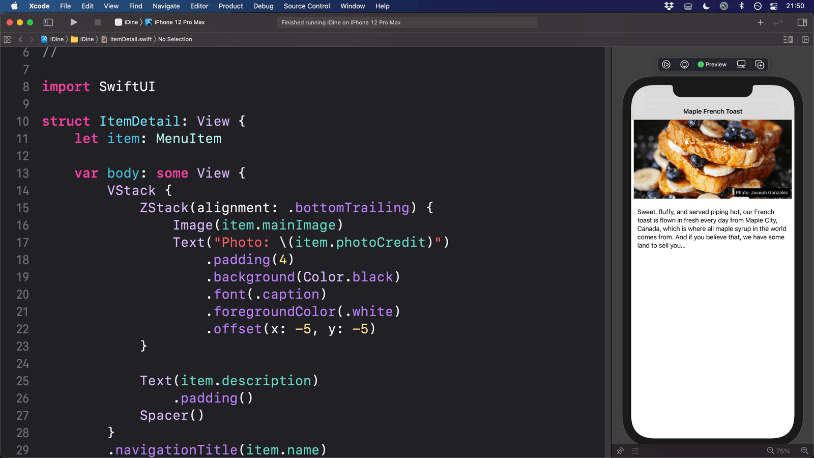
This is starting to look good, but we also need to find a way to show the name of the person who took the photo of our food. We could put that below the picture or inside an alert, but a better idea is to put over the image, in the bottom-right corner.
You've already met horizontal and vertical stacks (HStack and VStack), but SwiftUI gives us a third option called ZStack to handle overlapping views. To use one here, replace our existing image with this:
ZStack {
    Image(item.mainImage)
    Text("Photo: \(item.photoCredit)")
}
That creates the image then layers some text on top. Chances are you'll struggle to see that text, so let's apply some modifiers to make it clearer:
Text("Photo: \(item.photoCredit)")
    .padding(4)
    .background(.black)
    .font(.caption)
    .foregroundStyle(.white)
Tip: If you swap the order of the padding() and background() modifiers the result is different. The order matters!
It's more visible now, but that just means we can see it doesn't look great – it shouldn't really be right over our food!
To fix that we can add some alignment to our ZStack so that the label is in the bottom-right corner:
ZStack(alignment: .bottomTrailing) {
We can even apply some custom offsets to the text, pulling it up and left just a little from the edge:
Text("Photo: \(item.photoCredit)")
    .padding(4)
    .background(.black)
    .font(.caption)
    .foregroundStyle(.white)
    .offset(x: -5, y: -5)
Nice!
There is one other layout issue, but you might not have noticed it yet depending on your Xcode configuration: some parts of our user interface hang off the screen!
I've been using the iPhone 14 Pro Max device for my canvas so far, which works great because it has a huge screen. However, if I change to a small device – e.g. the iPhone SE (go to Product > Destination > iPhone SE (3rd Generation)) – that has a much smaller screen, and now you should see the photo credit area is now running off the right edge of the screen.
This is happening because SwiftUI displays images at their natural size by default, meaning that they take up the same amount of width and height on screen as they have in pixels. Our main image is too big for the iPhone SE screen, and so rather than squishing it SwiftUI just lets it overflow outside of the screen – the image hangs out, and in doing so allows everything else to grow too.
To fix this we need to add two new modifiers to our image: one to make the image resizable, and one to make it scale itself to fit the available space.
So, modify your image to this:
Image(item.mainImage)
    .resizable()
    .scaledToFit()
With that small change, our image will run edge to edge on all iPhone screen sizes, which is much better. As well as scaledToFit(), there is also a scaledToFill() modifier – the former will ensure the whole image is visible, even if that means leaving a little space empty, whereas the latter will never leave any space empty even if that means clipping some of the picture. Both will automatically retain the natural aspect ratio of the image they are applied to.
Further reading
Similar solutions…
