
Two-way bindings in SwiftUI
Two-way bindings in SwiftUI 관련

Updated for Xcode 15
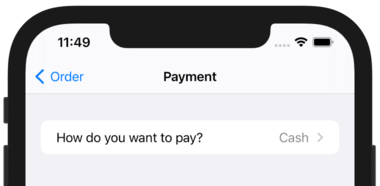
If you look in the SwiftUI preview window you'll see the standard iOS picker interface – a pop up menu of options. By default it will show the first option, because it reads the value of paymentType, which we set to “Cash”. However, when the user brings up the menu their selection changes – they might select “Credit Card” or “iDine Points” instead of cash.
So, this picker doesn't just read the value of paymentType, it also writes the value. This is what's called a two-way binding, because any changes to the value of paymentType will update the picker, and any changes to the picker will update paymentType.
This is where the dollar sign comes in: Swift property wrappers use that to provide two-way bindings to their data, so when we say $paymentType SwiftUI will write the value using the property wrapper, which will in turn stash it away and cause the UI to refresh automatically.
At first glance all these @ and $s might seem a bit un-Swifty, and it's true that if you're coming from UIKit you might not used to working in this way. However, they allow us to get features that would otherwise require a lot of hassle:
- Without
@Statewe wouldn't be able to change properties in our structs, because structs are fixed values. - Without
StateObjectwe wouldn't be able to create classes that stay alive for the duration of our app. - Without
@EnvironmentObjectwe wouldn't be able to receive shared data from elsewhere in our app. - Without
ObservableObjectwe wouldn't be notified when an external value changes. - Without
$propertytwo-way bindings we would need to update values by hand.
Anyway, that's our basic picker complete, so if we return to OrderView.swift we can update our code so that it shows our new CheckoutView struct rather than some text saying “Checkout”.
Find this code:
NavigationLink("Place Order") {
    Text("Check out")
}
And replace it with this:
NavigationLink("Place Order") {
    CheckoutView()
}
Try running the app now, then go to the Order tab and press Place Order. The result is… well, less than perfect, let's put it that way. And that's despite putting in quite a lot of work just to get this far.
Well, we're going to change just one word in CheckoutView.swift, and it should make all that work feel justified.
Inside CheckoutView, I'd like you to change VStack to Form, then press Cmd+R to try the app again. Can you spot the difference?
Previously we had a plain pop up menu with no title, but now that we're in a form we get a single table row that shows our picker's title alongside its currently selected value.
This is the power of SwiftUI's declarative approach to user interfaces: we say what behavior we want rather than the precise styling of it, and SwiftUI will automatically adapt it according to the context where it's used.
Let's continue on with our form by adding two more components: one that lets users select whether they have an iDine loyalty card, and another that lets them enter their card number. Both of these need two-way bindings just like our picker, so let's start with two new @State properties:
@State private var addLoyaltyDetails = false
@State private var loyaltyNumber = ""
Now we can add controls to our form to represent those – Toggle is the equivalent of a UISwitch, and TextField is the equivalent of UITextField. Add these two inside our existing form section:
Toggle("Add iDine loyalty card", isOn: $addLoyaltyDetails)
TextField("Enter your iDine ID", text: $loyaltyNumber)
There's not a lot of code there, but it's worth mentioning some details:
- Both controls are bound to those
@Stateproperties we just made. - The
Toggleswitch has some text inside that will automatically appear to the left as a description. - The
TextFieldhas some placeholder text so users know what to type in there.
Before you run the app, there's another change I'd like to talk about first. That text field we just added – should it always be there, or only when the toggle switch is enabled?
We bound Toggle to the value of addLoyaltyDetails, which means when the user flicks it on or off that Boolean gets set to true or false. Wouldn't it be great if the text field was visible only when the toggle was on?
Well, it turns out that's pretty easy to do. Try wrapping the text field in a condition:
Toggle("Add iDine loyalty card", isOn: $addLoyaltyDetails)

if addLoyaltyDetails {
    TextField("Enter your iDine ID", text: $loyaltyNumber)
}
When you run the program now you'll see that changing the state of the toggle shows or hides the text field. If you think it through this should all make sense:
- The toggle has a two-way binding to the
addLoyaltyDetailsproperty. - That means when the toggle is changed, the property updates.
- That property is marked with
@State. - When any
@Stateor@EnvironmentObjectchanges its value, SwiftUI will re-invoke thebodyproperty. - That
bodyproperty directly reads the value ofaddLoyaltyDetailsto decide whether the text field is created or not.
For an improved effect, modify the binding on the Toggle so that it animates any changes it causes:
Toggle("Add iDine loyalty card", isOn: $addLoyaltyDetails.animation())
That will cause the loyalty card row to slide in and out smoothly.
Let's try another common control: segmented controls. In SwiftUI this is actually just a Picker with a modifier, so it works in exactly the same way – we give it a two-way binding that stores its selection, then use a ForEach to loop over an array to create some options to choose from.
For this screen, we can use a segmented control to represent various tip percentages that the user can select from. So, first add this property to store the options we want to show:
let tipAmounts = [10, 15, 20, 25, 0]
Now add this property to store the selected tip amount:
@State private var tipAmount = 15
We can now put all that into a segmented control in our form. I'm going to put this into a new section in our form, because it lets us add a title that makes the UI clearer:
Section("Add a tip?") {
    Picker("Percentage:", selection: $tipAmount) {
        ForEach(tipAmounts, id: \.self) {
            Text("\($0)%")
        }
    }
    .pickerStyle(.segmented)
}
We're going to add one more component to our form, which is a button to actually confirm the order. We'll come back to its exact functionality in just a moment, because there are other things we need to look at first.
Here's the final section for the table:
Section("Total: $100") {
    Button("Confirm order") {
        // place the order
    }
}
Yes, I know the total order value is wrong, but just run the app for now.
We added a button inside ItemDetail and it was blue text on a clear background, centered on the screen. Now we have a button in our form, and it's different: it's blue text, left aligned, and if you tap it the whole row flashes gray. This is another example of the way SwiftUI's forms system changes the design and behavior of components inside it.
Further reading
Similar solutions…