
How to position views in a grid using LazyVGrid and LazyHGrid
How to position views in a grid using LazyVGrid and LazyHGrid 관련

Updated for Xcode 15
SwiftUI's LazyVGrid and LazyHGrid give us grid layouts with a fair amount of flexibility. The simplest possible grid is made up of three things: your raw data, an array of GridItem describing the layout you want, and either a LazyVGrid or a LazyHGrid that brings together your data and your layout.
For example, this will create a vertical grid layout using cells that are 80 points in size:
struct ContentView: View {
    let data = (1...100).map { "Item \($0)" }

    let columns = [
        GridItem(.adaptive(minimum: 80))
    ]

    var body: some View {
        ScrollView {
            LazyVGrid(columns: columns, spacing: 20) {
                ForEach(data, id: \.self) { item in
                    Text(item)
                }
            }
            .padding(.horizontal)
        }
        .frame(maxHeight: 300)
    }
}
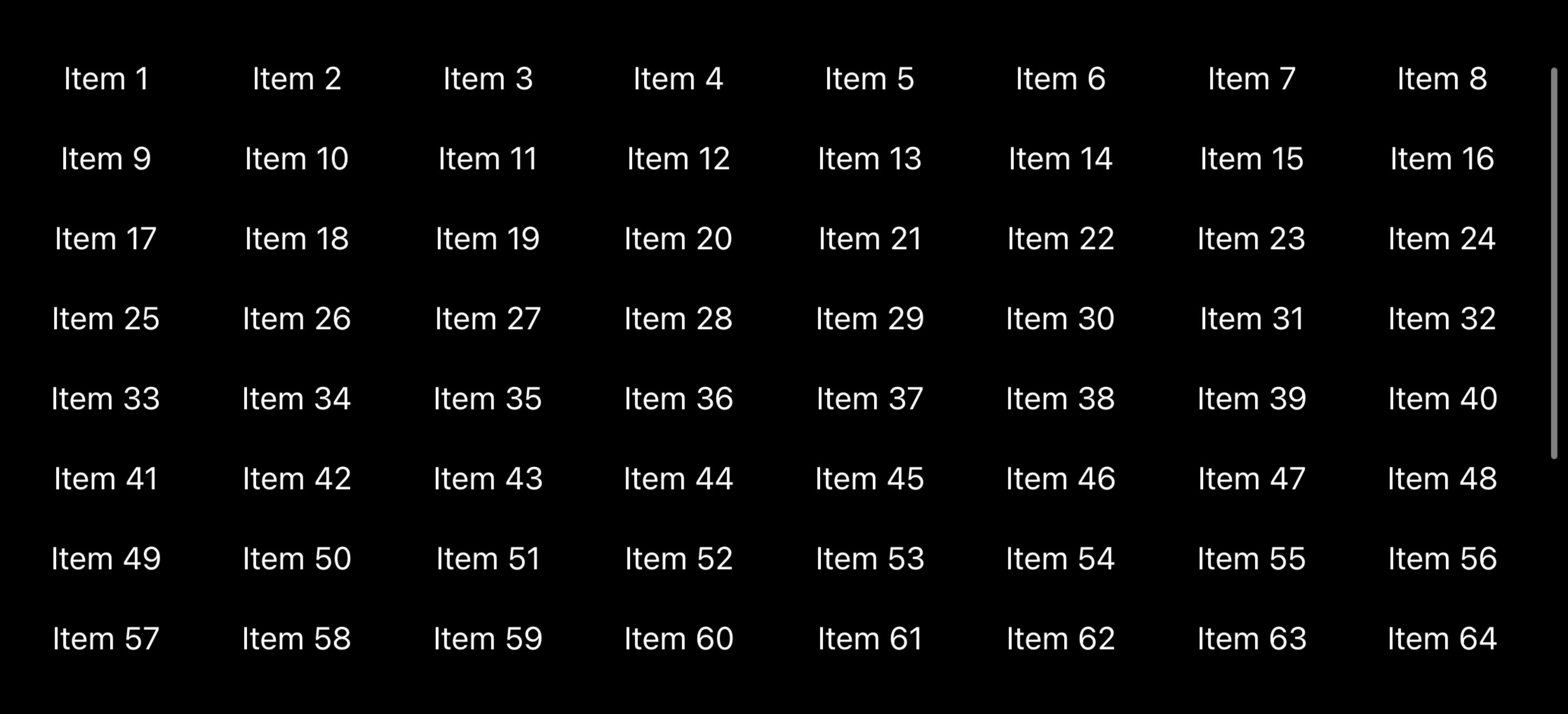
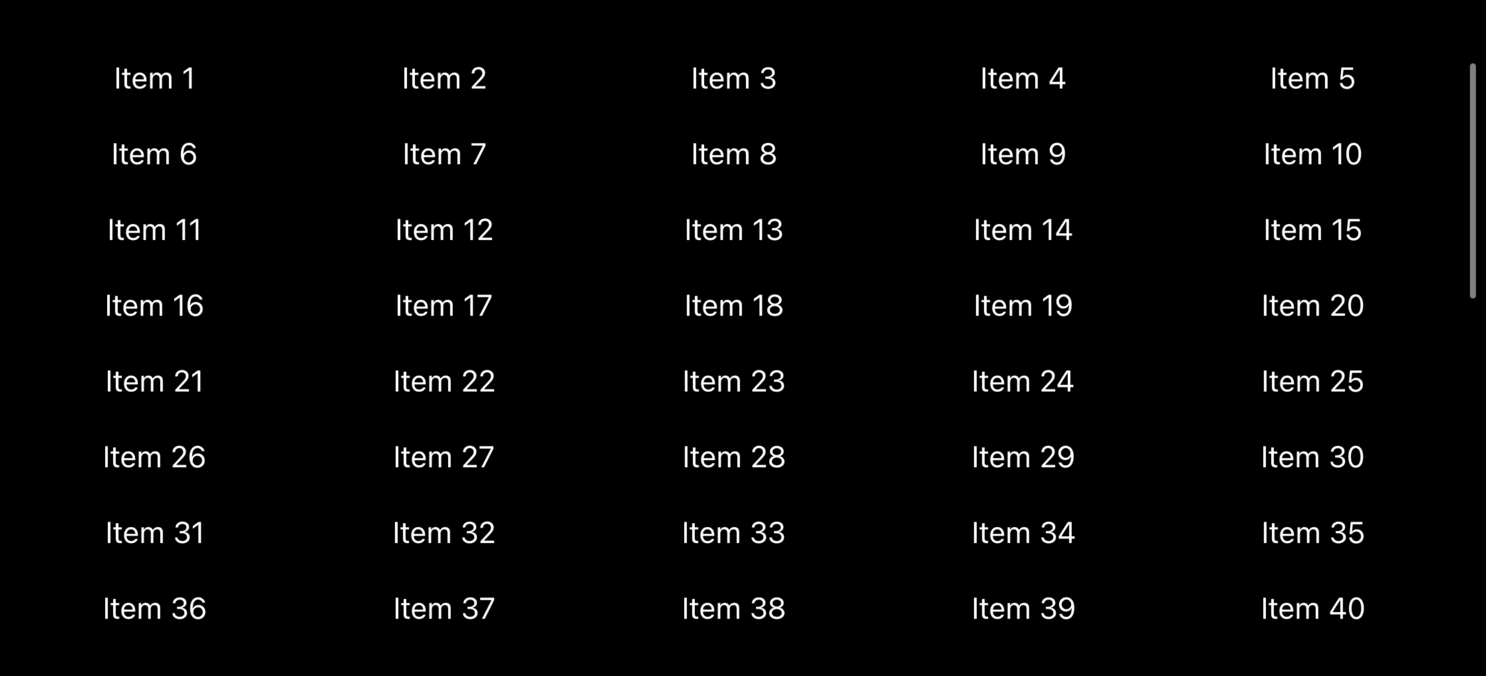
Using GridItem(.adaptive(minimum: 80)) means we want the grid to fit in as many items per row as possible, using a minimum size of 80 points each.
If you wanted to control the number of columns you can use .flexible() instead, which also lets you specify how big each item should be but now lets you control how many columns there are. For example, this creates five columns:
struct ContentView: View {
    let data = (1...100).map { "Item \($0)" }

    let columns = [
        GridItem(.flexible()),
        GridItem(.flexible()),
        GridItem(.flexible()),
        GridItem(.flexible()),
        GridItem(.flexible())
    ]

    var body: some View {
        ScrollView {
            LazyVGrid(columns: columns, spacing: 20) {
                ForEach(data, id: \.self) { item in
                    Text(item)
                }
            }
            .padding(.horizontal)
        }
        .frame(maxHeight: 300)
    }
}
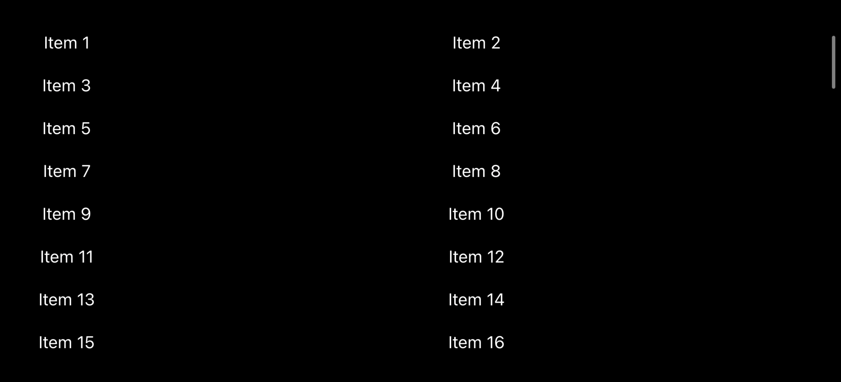
A third option is to use fixed sizes. For example, this will make the first column be exactly 100 points wide, and allow the second column to fill up all the remaining space:
struct ContentView: View {
    let data = (1...100).map { "Item \($0)" }

    let columns = [
        GridItem(.fixed(100)),
        GridItem(.flexible()),
    ]

    var body: some View {
        ScrollView {
            LazyVGrid(columns: columns, spacing: 20) {
                ForEach(data, id: \.self) { item in
                    Text(item)
                }
            }
            .padding(.horizontal)
        }
        .frame(maxHeight: 300)
    }
}
You can also use LazyHGrid to make a horizontally scrolling grid, which works in much the same way except it accepts rows in its initializer.
For example, we could create 10 side by side heading images that are horizontally scrolling like this:
struct ContentView: View {
    let items = 1...50

    let rows = [
        GridItem(.fixed(50)),
        GridItem(.fixed(50))
    ]

    var body: some View {
        ScrollView(.horizontal) {
            LazyHGrid(rows: rows, alignment: .center) {
                ForEach(items, id: \.self) { item in
                    Image(systemName: "\(item).circle.fill")
                        .font(.largeTitle)
                }
            }
            .frame(height: 150)
        }
    }
}
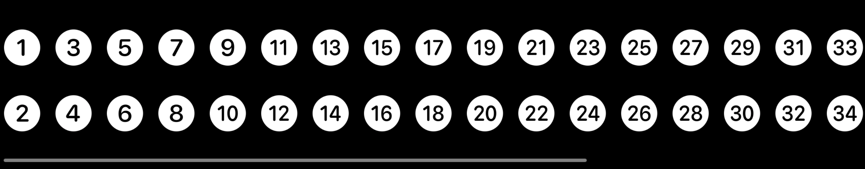
As you can see, the code required to create horizontal and vertical grids is almost the same, changing just rows for columns.
If you're required to support iOS 13 you won't have access to LazyHGrid or LazyVGrid, so read below for an alternative…
SwiftUI gives us VStack for vertical layouts and HStack for horizontal layouts, but nothing that does both – nothing that can lay out views in a grid structure.
Fortunately we can write one ourselves by leveraging SwiftUI's view builder system. This means writing a type that must be created using a row and column count, plus a closure it can run to retrieve the views for a given cell in the grid. Inside the body it can then loop over all the rows and columns and create cells inside VStack and HStack to make a grid, each time calling the view closure to ask what should be in the cell.
In code it looks like this:
struct GridStack<Content: View>: View {
    let rows: Int
    let columns: Int
    let content: (Int, Int) -> Content

    var body: some View {
        VStack {
            ForEach(0 ..< rows, id: \.self) { row in
                HStack {
                    ForEach(0 ..< columns, id: \.self) { column in
                        content(row, column)
                    }
                }
            }
        }
    }

    init(rows: Int, columns: Int, @ViewBuilder content: @escaping (Int, Int) -> Content) {
        self.rows = rows
        self.columns = columns
        self.content = content
    }
}

// An example view putting GridStack into practice.
struct ContentView: View {
    var body: some View {
        GridStack(rows: 4, columns: 4) { row, col in
            Image(systemName: "\(row * 4 + col).circle")
            Text("R\(row) C\(col)")
        }
    }
}
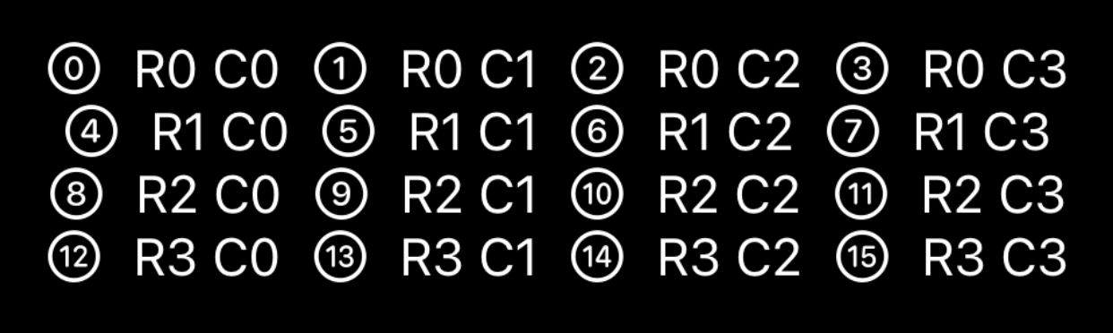
That creates a 4x4 grid with an image and text in each cell.
Similar solutions…
