Day 30
Day 30 관련

Project 6, part one
Famed French fashion designer Coco Chanel once said that “fashion is architecture: it is a matter of proportions.” The same is true of user interface design: our goal is to make all our important functionality available to the user without making it feel squashed or squeezed in.
Today we’re starting a new technique project where we’ll look at how Auto Layout lets us set some fairly complicated rules to make our UI look great. There are several different ways of doing this, and I’ll be showing you them all in this project – I’d rather you tried them yourself and decided which worked best for you, rather than me trying to pick and choose based on my own preferences.
Regardless of which you choose, as you’ll see the end result is that we have extraordinary power over the way our user interface adapts to different devices and rotation changes.
Today you have three topics to work through, and you’ll learn about using aspect ratio constraints, Visual Format language, and more.
Setting up
Setting up
In this technique project you're going to learn more about Auto Layout, the powerful and expressive way iOS lets you design your layouts. We used it in project 2 to make sure our flag buttons were positioned correctly, but that project has a problem: if you rotate your device, the flags don't fit on the screen!
So, we're first going to fix project 2 so that it demonstrates more advanced Auto Layout techniques (while also making the flags stay on the screen correctly!), then take a look at ways you can use Auto Layout in code.
First: take a copy of project 2, call it project6a, then open it in Xcode. All set? Then let's begin…
Advanced Auto Layout
Advanced Auto Layout
When you run the project, it looks fine in portrait, but is unplayable on landscape because some of the buttons are hidden. You have two options: either disable landscape mode, or make your layout work across both orientations.
Disabling orientations isn't a great solution, but sometimes it's the right solution. Most games, for example, fix their orientation because it just doesn't make sense to support both. If you want to do this, press Cmd+1 to show the project navigator on the left of your Xcode window, select your project (it's the first item in the pane), then to the right of where you just clicked will appear another pane showing "PROJECT" and "TARGETS", along with some more information in the center.
Please note: This project and targets list can be hidden by clicking the disclosure button in the top-left of the project editor (directly beneath the icon with four squares), and you may find yours is already hidden. I strongly recommend you show this list – hiding it will only make things harder to find, so please make sure it's visible!
In the picture below you can see the project editor, with the device orientations at the bottom. This is the collapsed view of projects and targets, so there's a dropdown arrow at the top that says "Project2" (just above where it says Identity in bold), and to the left of that is the button to show the projects and targets list.
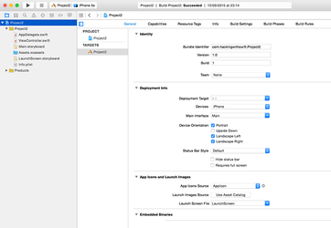
This view is called the project editor, and contains a huge number of options that affect the way your app works. You'll be using this a lot in the future, so remember how to get here! Select Project 2 under TARGETS, then choose the General tab, and scroll down until you see four checkboxes called Device Orientation. You can select only the ones you want to support.
You'll need to support selective orientations in some later projects, but for now let's take the smart solution: add extra rules to Auto Layout so it can make the layout work great in landscape mode.
Open Main.storyboard in Interface Builder, select the bottom flag, then Ctrl-drag from the flag to the white space directly below the flag – in the view controller itself. The direction you drag is important, so please drag straight down.
When you release your mouse button, a popup will appear that includes the option “Bottom Space to Safe Area” – please select that. This creates a new Auto Layout constraint that the bottom of the flag must be at least X points away from the bottom of the view controller, where X is equal to whatever space there is in there now.
Although this is a valid rule, it will screw up your layout because we now have a complete set of exact vertical rules: the top flag should be 36 points from the top, the second 30 from the first, the third 30 from the second, and the third X away from the bottom. It's 207 for me, but yours might be different.
Because we've told Auto Layout exactly how big all the spaces should be, it will add them up and divide the remaining space among the three flags however it thinks best. That is, the flags must now be stretched vertically in order to fill the space, which is almost certainly what we don't want.
Instead, we're going to tell Auto Layout where there is some flexibility, and that's in the new bottom rule we just created. The bottom flag doesn't need to be precisely 207 points away from the bottom of the safe area – it just needs to be some distance away, so that it doesn't touch the edge. If there is more space, great, Auto Layout should use it, but all we care about is the minimum.
Select the third flag to see its list of constraints drawn in blue, then (carefully!) select the bottom constraint we just added. In the utilities view on the right, choose the attributes inspector (Alt+Cmd+4), and you should see Relation set to Equal and Constant set to 207 (or some other value, depending on your layout).
What you need to do is change Equal to be "Greater Than or Equal", then change the Constant value to be 20. This sets the rule "make it at least 20, but you can make it more to fill up space." The layout won't change visually while you're doing this, because the end result is the same. But at least now that Auto Layout knows it has some flexibility beyond just stretching the flags!
Our problem is still not fixed, though: in landscape, an iPhone SE has just 320 points of space to work with, so Auto Layout is going to make our flags fit by squashing one or maybe even two of them. Squashed flags aren't good, and having uneven sizes of flags isn't good either, so we're going to add some more rules.
Select the second button, then Ctrl-drag to the first button. When given the list of options, choose Equal Heights. Now do the same from the third button to the second button. This rule ensures that at all times the three flags have the same height, so Auto Layout can no longer squash one button to make it all fit and instead has to squash all three equally.
That fixes part of the problem, but in some respects it has made things worse. Rather than having one squashed flag, we now have three! But with one more rule, we can stop the flags from being squashed ever. Select the first button, then Ctrl-drag a little bit upwards – but stay within the button! When you release your mouse button, you'll see the option "Aspect Ratio", so please choose it.
The Aspect Ratio constraint solves the squashing once and for all: it means that if Auto Layout is forced to reduce the height of the flag, it will reduce its width by the same proportion, meaning that the flag will always look correct. Add the Aspect Ratio constraint to the other two flags, and run your app again. It should work great in portrait and landscape, all thanks to Auto Layout!
Auto Layout in code: addConstraints() with Visual Format Language
Auto Layout in code: addConstraints() with Visual Format Language
Create a new Single View App project in Xcode, naming it Project6b. We're going to create some views by hand, then position them using Auto Layout. Put this into your viewDidLoad() method:
override func viewDidLoad() {
    super.viewDidLoad()

    let label1 = UILabel()
    label1.translatesAutoresizingMaskIntoConstraints = false
    label1.backgroundColor = UIColor.red
    label1.text = "THESE"
    label1.sizeToFit()

    let label2 = UILabel()
    label2.translatesAutoresizingMaskIntoConstraints = false
    label2.backgroundColor = UIColor.cyan
    label2.text = "ARE"
    label2.sizeToFit()

    let label3 = UILabel()
    label3.translatesAutoresizingMaskIntoConstraints = false
    label3.backgroundColor = UIColor.yellow
    label3.text = "SOME"
    label3.sizeToFit()

    let label4 = UILabel()
    label4.translatesAutoresizingMaskIntoConstraints = false
    label4.backgroundColor = UIColor.green
    label4.text = "AWESOME"
    label4.sizeToFit()

    let label5 = UILabel()
    label5.translatesAutoresizingMaskIntoConstraints = false
    label5.backgroundColor = UIColor.orange
    label5.text = "LABELS"
    label5.sizeToFit()

    view.addSubview(label1)
    view.addSubview(label2)
    view.addSubview(label3)
    view.addSubview(label4)
    view.addSubview(label5)
}
All that code creates five UILabel objects, each with unique text and a unique background color. All five views then get added to the view belonging to our view controller by using view.addSubview().
We also set the property translatesAutoresizingMaskIntoConstraints to be false on each label, because by default iOS generates Auto Layout constraints for you based on a view's size and position. We'll be doing it by hand, so we need to disable this feature.
If you run the app now, you'll see seem some colorful labels at the top, overlapping so it looks like it says "LABELS ME". That's because our labels are placed in their default position (at the top-left of the screen) and are all sized to fit their content thanks to us calling sizeToFit() on each of them.
We're going to add some constraints that say each label should start at the left edge of its superview, and end at the right edge. What’s more, we're going to do this using a technique called Auto Layout Visual Format Language (VFL), which is kind of like a way of drawing the layout you want with a series of keyboard symbols.
Before we do that, we need to create a dictionary of the views we want to lay out. The reason this is needed for VFL will become clear shortly, but first here's the dictionary you need to add below the last call to addSubview():
let viewsDictionary = ["label1": label1, "label2": label2, "label3": label3, "label4": label4, "label5": label5]
That creates a dictionary with strings for its keys and our labels as its values (the values). So, to get access to label1, we can now use viewsDictionary["label1"]. This might seem redundant, but wait just a moment longer: it's time for some Visual Format Language!
Add these lines directly below the viewsDictionary that was just created:
view.addConstraints( NSLayoutConstraint.constraints(withVisualFormat: "H:|[label1]|", options: [], metrics: nil, views: viewsDictionary))
view.addConstraints( NSLayoutConstraint.constraints(withVisualFormat: "H:|[label2]|", options: [], metrics: nil, views: viewsDictionary))
view.addConstraints( NSLayoutConstraint.constraints(withVisualFormat: "H:|[label3]|", options: [], metrics: nil, views: viewsDictionary))
view.addConstraints( NSLayoutConstraint.constraints(withVisualFormat: "H:|[label4]|", options: [], metrics: nil, views: viewsDictionary))
view.addConstraints( NSLayoutConstraint.constraints(withVisualFormat: "H:|[label5]|", options: [], metrics: nil, views: viewsDictionary))
That's a lot of code, but actually it's just the same thing five times over. As a result, we could easily rewrite those in a loop, like this:
for label in viewsDictionary.keys {
    view.addConstraints( NSLayoutConstraint.constraints(withVisualFormat: "H:|[\(label)]|", options: [], metrics: nil, views: viewsDictionary))
}
Note that we're using string interpolation to put the key ("label1", etc) into the VFL.
Let's eliminate the easy stuff, then focus on what remains.
view.addConstraints(): this adds an array of constraints to our view controller's view. This array is used rather than a single constraint because VFL can generate multiple constraints at a time.NSLayoutConstraint.constraints(withVisualFormat:)is the Auto Layout method that converts VFL into an array of constraints. It accepts lots of parameters, but the important ones are the first and last.- We pass
[](an empty array) for the options parameter andnilfor the metrics parameter. You can use these options to customize the meaning of the VFL, but for now we don't care.
That's the easy stuff. So, let's look at the Visual Format Language itself: "H:|[label1]|". As you can see it's a string, and that string describes how we want the layout to look. That VFL gets converted into Auto Layout constraints, then added to the view.
The H: parts means that we're defining a horizontal layout; we'll do a vertical layout soon. The pipe symbol, |, means "the edge of the view." We're adding these constraints to the main view inside our view controller, so this effectively means "the edge of the view controller." Finally, we have [label1], which is a visual way of saying "put label1 here". Imagine the brackets, [ and ], are the edges of the view.
So, "H:|[label1]|" means "horizontally, I want my label1 to go edge to edge in my view." But there's a hiccup: what is "label1"? Sure, we know what it is because it's the name of our variable, but variable names are just things for humans to read and write – the variable names aren't actually saved and used when the program runs.
This is where our viewsDictionary dictionary comes in: we used strings for the key and UILabels for the value, then set "label1" to be our label. This dictionary gets passed in along with the VFL, and gets used by iOS to look up the names from the VFL. So when it sees [label1], it looks in our dictionary for the "label1" key and uses its value to generate the Auto Layout constraints.
That's the entire VFL line explained: each of our labels should stretch edge-to-edge in our view. If you run the program now, that's sort of what you'll see, although it highlights our second problem: we don't have a vertical layout in place, so although all the labels sit edge-to-edge in the view, they all overlap.
We're going to fix this with another set of constraints, but this time it's just one (long) line.
view.addConstraints( NSLayoutConstraint.constraints(withVisualFormat: "V:|[label1]-[label2]-[label3]-[label4]-[label5]", options: [], metrics: nil, views: viewsDictionary))
That's identical to the previous five, except for the VFL part. This time we're specifying V:, meaning that these constraints are vertical. And we have multiple views inside the VFL, so lots of constraints will be generated. The new thing in the VFL this time is the - symbol, which means "space". It's 10 points by default, but you can customize it.
Note that our vertical VFL doesn't have a pipe at the end, so we're not forcing the last label to stretch all the way to the edge of our view. This will leave whitespace after the last label, which is what we want right now.
If you run your program now, you'll see all five labels stretching edge-to-edge horizontally, then spaced neatly vertically. It would have taken quite a lot of Ctrl-dragging in Interface Builder to make this same layout, so I hope you can appreciate how powerful VFL is!