
How to Build a Reusable Keyboard Shortcut Listener Component in React
How to Build a Reusable Keyboard Shortcut Listener Component in React 관련

If you’re like me and you loveeeeee shortcuts, you know how satisfying it is to press a few keys and watch the magic happen. Whether it’s the familiar Ctrl+C - Ctrl+V that devs use to “borrow code” 😉 from LLMs and code pages, or the personalised shortcuts we set up in our favourite tools, keyboard shortcuts save time and make us feel like a computer wiz.
Well, fear not! I’ve cracked the code for building components that trigger and respond to keyboard shortcuts. In this article, I’ll teach you how to create them with React, Tailwind CSS, and Framer Motion.
Prerequisites
- Fundamentals of HTML, CSS, and Tailwind CSS
- Fundamentals of JavaScript, React, and React Hooks.
What Is a Keyboard Shortcut Listener (KSL) Component?
A Keyboard Shortcut Listener component (KSLC) is a component that listens for specific key combinations and triggers actions in your app. It's designed to make your app respond to keyboard shortcuts, allowing for a smoother, more efficient user experience.
Why is it important?
- Accessibility: The KSL component makes it simple for people who use a keyboard to trigger actions, making your app more inclusive and easy to use.
- Snappier Experience: Shortcuts are quick and efficient, allowing users to get things done in less time. No more fumbling around for the mouse—just hit a key (or two) and boom, action happens!
- Reusability: Once you’ve set up your KSL, it can handle different shortcuts across your app, making it easy to add without rewriting the same logic.
- Cleaner Code: Instead of scattering keyboard event listeners everywhere, the KSL component keeps things tidy by centralising the logic. Your code stays clean, organized, and easier to maintain.
How to Build the KSL Component
I've prepared a GitHub repository with starter files (Daiveedjay/KSL-Component) to speed things up. Simply clone this repo and install the dependencies.
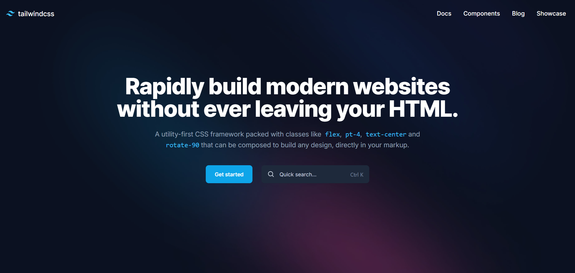
For this project, we’re using Tailwind’s home page as our muse and creating the KSL functionality. After installing and running the build command, here’s what your page should look like:
How to Create the Reveal Component
The reveal component is the component we want to show when we use the shortcut.
To begin, create a file called search-box.tsx and paste in this code:
export default function SearchBox() {
  return (
    <div className="fixed top-0 left-0 w-full h-full backdrop-blur-sm bg-slate-900/50 ">
      {" "}
      <div className=" p-[15vh] text-[#939AA7] h-full">
        <div className="max-w-xl mx-auto divide-y divide-[#939AA7] bg-[#1e293b] rounded-md">
          <div className="relative flex justify-between px-4 py-2 text-sm ">
            <div className="flex items-center w-full gap-2 text-white">
              <BiSearch size={20} />
              <input
                type="text"
                className="w-full h-full p-2 bg-transparent focus-within:outline-none"
                placeholder="Search Documentation"
              />
            </div>
            <div className="absolute -translate-y-1/2 right-4 top-1/2 ">
              <kbd className="p-1 text-xs rounded-[4px] bg-[#475569] font-sans font-semibold text-slate-400">
                <abbr title="Escape" className="no-underline ">
                  Esc{" "}
                </abbr>{" "}
              </kbd>
            </div>
          </div>
          <div className="flex items-center justify-center p-10 text-center ">
            <h2 className="text-xl">
              How many licks does it take to get to the center of a Tootsie pop?
            </h2>
          </div>
        </div>
      </div>
    </div>
  );
}
Ok, so what’s happening in this code?
- Main Overlay (
<div className="fixed top-0 left-0 ...">)- This is the full-screen overlay that dims the background.
- The
backdrop-blur-smadds a subtle blur to the backdrop, andbg-slate-900/50gives it a semi-transparent dark overlay.
- Search Box Wrapper (
<div className="p-[15vh] ...">)- The content is centered using padding and flex utilities.
- The
max-w-xlmakes sure that the search box stays within a reasonable width for readability.
Then in your App.tsx, create a state that dynamically shows that component:
const [isOpen, setIsOpen] = useState<boolean>(false);
useState: This hook initializesisOpentofalse, meaning the search box is hidden by default.- When
isOpenis set totrue, theSearchBoxcomponent will render on the screen.
And render the search component:
{isOpen && <SearchBox />}
To show the search component, add a toggle function to the input button:
<button
  type="button"
  className="items-center hidden h-12 px-4 space-x-3 text-left rounded-lg shadow-sm sm:flex w-72 ring-slate-900/10 focus:outline-none hover:ring-2 hover:ring-sky-500 focus:ring-2 focus:ring-sky-500 bg-slate-800 ring-0 text-slate-300 highlight-white/5 hover:bg-slate-700"
  onClick={() => setIsOpen(true)}>
  <BiSearch size={20} />
  <span className="flex-auto">Quick search...</span>
   <kbd className="font-sans font-semibold text-slate-500">
   <abbr title="Control" className="no-underline text-slate-500">
    Ctrl{" "}
    </abbr>{" "}
    K
   </kbd>
</button>
The onClick event sets isOpen to true, displaying the SearchBox.
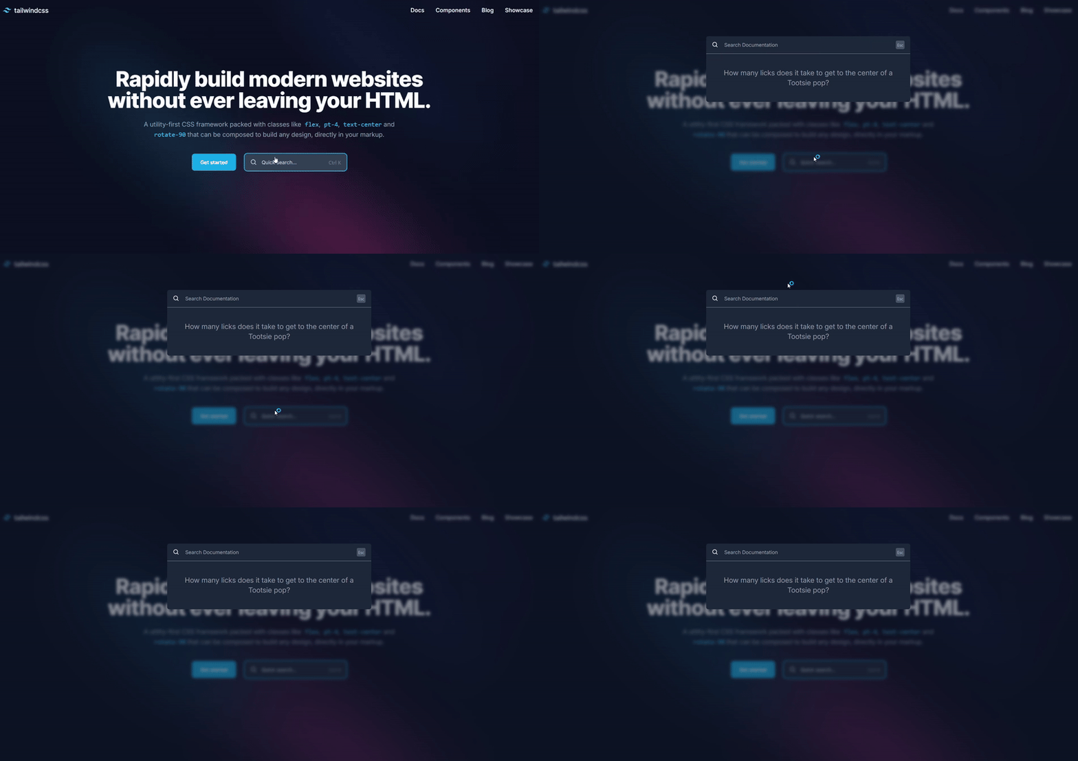
But as you’ve seen, this was triggered by a click action, not a keyboard shortcut action. Let’s do that next.
How to Trigger the Component via Keyboard Shortcut
To make the reveal component open and close using a keyboard shortcut, we’ll use a useEffect hook to listen for specific key combinations and update the component’s state accordingly.
Step 1: Listen for Keyboard Events
Add an useEffect hook in your App.tsx file to listen for key presses:
  useEffect(() => {
    const handleKeyDown = (event: KeyboardEvent) => {
      if (event.ctrlKey && event.key === Key.K) {
        event.preventDefault(); // Prevent default browser behavior

      }    };

    window.addEventListener("keydown", handleKeyDown);
    return () => {
      window.removeEventListener("keydown", handleKeyDown);
    };
  }, []);
What’s happening in this code?
- Effect Setup (
useEffect)useEffectensures that the event listener for key presses is added when the component mounts and cleaned up when the component unmounts, preventing memory leaks.
- Key Combination (
event.ctrlKey && event.key === "k")- The
event.ctrlKeychecks if the Control key is being pressed. - The
event.key === "k"ensures we’re listening specifically for the "K" key. Together, this checks if the Ctrl+K combination is pressed.
- The
- Prevent Default Behavior (
event.preventDefault())- Some browsers may have default behaviors tied to key combinations like Ctrl+K (e.g., focusing the browser’s address bar). Calling
preventDefaultstops this behavior.
- Some browsers may have default behaviors tied to key combinations like Ctrl+K (e.g., focusing the browser’s address bar). Calling
- Event Cleanup (
return () => ...)- The cleanup function removes the event listener to prevent duplicate listeners from being added if the component re-renders.
Step 2: Toggle Component Visibility
Next, update the handleKeyDown function to toggle the SearchBox visibility when the shortcut is pressed:
useEffect(() => {
    const handleKeyDown = (event: KeyboardEvent) => {
      // Listen for Ctrl + K
      if (event.ctrlKey && event.key === Key.K) {
        event.preventDefault(); // Prevent default browser behavior
        setIsOpen((prev) => !prev); // Toggle the search box
      } else if (event.key === Key.Escape) {
        setIsOpen(false); // Close the search box
      }
    };

    window.addEventListener("keydown", handleKeyDown);
    return () => {
      window.removeEventListener("keydown", handleKeyDown);
    };
  }, []);
What’s happening in this code?
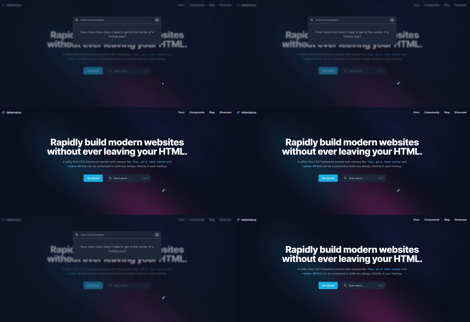
- Toggling State (
setIsOpen((prev) => !prev))- When Ctrl+K is pressed, the
setIsOpenstate setter toggles the visibility of theSearchBox. - The
prevargument represents the previous state. Using!prevflips its value:true(open) becomesfalse(close).false(closed) becomestrue(open).
- When Ctrl+K is pressed, the
- Closing with the Escape Key (
event.key === "Escape")- When the Escape key is pressed,
setIsOpen(false)explicitly sets the state tofalse, closing theSearchBox.
- When the Escape key is pressed,
How to Animate the Component’s Visibility
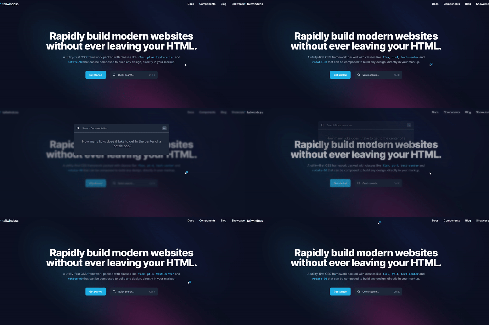
At the moment, our component works, but it lacks a little flair, wouldn’t you say? Let’s change that.
Step 1: Create the Overlay Component
We’ll start by creating an overlay component, which acts as the dark, blurred backdrop for the search box. Here’s the base version:
import { ReactNode } from "react";

export default function OverlayWrapper({ children }: { children: ReactNode }) {
  return (
    <div
      className="fixed top-0 left-0 w-full h-full backdrop-blur-sm bg-slate-900/50 ">
      {children}
    </div>
  );
}
Step 2: Add Animations to the Overlay
Now, let’s make the overlay fade in and out using Framer Motion. Update the OverlayWrapper component like this:
import { motion } from "framer-motion";
import { ReactNode } from "react";

export default function OverlayWrapper({ children }: { children: ReactNode }) {
  return (
    <motion.div
      initial={{ opacity: 0 }}
      animate={{ opacity: 1 }}
      exit={{ opacity: 0 }}
      className="fixed top-0 left-0 w-full h-full backdrop-blur-sm bg-slate-900/50 ">
      {children}
    </motion.div>
  );
}
Key animation props:
initial: Sets the starting state when the component is mounted (fully transparent).animate: Defines the state to animate toward (fully opaque).exit: Specifies the animation when the component is unmounted (fading out).
Step 3: Animate the Search Box
Next, add some motion to the search box itself. We’ll make it slide and fade in when it appears and slide out when it disappears.
import { motion } from "framer-motion";
import { BiSearch } from "react-icons/bi";
import OverlayWrapper from "./overlay";

export default function SearchBox() {
  return (
    <OverlayWrapper>
      <motion.div
        initial={{ y: "-10%", opacity: 0 }}
        animate={{ y: "0%", opacity: 1 }}
        exit={{ y: "-5%", opacity: 0 }}
        className=" p-[15vh] text-[#939AA7] h-full">
        <div
          className="max-w-xl mx-auto divide-y divide-[#939AA7] bg-[#1e293b] rounded-md"
        >
          <div className="relative flex justify-between px-4 py-2 text-sm ">
            <div className="flex items-center w-full gap-2 text-white">
              <BiSearch size={20} />
              <input
                type="text"
                className="w-full h-full p-2 bg-transparent focus-within:outline-none"
                placeholder="Search Documentation"
              />
            </div>
            <div className="absolute -translate-y-1/2 right-4 top-1/2 ">
              <kbd className="p-1 text-xs rounded-[4px] bg-[#475569] font-sans font-semibold text-slate-400">
                <abbr title="Escape" className="no-underline ">
                  Esc{" "}
                </abbr>{" "}
              </kbd>
            </div>
          </div>
          <div className="flex items-center justify-center p-10 text-center ">
            <h2 className="text-xl">
              How many licks does it take to get to the center of a Tootsie pop?
            </h2>
          </div>
        </div>
      </motion.div>
    </OverlayWrapper>
  );
}
Step 4: Enable Animation Tracking with AnimatePresence
Finally, wrap your conditional rendering logic in the AnimatePresence component provided by Framer Motion. This ensures Framer Motion tracks when elements enter and leave the DOM.
<AnimatePresence>{isOpen && <SearchBox />}</AnimatePresence>
This enables Framer Motion to track when an element enters and leaves the DOM.

How to Optimize Your KSL Component
If you thought we were done, not so fast…We still have a little more to do.
We need to optimize for accessibility. We should add a way for users to close the search component with a mouse, as accessibility is very important.
To do this, start by creating a hook called useClickOutside. This hook uses a reference element to know when a user is clicking outside the target element (search box) which is a very popular behaviour for closing modals and KSLCs.
import { useEffect } from "react";

type ClickOutsideHandler = (event: Event) => void;

export const useClickOutside = (
  ref: React.RefObject<HTMLElement>,
  handler: ClickOutsideHandler
) => {
  useEffect(() => {
    const listener = (event: Event) => {
      // Do nothing if clicking ref's element or descendant elements
      if (!ref.current || ref.current.contains(event.target as Node)) return;

      handler(event);
    };

    document.addEventListener("mousedown", listener);
    document.addEventListener("touchstart", listener);

    return () => {
      document.removeEventListener("mousedown", listener);
      document.removeEventListener("touchstart", listener);
    };
  }, [ref, handler]);
};
To use this hook, pass in the function responsible for opening and closing the search component:
<AnimatePresence> {isOpen && <SearchBox close={setIsOpen} />} </AnimatePresence>
Then receive the function in the search with its proper prop type:
export default function SearchBox({
  close,
}: {
  close: React.Dispatch<React.SetStateAction<boolean>>;
}) {
After that, create a reference (ref) to the item you want to track and mark that element:
import { motion } from "framer-motion";
import { useRef } from "react";
import { BiSearch } from "react-icons/bi";
import { useClickOutside } from "../hooks/useClickOutside";
import OverlayWrapper from "./overlay";

export default function SearchBox({
  close,
}: {
  close: React.Dispatch<React.SetStateAction<boolean>>;
}) {
  const searchboxRef = useRef<HTMLDivElement>(null);
  return (
    <OverlayWrapper>
      <motion.div
        initial={{ y: "-10%", opacity: 0 }}
        animate={{ y: "0%", opacity: 1 }}
        exit={{ y: "-5%", opacity: 0 }}
        className=" p-[15vh] text-[#939AA7] h-full">
        <div
          className="max-w-xl mx-auto divide-y divide-[#939AA7] bg-[#1e293b] rounded-md"
          ref={searchboxRef}>
          <div className="relative flex justify-between px-4 py-2 text-sm ">
            <div className="flex items-center w-full gap-2 text-white">
              <BiSearch size={20} />
              <input
                type="text"
                className="w-full h-full p-2 bg-transparent focus-within:outline-none"
                placeholder="Search Documentation"
              />
            </div>
            <div className="absolute -translate-y-1/2 right-4 top-1/2 ">
              <kbd className="p-1 text-xs rounded-[4px] bg-[#475569] font-sans font-semibold text-slate-400">
                <abbr title="Escape" className="no-underline ">
                  Esc{" "}
                </abbr>{" "}
              </kbd>
            </div>
          </div>
          <div className="flex items-center justify-center p-10 text-center ">
            <h2 className="text-xl">
              How many licks does it take to get to the center of a Tootsie pop?
            </h2>
          </div>
        </div>
      </motion.div>
    </OverlayWrapper>
  );
}
Then pass in that ref and the function to be called when a click outside that element is detected.
useClickOutside(searchboxRef, () => close(false));
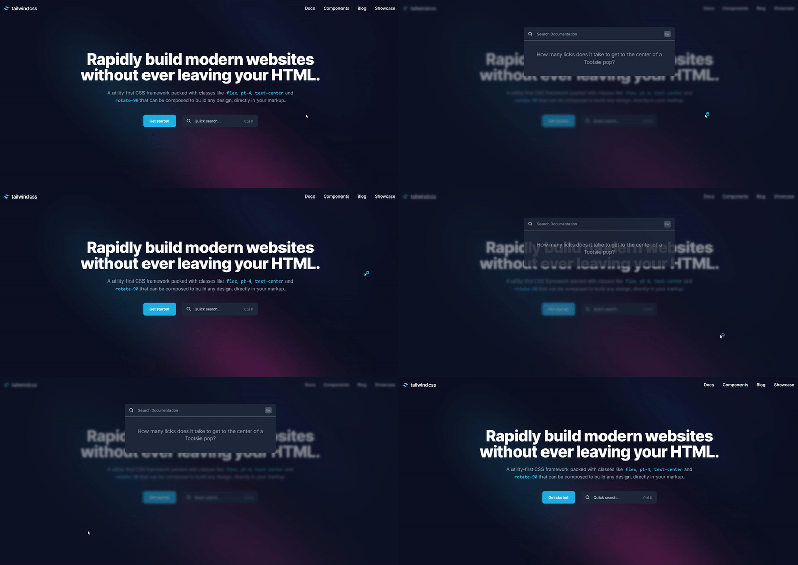
We can also optimize the code a bit more. Like we did with the accessibility feature, we can make out listener for detecting shortcuts much cleaner and efficient with the following steps.
First, create a useKeyBindings hook file for handling key press combinations.
Then define the hook and the Interface. The hook will accept an array of bindings, where each binding consists of:
- A
keysarray, which specifies the key combination (for example, ["Control", "k"]) - A callback function, which gets called when the corresponding keys are pressed.
import { useEffect } from "react";

// Define the structure of a keybinding
interface KeyBinding {
  keys: string[]; // Array of keys (e.g., ["Control", "k"])
  callback: () => void; // Function to execute when the keys are pressed
}

export const useKeyBindings = (bindings: KeyBinding[]) => {

};
Next, create the handleKeyDown function. Inside the hook, define a function that will listen for keyboard events. This function will check if the pressed keys match any defined key combinations.
We'll normalize the keys to lowercase so that the comparison is case-insensitive and track which keys are pressed by checking for ctrlKey, shiftKey, altKey, metaKey, and the key pressed (for example, "k" for Ctrl+K).
const handleKeyDown = (event: KeyboardEvent) => {
  // Track the keys that are pressed
  const pressedKeys = new Set<string>();

  // Check for modifier keys (Ctrl, Shift, Alt, Meta)
  if (event.ctrlKey) pressedKeys.add("control");
  if (event.shiftKey) pressedKeys.add("shift");
  if (event.altKey) pressedKeys.add("alt");
  if (event.metaKey) pressedKeys.add("meta");

  // Add the key that was pressed (e.g., "k" for Ctrl + K)
  if (event.key) pressedKeys.add(event.key.toLowerCase());
};
Next, we’ll compare the pressed keys with the keys array from our bindings to check if they match. If they do, we’ll call the associated callback function. We also ensure that the number of pressed keys matches the number of keys defined in the binding.
// Loop through each keybinding
bindings.forEach(({ keys, callback }) => {
  // Normalize the keys to lowercase for comparison
  const normalizedKeys = keys.map((key) => key.toLowerCase());

  // Check if the pressed keys match the keybinding
  const isMatch =
    pressedKeys.size === normalizedKeys.length &&
    normalizedKeys.every((key) => pressedKeys.has(key));

  // If the keys match, call the callback
  if (isMatch) {
    event.preventDefault(); // Prevent default browser behavior
    callback(); // Execute the callback function
  }
});
Finally, set up event listeners on the window object to listen for keydown events. These listeners will trigger the handleKeyDown function whenever a key is pressed. Make sure to add clean up the event listeners when the component unmounts.
useEffect(() => {
  // Add event listeners for keydown
  window.addEventListener("keydown", handleKeyDown);

  // Cleanup the event listeners when the component unmounts
  return () => {
    window.removeEventListener("keydown", handleKeyDown);
  };
}, [bindings]);
The full useKeyBindings hook now put together looks like this:
import { useEffect } from "react";

interface KeyBinding {
  keys: string[]; // A combination of keys to trigger the callback (e.g., ["Control", "k"])
  callback: () => void; // The function to execute when the keys are pressed
}

export function useKeyBindings(bindings: KeyBinding[]) {
  useEffect(() => {
    const handleKeyDown = (event: KeyboardEvent) => {
      bindings.forEach(({ keys, callback }) => {
        const normalizedKeys = keys.map((key) => key.toLowerCase());
        const pressedKeys = new Set<string>();

        // Track modifier keys explicitly
        if (event.ctrlKey) pressedKeys.add("control");
        if (event.shiftKey) pressedKeys.add("shift");
        if (event.altKey) pressedKeys.add("alt");
        if (event.metaKey) pressedKeys.add("meta");

        // Add the actual key pressed
        if (event.key) pressedKeys.add(event.key.toLowerCase());

        // Match exactly: pressed keys must match the defined keys
        const isExactMatch =
          pressedKeys.size === normalizedKeys.length &&
          normalizedKeys.every((key) => pressedKeys.has(key));

        if (isExactMatch) {
          event.preventDefault(); // Prevent default behavior
          callback(); // Execute the callback
        }
      });
    };

    window.addEventListener("keydown", handleKeyDown);
    return () => {
      window.removeEventListener("keydown", handleKeyDown);
    };
  }, [bindings]);
}
Here’s how you can use this hook in your App:
import { useKeyBindings } from "./hooks/useKeyBindings";

export default function App() {
  const [isOpen, setIsOpen] = useState<boolean>(false);

  useKeyBindings([
    {
      keys: ["Control", "k"], // Listen for "Ctrl + K"
      callback: () => setIsOpen((prev) => !prev), // Toggle the search box
    },
    {
      keys: ["Escape"], // Listen for "Escape"
      callback: () => setIsOpen(false), // Close the search box
    },
  ]);
Which gives the following result:
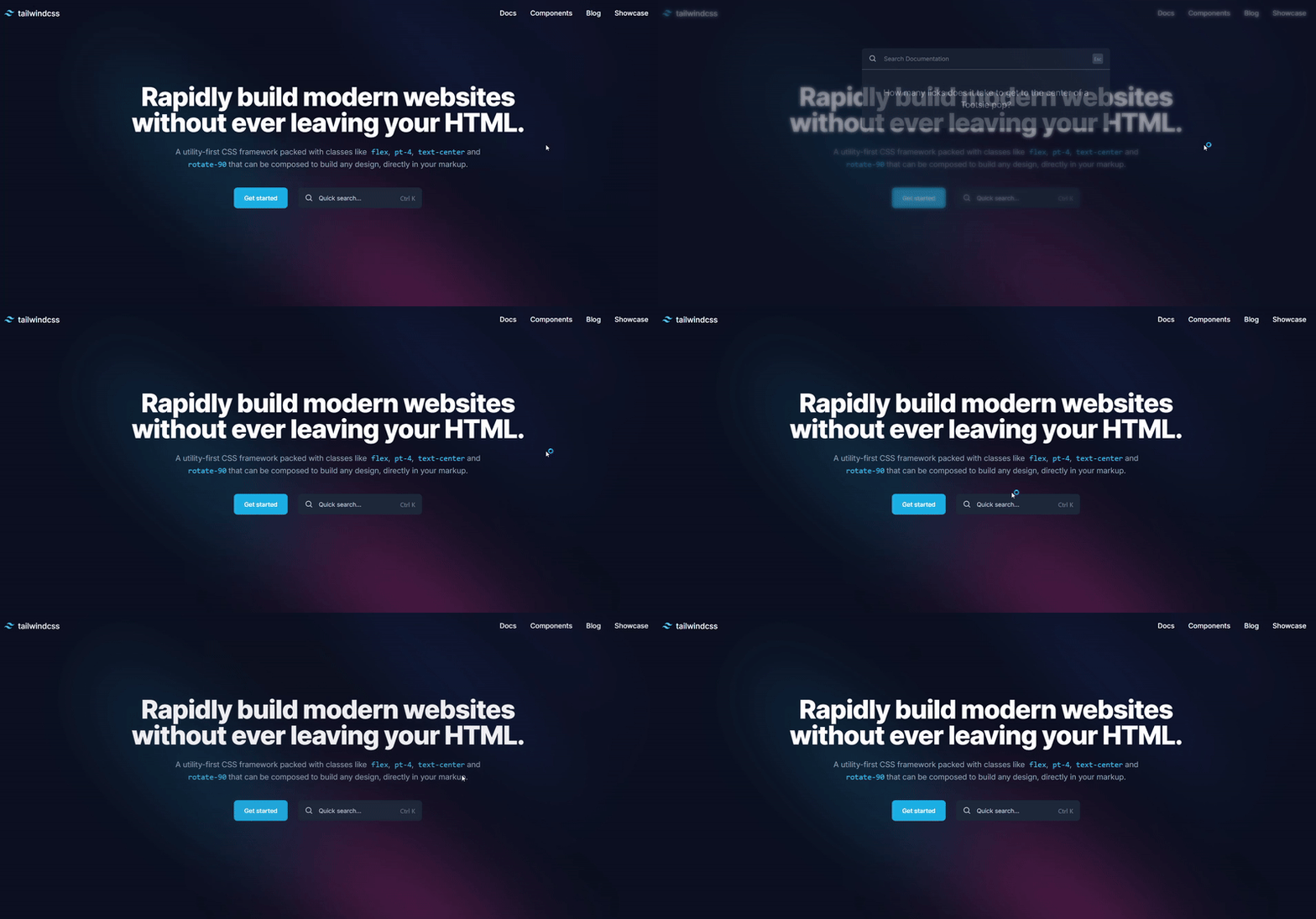
With this approach, you can even add multiple shortcuts to trigger the search component’s visibility.
useKeyBindings([
    {
      keys: ["Control", "k"], // Listen for "Ctrl + K"
      callback: () => setIsOpen((prev) => !prev), // Toggle the search box
    },
    {
      keys: ["Control", "d"], // Listen for "Ctrl + D"
      callback: () => setIsOpen((prev) => !prev), // Toggle the search box
    },
    {
      keys: ["Escape"], // Listen for "Escape"
      callback: () => setIsOpen(false), // Close the search box
    },
  ]);
Here are links to all the resources you may need for this article:
Conclusion
I hope this article felt like a well-timed shortcut, getting you to the heart of building reusable keyboard shortcut components. With every keypress and animation, you can now turn ordinary web experiences extraordinary ones.
I hope your shortcuts help you create apps that click with your users. After all, the best journeys often start with just the right combination.
Like my articles?
Feel free to buy me a coffee here, to keep my brain chugging and provide more articles like this.
Contact Information
Want to connect or contact me? Feel free to hit me up on the following: