
How to Use Tooltips in JetpackCompose
How to Use Tooltips in JetpackCompose 관련

When I wrote my last article about Jetpack Compose, I stated there that Jetpack Compose is missing some (in my opinion) basic components, and one of them is the tooltip.
At the time, there was no built-in composable to display tooltips and there were several alternative solutions circling online. The problem with those solutions was that once Jetpack Compose released newer versions, those solutions might break. So it wasn’t ideal and the community was left hoping that sometime in the future, support would be added for tooltips.
I’m glad to say that since version 1.1.0 of Compose Material 3, we now have built in tooltip support. 👏
While this in itself is great, more than a year has passed since that version was released. And with subsequent versions, the API related to tooltips changed drastically as well.
If you go over the changelog, you will see how the public and internal APIs have changed. So bear in mind, that when you read this article, things may have continued to change as everything related to Tooltips is still marked by the annotation ExperimentalMaterial3Api::class.
Note
❗️ The version of material 3 used for this article is 1.2.1, which was released on March 6th, 2024
Tooltip Types
We now have support for two different types of tooltips:
- Plain tooltip
- Rich media tooltip
Plain Tooltip
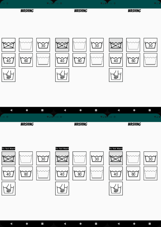
You can use the first kind to provide information about an icon button that wouldn’t be clear otherwise. For example, you can use a plain tooltip to indicate to a user what the icon button represents.
To add a tooltip to your application, you use the TooltipBox composable. This composable takes several arguments:
fun TooltipBox(
    positionProvider: PopupPositionProvider,
    tooltip: @Composable TooltipScope.() -> Unit,
    state: TooltipState,
    modifier: Modifier = Modifier,
    focusable: Boolean = true,
    enableUserInput: Boolean = true,
    content: @Composable () -> Unit,
)
Some of these should be familiar to you if you have used Composables before. I’ll highlight the ones that have a specific use case here:
positionProvider: OfPopupPositionProvidertype, and is used to calculate the position of the tooltip.tooltip: This is where you can design the UI of how the tooltip will look like.state: This holds the state that is associated with a specific Tooltip instance. It exposes methods like showing/dismissing the tooltip and when instantiating an instance of one, you can declare if the tooltip should be persistent or not (meaning if it should keep displaying on the screen until a user performs a click action outside the tooltip).content: This is the UI that the tooltip will display above/below.
Here is an example of instantiating a BasicTooltipBox with all the relevant arguments filled in:
@OptIn(ExperimentalFoundationApi::class, ExperimentalMaterial3Api::class)
@Composable
fun BasicTooltip() {
    val tooltipPosition = TooltipDefaults.rememberPlainTooltipPositionProvider()
    val tooltipState = rememberBasicTooltipState(isPersistent = false)

    BasicTooltipBox(positionProvider = tooltipPosition,
        tooltip =  { Text("Hello World") } ,
        state = tooltipState) {
        IconButton(onClick = { }) {
            Icon(imageVector = Icons.Filled.Favorite,
                    contentDescription = "Your icon's description")
        }
    }
}

Jetpack Compose has a built in class called TooltipDefaults. You can use this class to help you instantiate arguments that make up a TooltipBox. For instance, you could use TooltipDefaults.rememberPlainTooltipPositionProvider to correctly position the tooltip in relation to the anchor element.
Rich Tooltip
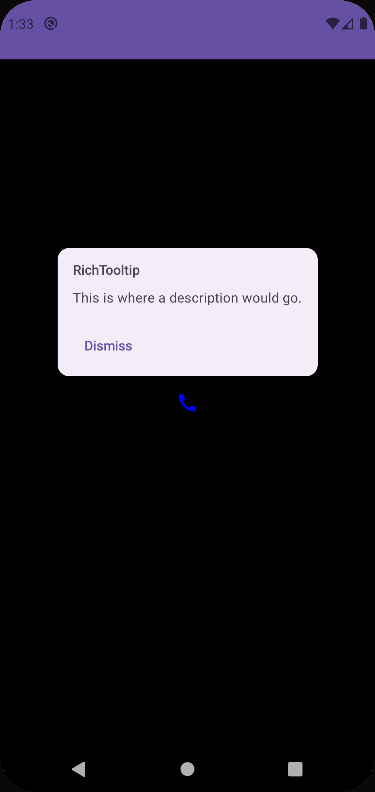
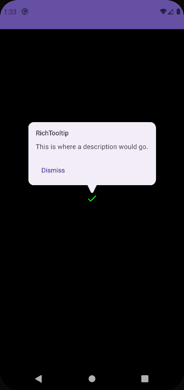
A rich media tooltip takes more space than a plain tooltip and can be used to provide more context about the functionality of an icon button. When the tooltip is shown, you can add buttons and links to it to provide further explanation or definitions.
It is instantiated in a similar way as a plain tooltip, inside of a TooltipBox, but you use the RichTooltip composable.
TooltipBox(positionProvider = tooltipPosition,
    tooltip = {
        RichTooltip(
            title = { Text("RichTooltip") },
            caretSize = caretSize,
            action = {
                TextButton(onClick = {
                    scope.launch {
                        tooltipState.dismiss()
                        tooltipState.onDispose()
                    }
                }) {
                    Text("Dismiss")
                }
            }
        ) {
            Text("This is where a description would go.")
        }
    },
    state = tooltipState) {
    IconButton(onClick = {
        /* Icon button's click event */
    }) {
        Icon(imageVector = tooltipIcon,
            contentDescription = "Your icon's description",
            tint = iconColor)
    }
}
A few things to notice about a Rich tooltip:
- A Rich tooltip has support for a caret.
- You can add an action (that is, a button) to the tooltip to give users an option to find out more information.
- You can add logic to dismiss the tooltip.
Edge Cases
When you choose to mark your tooltip state as persistent, it means that once the user interacts with the UI that shows your tooltip, it will stay visible until the user presses anywhere else on the screen.
If you looked at the example of a Rich tooltip from above, you might have noticed that we have added a button to dismiss the tooltip once it’s clicked.
There is a problem that happens once a user presses that button. Since the dismiss action is performed on the tooltip, if a user wants to perform another long press on the UI item that invokes this tooltip, the tooltip won’t be shown again. This means that the state of the tooltip is persistent on it being dismissed. So, how do we go about and resolve this?

In order to “reset” the state of the tooltip, we have to call the onDispose method that is exposed through the tooltip state. Once we do that, the tooltip state is reset and the tooltip will be shown again when the user performs a long press on the UI item.
@OptIn(ExperimentalMaterial3Api::class)
@Composable
fun RichTooltip() {
    val tooltipPosition = TooltipDefaults.rememberRichTooltipPositionProvider()
    val tooltipState = rememberTooltipState(isPersistent = true)
    val scope = rememberCoroutineScope()

    TooltipBox(positionProvider = tooltipPosition,
        tooltip = {
            RichTooltip(
                title = { Text("RichTooltip") },
                caretSize = TooltipDefaults.caretSize,
                action = {
                    TextButton(onClick = {
                        scope.launch {
                            tooltipState.dismiss()
                            tooltipState.onDispose()  /// <---- HERE
                        }
                    }) {
                        Text("Dismiss")
                    }
                }
            ) {

            }
        },
        state = tooltipState) {
        IconButton(onClick = {  }) {
            Icon(imageVector = Icons.Filled.Call, contentDescription = "Your icon's description")
        }
    }
}

onDispose solves the issueAnother scenario where the tooltip state does not reset is if instead of calling ourselves for the dismiss method per a user’s action, the user clicks outside of the tooltip, causing it to be dismissed. This calls the dismiss method behind the scenes and the tooltip state is set to dismissed. Long pressing on the UI element to see our tooltip again will result in nothing.
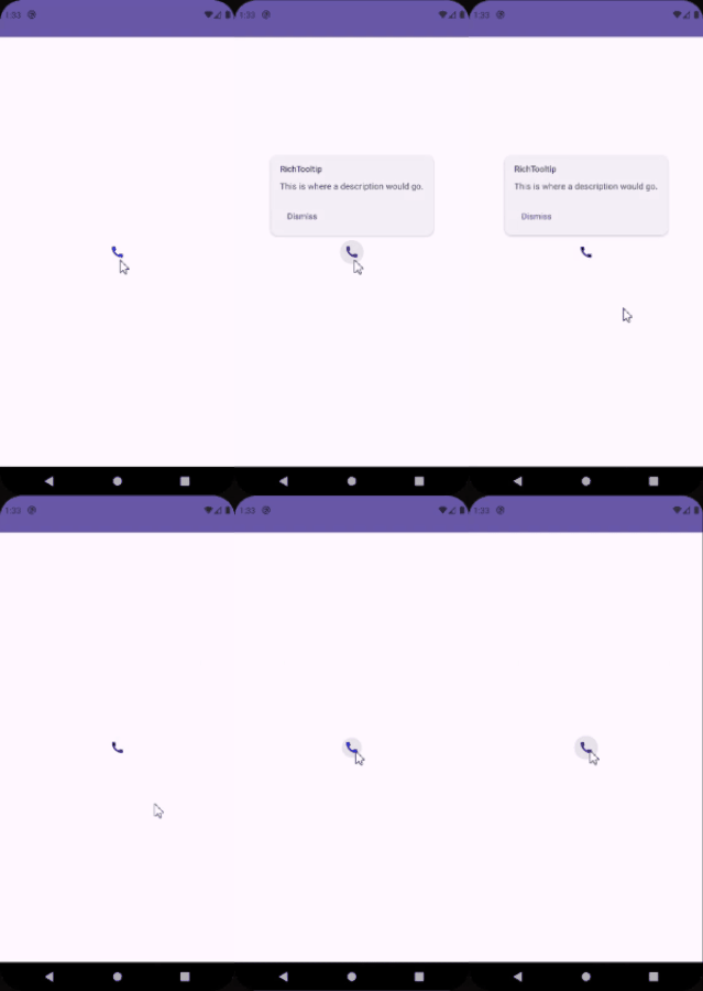
Our logic that calls the tooltip’s onDispose method does not get triggered, so how can we reset the tooltip’s state?
Currently, I haven’t been able to figure this out. It might be related to the tooltip’s MutatorMutex. Maybe with upcoming releases, there will be an API for this. I did notice that if other tooltips are present on the screen and they are pressed, this resets the previously clicked upon tooltip.

If you would like to see the code featured here, you can go to this GitHub repository (TomerPacific/MediumArticles)
If you would like to see tooltips in an application, you can check it out here.
https://play.google.com/store/apps/details?id=com.tomerpacific.laundry